Album Advertisement
Scott Galloway

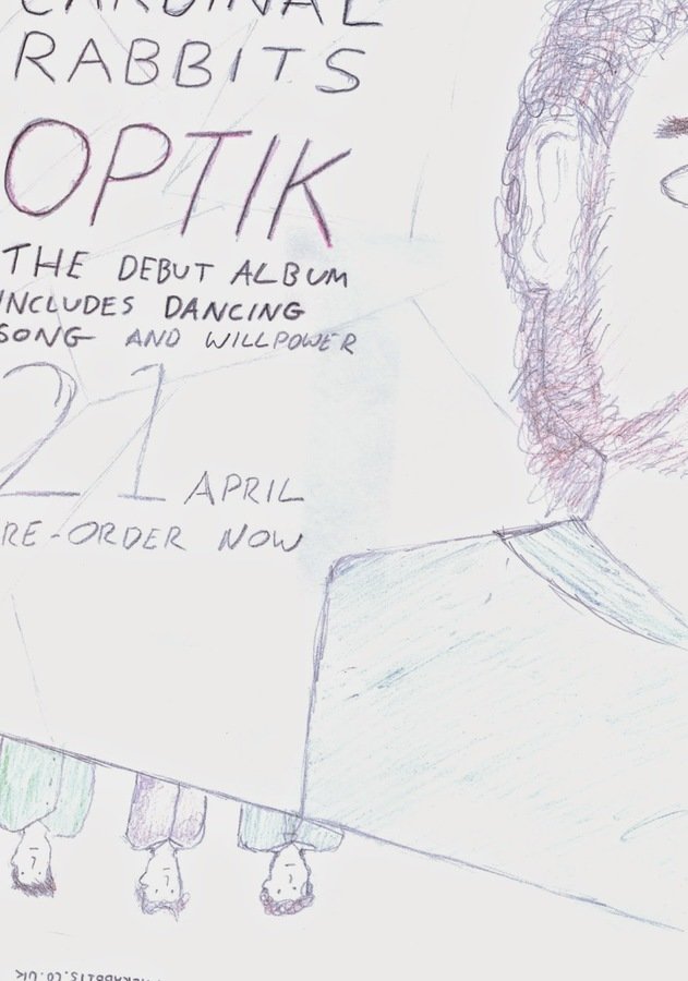
For our Album cover Advertisement, our group decided to carry on the fragmented theme which can be seen running throughout the different panels of our album. This will help the audience identify that it is a promotion for the album as the colours a style will all be the same. This will also add a unique feel to the advertisement as the style a d design is unique to the band it is advertising.
We decided to have a large image of the main band member with only one side of his face/body showing as well as the other band members under him in a smaller image. This is a convention we have found when looking at different indie album advertisements. It is also used to promote the main band member and the band itself as the consumers can identify with the main band member and will also be album to relate to him through the advertisement.
To help the customers further identify with the advert, the text will be exactly the same that has been used on the album cover. We felt the style of the font suited the genre and the was quite conventional on different indie album cover. Therefore we felt that by using the same font, it will help the audience identify what band and album it is and also keep the slick style of the album cover art work.
The use of the text stating some of the songs on the album can be used to promote the album. If the audience like the songs hat are stated on the poster, they are going to me more inclined to purchase the album as they know what there are songs on there which they like.
We decided to have a large image of the main band member with only one side of his face/body showing as well as the other band members under him in a smaller image. This is a convention we have found when looking at different indie album advertisements. It is also used to promote the main band member and the band itself as the consumers can identify with the main band member and will also be album to relate to him through the advertisement.