Introduction to Mobile Design
What is Mobile?
"a portable, wireless computing device that is small enough to be used while held
in the hand; a hand-held"
- Dictionary


Are we designing for smaller screen sizes or touch?
1. Touch - larger screen sizes
2. Smaller screen sizes - not touch device
3. Smaller screen sizes - touch device
Fundamentally, “mobile” refers to the user, and not the device or the application.
- Barbara Ballard
Native app?
Web app?
Responsive design?
Responsive Design
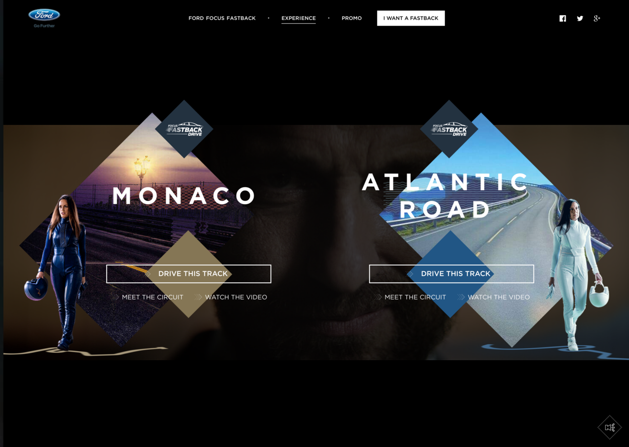
Approach in web design where the web site responds to the screen size and device that the user is accessing it from.
Responsive Design
- Industries answer for users accessing web content across multiple devices
- Design is coded using percentages instead of fixed units to create a flexible design
- Implemented in the CSS using "breakpoints"
- Javascript is often used to enhance functionality on touch screens (navigation, accordians)
- Most website built today use a responsive design
Web App
Apps that are basically websites and are accessed through the web browser
Web App
- User needs to have internet access in order to access content
- User can download from a website (don't have to submit to app stores)
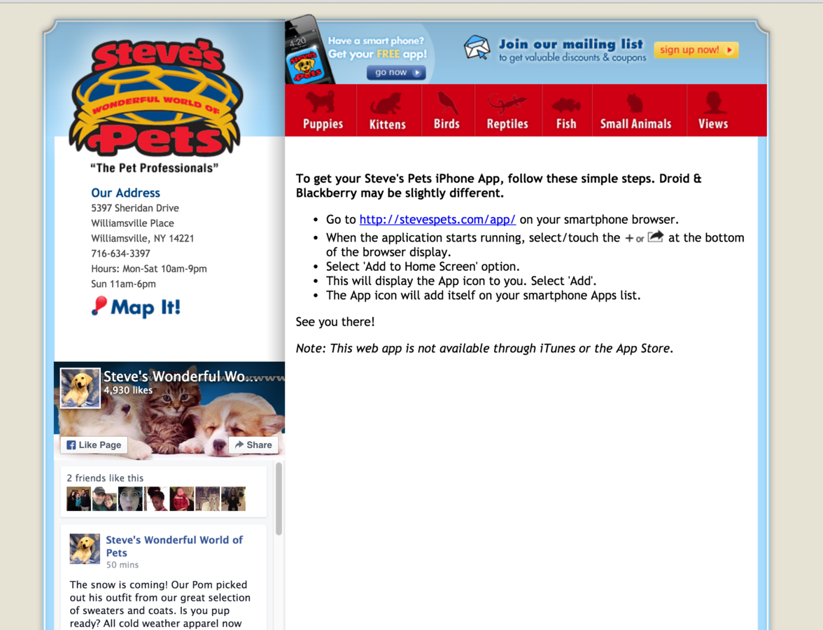
- Can add access to the app by adding a homepage icon on a mobile device
- User doesn't have to download updates
- App uses HTML, CSS, Javascript and other front-end development languages
- Have limited access to device hardware
- Are less expensive to develop but speed depends on internet access

Native app
App developed for a specific mobile device and is installed directly on the mobile device
Native app
- Users access app from the app store
- Coded using the Objective C language / Swift, (IOS), Java (Andriod), or C++ (Windows, Android)
- App can run when the user doesn't have internet access
- App updates are pushed through the app store
- Can access device hardware
- More expensive to develop but tend to run faster


