3. Development
4. Deployment
The 4 Stages of Web Development
1. Discovery
2. Design
3. Development
4. Deployment
The 4 Stages of Web Development
Development
Develop
- Write clean, valid code
- Optimize images and video (Use pure CSS in place of images where possible)
- Chrome Dev Tools: Network; Audits
- Validate W3C validator http://validator.w3.org/
Convert Sketches to HTML & CSS
- Sketch out your wireframes - Simplify!
- Compute grid dimensions in pixels.
- Convert static pixel grid to fluid percentages.
- Build out wireframe in HTML and CSS, starting with
the largest, most general areas, like #wrapper and
#main, down to the smallest details, like buttons. - Discover breakpoints and add media queries.
Inspect Sample Site - Robot or Not
- Download and inspect the Robot or Not
website files (from Ethan Marcotte.) - This is a complex site, with lots going on. You
will not be building sites this complex, but
you may find helpful tips by looking through
the code.
Remember to use your references if you get lost
DOM
- The Document Object Model is an interface that allows a programming language to manipulate the content, structure, and style of a website.
- In addition to parsing the style and structure of the HTML and CSS, the browser creates a representation of the document known as the Document Object Model. This model allows JavaScript to access the text content and elements of the website document as objects
- See Chris Coyier's post on What is the DOM?
HTML5 Semantic Elements
- header
- main
- section
- article
- nav
- aside
- footer

Hyperlinks
- Hyperlinks (<a> anchor tags) are the heart of HTML. Clicking a link sends a request to a web server to send a different page to the browser.
- A link (URL) is the address (or the path) to the location of the new page.
- A link can call for a page located on the same website or on a different site altogether.
Hyperlinks
- An absolute path points to a specific page on a specific server using a full URL <http://art.buffalo.edu/coursenotes/art320/index.html>
- A document-relative path points to a file relative to the file you are currently browsing <../exercises/ex01-htm5-and-css3/> (one level up out of the current directory and into the folder named “exercises”)
- A root-relative path describes the location of a file relative to the top level of a site </exercises/ex01-htm5-and-css3/> (at the top level of the website in the exercises folder.)
Hyperlinks
A broken path:
If the location of the linked page changes, or if it’s name is changed, the link must be updated to reflect the new path, otherwise a 404 (Page Not Found) error will result.
Anchor Tags <a>
Fully Resolved URL
http://www.art.buffalo.edu/undergraduate/programs.html
Absolute Path
<a href = "http://www.art.buffalo.edu/undergraduate/programs.html">VS</a>
Document Relative Path
<a href = "../undergraduate/programs.html">Undergrad Programs</a>
Root Relative Path
<a href = "/undergraduate/programs.html">Undergrad Programs</a>
Directories & Paths

Email Links
<a href="mailto:benny@gmail.com">Email me!</a>
Opening Links in a New Tab/Window
<a href="https://www.google.com/" target="_blank">Go to Google</a>
More Linking
<h1 id="top">Film-Making Terms</h1>
<a href="#arc_shot">Arc Shot</a><br />
<a href="#interlude">Interlude</a><br />
<a href="#prologue">Prologue</a><br /><br />
<h2 id="arc_shot">Arc Shot</h2>
<p>A shot in which the subject is photographed by
an encircling or moving camera</p>
<h2 id="interlude">Interlude</h2>
<p>A brief, intervening film scene or sequence, not specifically tied to the plot,
that appears within a film</p>
<h2 id="prologue">Prologue</h2>
<p>A speech, preface, introduction, or brief scene preceding
the the main action or plot of a film; contrast to epilogue</p>
<p><a href="#top">Top</a></p>

More Linking
Using Images Demo
Site Building
- Carefully compute and markup the measurements of each component of your sketches/wireframes.
- Which components can be grouped together within DIVs?
- Consider how each DIV will flow, float and clear in the overall HTML: By default, browsers place a line break after each <div> element. Overridden with floats (moves a <div> left or right) and clears (forces a line break left and right)
- Create your <div> tags in your HTML according to your flow analysis, and give them width, height and position in CSS.
CSS Box Model
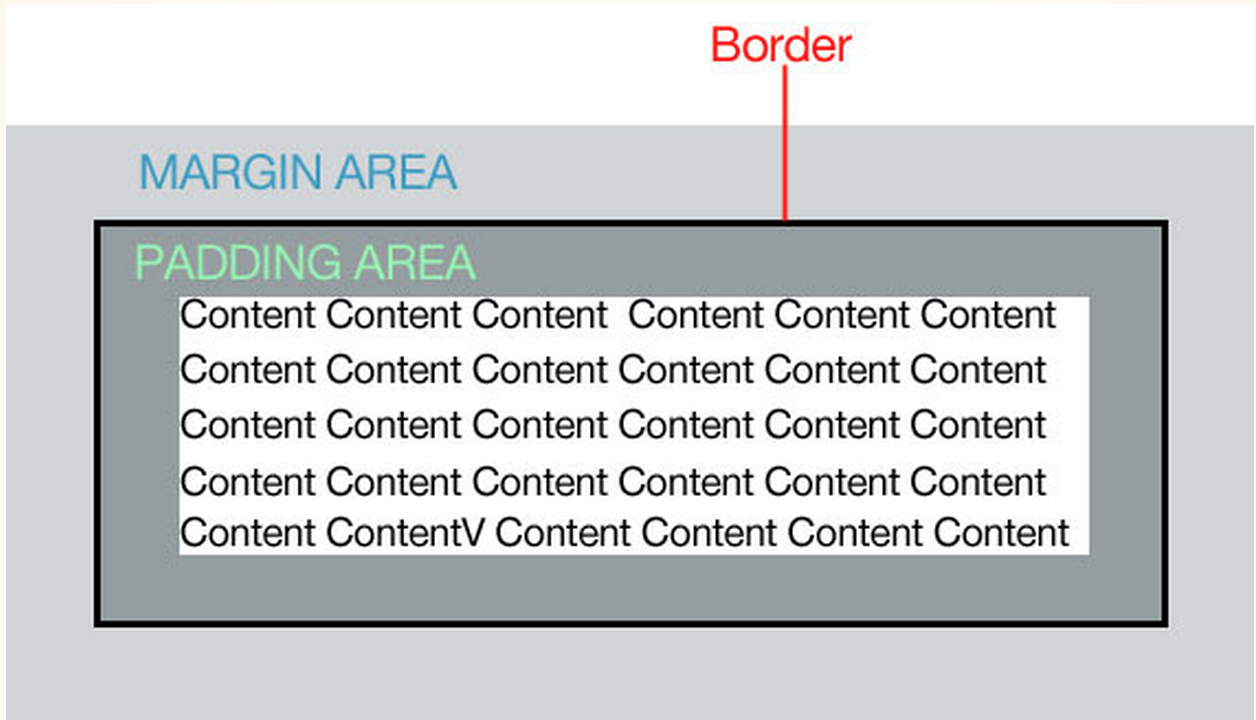
CSS Box Model
- padding- the space in between the border and the content. Padding is added on to the total width of the box.
- margin- moves the "entire box" to the left, right, up or down
- border- a line that surrounds the the element. Borders are added on to the total width of the box
You can effect all four sizes of the box
Box Model Demo
CSS Box Model
The total width of the box below is 300px:
width: 250px;
padding: 10px;
border: 5px solid gray;
margin: 10px;
Floats & Clears
-
Floats cause block elements to behave as inline
elements, that is, they will move right or left
rather than stacking in their own lines -
Clears force a line break. In other words, they will
cause an inline-behaving object to appear on a
new line. - Objects must have defined widths to float next to
each other, or else they will overlap.
Float Demo
Responsive Design
- RWD acknowledges that websites are increasingly
accessed from a multitude of devices with
different screen sizes and in different contexts -
sitting at a desk or on a train, swiping from page
to page or having the words read aloud. - When executed properly, a single responsive site
provides optimized users experience and content
across all devices.
Process for RWD
- sketch
- compute grid and dimensions
- convert static grid to fluid, pixel measurements to percentages: target ÷ context = result
- build out wireframe
- discover breakpoints and add media queries
Fluid Grid Equation
Take the target size from the comp, and divide it
by the size of its containing element—in other
words, its context. The result is the desired size
expressed in relative percentages.
Flexible Grids
Every row and column can be expressed as a
proportion of their containing elements.
Flexible Font Sizes
- The Browser Reset CSS should give the body tag should have an initial font-size attribute of 100%.
- Most browsers interpret 100% as 16px.
- If the target size of your <p> text, for example, is 11px, divide 11px by the font-size of its containing element: 11 ÷ 16 = 0.6875em.
Flexible Font Sizes
Flexible Type
body {
background-color: #DCDBD9;
color: #2C2C2C;
font: normal 100% Georgia, serif;
}
Not Flexible Type
h1 {
font-size:24px;
font-style: italic;
font-weight: normal;
}
Flexible Font Sizes
target ÷ context = result
- take the target font size from the comp, and divide it by the font-size of its containing element—in other words, its context.
- The result is our desired font-size expressed in relative, flexible ems.
- base font-size: 100% usually equates to 16px
- 24 ÷ 16 = 1.5em
Flexible Font Sizes
flexible type
body {
background-color: #DCDBD9;
color: #2C2C2C;
font: normal 100% Georgia, serif;
}
h1 {
font-size: 1.5em;
font-weight: normal;
}
Flexible Font Sizes
target ÷ context = result
- The context of an element is expressed by the parent it is contained within. ie the context of an <a> element within an <h1> element is the <h1> element.
- If the desired target for an <a> within a 24px (1.5em) <h1> is 11px, the formula would be: 11 ÷ 24 = .458333333333
Flexible Font Sizes
flexible type
h1 a {
font: bold 0.458333333333333em Arial, sans-
/* 11px / 24px */
color: #747474;
letter-spacing: 0.15em;
text-transform: uppercase;
text-decoration: none;
}
Media Queries
- Media queries inspect the physical attributes on the device being used.
- HTML meta tag - viewport (must be present)
- <meta name="viewport" content="width=device-width, initialscale=1.0" />
Media Queries Break Points
- @media screen and (min-width: 1024px)
- At each breakpoint, media queries cause new CSS to be loaded, changing the size and position of elements.
- Test for appropriate break points by enlarging your window until the design no longer works well. Note the window size, create a break point, and alter the CSS as needed.
Final Steps
- Embed images as <div> backgrounds (in CSS)
and in <img> elements (in CSS) - Import web fonts, as needed
- Add CSS decorations as needed: box shadows,
borders, rounder corners, color gradients - Populate content areas with text and images


Not a responsive grid
#page {
width: 960px;
margin: 0 auto;
}
Responsive Grid
#page {
width: 90%
margin: 0 auto;
}
HTML & CSS Tools
- browser compatibility
- some properties require vendor-specific prefixes
- many designers no longer supporting IE 8 and
HTML & CSS Tools
- box shadow
- text-shadow
HTML & CSS Tools
- include link in HTML
- include font-family code in CSS
HTML & CSS Tools
- Xcode - iOS Simulator
- Google Chrome Dev Tools
- Opera Mobile Emulator
Deployment
Deployment
- Domain Name Registration
- Hosting Services: Shared, Virtual Private Server, Private Server
- FTP/SFTP