C4: Session 7
Creating Responsive Layouts
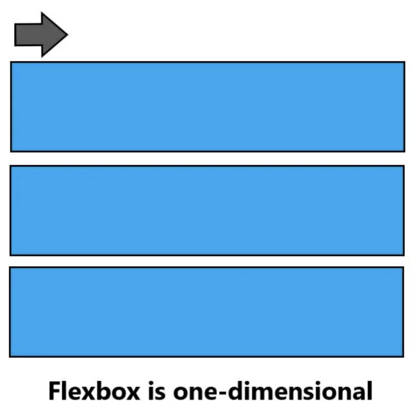
Flexbox
- Must choose rows OR columns
- Content-first strategy
- Great for one-dimensional layouts and content alignment
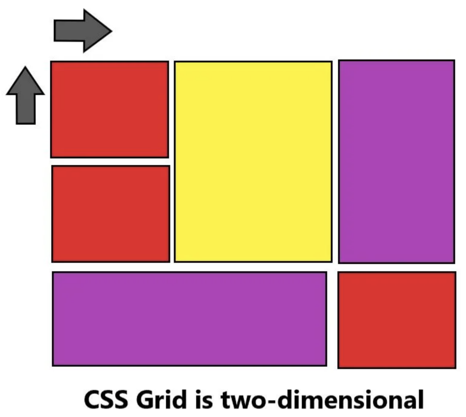
Grid
- Can use both rows AND columns
- Layout-first strategy
- Great for complex layouts and structuring a page
Flexbox
Grid
Let's Practice
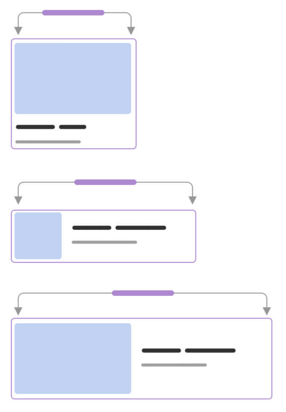
Media Queries
Media Queries
- A responsive design strategy
- A way to conditionally apply CSS rules based on the size of the viewport
Syntax
@media only screen and (max-width: 768px) {
  // add css rules to apply when the
  // screen is less than 768px wide
}

@media only screen and (min-width: 768px) and (max-width: 1024px) {
  // add css rules to apply when the screen width is
  // greater than 768px but less than 1024px wide
}
Desktop
Mobile
Solution
Next Session
JavaScript Foundations