C4: Session 5
Flexbox
CSS Flexbox
CSS Flexbox
Flexbox is a layout framework in CSS
- Provides an easy way to arrange items within a container
CSS Flexbox
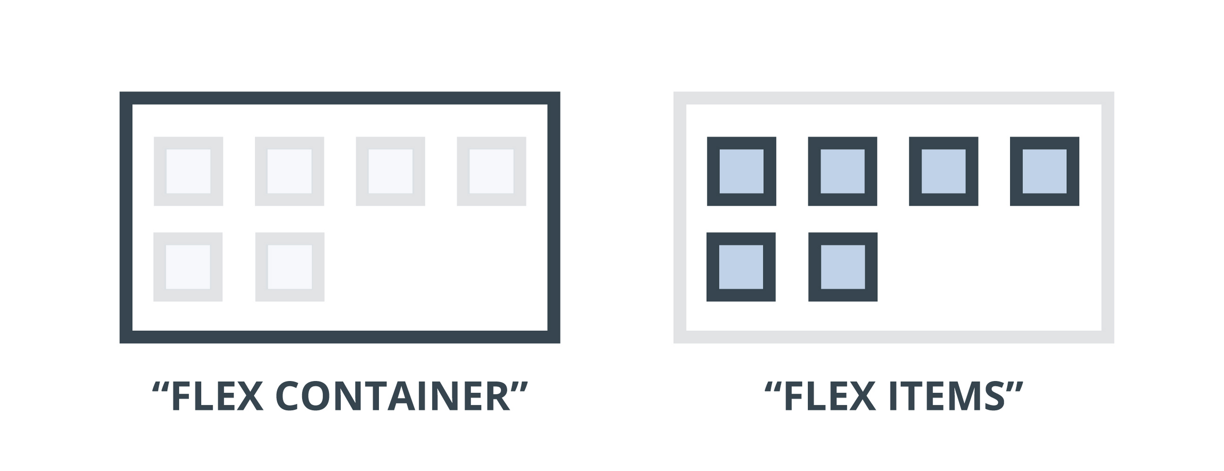
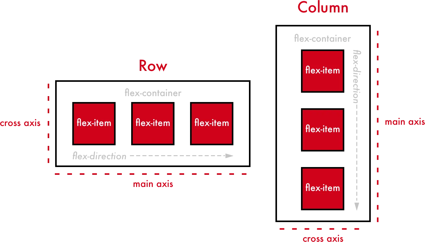
Flexbox Architecture
Flex items are distributed along the main axis of the flex container, and can be positioned horizontally (row direction) or vertically (column direction).
CSS Flexbox
Flexbox Properties
displayflex-directionjustify-contentalign-itemsflex-wrapgap
CSS Flexbox
Flexbox Properties
display: used to define the container element as a flex container
CSS Flexbox
Flexbox Properties
flex-direction: used to define the direction in which the flex items should be laid out
CSS Flexbox
Flexbox Properties
justify-content: used to define how the flex items should be aligned along the main axis of the flex container
CSS Flexbox
Flexbox Properties
align-items: used to define how flex items should be aligned along the cross-axis of the flex container
CSS Flexbox
Flexbox Properties
flex-wrap: used to define whether flex items are forced in a single line or can be wrapped into multiple lines
CSS Flexbox
Flexbox Properties
gap: used to define the space between rows and columns of the flex container
Concept Practice: Flexbox
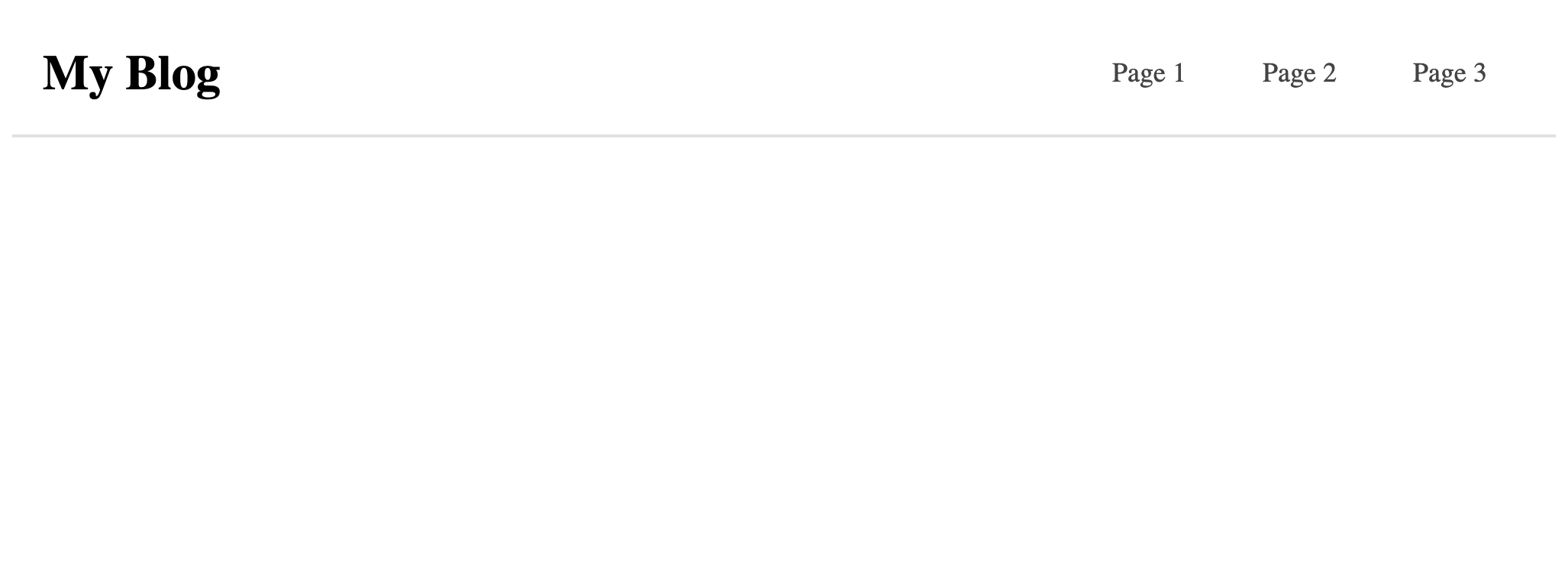
Flexbox Component
Let's try to create a component using flexbox!
Concept Practice: Flexbox
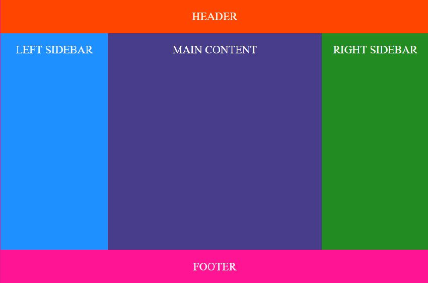
Flexbox Layout
Let's try to create a layout using flexbox!
CSS Flexbox
Resources
- https://flexboxfroggy.com (Game)
- https://yoksel.github.io/flex-cheatsheet (Cheatsheet)
- https://www.samanthaming.com/flexbox30 (Review Tidbits)
- https://css-tricks.com/snippets/css/a-guide-to-flexbox (Guide)
Next Session
CSS Grid