how to think about data
Shirley Wu
custom data visualizations can be categorized into two broad categories:
EXPOSITORY
VS.
EXPLORATORY
expository
- static dataset
- explore data for story
- communicate story to audience
exploratory
- dynamic dataset
- interview stakeholders
- build tool for stakeholders to explore the data
examples:
New York Times, The Pudding, The Washington Post, etc.
examples:
scientific visualizations, internal business tools at Netflix, Uber, Airbnb, etc.
expository

Data exploration
with Observables
and Vega-Lite
↓
Design with
and Gestalt Laws
↓
Code with
and D3.js shapes, layouts
↓
Finish with
Data exploration
with Observables
and Vega-Lite
↓
Design with
and Gestalt Laws
↓
Code with
and D3.js shapes, layouts
↓
Finish with
data exploration
data exploration:
data types
- Categorical (movie genres)
- Ordinal (t-shirt sizes)
- Quantitative (ratings/scores)
- Temporal (dates)
- Spatial (cities)
data exploration

data exploration:
some basic chart types
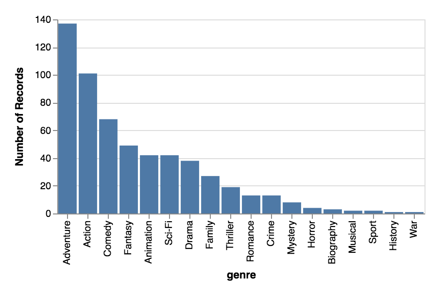
Bar chart
For categorical comparisons
Domain: categorical
Range: quantitative
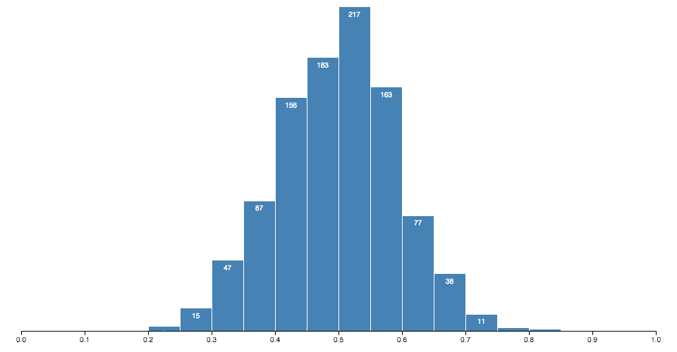
Histogram
For categorical distributions
Domain: quantitative bins
Range: frequency of quantitative bin
data exploration:
some basic chart types
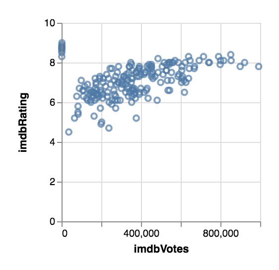
Scatterplot
For correlation
2 categories, and the relationship between their quantitative values
data exploration:
some basic chart types
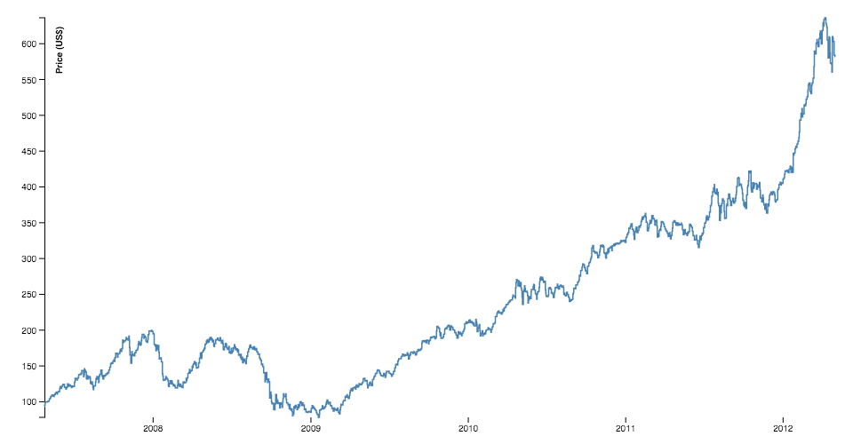
Line chart
For temporal trends
Domain: temporal
Range: quantitative
data exploration:
some basic chart types
data exploration
Brainstorm some charts
to answer the questions.
data exploration:
exercise (together)

data exploration:
more charting tools
Plug & Play:
Needs code:
data exploration:
advice
- Check for missing data, and the validity of the data
- Focus on one question at a time (it's very easy to get sidetracked with a tangent)
- If there IS an interesting tangent, make a note for later
- If the question leads to a dead-end, explore another question or the tangent you found earlier
- Don't be afraid to go out and look for additional data to aid your exploration
- Sometimes, no interesting pattern IS very interesting
translate from
data to design
- Concentrate on the takeaways to communicate across
- What does that mean in terms of the data? (Individual or aggregate elements? Which attributes?)
- Map the relevant data to visual elements
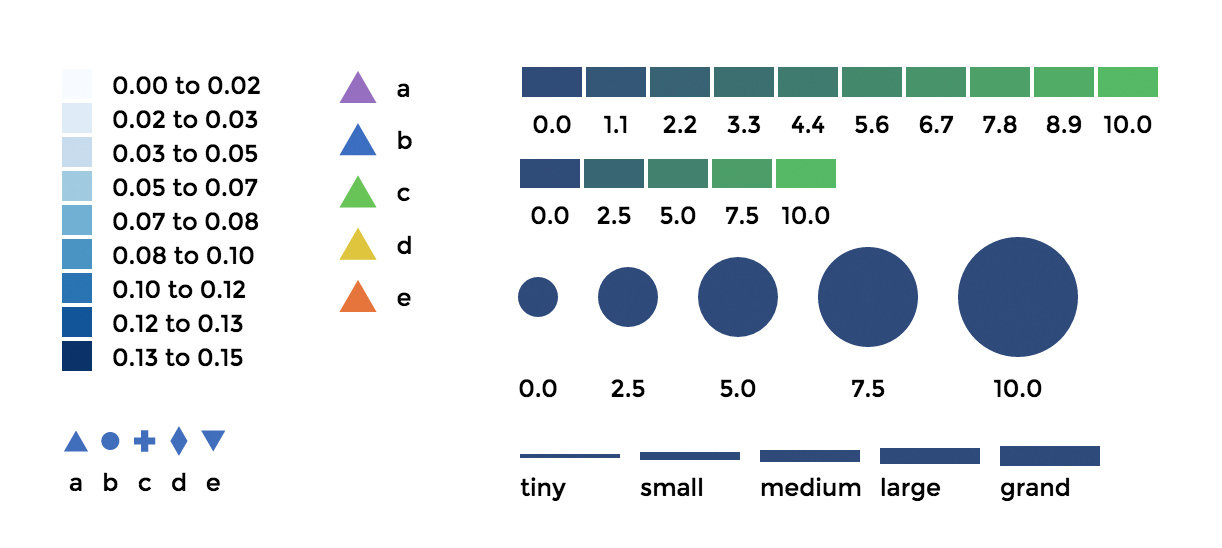
design:
marks & channels
Map individual or
aggregate data
elements to marks.
Map data attributes
to channels.
Design:
marks

Visualization Analysis and Design. Tamara Munzner, with illustrations by Eamonn Maguire. A K Peters Visualization Series, CRC Press, 2014.
Design:
channels
Visualization Analysis and Design. Tamara Munzner, with illustrations by
Eamonn Maguire. A K Peters Visualization Series, CRC Press, 2014.

Quantitative
- Position
- Size
- Color
Categorical
- Shape
- Texture
- Color
Temporal
- Animation
Design:
marks & channels
Visualization Analysis and Design. Tamara Munzner, with illustrations by
Eamonn Maguire. A K Peters Visualization Series, CRC Press, 2014.

mark
bar
channels
x: category
y: quant
mark
point
channels
x: quant
y: quant
mark
point
channels
x: quant
y: quant
color: category
mark
point
channels
x: quant
y: quant
color: category
size: quant
Design:
channel effectiveness
Visualization Analysis and Design. Tamara Munzner, with illustrations by
Eamonn Maguire. A K Peters Visualization Series, CRC Press, 2014.

Design:
marks & channels
-
One-to-one mapping of data to channel
-
Multiple mappings of channel to mark (x, y, size, color usually)
-
Do not EVER map multiple data attributes to the same channel
Design:
Gestalt laws of grouping
the human mind naturally
groups individual elements
into patterns
↓
use in data visualization to
save processing time
Design:
Gestalt laws of grouping
Proximity
Put related objects near each other
(The Functional Art, Ch. 6 by Alberto Cairo)
Design:
Gestalt laws of grouping
Similarity
Indicate like objects (helpful if they can't be placed close to each other)

(The Functional Art, Ch. 6 by Alberto Cairo)
Design:
Gestalt laws of grouping
Enclosure
Helpful when creating visualizations with multiple sections

(The Functional Art, Ch. 6 by Alberto Cairo)
Design:
visual metaphors
Take advantage of what people are already familiar with


design:
exercise
Sketch all the things!
- What is your main message(s)?
- What marks will you use? Do they represent individual data points, or aggregate?
- What channels will your marks use? How do they support your message?


readability
Titles, descriptions, and legends
to explain the visualization
Axes and annotations
to describe the data
READABILITY:
axes & legends
d3-legend by Susie Lu
READABILITY:
Annotations
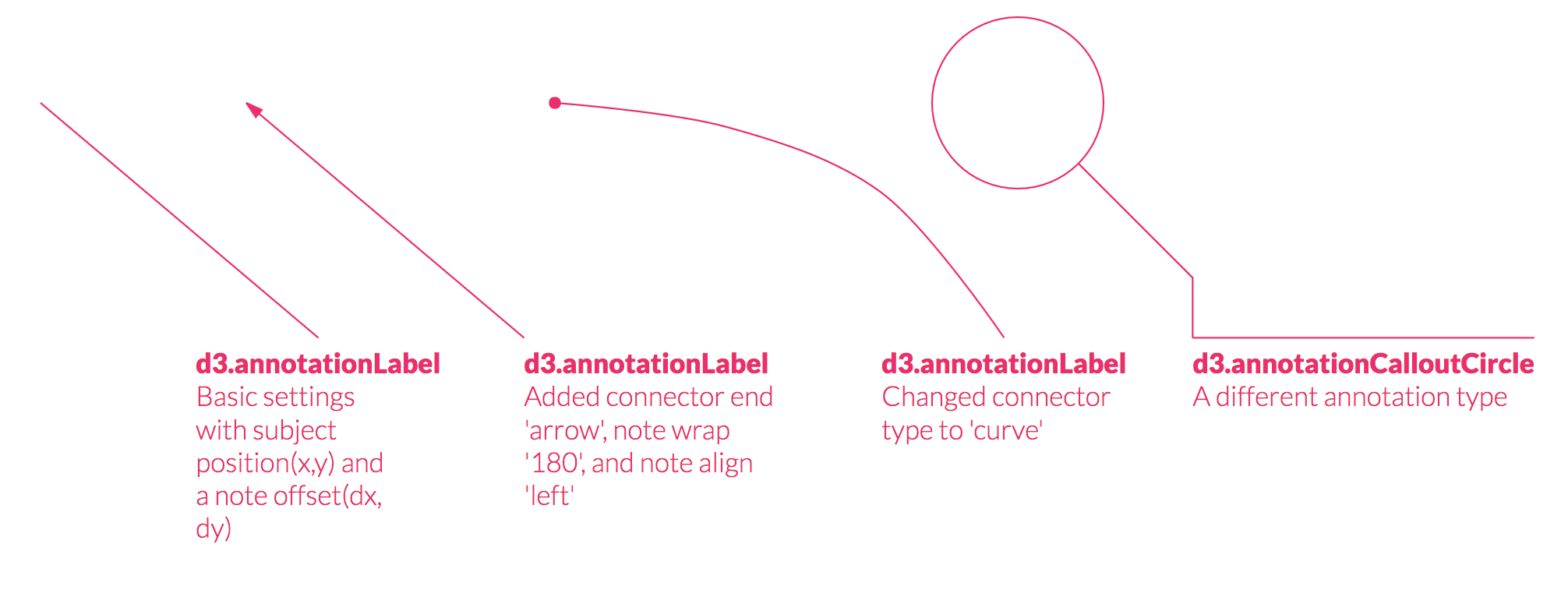
d3-annotation by Susie Lu

more svg for
context & aesthetics
- Patterns
- Gradients
- Text on a path
- SVG filters
(blurs, drop-shadows) - Clipping & masking


Movies have the biggest box office
during the summer and winter holidays
resources
Books:
The Functional Art by Alberto Cairo
Visual Analysis and Design by Tamara Munzner
Online:
The little of visualization design
Information is Beautiful Awards
My coding
workshops