APP Data Training Extravaganza
How to make something with your data
Data can be beautiful

These tools can make data be beautiful


Hello Datawrapper
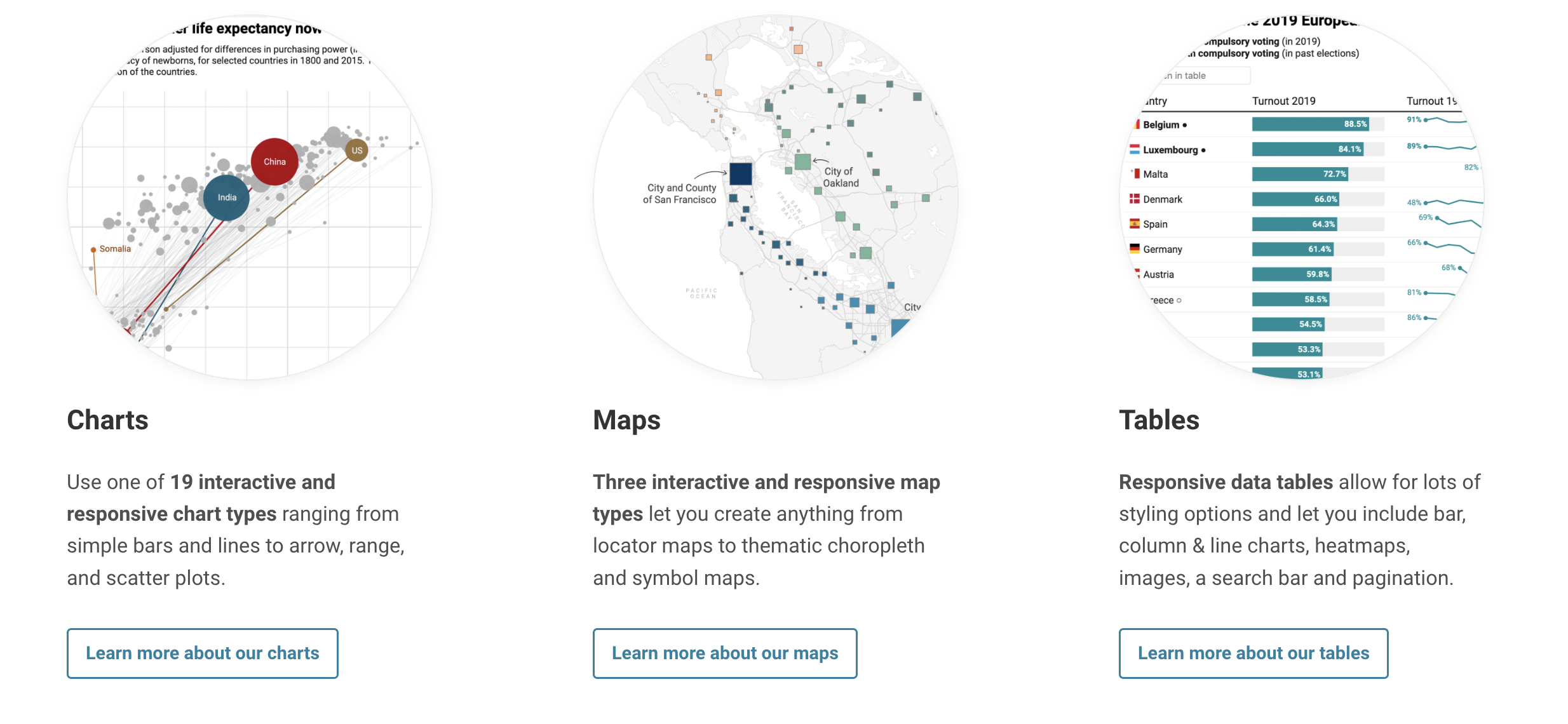
Datawrapper was built by a journalist, has a commitment to remaining free and works in Presto
Let's make a map!
Types of Maps
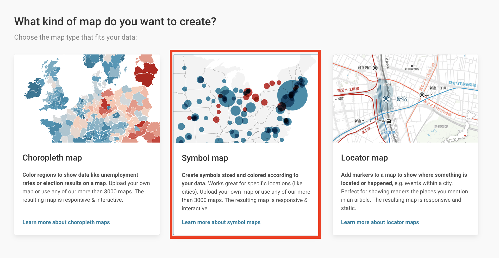
We're going to create a symbol map, so select "create new map", then "symbol map"
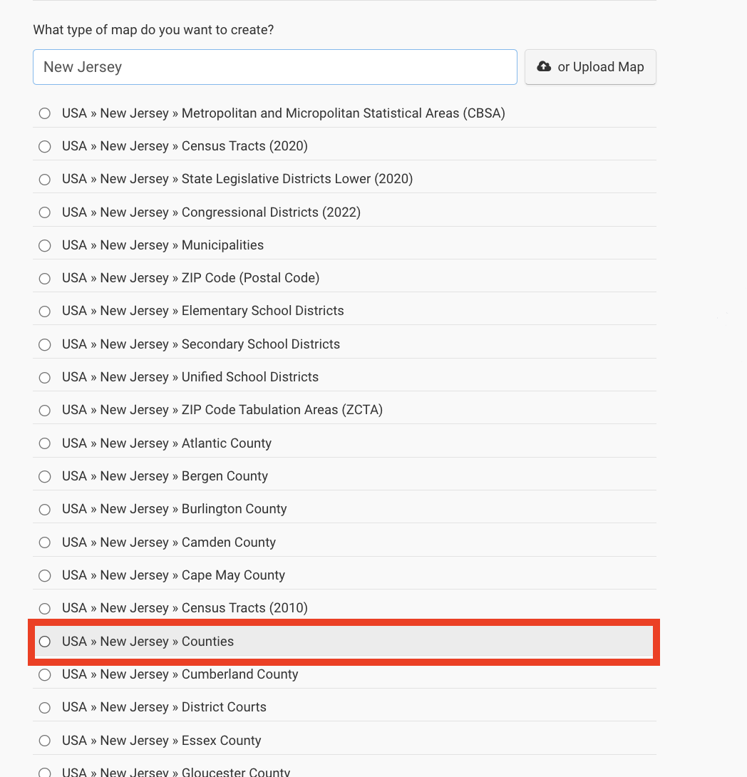
Here you can select a geography

Select "Counties"
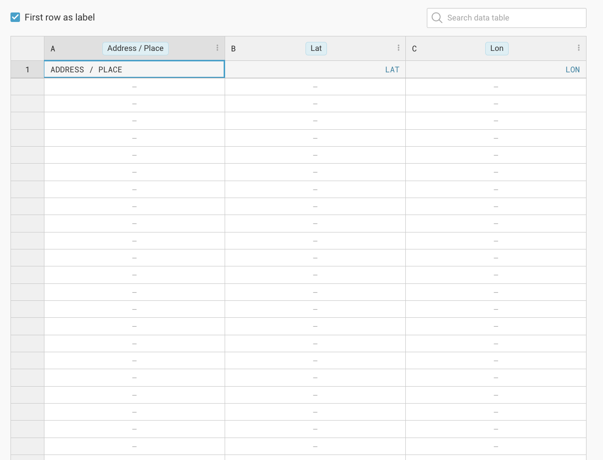
Paste your data into the sheet
Paste the database you compiled in the last exercise where it says "Address/place"
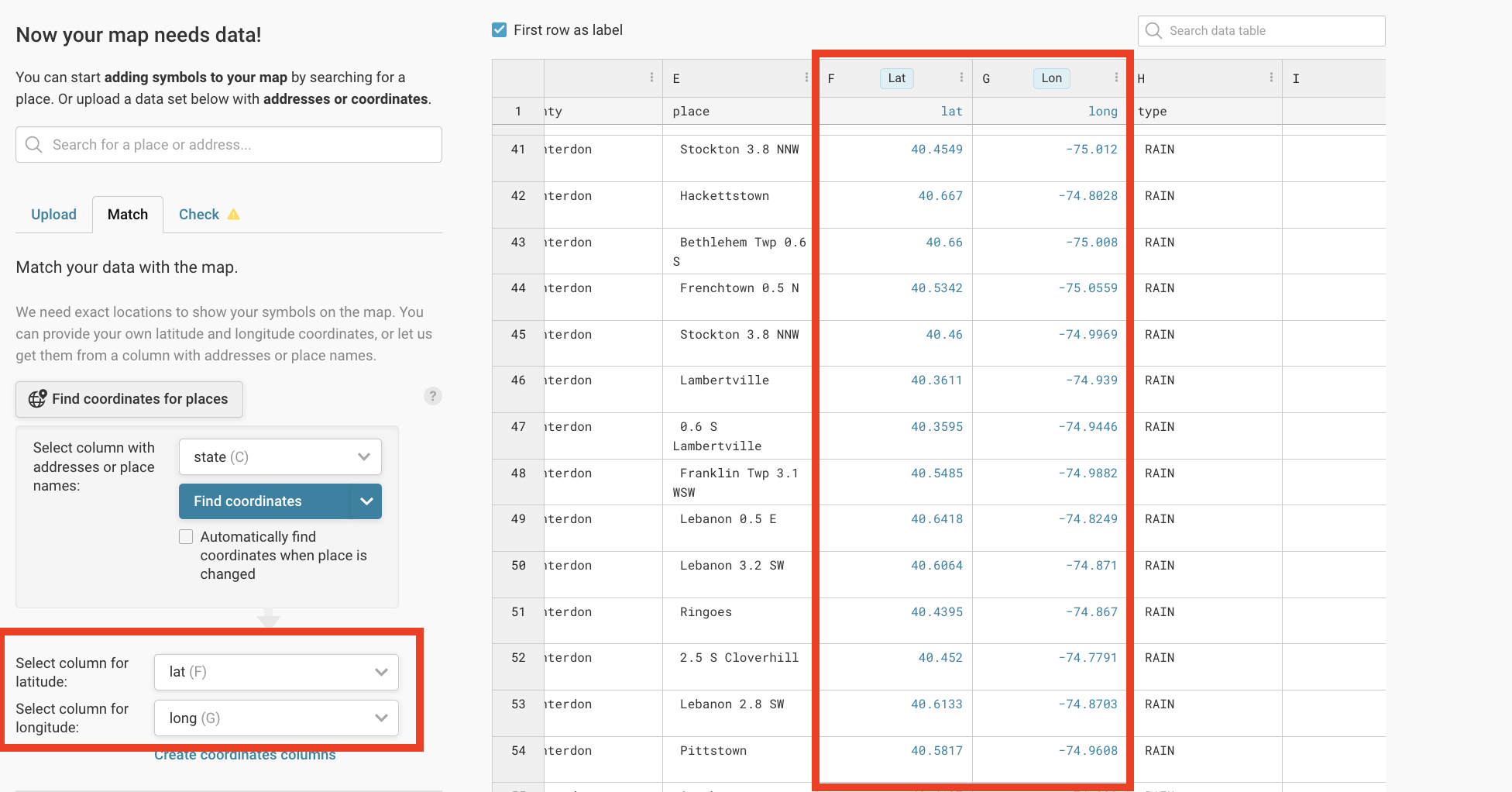
Check the lat/long data
Make sure that the two columns containing the latitude and longitude data are correctly identified. Hit proceed.
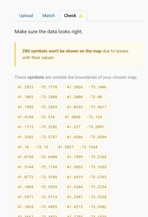
What warnings do you have?
These are ok, as we're only worried about showing information for New Jersey right now.
Click proceed
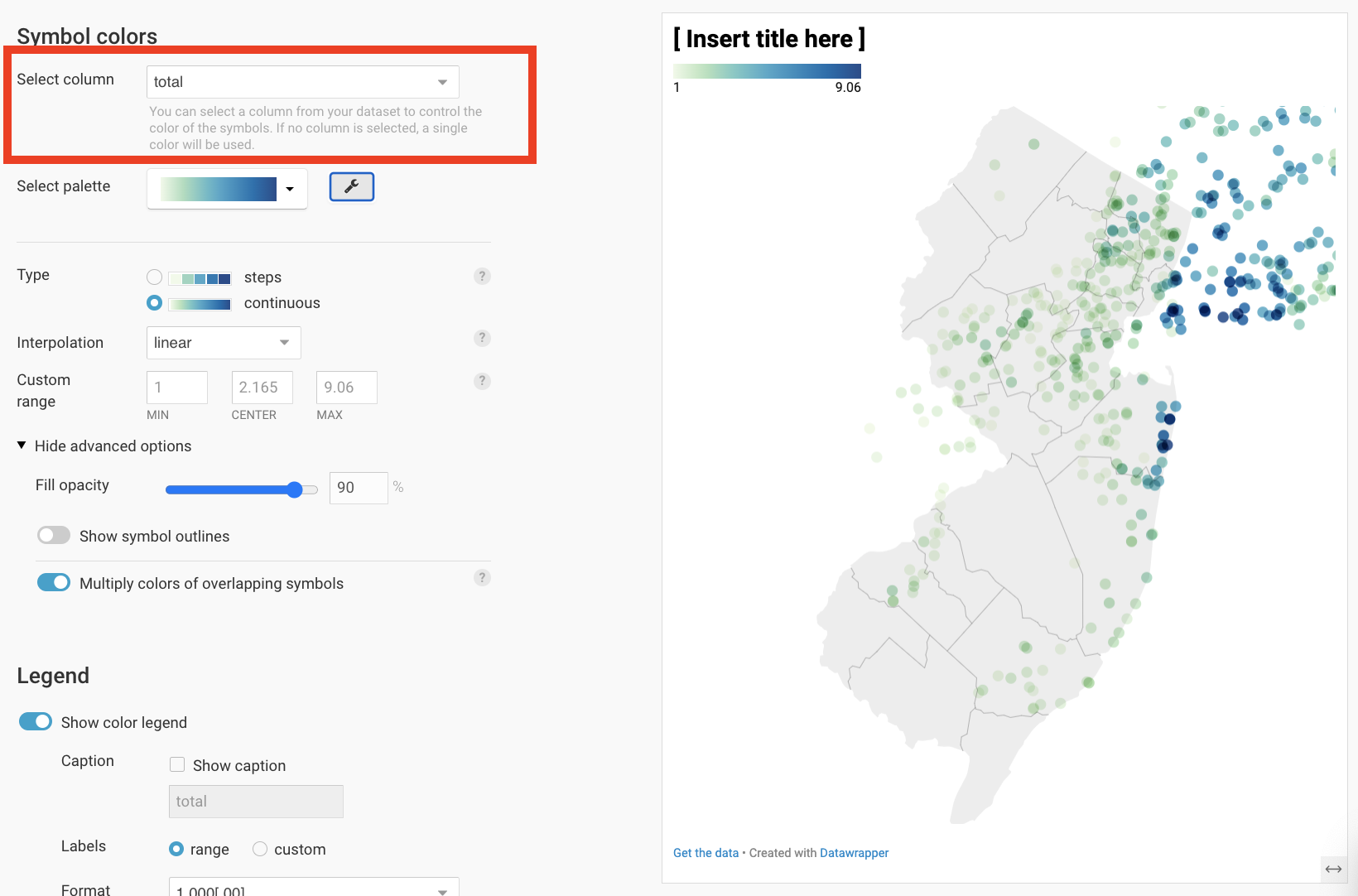
Select "total" to be the column you color the map by. Expand and play with the options!
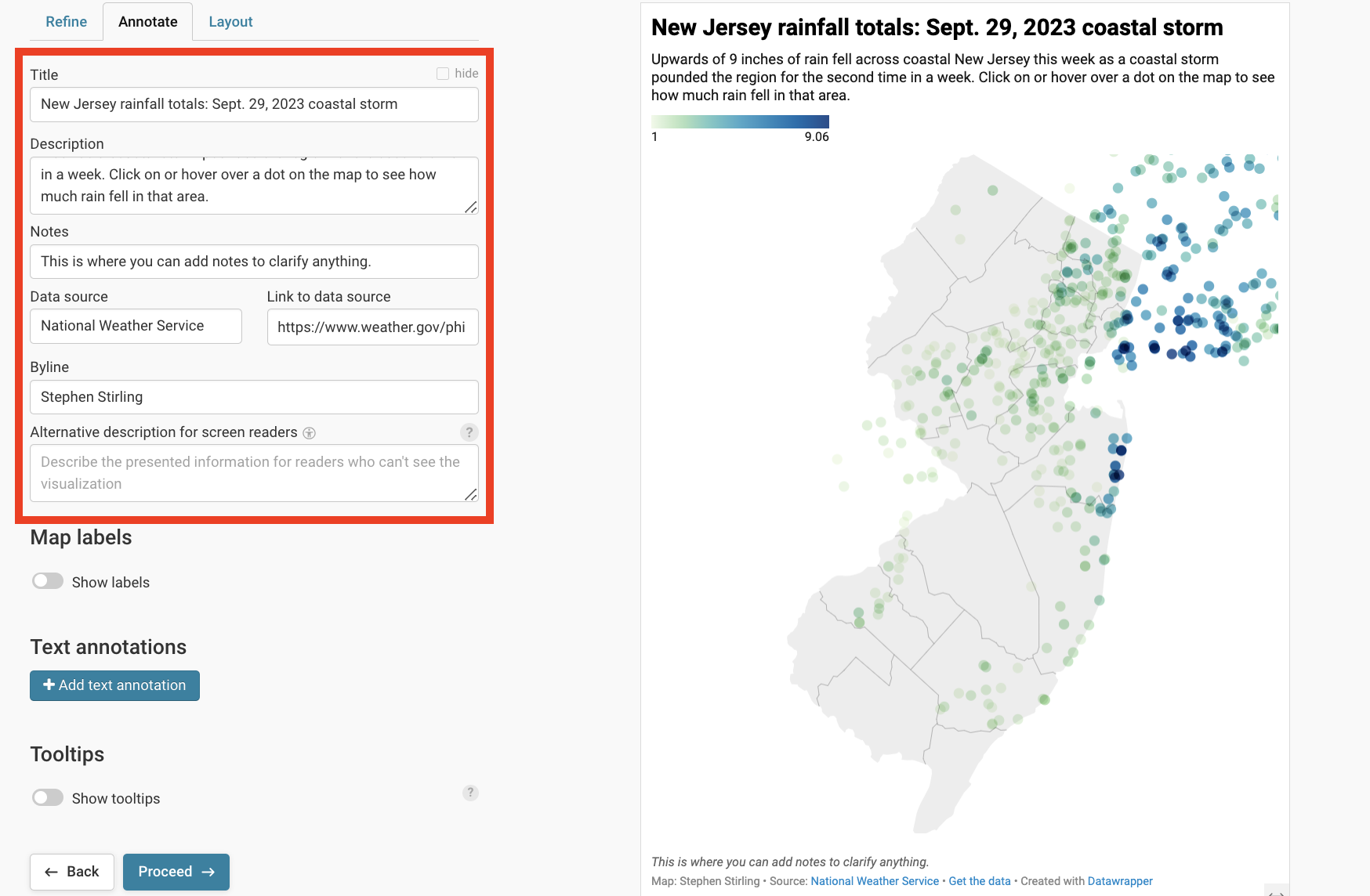
The annotate section populates the text fields in the data viz. Fill them out.
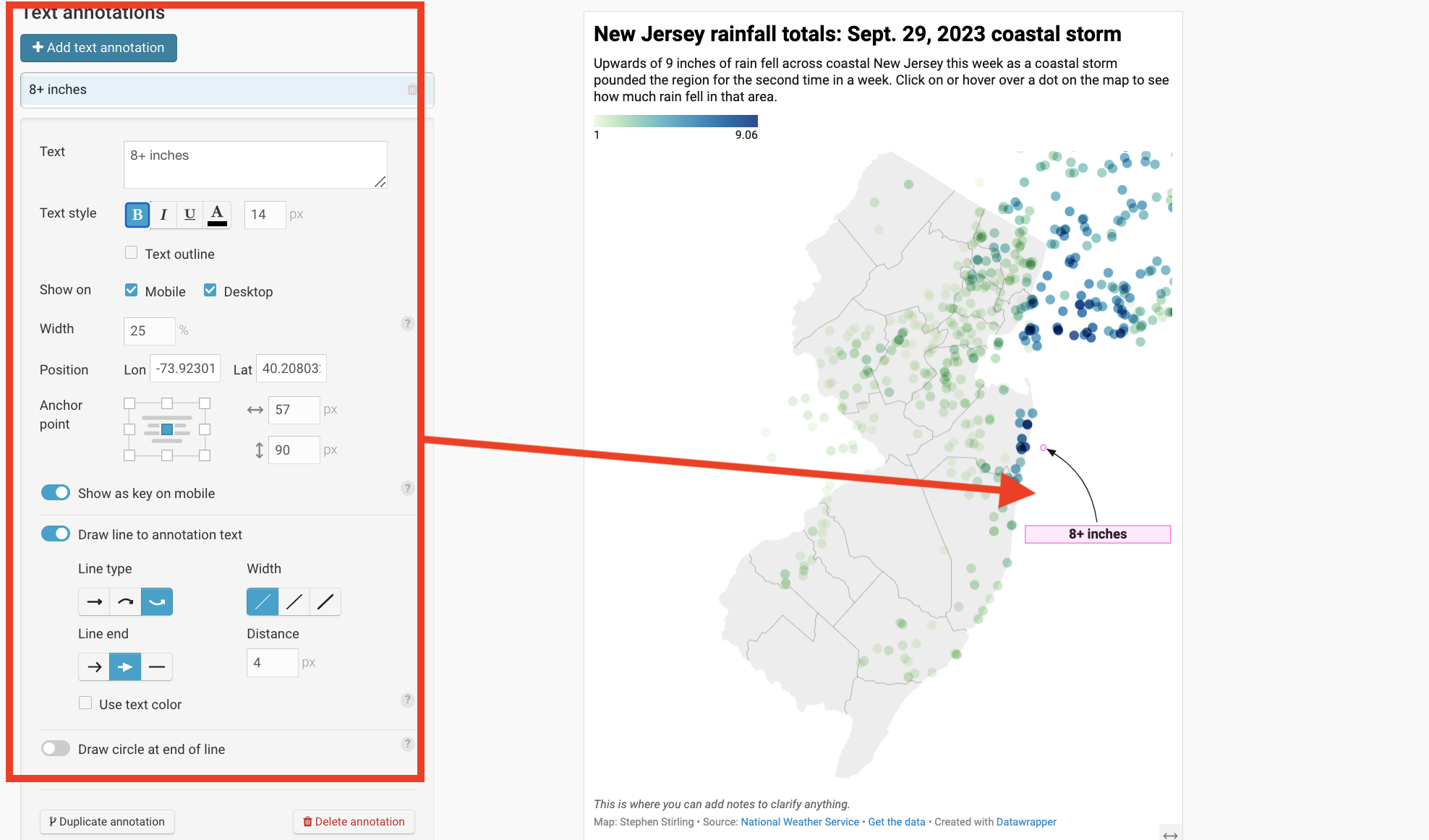
Text annotations can add important context to your data viz
Tooltips add depth
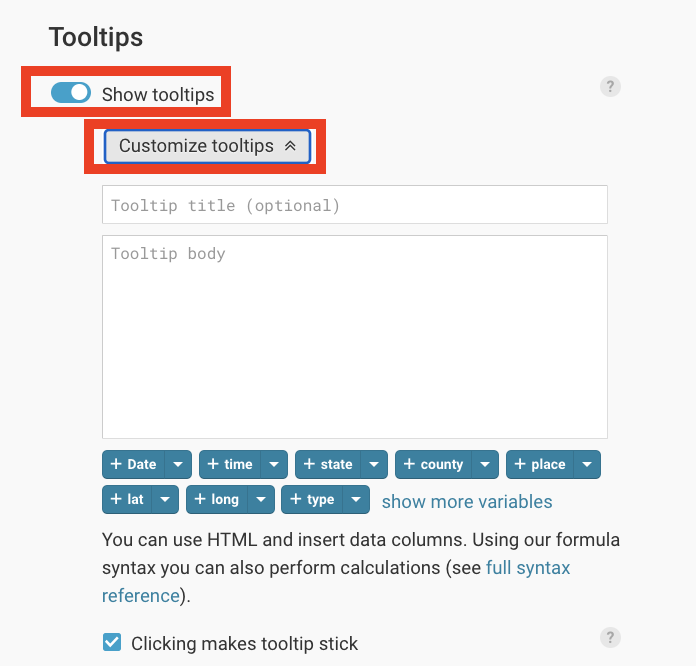
Tooltips populate pop-up bubbles that appear when you hover or click on a data element.
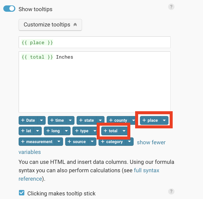
The language can be a bit strange to learn.
If you add two curly parentheses ({{) around a column heading, it will change the data based on the correct geography.
Publish!
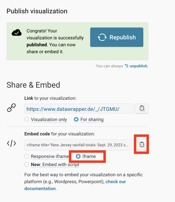
- When you're ready to embed your visualization into a Presto post, hit publish! You can always edit and republish.
- Select "iframe" and copy the full embed code.
- DO NOT attempt to just use the Link and paste in Presto embedder. It will cut off the bottom of your visualization.
Embedding
IMPORTANT
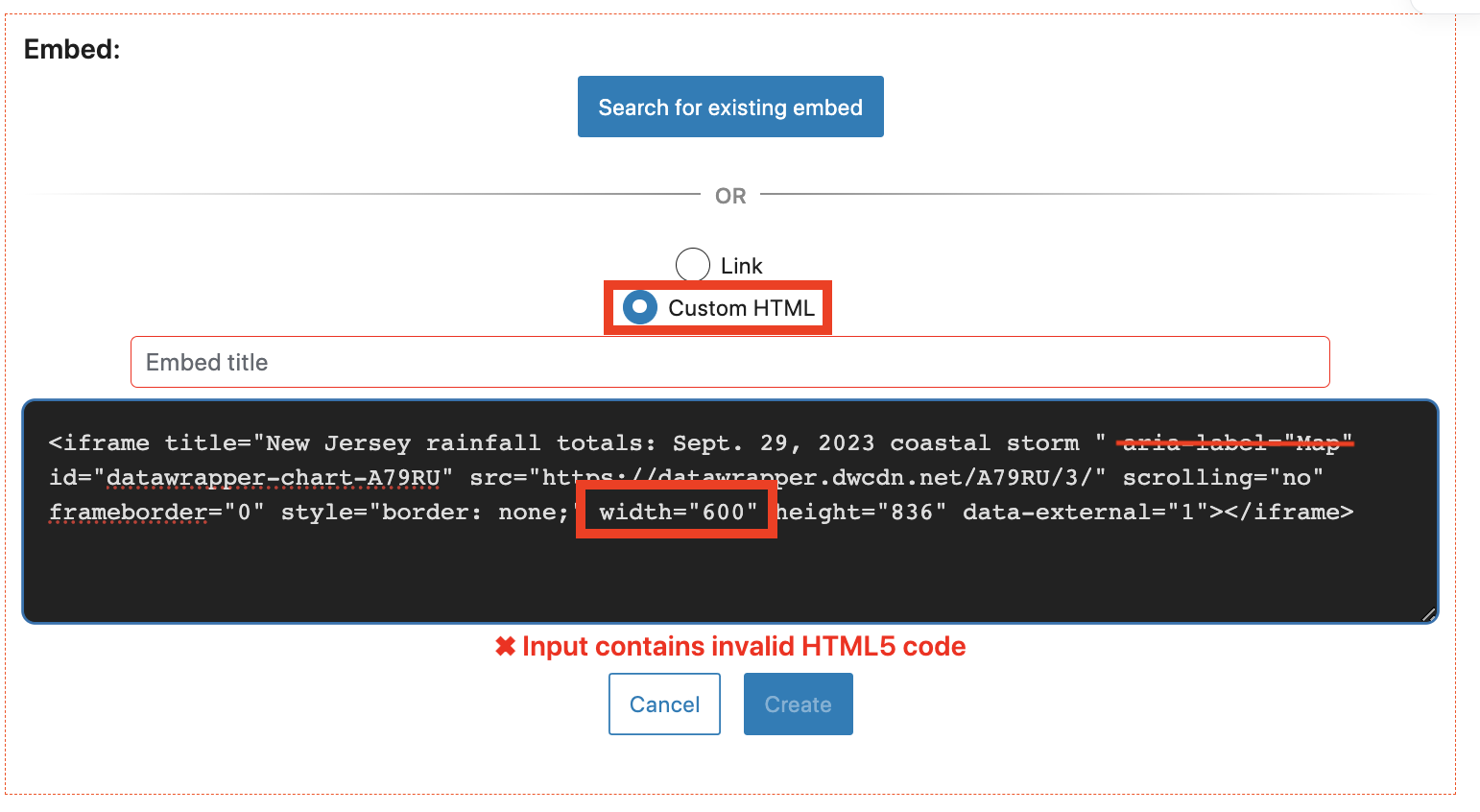
Select "Custom HTML" and paste your embed code there. Remove "aria label='Map'" from the code. Change the width to 100%. Click create.

-
Always remove the "aria-label" when using DataWrapper
-
Always set width to "100%." This allows your viz to resize for mobile.
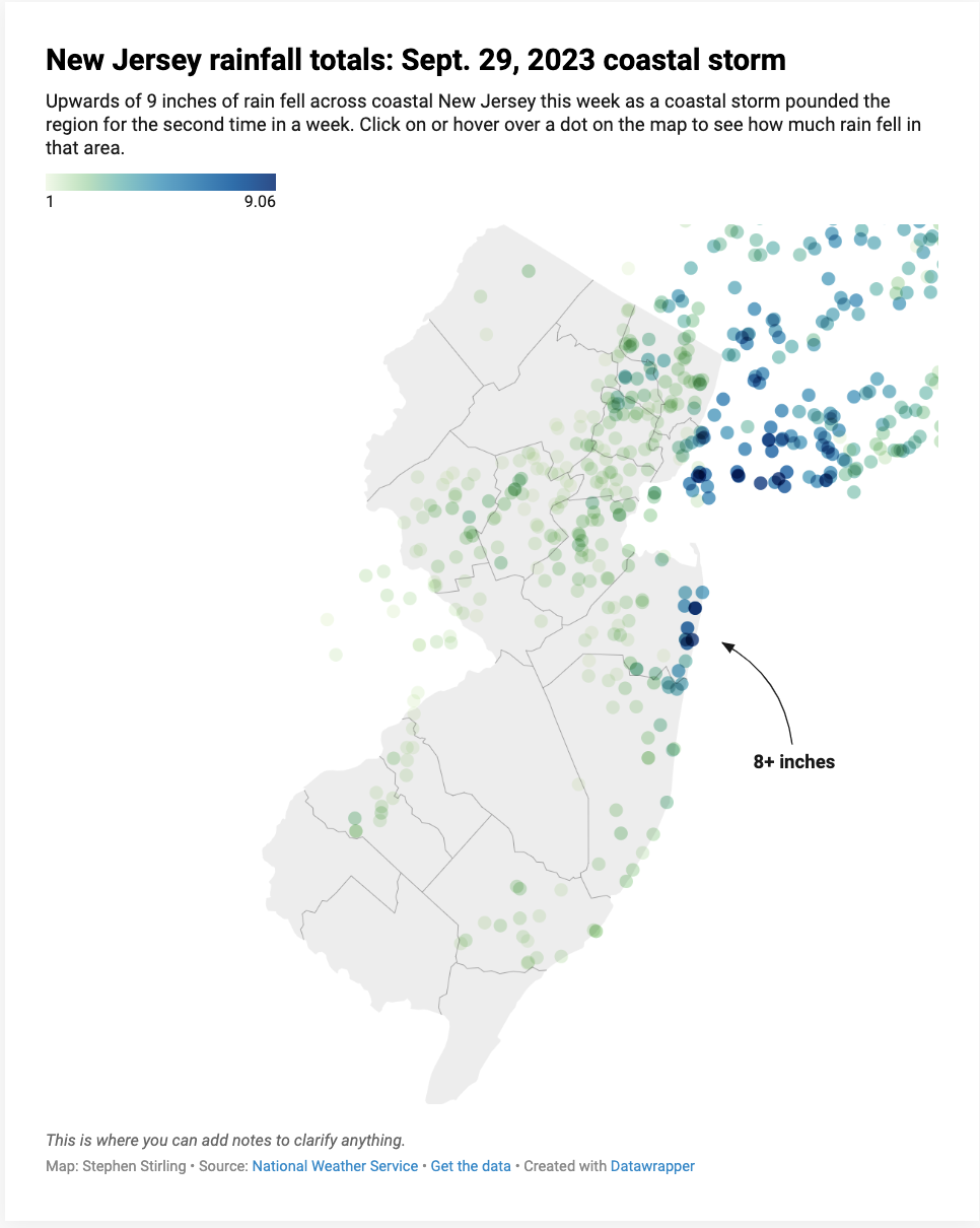
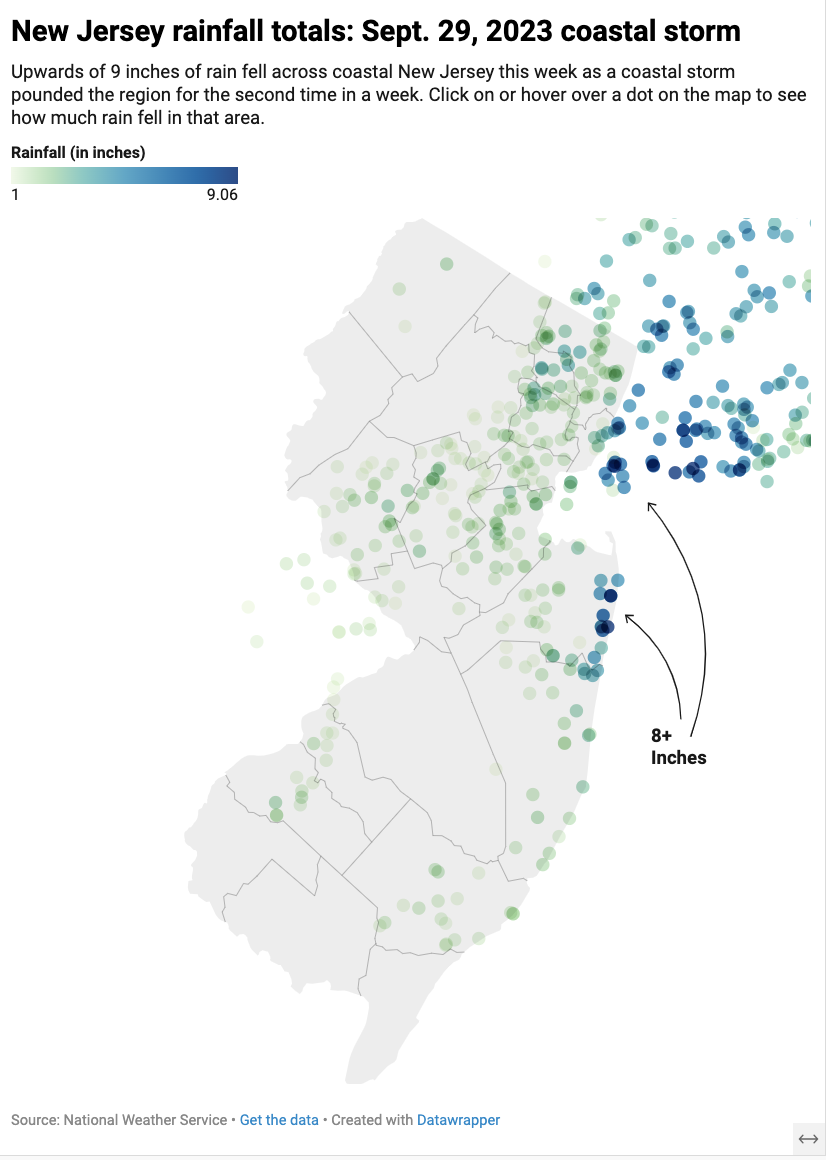
Your embed should look like this
