Accessibility First Design System Components

Stephanie Eckles
@5t3ph
5t3ph.dev/a11y-ds-slides
Accessibility + Empathy
the most promising way to use technology to affect positive change
Thank you!
for working to improve interactive experiences
and make them accessible for all users
2007 - 2018
Advertising/Marketing Developer
- Multi-platform DS: React, HTML/Sass, Angular
2007 - 2018
Advertising/Marketing Developer
Oct 2018 - Present
Lead DS Developer,
Frontend Product Dev
egghead instructor
ModernCSS.dev
LearnFromSteph.dev
dev.to/5t3ph
mom of 2 girls
Quick shout-out to my team and our fantastic dedicated accessibility gurus!
🥰
What I Want to Share Today:
What I Want to Share Today:
- The value of design systems
What I Want to Share Today:
- The value of design systems
- Considerations for design system DX
What I Want to Share Today:
- The value of design systems
- Considerations for design system DX
- Tips for self-defensive accessibility in components and themes
Design Systems:
Design Systems:
provide a cohesive visual language, essential to building products faster and better
Design Systems:
establish design standards among products
Design Systems:
form a shared lexicon of
UI terms
Design Systems:
reduce technical debt with
tested, accessible components
What is a component?
What is a component?
an isolated piece of code
used as building blocks for more complex UI
Component Examples
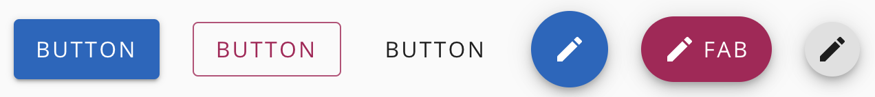
Component Examples
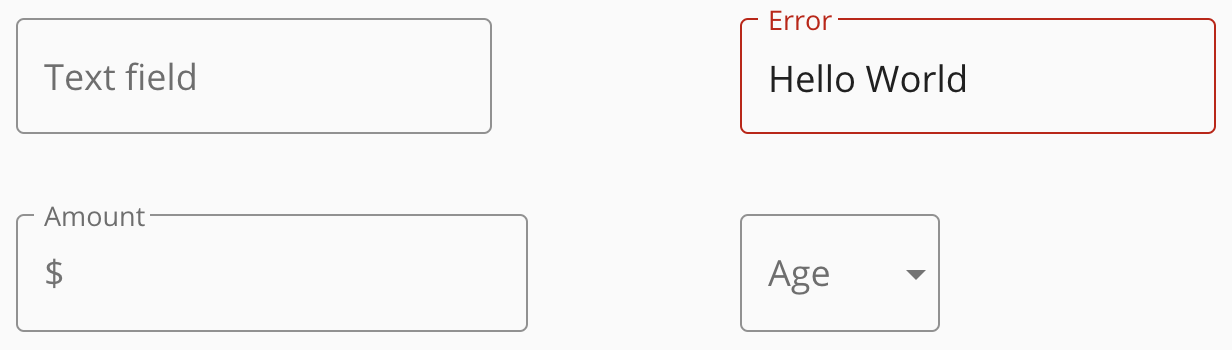
Component Examples

DX Win #1:
DX Win #1:
components inherently abstract pain points by encapsulation
components inherently
abstract pain points by
encapsulation
components inherently
abstract pain points by
encapsulation
providing semantic
HTML
components inherently
abstract pain points by
encapsulation
providing semantic
HTML
themed style
variants
components inherently
abstract pain points by
encapsulation
providing semantic
HTML
themed style
variants
components inherently
abstract pain points by
encapsulation
providing semantic
HTML
themed style
variants
guide developers with low familiarity with frontend/a11y
DX Win #2:
DX Win #2:
robust theme
capabilities alleviate
contrast issues
robust theme
capabilities alleviate
contrast issues
5t3ph.dev/a11y-ds-contrast
Ensure your theme system accounts for both initial text contrast as well as stateful-contrast
DX Win #3:
DX Win #3:
in-context a11y warnings
and documentation
in-context a11y warnings
and documentation
Example: <IconButton />
in-context a11y warnings
and documentation
Example: <IconButton />
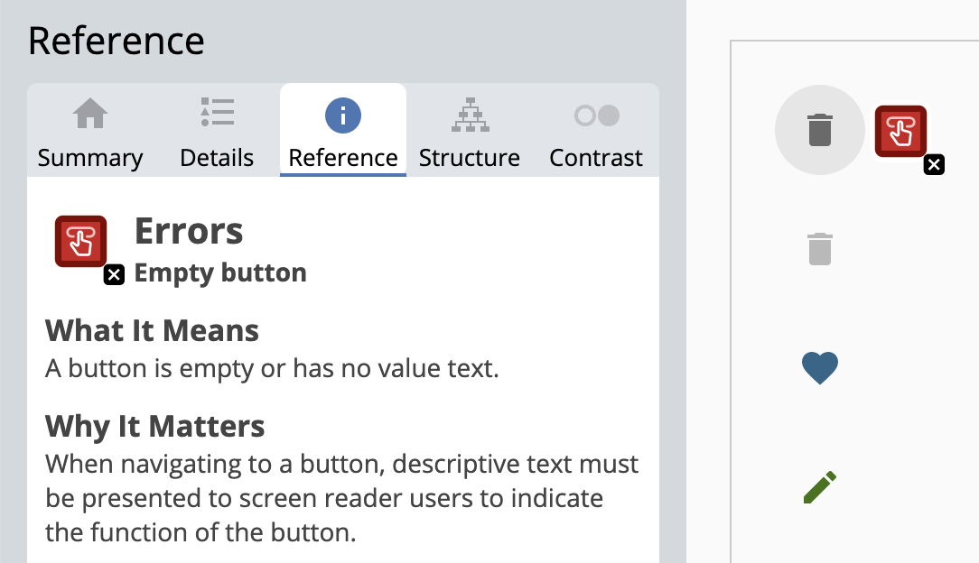
failure to provide reasonable alternative text for the label
in-context a11y warnings
and documentation
npm install warningin-context a11y warnings
and documentation
warning(
  props['aria-label'],
  'Design System: IconButton requires an aria-label prop. For a working, accessible example, see https://designsystemdocs.io/components/icon-buttons',
);
Example: <IconButton />
in-context a11y warnings
and documentation
warning(
  props['aria-label'],
  'Design System: IconButton requires an aria-label prop. For a working, accessible example, see https://designsystemdocs.io/components/icon-buttons',
);
Example: <IconButton />
in-context a11y warnings
and documentation
warning(
  props['aria-label'],
  'Design System: IconButton requires an aria-label prop. For a working, accessible example, see https://designsystemdocs.io/components/icon-buttons',
);
Example: <IconButton />
in-context a11y warnings
and documentation
warning(
  props['aria-label'],
  'Design System: IconButton requires an aria-label prop. For a working, accessible example, see https://designsystemdocs.io/components/icon-buttons',
);- Appears in console only in dev environment
in-context a11y warnings
and documentation
warning(
  props['aria-label'],
  'Design System: IconButton requires an aria-label prop. For a working, accessible example, see https://designsystemdocs.io/components/icon-buttons',
);- Appears in console only in dev environment
- In-context opportunity to provide fix
- include link to docs demo
- Complimentary to aXe or other a11y linters
DX Win #4:
required props and a11y-aware
defaults in consideration of
component intent
component
intent
component
intent
🤝
component
intent
accessibility
guidelines
🤝
component
intent
accessibility
guidelines
🤝
overlap of design system guidelines and accessibility standards
required props and a11y-aware defaults
Example: <Input />
interface IInputProps extends React.InputHTMLAttributes<HTMLInputElement> {
  type?: InputType;
}

const Input: React.FunctionComponent<IInputProps> = ({ type = "text" }) => {
  return <input type={type} />;
};
required props and a11y-aware defaults
Example: <Input />
interface IInputProps extends React.InputHTMLAttributes<HTMLInputElement> {
  type?: InputType;
}

const Input: React.FunctionComponent<IInputProps> = ({ type = "text" }) => {
  return <input type={type} />;
};
required props and a11y-aware defaults
Example: <Input />
interface IInputProps extends React.InputHTMLAttributes<HTMLInputElement> {
  type?: InputType;
}

const Input: React.FunctionComponent<IInputProps> = ({ type = "text" }) => {
  return <input type={type} />;
};
required props and a11y-aware defaults
Example: <Image />
interface IImageProps {
  alt: string;
  src: string;
}

const Image: React.FunctionComponent<IImageProps> = ({ alt = "", src }) => {
  return <img alt={alt} src={src} />;
};
required props and a11y-aware defaults
Example: <Image />
interface IImageProps {
  alt: string;
  src: string;
}

const Image: React.FunctionComponent<IImageProps> = ({ alt = "", src }) => {
  return <img alt={alt} src={src} />;
};
required props and a11y-aware defaults
best practice defaults
specific to your design system
required props and a11y-aware defaults
best practice defaults
specific to your design system
best practice defaults
specific to your design system
Example: <Button />
interface IButtonProps {
  variant?: 'contained' | 'outlined' | 'text';
}

const Button: React.FunctionComponent<IButtonProps> = ({ variant = "contained", ...props }) => {
  return <button class=`button-${variant}` {...props} />;
};
robust, contrast-safe theming
robust, contrast-safe theming
in-context a11y warnings and docs
required
props
robust, contrast-safe theming
in-context a11y warnings and docs
required
props
a11y-aware
defaults
robust, contrast-safe theming
in-context a11y warnings and docs
required
props
a11y-aware
defaults
design system
best practices
robust, contrast-safe theming
in-context a11y warnings and docs
required
props
a11y-aware
defaults
design system
best practices
accessible, easy to
implement design system components
robust, contrast-safe theming
in-context a11y warnings and docs
But...
But...
components can't cover every accessibility concern
Going beyond components...
Going beyond components...
production-ready
accessible examples in documentation
Going beyond components...
a11y-tested library of extended patterns
Going beyond components...
encouraging a11y linters and browser extensions
Going beyond components...
offering accessibilty audits
Going beyond components...
offering "getting started" workshops
Accessibility First Design System Components
Stephanie Eckles
@5t3ph
5t3ph.dev/a11y-ds-slides