Адаптивный дизайн. Свежий взгляд
Стас Мельников
Наставник по HTML-верстке в "TeenCoder"
Познакомимся?
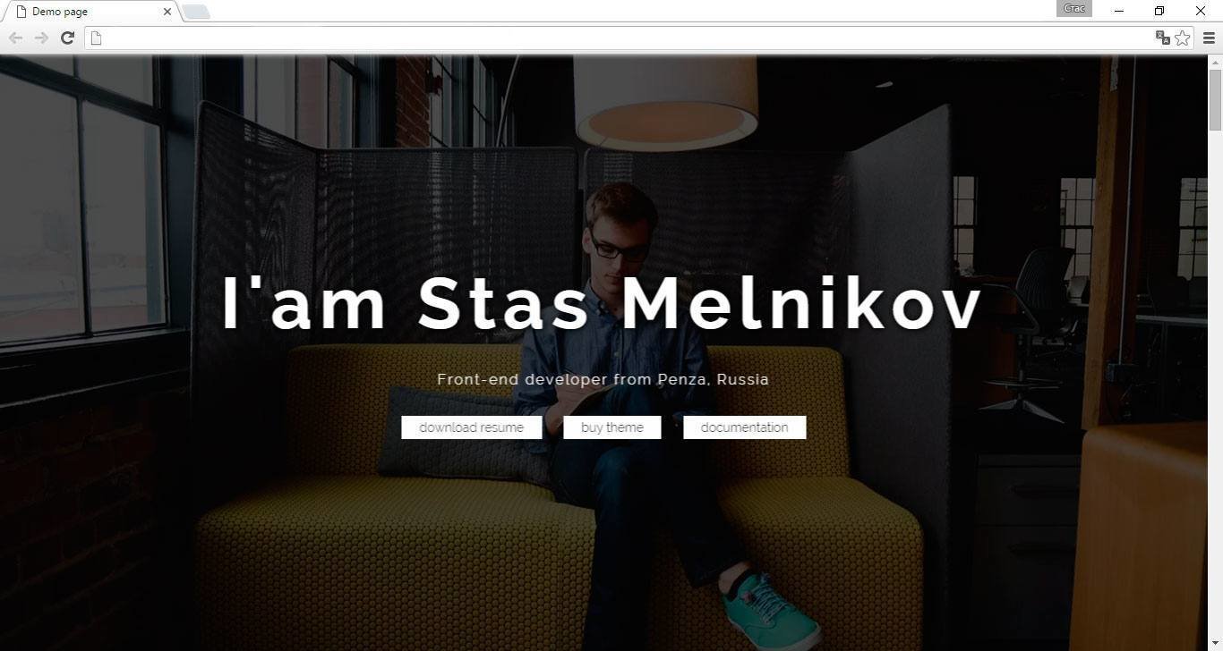
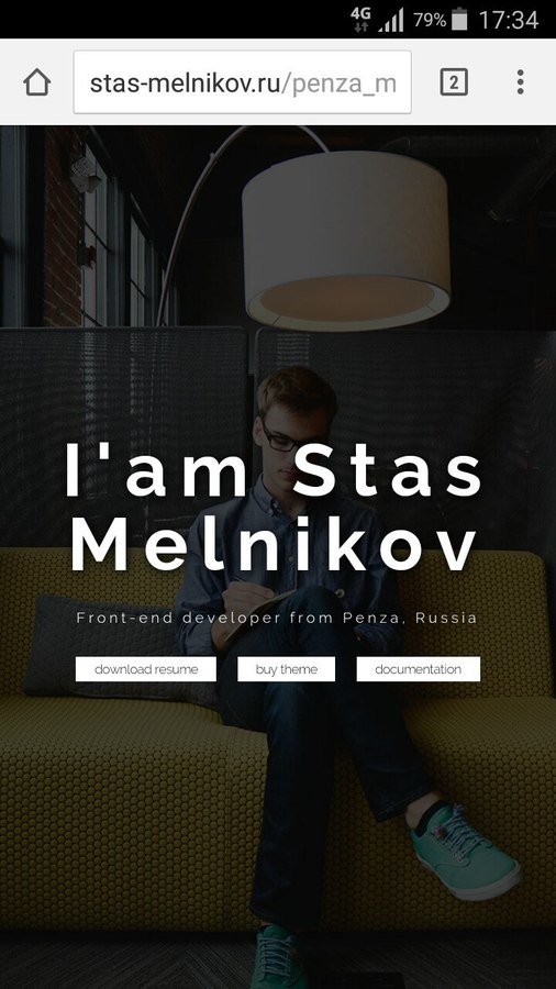
Требуется реализовать блок с фоновым изображением таким образом, чтобы он пропорционально изменялся в зависимости от устройства, а также полностью занимал весь первый экран пользователя.
Решения?
HTML
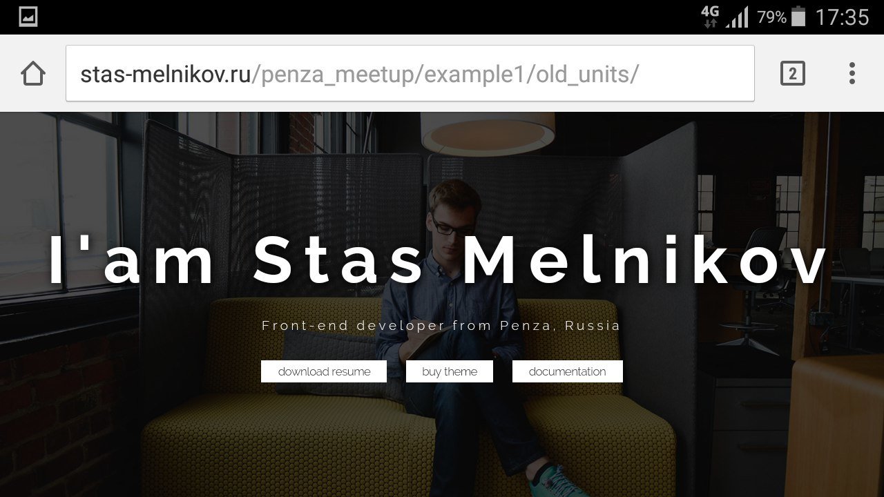
<header class="header">
    <div class="welcome">
        <h1 class="welcome__title">
            I'am Stas Melnikov
            <span class="welcome__label">Front-end developer from Penza, Russia</span>
        </h1>
        <div class="welcome__footer">
            <a href="#" class="welcome__link">download resume</a>
            <a href="#" class="welcome__link">buy theme</a>
            <a href="#" class="welcome__link">documentation</a>
        </div>
    </div>
</header>
CSS
html, body{
height: 100%;
}
.header {
background: url("../images/programmer.jpg") no-repeat center 50%;
background-size: cover;
height: 100%;
width: 100%;
}
.welcome {
width: 100%;
position: absolute;
top: 50%;
left: 50%;
transform: translate(-50%, -50%);
z-index: 2;
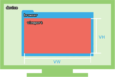
}VH и VW
VH/VW - это единицы измерения, которые рассчитываются относительно viewport
Задачи
- Фиксированная шапка
- Фиксированный каркас
- Landing Page
- Модальные окна
- Анимации
Рефакторинг
Проценты
VH
.header {
    background: url("../images/programmer.jpg");
    background-repeat: no-repeat;
    background-position: center 50%;
    background-size: cover;
    height: 100vh;
    width: 100%;
}

.welcome {
    width: 100%;
    position: absolute;
    top: 50%;
    left: 50%;
    transform: translate(-50%, -50%);
    z-index: 2;
}
html, body{
    height: 100%;
}

.header {
    background: url("../images/programmer.jpg");
    background-repeat: no-repeat;
    background-position: center 50%;
    background-size: cover;
    height: 100%;
    width: 100%;
}

.welcome {
    width: 100%;
    position: absolute;
    top: 50%;
    left: 50%;
    transform: translate(-50%, -50%);
    z-index: 2;
}
Минус
- VW и VH включают в себя ширину скроллбара
Продолжаем
HTML
<div class="welcome">
    <h1 class="welcome__title">
        I'am Stas Melnikov
        <span class="welcome__label">Front-end developer from Penza, Russia</span>
    </h1>
</div>
<div class="welcome__footer"><a href="#" class="welcome__link">download resume</a></div>
CSS
.welcome {
    font-size: 10px;
}

.welcome__title {
    font-size: 8em; /*80px*/
    line-height: 80px;
}

.welcome__label {
    font-size: .2em; /*16px*/
}

.welcome__link {
    font-size: 1.4em;/*14px*/
    padding: .35715em 1.42856em;/*5px / 14px = 0.35715 и 20px / 14px = 1.4285em*/
    margin: 0 .7143em;/*10px / 14px = 0.7143em*/
}

@media screen and (max-width: 640px){

    .welcome{
        font-size: 6px;
    }

    .welcome__title {
        line-height: 48px;
    }
}
Как-то сложно
Минусы
- Зависимость от HTML
- Много считать
Плюсы
- Тренировка мозга
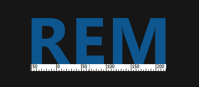
REM
root em
REM - это единица измерения, которая рассчитывается относительно корневого элемента страницы(html)
Рефакторинг
EM
REM
html{
    font-size: 10px;
}

.welcome__title {
    font-size: 8rem; /*80px*/
    line-height: 8rem;
}

.welcome__label {
    font-size: 1.6rem; /*16px*/
}

.welcome__link {
    font-size: 1.4rem; /*14px*/
    padding: .5rem 2rem; /*5px и 20px*/
    margin: 0 1rem; /*10px*/
}

@media screen and (max-width: 640px){

    html{
        font-size: 6px;
    }
}
.welcome {
font-size: 10px;
}
.welcome__title {
font-size: 8em; /*80px*/
line-height: 80px;
}
.welcome__label {
font-size: .2em; /*16px*/
}
.welcome__link {
font-size: 1.4em;/*14px*/
padding: .35715em 1.42856em;/*5px и 20px*/
margin: 0 .7143em;/*10px*/
}
@media screen and (max-width: 640px){
.welcome{
font-size: 6px;
}
.welcome__title {
line-height: 48px;
}
}Минусы
- Не нашел
Old
New


Old
New
Кто использует?
Ссылки
Стас Мельников