Tailwind CSS
什麼是 Tailwind CSS ?
BEM、OOCSS ...
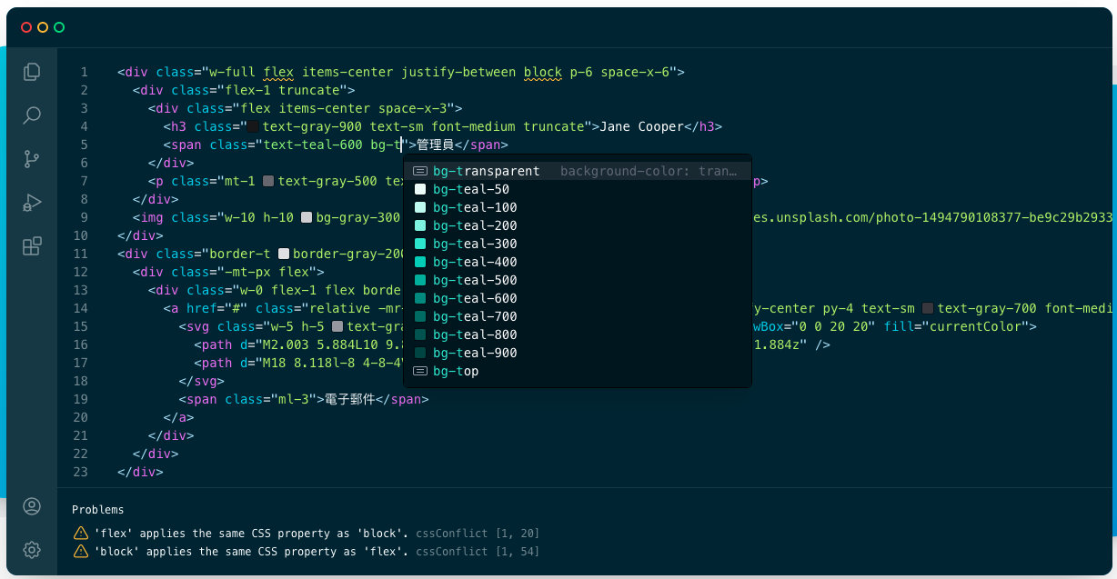
<div class="chat-notification">
  <div class="chat-notification-logo-wrapper">
    <img
      class="chat-notification-logo"
      src="/img/logo.svg"
      alt="ChitChat Logo">
  </div>
  <div class="chat-notification-content">
    <h4 class="chat-notification-title">ChitChat</h4>
    <p class="chat-notification-message">You have a new message!</p>
  </div>
</div>
<style>
.chat-notification {
display: flex;
max-width: 24rem;
margin: 0 auto;
padding: 1.5rem;
border-radius: 0.5rem;
background-color: #fff;
box-shadow: 0 20px 25px -5px rgba(0, 0, 0, 0.1), 0 10px 10px -5px rgba(0, 0, 0, 0.04);
}
.chat-notification-logo-wrapper {
flex-shrink: 0;
}
.chat-notification-logo {
height: 3rem;
width: 3rem;
}
.chat-notification-content {
margin-left: 1.5rem;
padding-top: 0.25rem;
}
.chat-notification-title {
color: #1a202c;
font-size: 1.25rem;
line-height: 1.25;
}
.chat-notification-message {
color: #718096;
font-size: 1rem;
line-height: 1.5;
}
</style>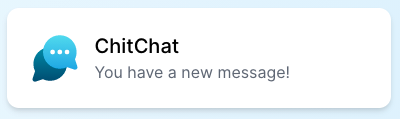
你可能聽過
Atomic CSS
Functional CSS
Utility-First CSS
Atomic CSS
.bw-1x {
  border-width: 1px;
}
.bw-2x {
  border-width: 2px;
}
.bss {
  border-style: solid;
}
.sans {
  font-style: sans-serif;
}
.p-1x {
  padding: 10px;
}
Atomic CSS
要先有較長的前置作業
在命名規範上會花很長的時間
花時間記名字,大家一起寫 Code 可能會吵架
<div class="max-w-sm mx-auto flex p-6 bg-white rounded-lg shadow-xl">
  <div class="flex-shrink-0">
    <img class="h-12 w-12" src="/img/logo.svg" alt="ChitChat Logo">
  </div>
  <div class="ml-6 pt-1">
    <h4 class="text-xl text-gray-900 leading-tight">ChitChat</h4>
    <p class="text-base text-gray-600 leading-normal">You have a new message!</p>
  </div>
</div>
那幹嘛不直接寫 inline-style
沒有 Media Query 和 Pseudo (hover, focus ...)
無法複用,而且每個 inline-style 是獨立的,很難有完整的規範
可讀性、跟簡潔性還是差蠻多的
// Inline-Style
<div style="width: 100%;padding-top: 64px;padding-bottom: 160px;">
  <div style="padding: 24px;">
    <h1 style="font-size:20px;color:#2d3748;font-weight: 400;">
      <!-- ....  -->
    </h1>
    <div style="margin-top:64px;color:#718096;">
       <!-- ...  -->
    </div>
    <p class="color: #718096;">
     Text
    </p>
  </div>
</div>

// Tailwind
<div class="w-full pt-16 pb-40">
  <div class="p-6">
    <h1 class="text-xl text-gray-800 font-normal">
      <!-- ....  -->
    </h1>
    <div class="m-16 text-gray-600">
       <!-- ...  -->
    </div>
    <p class="text-gray-600">
     Text
    </p>
  </div>
</div>
@media (min-width: 1024px) {
.container {
grid-template-columns: repeat(3,minmax(0,1fr));
}
}
@media (min-width: 768px) {
.container {
grid-template-columns: repeat(2,minmax(0,1fr));
}
}
.conainer {
display: grid;
gap: 1rem;
}
<div class="container">
  <div class="item"></div>
  <div class="item"></div>
  <div class="item"></div>
  <div class="item"></div>
  <div class="item"></div>
  <div class="item"></div>
</div>
電腦尺寸下分三塊一群、平板尺寸下分兩塊一群
<div class="grid grid-cols-1 md:grid-cols-2 lg:grid-cols-3 gap-4">...</div>
這樣有什麼好處?
不用在為命名困擾,或命名出一些很怪的 class 名稱
移動功能時,你的樣式不會跑掉
新增功能時,CSS 不太會變肥
刪掉功能時,你也可以確保樣式一起被刪掉
可以高度客製化樣式
改樣式直接改 HTML & 幾乎不用寫 CSS
// Example `tailwind.config.js` file
module.exports = {
  prefix: 'trevi-', /* trevi-text-gray-100, sm:trevi-text-gray-100 */
  important: true,
  separator: ':', /* sm:text-gray-100, hover:text-gray-100 */
  theme: {
    fontFamily: {
      display: ['Gilroy', 'sans-serif'], /* font-display */
      body: ['Graphik', 'sans-serif'], /* font-body */
    },
    extend: {
      colors: {
        cyan: '#9cdbff', /* text-cyan, border-cyan, bg-cyan */
        gray: {
          100: '#f7fafc', /* text-gray-100, border-gray-100, bg-gray-100 */
          400: '#cbd5e0',
          700: '#4a5568',
          900: '#1a202c',
        }
      },
      margin: { /* m-auto, mx-auto */
        '96': '24rem', /* m-96, -ml-96, mt-96, sm:mr-96, hover:mb-96 */
        '128': '32rem', /* my-128, mx-128 */
      },
    }
  },
  variants: {
    opacity: ['responsive', 'hover'] /* sm:opacity-90, hover:opacity-90 */
  }
}
那什麼時候適合使用?
高度樣式客製化的專案、對設計有要求的
你真的很想做 CSS 的 Tree-Shaking
想要快速搭建一個網站
缺點是?
<button class="py-2 px-4 bg-green-500 text-white font-semibold rounded-lg shadow-md hover:bg-green-700 focus:outline-none focus:ring-2 focus:ring-green-400 focus:ring-opacity-75">
  Click me
</button>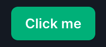
編譯慢
Component 的概念就相當重要
<button class="btn-indigo">
  Click me
</button>

<style>
  .btn-indigo {
    @apply py-2 px-4 bg-indigo-500 text-white font-semibold rounded-lg shadow-md hover:bg-indigo-700 focus:outline-none focus:ring-2 focus:ring-indigo-400 focus:ring-opacity-75;
  }
</style>
@tailwind base;
@tailwind components;
@tailwind utilities;

@layer components {
  .btn-blue {
    @apply py-2 px-4 bg-blue-500 text-white font-semibold rounded-lg shadow-md hover:bg-blue-700 focus:outline-none focus:ring-2 focus:ring-blue-400 focus:ring-opacity-75;
  }
}
快速入門
// tailwind.config.js
module.exports = {
  purge: [
    './src/**/*.html',
    './src/**/*.vue',
    './src/**/*.jsx',
  ],
  theme: {},
  variants: {},
  plugins: [],
}
<!-- Error -->
<div class="text-{{ error ? 'red' : 'green' }}-600"></div>
<!-- Correct -->
<div class="{{ error ? 'text-red-600' : 'text-green-600' }}"></div>
快速上手的一些概念
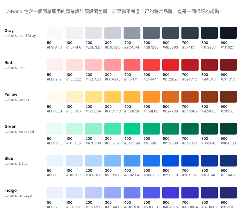
Color
用到任何需要顏色的地方,都是使用 {property}-{color}
<div class="bg-pink-900 text-white border border-yellow-900"></div>Spacing
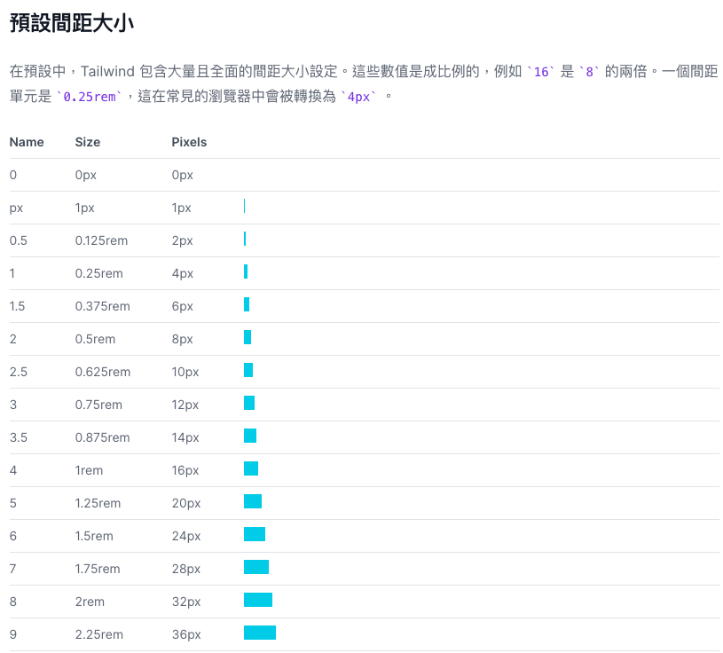
用到任何跟間距、大小有關的地方,都是使用 {property}-{spacing}
<div class="m-6 p-12 w-32 h-32 min-w-12 min-h-12"></div>padding, margin, width, height, maxHeight, gap, inset ...
RWD
// tailwind.config.js
module.exports = {
  theme: {
    screens: {
      'sm': '640px',
      // => @media (min-width: 640px) { ... }

      'md': '768px',
      // => @media (min-width: 768px) { ... }

      'lg': '1024px',
      // => @media (min-width: 1024px) { ... }

      'xl': '1280px',
      // => @media (min-width: 1280px) { ... }

      '2xl': '1536px',
      // => @media (min-width: 1536px) { ... }
    }
  }
}
預設情況下有這個斷點
RWD
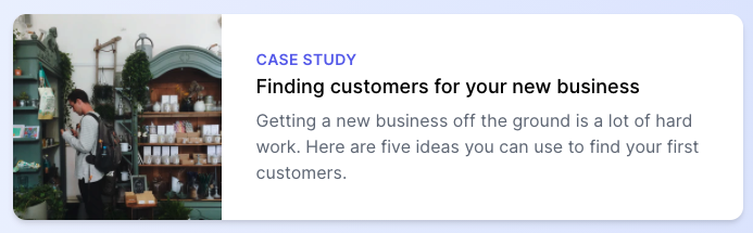
<div class="max-w-md mx-auto bg-white rounded-xl shadow-md overflow-hidden md:max-w-2xl">
  <div class="md:flex">
    <div class="md:flex-shrink-0">
      <img class="h-48 w-full object-cover md:h-full md:w-48" src="/img/store.jpg" alt="Man looking at item at a store">
    </div>
    <div class="p-8">
      <div class="uppercase tracking-wide text-sm text-indigo-500 font-semibold">Case study</div>
      <a href="#" class="block mt-1 text-lg leading-tight font-medium text-black hover:underline">Finding customers for your new business</a>
      <p class="mt-2 text-gray-500">Getting a new business off the ground is a lot of hard work. Here are five ideas you can use to find your first customers.</p>
    </div>
  </div>
</div>
分別可以使用 sm: md: ... 這幾個 Prefix 來呈現不同樣式
RWD

>=md
<md
RWD
<!-- This will only center text on screens 640px and wider, not on small screens -->
<div class="sm:text-center"></div>
<!-- This will center text on mobile, and left align it on screens 640px and wider -->
<div class="text-center sm:text-left"></div>Pseudo
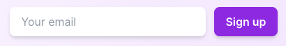
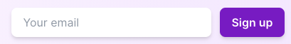
<form>
  <input class="border
                border-transparent
                focus:outline-none
                focus:ring-2
                focus:ring-purple-600
                focus:border-transparent">
  <button class="bg-purple-600
                 hover:bg-purple-700
                 focus:outline-none
                 focus:ring-2
                 focus:ring-purple-600
                 focus:ring-opacity-50">
    Sign up
  </button>
</form>visited, checked, focus-within, hover, focus, focus-visible, active ...
有的預設會開啟,有的不會有,都可以自己調整
Pseudo
normal
hover
... More
Container, Box Decoration Break, Box Sizing, Display, Floats, Clear, Isolation, Object Fit (物件適配), Object Position, Overflow, Overscroll Behavior, Position, Top / Right / Bottom / Left, Visibility, Z-Index, Flex Direction, Flex Wrap, Flex, Flex Grow, Flex Shrink, Order, Grid Template Columns, Grid Column Start / End, Grid Template Rows, Grid Row Start / End, Grid Auto Flow, Grid Auto Columns, Grid Auto Rows, Gap, Justify Content, Justify Items, Justify Self, Align Content, Align Items, Align Self, Place Content, Place Items, Place Self, Padding, Margin, Space Between, Width (寬度), Min-Width, Max-Width, Height, Min-Height, Max-Height, Font Family, Font Size, Font Smoothing, Font Style, Font Weight, Font Variant Numeric, Letter Spacing, Line Height, List Style Type, List Style Position, Placeholder Color, Placeholder Opacity, Text Align (文字對齊), Text Color, Text Opacity, Text Decoration, Text Transform, Text Overflow, Vertical Align, Whitespace, Word Break (字詞斷行), Background Attachment (背景滾動), Background Clip (背景裁切), Background Color (背景顏色), Background Opacity (背景透明度), Background Origin, Background Position (背景位置), Background Repeat (背景重覆顯示), Background Size (背景尺寸), Background Image (背景圖片), Gradient Color Stops, Border Radius, Border Width, Border Color, Border Opacity, Border Style, Divide Width, Divide Color, Divide Opacity, Divide Style, Ring Width, Ring Color, Ring Opacity, Ring Offset Width, Ring Offset Color, Box Shadow, Opacity, Mix Blend Mode, Background Blend Mode (背景混合模式), Filter, Blur, Brightness, Contrast, Drop Shadow, Grayscale, Hue Rotate, Invert, Saturate, Sepia, Backdrop Filter (背景濾鏡), Backdrop Blur (背景模糊), Backdrop Brightness (背景亮度), Backdrop Contrast (背景對比), Backdrop Grayscale (背景灰階), Backdrop Hue Rotate (背景色相旋轉), Backdrop Invert (背景負片), Backdrop Opacity (背景透明度), Backdrop Saturate (背景飽和度), Backdrop Sepia (背景護眼色調), Border Collapse, Table Layout, Transition Property, Transition Duration, Transition Timing Function, Transition Delay, Animation, Transform, Transform Origin, Scale, Rotate, Translate, Skew, Appearance, Cursor, Outline, Pointer Events, Resize, User Select, Fill, Stroke, Stroke Width, 螢幕報讀器, Typography, Forms, Aspect Ratio, Line Clamp
EXTRA
Windi

Just-in-Time Mode
(JIT)
  // tailwind.config.js
  module.exports = {
    mode: 'jit',
   // These paths are just examples, customize them to match your project structure
   purge: [
     './public/**/*.html',
     './src/**/*.{js,jsx,ts,tsx,vue}',
   ],
    theme: {
      // ...
    }
    // ...
  }
<!-- Sizes and positioning -->
<img class="absolute w-[762px] h-[918px] top-[-325px] right-[62px] md:top-[-400px] md:right-[80px]" src="/crazy-background-image.png">
<!-- Colors -->
<button class="bg-[#1da1f1]">Share on Twitter</button>
<!-- Complex grids -->
<div class="grid-cols-[1fr,700px,2fr]">...</div>
<!-- CSS Variable -->
<div class="text-[var(--mystery-var)]">...</div>
<!-- Important -->
<p class="font-bold !font-medium">
This will be medium even though bold comes later in the CSS.
</p>
<!-- Complex Pseudo -->
<div data-content="hello world" class="before:content-[attr(data-content)] before:block ...">
<!-- CSS Calc -->
<div class="h-[calc(1000px-4rem)]">...</div>
<!-- Dynamic -->
<div className={ size === 'lg' ? 'mt-[22px]' : 'mt-[17px]' }></div>