Website: https://flourish.studio
—> register
Data: https://bit.ly/dh2023
basic rules of good data design
Krisztián Szabó
Szabó Krisztián
Átlátszó
ATLO


Frequently used softwares:
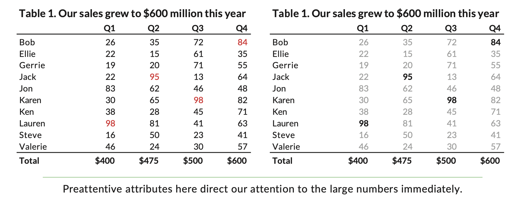
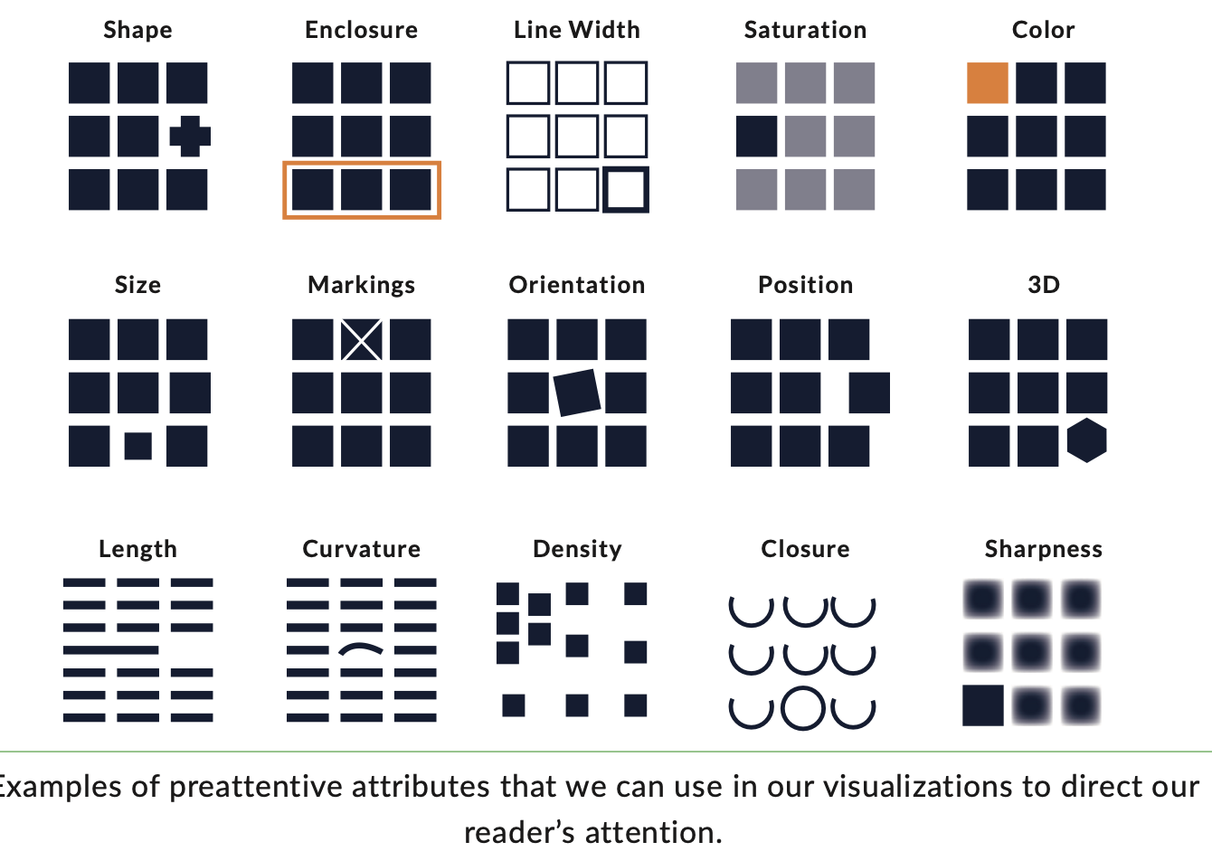
Preattentive processing
Five guidelines for better data visualisations
- Show the data
- Reduce the clutter
- Integrate the graphics and text
- Avoid the spaghetti chart
- Start with gray
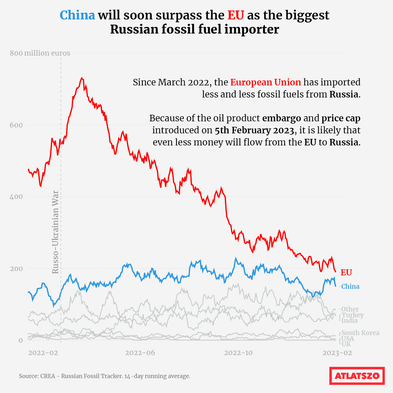
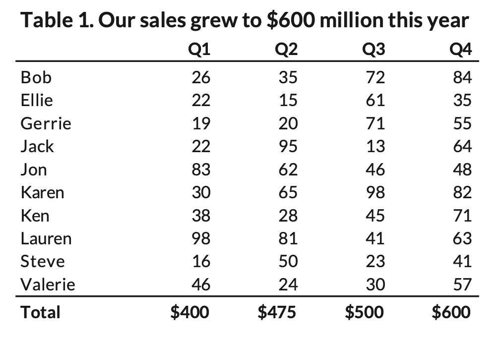
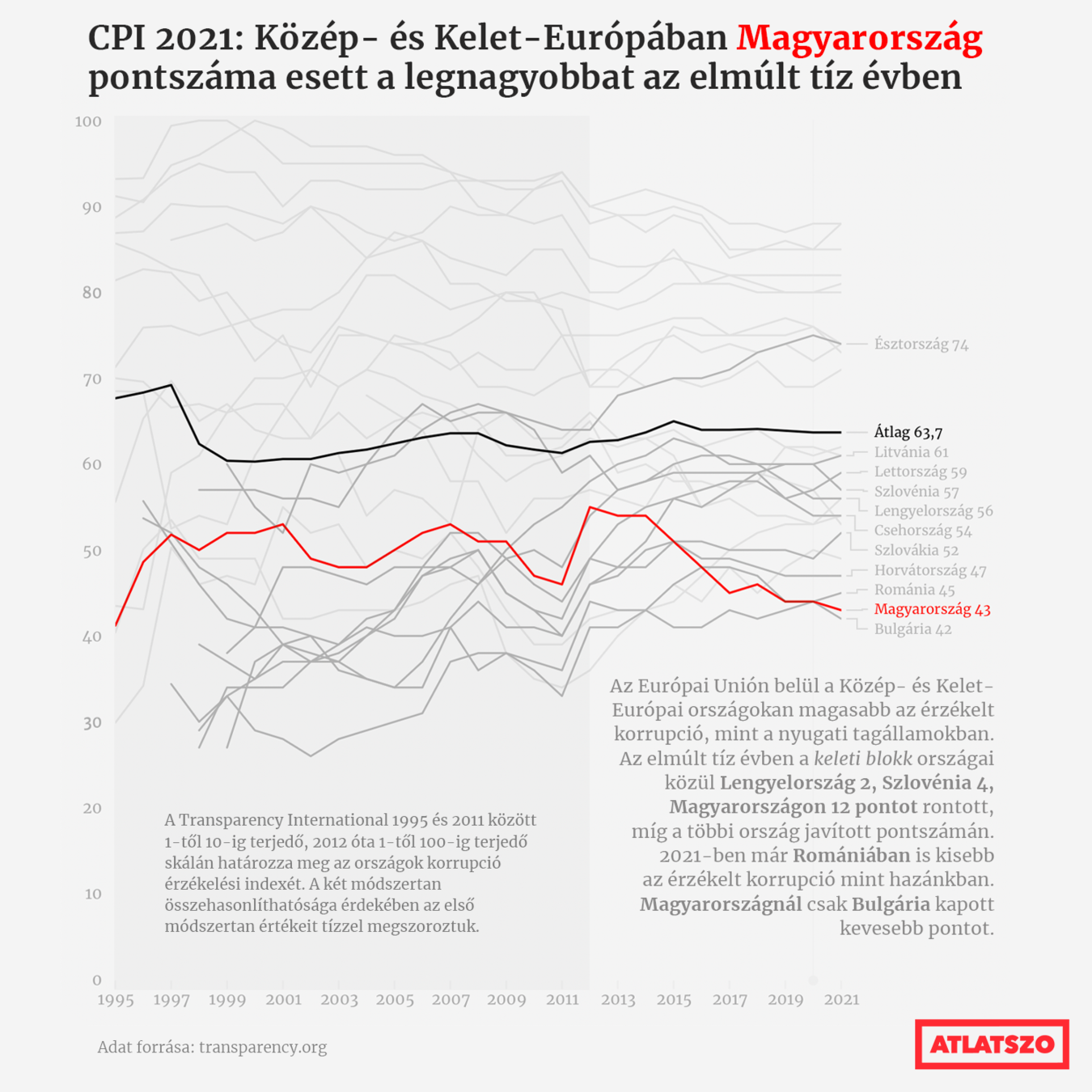
1. Show the data
"Not all the data must be shown, but you should highlight the values, that are important to your argument"
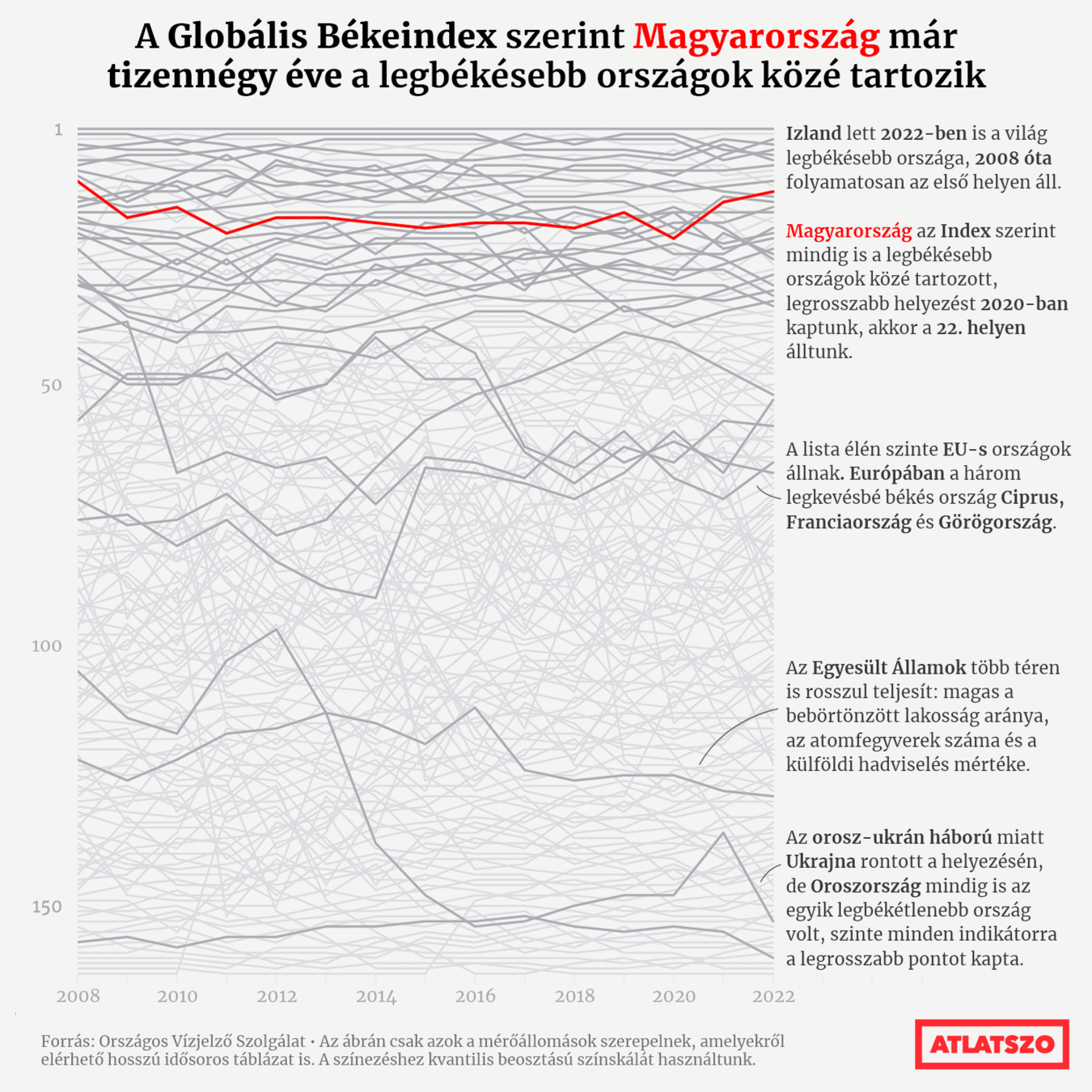
444.hu Coronavirus site
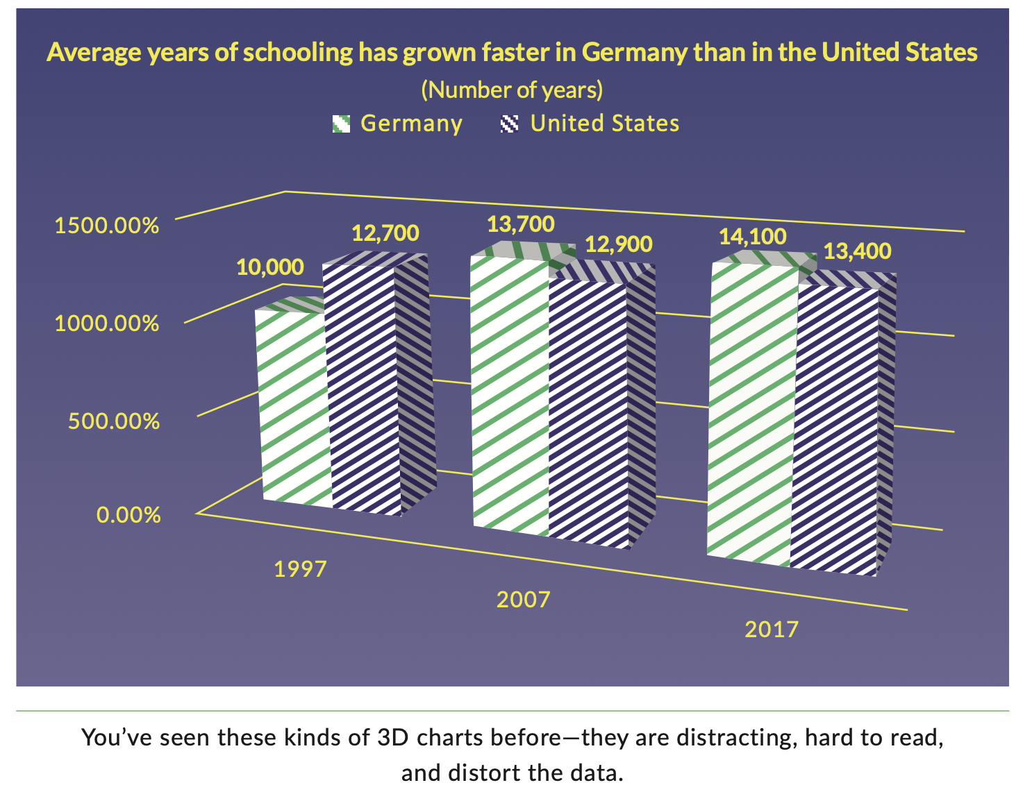
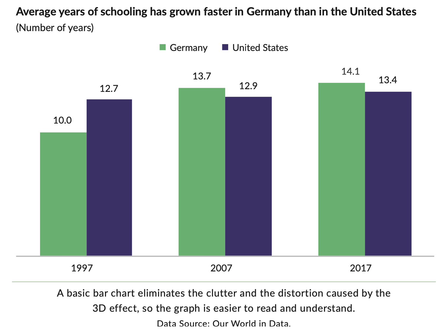
2. Reduce the clutter
"The use of unnecessary visual elements distracts your reader from the central data and clutters the page."
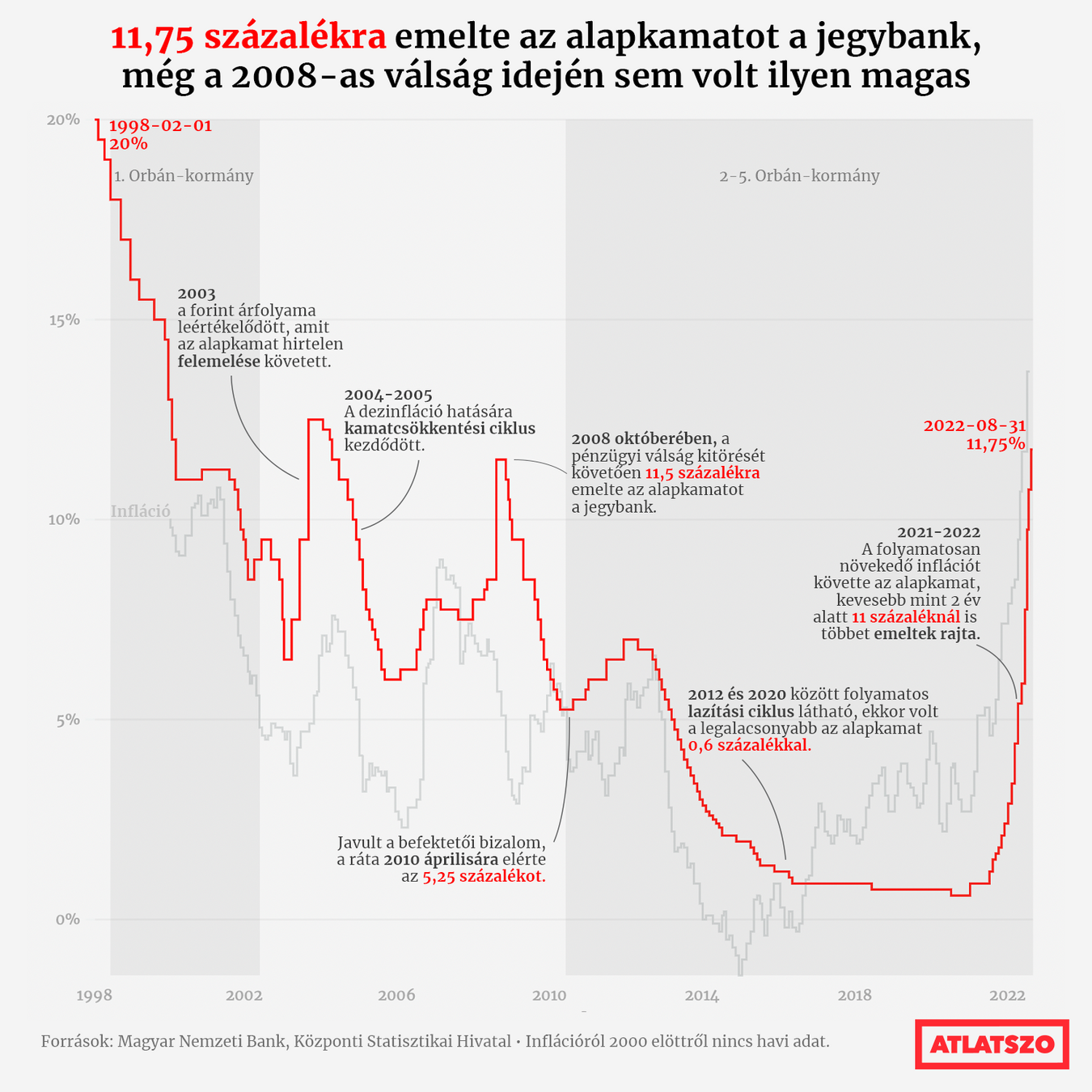
3. Integrate the graphics and text
"Far too often, we treat the text and annotations as an afterthought, but these elements can be used to explain how to read the content in the graph as well as how to read the graph itself."
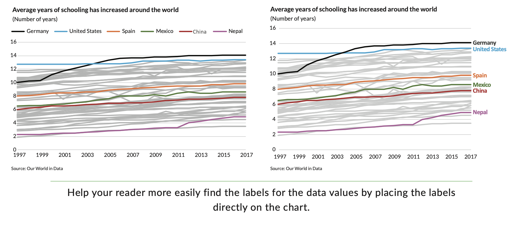
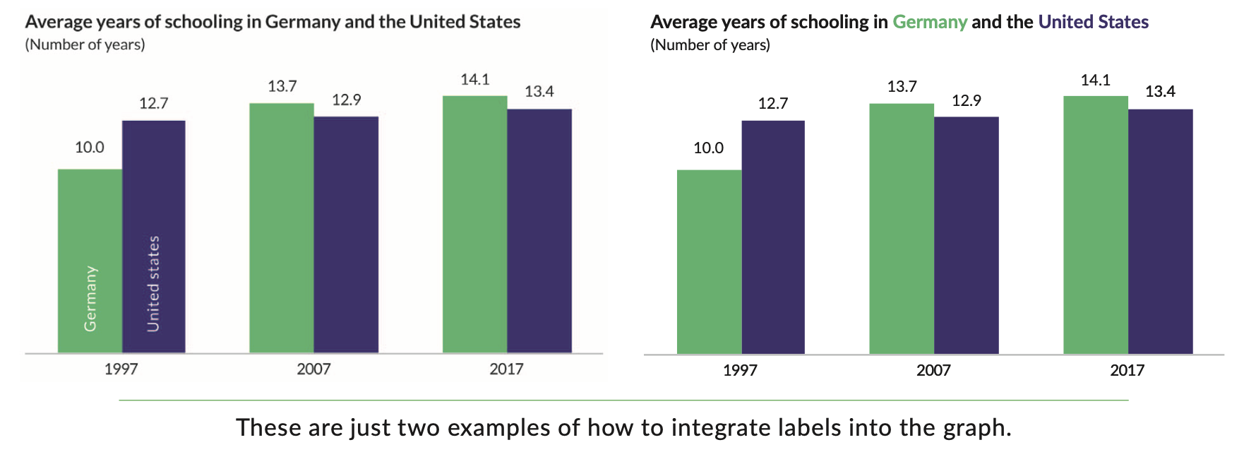
a. Remove legend
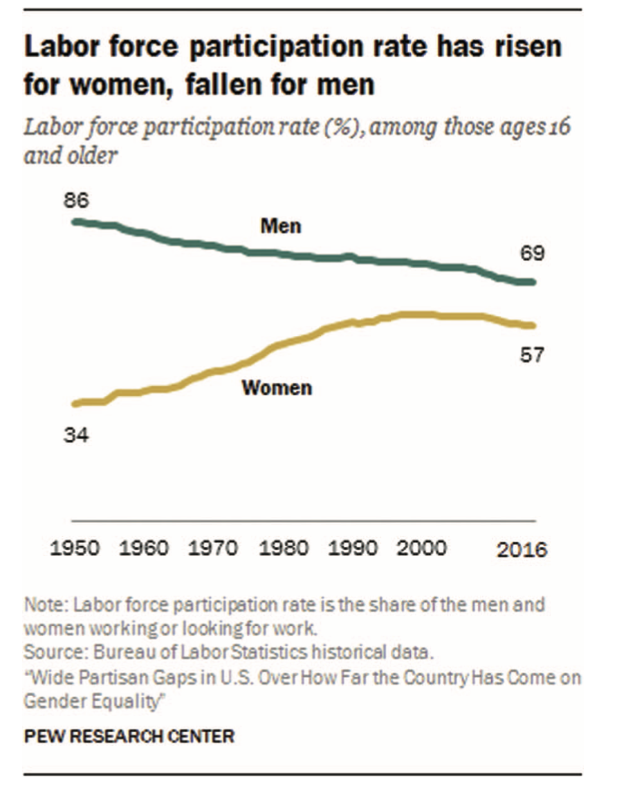
b. Write the title like a newspaper headline
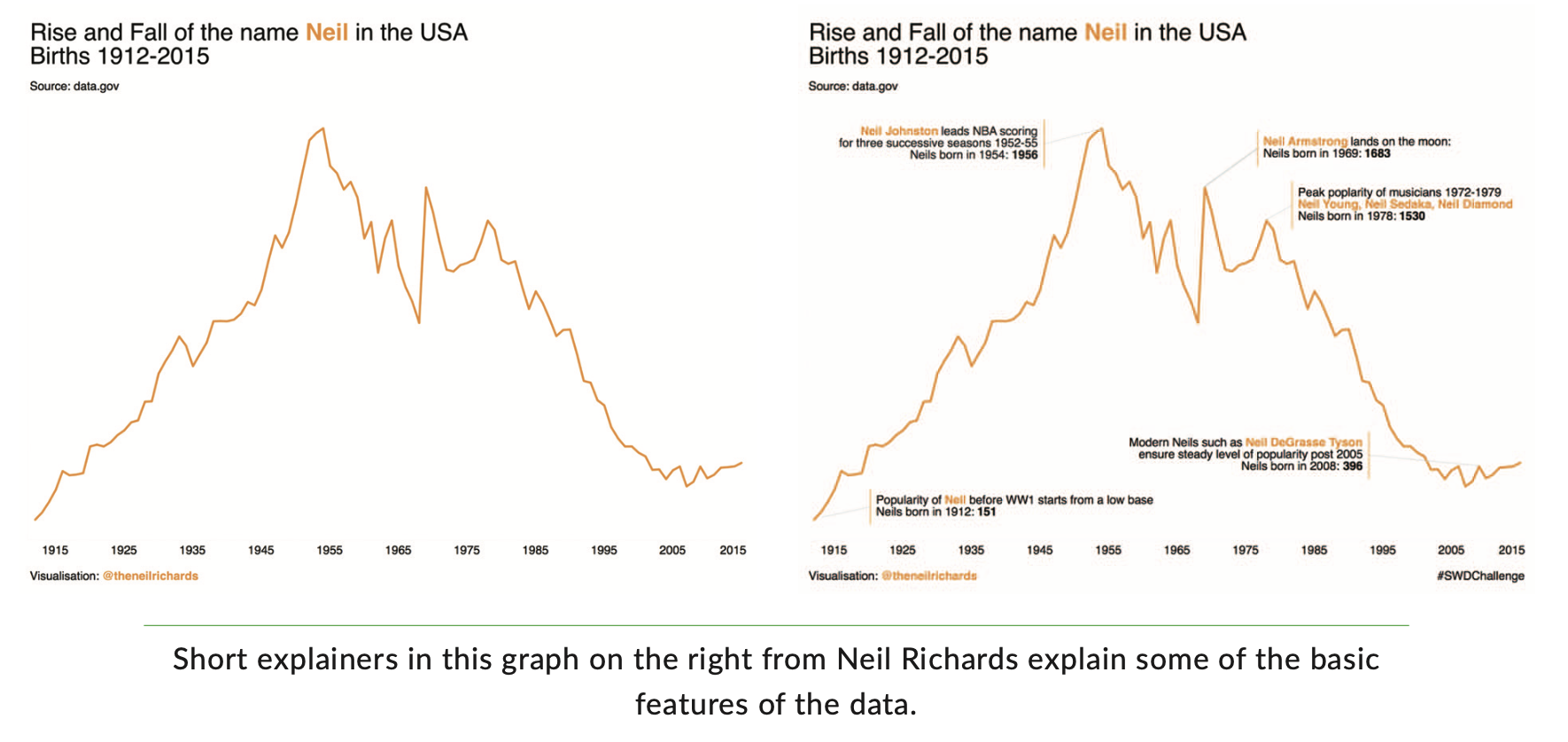
c. Add explainers (annotations)
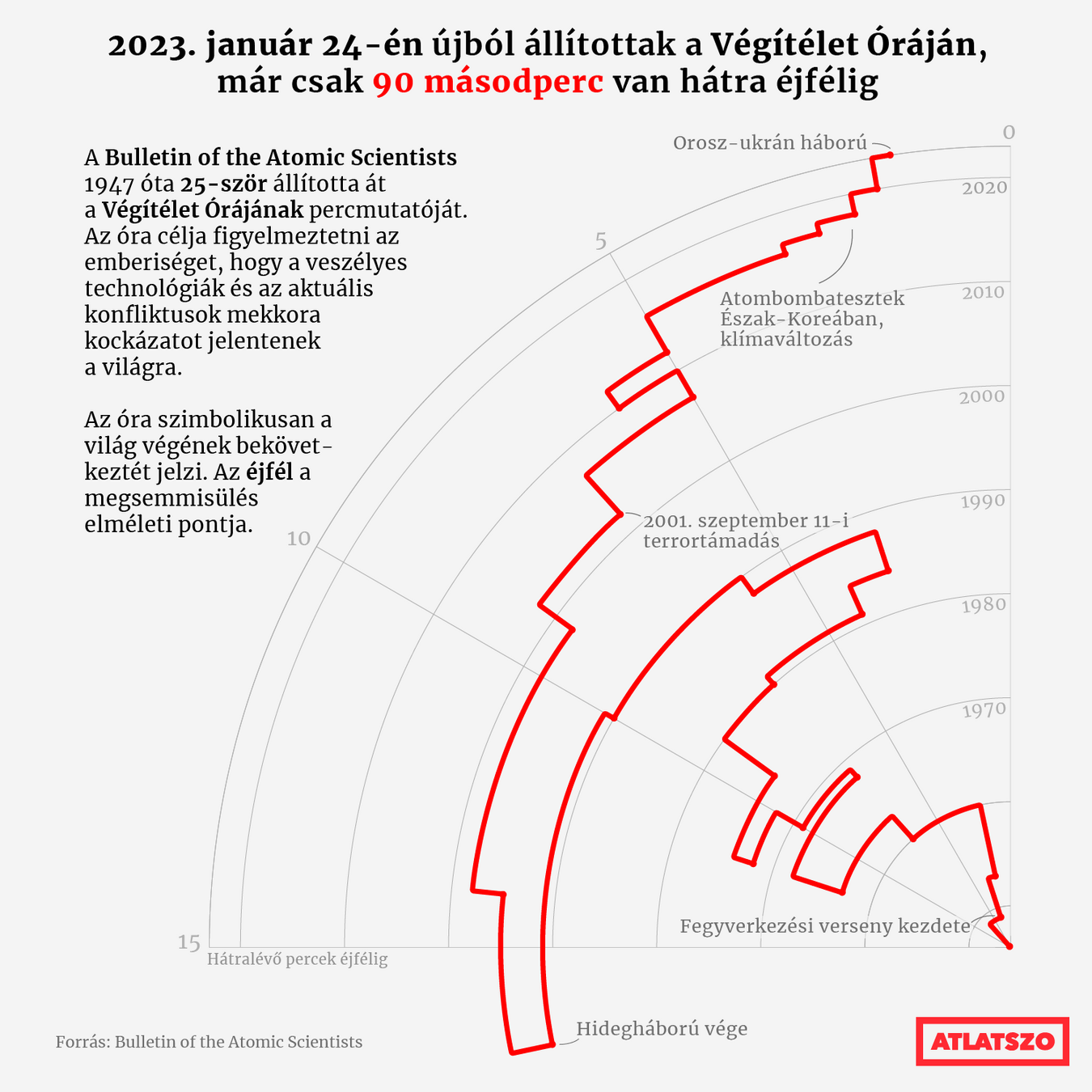
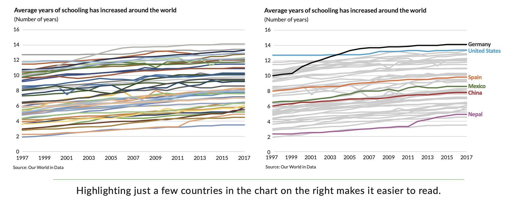
4. Avoid the spaghetti chart
"Instead of putting all of the data on one graph, create multiple, smaller versions with variations on the basic data. These are smaller charts that use the same scale, axes, and scope but spread the data across multiple visuals"
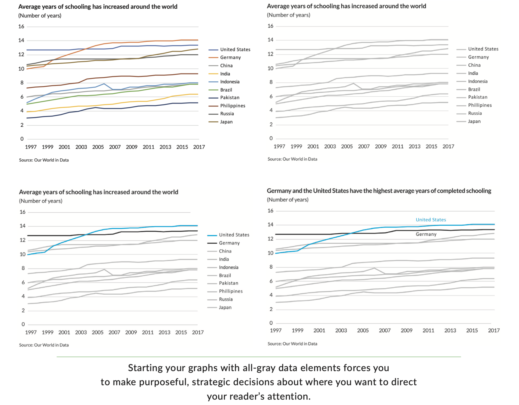
5. Start with gray
"You force yourself to be purposeful and strategic in your use of color, labels, and other elements"


Dimensions, typeface, position, axes, gridlines, legend, annotation, colour, branding, etc
Colors

Binary
Color

Linear
Color

Divergent
Color

Categorical
Color

Highlight
Style is just as important as data.
What is your message worth
if your readers cannot understand it?