Taley'a Mirza
Google Developers Expert, Web Technologies
Software Engineer, Careem
Former Lead Instructor, Tech Karo 2020

What makes a design and user experience great?
Web Technologies
Do you want to create your website?
But you don't know where to start first?
You want your website to look great.
But you always struggle in choosing the right colors for your website?
Do you end up messing with your layouts and grids?
Let's restructure the order of designing our websites
with the right tools and better strategy
To build a better design and user experience
What we will learn today!
- What is a great user experience?
- Identifying the audience
- Choosing the right color scheme
- Decide the number of pages and their linking
- Prototype the layout
- Collect the required resources
- Design your web pages
What is a great user experience?
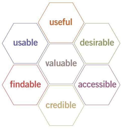
UX is ensuring that users find value in what you are providing to them

Useful: Your content should be original and fulfill a need
Usable: The site must be easy to use
Accessible: Content needs to be accessible to people with disabilities
Credible: Users must trust and believe what you tell them
Desirable: Image, identity, brand, and other design elements are used to evoke emotion and appreciation
Findable: Content needs to be navigable and locatable onsite and offsite
Who is your audience?
Create your brand!
through the color scheme and fonts!
How?
- Find the right color combinations
- Choose your Primary and Secondary fonts
- Fix your font variants, and colors around the website
- Do not use different colors in the description text
- Do not use fancy text (unless it is needed)
https://coolors.co/generate
https://fonts.google.com/
Roboto
Montserrat
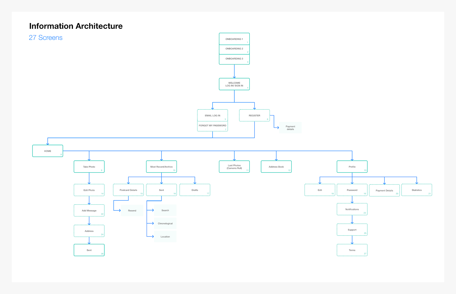
Make a site map
how information is organized, structured, and presented to users.
Find the pages that are needed for your website
Decide their linking to each other

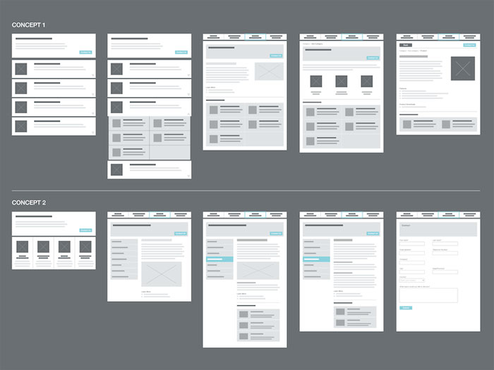
Prototype the design
A rough sketch of how you are going to place content on your pages.
Important thing is to be attentive to grids, spaces, and responsiveness
Draw.io
Paper sketch
Paint
Illustrator, photoshop and sketch

Collect the resources
- Images (unsplash, freepik)
- Fonts (Google fonts)
- Icons (fontawesome)
- Create your content information
Finally, Code your design!
Be Attentive while designing!
- Your designs should be consistent and responsive. Responsiveness is the key element for designing websites.
- The same elements should be used across all web pages for consistency like buttons, fonts, forms, and image containers.
- Create your own brand identity by fixing the colors scheme and fonts styles.
- You must research, decide the structure of your web pages and collect all your resources before placing content.
- Make it responsive first then do the additional stuff.
Happy Coding!
@TaleyaMirza