CSS Workshop
Ben Baker, October 2015
What has your experience with CSS been like?
Something like this?
Guess work
(and Stack Overflow)
can only get you so far...

By understanding the underlying principles,
CSS can be powerful,
logical and...
...fun? (no, really)
Cascading Style Sheets
"The separation of document content from document presentation
including aspects such as
the layout, colors, and fonts."
This separation can improve:
-
provide flexibility & control in the specification of presentation characteristics
-
enable multiple HTML pages to share formatting
(via a single .css file) -
reduce complexity and repetition in the structural content
-
display content on a broad range of devices
-
content accessibility
Who creates & maintains CSS?
-
W3C's CSS Working Group
-
this group propose new CSS features
-
once agreed features are implemented by the main browsers (Safari, Chrome, Firefox and IE/Edge etc.)
-
now browser companies have realised that standards are a good thing, CSS has grown rapidly over the past few years. This was not always the case...
What's the current state of play?
-
major browser vendors are all communicating and their rendering engines - Chrome (blink),
Safari (webkit), Firefox (Gecko), IE (Trident),
Edge (Edge HTML) - offer very similar results -
Internet Explorer 7/8 and 9 usage are dwindling
at ~6% (Aug 2015, w3c browser stats) - YES!

The building blocks
Overview of our HTML/CSS/JS approach
Processes:
- designs created & approved
- designs converted to static HTML/CSS/JS templates
- browser check, testing & fixes
- templates left untouched and elements are extracted and integrated into dynamic application during development
By having a static templates, debugging & fixing issues during development is MUCH easier.

HTML contains the
Document Object Model (DOM)
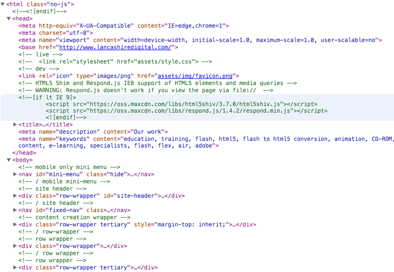
<html>
<head></head>
<body>
<!-- you style elements in here via CSS -->
</body>
</html>
CSS styles the body tag contents
within the DOM
HTML structure is important
-
the foundation of your page needs to be solid
-
Lets the computer know about data hierarchy
-
Useful for Search Engines and indexing
-
Accessibility (e.g. via Screen Readers) is something all of you should be aware of as is likely to come up on education projects

The page should still make sense without CSS
Basic rules for your
HTML markup:
- just one <h1> tag per page
- use <p> text for standard text copy
- use <ul> for menus items
- use common sense headers (<h2>, <h3>, <h4>) depending on the importance of the title to the page
- use HTML5 <header>, <nav>, <section>, <footer> tags for key content areas of the page
http://html5doctor.com/ is your friend
Well-formed HTML means:
- faster page loads
- Less likelihood of rendering issues due to
HTML parsing errors - better rendering across browsers
- less code to write in CSS as basics are established
Malformed HTML red herring
What appears to be a CSS issue isn't
(that's not an actual herring...)
Let's take a look at an example. http://lancashiredigital.local/work.html
A quick way to figure this out?
To avoid this...
http://validator.w3.org/ is your friend
Example structure using basic HTML5 tags
One-page site structure using just
70 lines of CSS (un-minified).

Bad ways to set CSS?
Inline style
Hard to maintain
<h1 style="font-size: 22px; colour: red;
padding: 10px 15px;">
Welcome to the  Lancashire Digital website
</h1>
Internal style
Better, but still hard to maintain
<html>
<head>
    <style>
    h1 {
         font-size: 22px;
         color: red;
         padding: 10px;
    }
    </style>
</head>
<body>
<h1>Welcome to the  Lancashire Digital website</h1>
</body>
</html>
Via JS.
Very hard to maintain.
var pageHeading = document.getElementsByTagName('h1')[0];
pageHeading.style.fontSize = '22px';
pageHeading.style.color = 'red';
pageHeading.style.padding = '10px';
What's the best way?
Always use external CSS* (where possible)
<html>
<head>

    <link rel="stylesheet" href="css/main.css">

</head>
<body>
<!-- you style elements in here via CSS -->
</body>
</html>
Setup a master CSS file and apply to your HTML
/* External main.css file */
.main-title {
     font-size: 22px;
     color: red;
     padding: 10px;
}
<!-- HTML body tag -->
<h1 class=“main-title”>Welcome to the Lancashire Digital website</h1>Why is this better?
- MUCH easier to maintain
- faster load times as CSS loaded in one-shot from the head tag
- easier to collaborate with others
- better for version control systems
Um... what if I have to use JavaScript to do stuff at runtime?
<!-- HTML markup -->
<h2>Your score: <span id=“YourScore”>10</span></h2>
// Js to update a score to 20
var scoreEl = document.getElementById("YourScore");
scoreEl.innerHTML = "20";
scoreEl.className += " high-score";/* CSS setting for high score */
.high-score {
color: green;
}Use HTML + CSS + JS
How do you know what to use when?
It's a structural building block of my page/app
HTML
It's purely style related
CSS
It's accessing data or manipulating the DOM in some way
JS
Concepts & Techniques
Classes & IDs
Classes
.my-class-name
IDs
#MyId
Used for multiple elements within the page with shared characteristics.
prefixed with ".".
Use for individual elements within the page.
IDs are unique, you should only have one per page.
Prefixed with a "#"
Should I only use classes?
The general recommendation is to only use classes as these are more flexible.
If you're absolutely sure an element will only ever be a single instance, IDs are fine.
Naming conventions
Very useful when working as a team.
There are differing opinions, the main thing is
choose a convention and stick to it.
Classes
Use lowercase letters and dashes instead of spaces.
Try to use generic names where possible.
IDs
Use CamelCase.
<!-- HTML example -->
<h2 class="section-title">What we do</h2>
<!-- HTML example -->
<h2 id="WhatWeDoTitle">What we do</h2>/* CSS example */
.section-title {
color: blue;
padding: 20px 0;
}/* CSS example */
#WhatWeDoTitle {
color: red;
margin: 15px 0 15px 0;
}Add a prefix to stop any
name clashes with frameworks etc.
/* inherited from a framework e.g. Bootstrap */
.modal{
    position:fixed;
    top:0;
    right:0;
    bottom:0;left:0;
    z-index:1050;
    display:none;
    overflow:hidden;
    outline:0;
}

/* LDL specific CSS example */
.modal {
    /* would affect all Bootstrap modals */
}
.ldl-modal {
    /* we can set our own css properties here
    and be sure we do not mess with anything major */
}
Chaining Classes
Chaining can be thought of as inheritance.
We chain by adding a space between each class name.
<!-- HTML chaining example -->
<div class="box"></div>

<div class="box green-box"></div>

<div class="box red-box round-corners"></div>

<div class="box blue-box round-corners"></div>
Abstraction of CSS
Through chaining key properties are abstracted away.
/* Example chaining css */
.box {
    width:100px;
    height:100px;
    background-color: black;
    float: left;
    margin:20px;
}
.green-box {
    background-color: green;
}
.red-box {
    background-color: red;
    box-shadow: 0 0 10px 5px #ddd;
}
.blue-box {
    background-color: blue;
    transform: rotate(45deg);
}
.round-corners {
    border-radius: 20px;
}
<!-- HTML box example -->
<div class="box"></div>
<div class="box green-box"></div>
<div class="box red-box round-corners"></div>
<div class="box blue-box round-corners"></div>Shorthand
Use shorthand to quickly set properties
/* CSS long winded example */
.box {
    width: 200px;
    height: 200px;
    background-color: red;

    padding-top: 10px;
    padding-right: 5px;
    padding-bottom: 10px;
    padding-left: 0px;

    margin-top: 0;
    margin-right: auto;
    margin-bottom: 0;
    margin-left: auto;

    border-width: 10px;
    border-style: dotted;
    border-color: black;
}
/* CSS concise example */
.box {
width: 200px;
height: 200px;
background-color: red;
margin: 0 auto;
padding: 10px 5px 10px 0;
border: 10px solid black;
}Remember value order
Some properties have a designated order
/* CSS margin/padding order examples */
.box {
    /* top/bottom 0, left/right auto */
    margin: 0 auto;

    /* top 10px, right 5px, bottom 10px, right 0 */
    padding: 10px 5px 10px 0;
}
Watch out though...
Use shorthand to quickly set properties
/* CSS banner example */
.banner {
    background: #299ed5 url(http://www.benbaker.co.uk//assets/img/header-bg.png) repeat-y;
    overflow: auto;
    padding: 60px;
    border-bottom: 3px solid #fff;
}
/*
*
*    Some time later...
*
*/
.banner {
    background: lime; /* clear all properties of the background as using shorthand */
}

.banner {
    background-color: lime; /* correct way to just change background color */
}Collapsing margins
How to fix a common problem where a parent element does not honour the height of its children
<h1> tag
Floating elements
/* CSS use overflow auto on element to */
.parent-element {
    overflow: auto;
}
Default browser CSS
Browsers come with a default stylesheet.
/* CSS to reset body tags default margin/padding */
body {
    margin:0;
    padding: 0;
}
Use CSS normalize
Lots of open source CSS out there to help
Most CSS frameworks will have these included.
Position elements
Usage of relative and absolute.
/* CSS to position an element absolutely inside its parent */
.parent-element {
    position: relative;
}

.child-element {
    position absolute;
    top: 10px;
    right: 10px;
}
Scrolling
Let scrolling be handled on-the-fly
/* CSS to dynamically show scrollbar */
.block {
    float: left;
    width: 33.3%;
    height: 120px;
    background-color: #fff;
    padding: 10px;
    box-sizing: border-box;

    overflow: auto;
}
Background alpha
How to set just the background of an elements opacity?
/* CSS bad way set opacity of block */
.block {
    width: 50.3%;
    height: 420px;
    padding: 10px 20px;
    box-sizing: border-box;
    margin: 40px auto;
    box-shadow: 0 0 15px 10px rgba(0,0,0,0.1);

    background-color: #fff;
    opacity: 0.5; /* affects entire element, not just background color */
}
Use rgba()
Sets just the background color's opacity
/* CSS set opacity of block */
.block {
    width: 50.3%;
    height: 420px;
    padding: 10px 20px;
    box-sizing: border-box;
    margin: 40px auto;
    box-shadow: 0 0 15px 10px rgba(0,0,0,0.1);

    /* third parameter is the alpha/opacity */
    background-color: rgba(255,255,255,0.5);
}
Equal spacing
Equally space elements across the page
/* CSS equally space elements in fifths across the page */
.block {
    float: left;
    width: 20%;
    height: 120px;
    background-color: #fff;
}
/* CSS equally space elements in thirds across the page */
.block {
    float: left;
    width: 33.33%;
    height: 120px;
    background-color: #fff;
}
box-spacing
Setting box-sizing allows us to add padding without affecting width/height
/* CSS equally space elements in fifths across the page */
.block {
    float: left;
    width: 20%;
    height: 120px;
    background-color: #fff;
    position: relative;

    padding:20px;
    box-sizing: border-box;
}
nth-child()
Operate on elements via a count in the DOM
/* CSS equally space elements in fifths across the page */
.block {
    float: left;
    width: 100px;
    height: 100px;
    background-color: #fff;
    margin: 10px;
}
.block:nth-child(1) { background-color: red; }
.block:nth-child(2) { background-color: yellow; }
.block:nth-child(3) { background-color: lime; }
.block:nth-child(4) { background-color: cyan; }
Odds & evens
Odd and even child selection
/* CSS even odd colours */
.block:nth-child(even) { background-color: red; }
.block:nth-child(odd) { background-color: yellow; }
/* CSS even row colours for a table */
tr:nth-child(even) td {
background-color: #eee;
}Opacity/Visibility/Display
Three different ways to hide an element
/* CSS three ways to hide element */
.block:nth-child(2) {
    opacity: 0;
    visibility: hidden;
    display: none;
}| collapse | events | tab order | |
|---|---|---|---|
| Opacity: 0; | No | Yes | Yes |
| visibility; hidden; | No | No | No |
| display: none; | Yes | No | No |
CSS Animations
Utilise the power of the GPU with CSS animations
/* CSS setup animations for all properties */
.box {
    font-family: sans-serif;
    background-color: red;
    text-align: center;
    width:150px;
    height: 150px;
    line-height: 150px;
    font-weight: bold;
    color: #fff;
    font-size: 30px;
    margin: 60px auto;

    transition: all 800ms ease-out;
}
/* CSS now on hover change some properties */
.box:hover {
width: 200px;
height: 200px;
line-height: 200px;
background-color: #fff;
box-shadow: 0 0 5px 10px #ddd;
color: red;
transform: rotate(360deg);
border-radius: 50% 50%;
border: 5px solid red;
}CSS keyframes
More control with keyframes
/* CSS setup animation properties */
div {
    width: 100px;
    height: 100px;
    background-color: red;
    position: relative;
    animation-name: example;
    animation-duration: 4s;
    animation-iteration-count: 3;
}
/* CSS example animation */
@keyframes example {
0% {background-color:red; left:0px; top:0px;}
25% {background-color:yellow; left:200px; top:0px;}
50% {background-color:blue; left:200px; top:200px;}
75% {background-color:green; left:0px; top:200px;}
100% {background-color:red; left:0px; top:0px;}
}Complex animations
Hi-res displays
Can mean pixelated images. Use vectors where possible.
SVGs are your friend for illustrations :)

Fonts
With CSS3 came web fonts
/* bold version of font */
@font-face {
    font-family: 'ubuntu-web';
    src: url('/assets/fonts/ubuntu-bold-webfont.eot');
    src: url('/assets/fonts/ubuntu-bold-webfont.eot?#iefix') format('embedded-opentype'),
         url('/assets/fonts/ubuntu-bold-webfont.woff2') format('woff2'),
         url('/assets/fonts/ubuntu-bold-webfont.woff') format('woff'),
         url('/assets/fonts/ubuntu-bold-webfont.ttf') format('truetype'),
         url('/assets/fonts/ubuntu-bold-webfont.svg#ubuntubold') format('svg');
    font-weight: 700;
    font-style: normal;
}
/* normal version of font */
@font-face {
    font-family: 'ubuntu-web';
    src: url('/assets/fonts/ubuntu-light-webfont.eot');
    src: url('/assets/fonts/ubuntu-light-webfont.eot?#iefix') format('embedded-opentype'),
         url('/assets/fonts/ubuntu-light-webfont.woff2') format('woff2'),
         url('/assets/fonts/ubuntu-light-webfont.woff') format('woff'),
         url('/assets/fonts/ubuntu-light-webfont.ttf') format('truetype'),
         url('/assets/fonts/ubuntu-light-webfont.svg#ubuntulight') format('svg');
    font-weight: 300;
    font-style: normal;
}
/* using a array of fonts we can set our preference, should one font fail to believe */
p, h2 {
    font-family: 'ubuntu-web', 'arial', sans-serif;
}

p {
    font-weight: 300;
}
Make sure they @font-face uses
common family name and weight
Fonts for icons
Using fonts for icon images is a great technique

Fontawesome
Using the fa classes we can create icons easily,
updating their size & colour is dead-easy
<!-- add a camera icon within a link to a gallery -->
<h2><a href="#"><i class="fa fa-camera-retro"></i> Gallery</a></h2>
<!-- include fontawesome CSS -->
<link rel="stylesheet" href="css/font-awesome.min.css">Media queries
@media queries allow us to adapt the CSS rules dependant on the device viewing the page
/* from 0 zero up to 500px wide */
@media (min-width: 0px) and (max-width: 500px) {
    .block {
        width:100%;
        font-size: 30px;
        height: auto;
    }
}

/* from 501px up to 700px do this */
@media (min-width:501px) and (max-width: 700px) {
    .block {
        width:50%;
        font-size: 20px;
    }
}Powerful detection
@media can detect a wide-range of features
width
height
orientation
aspect-ratio
resolution
and more...
Transforms
CSS3 has given us the ability to transform elements
/* CSS 2D transforms */
.block {
    transform: rotate(145deg);

    transform: skew(145deg);

    transform: scale(0.5,0.5);
}Filters
CSS3 has given us the ability to apply real-time filters
/* CSS 2D transforms */
.block {
    filter: blur(20px);
    filter: grayscale(20%);
    filter: sepia(50%);
}
/* can be combined*/
.block {
    filter: blur(20px) grayscale(20%) sepia(50%);
}not yet supported by IE or Edge
When to use canvas?
For games* (highly interactive elements) in a page
Reflections on SPAG games
100% canvas
A mixture like this could have been better
Why mix?
- avoid depth issues between canvas and the DOM
- game can sit below UI and talk to it (all JS)
- improve performance - 100% canvas can chug
- can tie-in UI with media queries CSS
- accessibility is possible!
- wrapper UI elements can be resolution-friendly, using svgs and hi-res images (when required)
If UI elements are brought out of the canvas and into the DOM, the benefits can be:
Dear lord... What if I have to support IE7/8/9?!
Avoid hacks
There have been "creative" fixes to the issue
/* CSS IE specific hacks */
#hack {
    color:red; /* All browsers */
    color:red !important;/* All browsers but IE6 */
    _color:red; /* Only works in IE6 */
    *color:red; /* IE6, IE7 */
    +color:red;/* Only works in IE7*/
    *+color:red; /* Only works in IE7 */
    color:red\9; /* IE6, IE7, IE8, IE9 */
    color:red\0; /* IE8, IE9 */
    color:red\9\0;/*Only works in IE9*/
}
Why is this a bad idea?
Remember this?
- Hard to manage
- Could break in future browsers
A better way
Server-side checks for IE (up to IE9)
<!-- Server-side checks that detect IE up to IE9 -->

<!--[if lt IE 7]> This is older than IE7 <![endif]-->

<!--[if IE 7]>    This is IE7 <![endif]-->

<!--[if IE 8]>    This is IE8 <![endif]-->

<!--[if gt IE 8]><!--> It's IE9 or another browser <!--<![endif]-->
Whilst good, has limitations.
Detect features
Use modernizr to give JS and CSS controls
/* modernizr adds features to the html tag which allow you to target features in CSS */
.no-cssgradients .header {
  background: url("images/glossybutton.png");/* does not support gradients e.g. old IE */
}
.cssgradients .header {
  background-image: linear-gradient(cornflowerblue, rebeccapurple);
}// JS detect if keyframe animation are supported by the browser
var keyframes = Modernizr.atRule('@keyframes');
if (keyframes) {
// keyframes are supported
// could be `@-webkit-keyframes` or `@keyframes`
} else {
// keyframes === `false`
}Debugging
Powerful debug features
- modify CSS properties on-the-fly (with arrows keys!)
- modify HTML on-the-fly
- easily see inheritance
- create new rules
- simulate events
- slow animations
- copy & paste out and in to text editor
Frameworks,
why bother?
Why recreate the wheel?
- Tried and tested on the web by a huge online community over years
- Covers all major browsers (and handles IE!)
- Responsive out-of-the-box
- Large community for support
- Powerful component libraries
- Extensions available on github
- if it doesn't exist, go create it!
- FREE to use


Bootstrap & Foundation
These are both excellent
Test & Assess and Evidence of Work used Bootstrap
Modal
Tabs
Popovers
Tooltips
Spinner
Slider
Calendar
Extended
Custom
CSS Pre-processors

What is a pre-processor?
Think of it as a compiler for your CSS
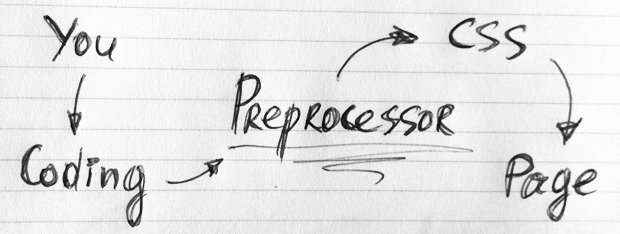
Turbo charges CSS giving it more power and flexibility
(You should still know your CSS though!)
If you can write CSS, you can write LESS.
Variables
Any CSS value can be stored as a variable
// LESS some variables

//= Directories
@assets-dir = "assets/";
@font-dir = "@{assets-dir}fonts/";

//= Fonts
@font-family-sans-serif: "SourceSansPro","Helvetica Neue",Helvetica,Arial,sans-serif;

@base-font-size: 14px; // base  font size for all elements

//= Header
@header-position: fixed; // we could set this to absolute?
@header-height: 49px; // seems a happy size and fits well, could rethink for mobile?

//= Icon font
@icon-font-path: "@{font-dir}/glyphicons/";

//= Colours
@brand-primary: #12a3da; // the generic brand colour

//= Headings
@main-heading-colour: @brand-primary;
Mixins (functions)
Allows you to write re-usable chunks of CSS
// LESS some variables

// Transformations
.scale(@ratio) {
  -webkit-transform: scale(@ratio);
      -ms-transform: scale(@ratio); // IE9 only
       -o-transform: scale(@ratio);
          transform: scale(@ratio);
}

// Button sizes
.button-size(@padding-vertical; @padding-horizontal; @font-size; @line-height; @border-radius) {
  padding: @padding-vertical @padding-horizontal;
  font-size: @font-size;
  line-height: @line-height;
  border-radius: @border-radius;

  .show-pointer(); // can call functions in functions
}

// Make hand cursor appear when mouse rolls over
.show-pointer (){
    cursor: pointer;
}
Mixins (functions)
In your main LESS file Mixins can be called to output CSS
// LESS main file

.advert {
    color: @advert-color;
    .scale( @advert-scale );
}

.advert-btn {
    .btn( @advert-btn-padding-y,
          @advert-btn-padding-x,
          @advert-btn-font-size,
          @advert-btn-line-height,
          @advert-btn-border-radius );
}
// CSS output from main LESS file

.advert {
    color: blue;
    -webkit-transform: scale(2,2);
      -ms-transform: scale(2,2);
       -o-transform: scale(2,2);
          transform: scale(2,2);
}

.advert-btn {
    padding: 10px 10px;
    font-size: 15px;
    line-height: normal;
    border-radius: 5px;
    cursor: pointer;
}
// LESS variables
@advert-color: blue; // advert text colour
@advert-scale: 2,2; // advert scale
@advert-btn-padding-y: 10px; // top/bottom
@advert-btn-padding-x: 10px; // left/right
@advert-btn-font-size: normal;
@advert-btn-line-height: normal;
@advert-btn-border-radius: 5px;How do variable & mixins fit-in?
You work in a main LESS file & import variables and mixins
Logically write your CSS in main.less
// main.less file - where the MEAT of your CSS goes

#tna-MainTabs { // CSS Main tabs in T&A and EoW modal
  border-bottom: 1px solid @nav-tabs-border-color;

  > li {
    float: left;
    // Make the list-items overlay the bottom border
    margin-bottom: -1px;
	.SmallCapitalise();
    > a {    // Actual tabs (as links)
      border-radius: @border-radius-base @border-radius-base 0 0;
      &:hover {
        border-color: @nav-tabs-link-hover-border-color @nav-tabs-link-hover-border-color @nav-tabs-border-color;
      }

      > .glyphicon {
	display: block;
	font-size: 20px;
	margin-bottom: 7px;
      }
    }
    // Active state, and its :hover to override normal :hover
    &.active > a {
      &,
      &:hover,
      &:focus {
        color: @brand-primary;
        border-bottom-color: @brand-primary;
        cursor: default;
      }
    }
  }
}
Nesting groups elements. Powerful "&" character
Let's take a look at an example site built with
How did we benefit from using LESS
for Test & Assess?
Just 2 hours dev time to create primary version
Compilers:
GUI & Task runners
PC
Mac
Cross-platform
Use a task runer such as Grunt to compile LESS
What about SASS?

Very similar to LESS. Some say more powerful.
Worth keeping an eye on.
Powerful features
Extensions, Loops, Guards, Parent selectors
Like CSS, LESS is evolving. Be sure to check out:

Why using LESS gets the
- once setup, simply changing one variable can make big changes across a project
- maintenance is MUCH easier
- nesting selectors makes CSS more readable
- retro fitting to non-less projects is very simple
- mundane tasks, like browser prefixes, are automated
- compilers can run CSS checks and warn you of issues
- minified, well-written CSS is outputted
- comment to your hearts content and not worry about whitespace or increase of filesize
Handy Resources
Reference
Playgrounds
Collaborate
Learn
This presentation was created with