Visual Hierarchy
Influences how users determine relationships and important of content
Size
Color (HSV)
Contrast
Proximity/Unity
Space
Repetition
Texture
Visual Hierarchy
Title Text
Worf, It's better than music. It's jazz. I recommend you don't fire until you're within 40,000 kilometers.
Size
Title Text 2: Electric Boogaloo
Wait a minute - you've been declared dead. You can't give orders around here.
Title Text
Worf, It's better than music. It's jazz. I recommend you don't fire until you're within 40,000 kilometers.
Title Text 2: Electric Boogaloo
Wait a minute - you've been declared dead. You can't give orders around here.
Do
Don't
Visual Hierarchy
Perceived Weight
Size
Larger objects are generally perceived as heavier
"Heavier" elements act as an 'anchor' when scanning and can imply importance - causing smaller near by elements to appear related
Elements near the top of the top of a page or content block are heavier.
Position
The further from the center/focus of a composition, the heaver it seems
Vertical objects appear heavier than horizontal ones.
Orientation
Orient sub-sections of content blocks or components in a way that doesn't conflict with the 'anchor' object
Visual Hierarchy
Color
Can be used to evoke attitudes or perceptions
Crimson
- Authority
- Sophistication
- Ruggedness
#993333
Can create contrast or connections
between objects
Dark/richer colors have more visual weight
High contrast background colors can effect weight
Visual Hierarchy
Contrast
Created using Hue, Saturation, Value
Contrast influences weight and can influence reading/scanning patterns
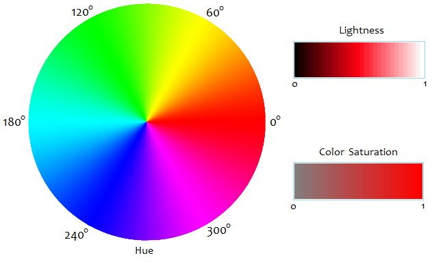
Hue - color
Saturation - how much of the color
Value - how light or dark
Visual Hierarchy
Contrast & Color
Do
Content section 1
Content section 3
Content section 2
Contrasting hue, saturation, and values make it easier to see what's different
Visual Hierarchy
Contrast & Color
Don't
What's this even say?
Content section 1
This hurts...
Don't pair colors with similar HSV
H
S
V
240
100
100
0
100
100
Visual Hierarchy
Contrast & Colorblindness
Don't
Section 2
Content section 1
Rely on value to create contrast for safer colorblind vision
H
S
V
0
67
60
27
67
60
Section 3
Visual Hierarchy
Contrast & Colorblindness
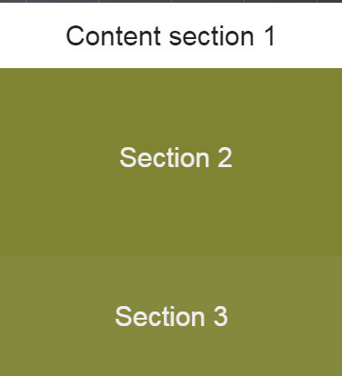
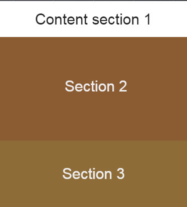
Section 2
Content section 1
Section 3
Deuteranomaly
Protanomaly
NoCoffee Vision Simulator
Chrome extension offers multiple color blindness and vision impairment simulation options.
Visual Hierarchy
Proximity & Unity
Creates relationships between elements
Visual Hierarchy
Space
Group related elements
Visual Hierarchy
Texture
Hey texture... get it... Nevermind
POWER
It's so rad.
GLOVE
Visual Hierarchy
Texture
Can effect weight and importance
The Enterprise computer system is controlled by three primary main processor cores, cross-linked with a redundant melacortz ramistat, fourteen kiloquad interface modules. We finished our first sensor sweep of the neutral zone. I think you've let your personal feelings cloud your judgement. Your shields were failing, sir. Sorry, Data. Maybe we better talk out here; the observation lounge has turned into a swamp. The unexpected is our normal routine. and attack the Romulans. You did exactly what you had to do. You considered all your options, you tried every alternative and then you made the hard choice.
Visual Hierarchy
Repetition
Creates consistency and can be used to imply meaning
Reading Patterns
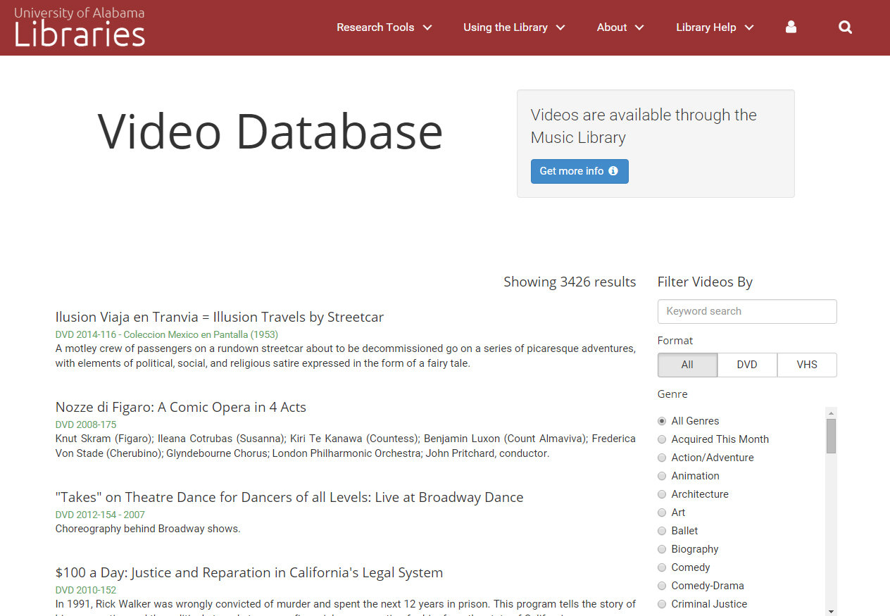

Users tend to scan in an "F" or "Z" pattern
Placing important content or items along these paths can be useful
Reading Patterns
Comfort vs. speed
People read faster with text has no line breaks, but they like reading with line breaks much more.
Ensign Babyface! The look in your eyes, I recognize it. You used to have it for me. We finished our first sensor sweep of the neutral zone.
Ensign Babyface! The look in your eyes, I recognize it. You used to have it for me. We finished our first sensor sweep of the neutral zone.
Fast
Comfortable
Visual Perception
Humans recognize and determine meaning from "visual" info much faster than "verbal" info (text)
vs.
Moon
Visual Perception
Dual-Coding Theory
Paring visual and textual (verbal) stimuli makes it easier to learn and remember
The Enterprise computer system is controlled by three primary main processor cores, cross-linked with a redundant melacortz ramistat, fourteen kiloquad interface modules.
Maybe we better talk out here; the observation lounge has turned into a swamp. The unexpected is our normal routine. and attack the Romulans.
We finished our first sensor sweep of the neutral zone. I think you've let your personal feelings cloud your judgement. Your shields were failing, sir. Sorry, Data.
vs.
Visual Perception
Working Memory
Where new and already stored info meets
I takes energy to store and create meaning for new information. Building a consistent "logography" means users will only have to learn once.
Only used to imply "root" level of navigation
Only used to imply success or confirmation of an action
Only used with contact info
Only used to imply failure or denial of an action or service
Some may have loser definitions, but are only used in specific contexts and remain constant in attitude or intent
Color can help reinforce context
Gestalt Theory
"The whole is greater than the sum of its parts"
Closure

Content blocks should be seen as one object. Build good visual hierarchy to ensure this.
Hick's Law
Every additional choice will increase the time it takes someone to make a decision
Tool many links or buttons can hinder UX
Fitt's Law
The time needed to move to a target is a function of the distance to the target and the width of the target
Mr. Worf, you do remember how to fire phasers?
more
Mr. Worf, you do remember how to fire phasers?
more...
Mr. Worf, you do remember how to fire phasers?
more
vs.