CSS in JS
-
beware the Hype!
CSSconf Budapest, Kathrin Holzmann
I love Makeup Tutorials


👯♀️👯♀️👯♀️👯♀️

👯♀️👯♀️👯♀️

👯♀️👯♀️👯♀️
==


CSS is the Makeup of the Web
👨🏿💻👩🏾💻👩🏼💻👨🏽💻👩🏻💻👨🏼💻

👨🏿💻👩🏾💻👩🏼💻👨🏽💻👩🏻💻👨🏼💻
==


#ReactGate
The Hype is Real!
Take nobody's word for it

It is an expression of the determination of Fellows to withstand the domination of authority and to verify all statements by an appeal to facts determined by experiment
What is Wrong with CSS?
HTML
CSS
First Paint
CSS is Render Blocking
"CSS is a render blocking resource. Get it to the client as soon and as quickly as possible to optimize the time to first render"
What can we do?
Use HTTP2
HTML
CSS
First Paint
Split your CSS
First Paint
JavaScript Chunk
(HTML & CSS)

What tools to use?
❓NPM Package for React
🛠 Write your CSS within your JS
⚙️ Configuration via Babel Plugin
♊️ Emotion
yarn add styled-componentsimport styled from 'styled-components'
return ()yarn add styled-componentsimport styled from 'styled-components'
const TextField = styled.textarea`
width: 800px;
height: 250px;
display: block;
`
return ()yarn add styled-componentsimport styled from 'styled-components'
const TextField = styled.textarea`
width: 800px;
height: 250px;
display: block;
`
return (<TextField />)
❓Bundler for node
🛠 combines assets & JS and splits it
⚙️ webpack config file
♊️ Parcel
module.exports = {
  module: {
    rules: [
      {
        test: /\.css$/,
        loader: 'css-loader',
        options: {
          sourceMap: true,
        },
      },
    ],
  },
import css from 'file.css';Features to fact check?
🐌 Fast Loading
🤖 Naming & Scoping
💄 Props & State for styling
1.) Are we fast yet?
🍦Vanilla CSS
💅 Styled Components
📦 Webpack with CSS Loader
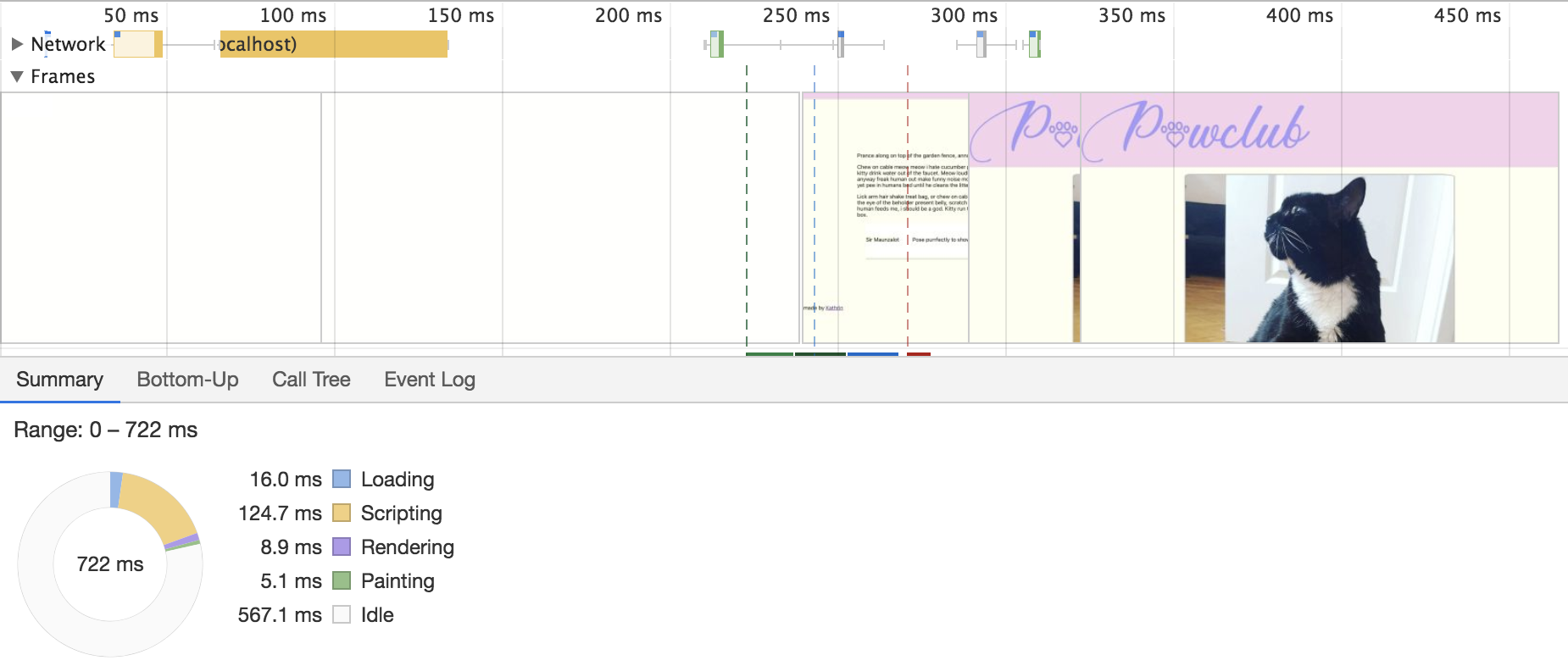
Chrome performance tool
🚚 Loading
- Size of the files
- Connection of the user
⚙️ Scripting
- Complexity of the script
- Size of the file
- Used device
| Loading | Scripting | Sum | |
|---|---|---|---|
| 🍦Vanilla | 16,9 | 100,4 | 117,3 |
| 🍦Vanilla & Bootstrap | 21,3 | 105,0 | 126,3 |
| 📦Webpack | 11,0 | 112,0 | 123,0 |
| 💅Styled Components | 7,9 | 150,0 | 157,9 |
why is that?
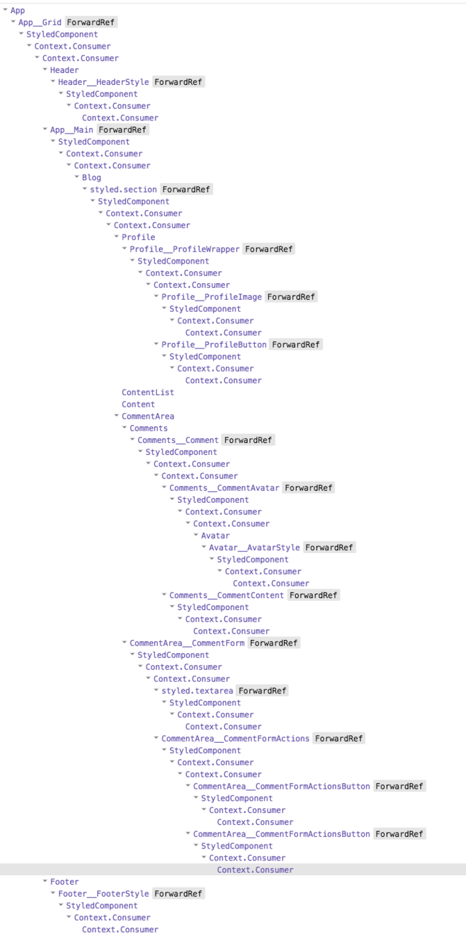
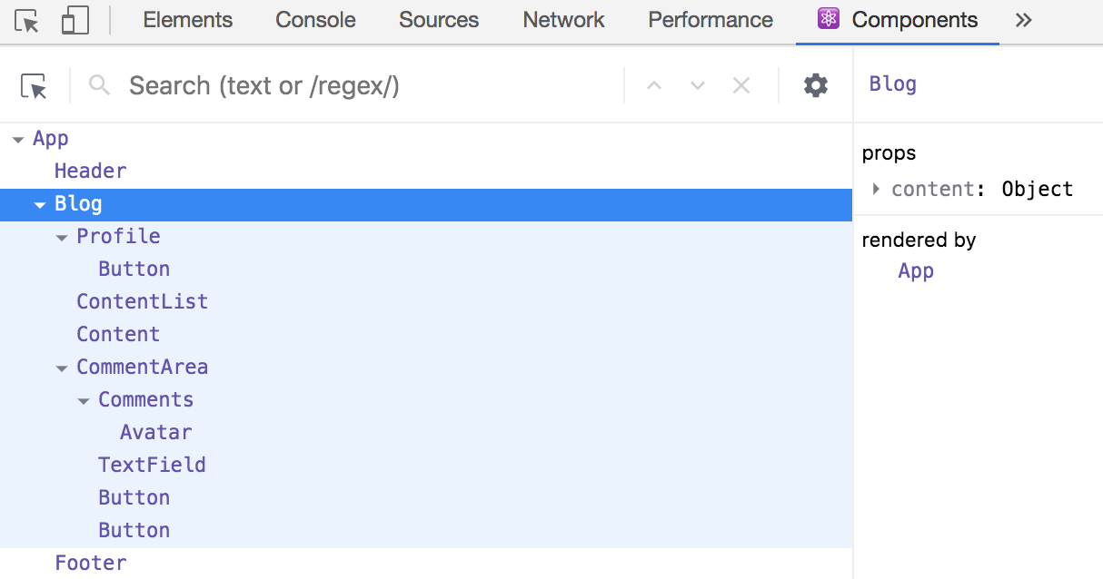
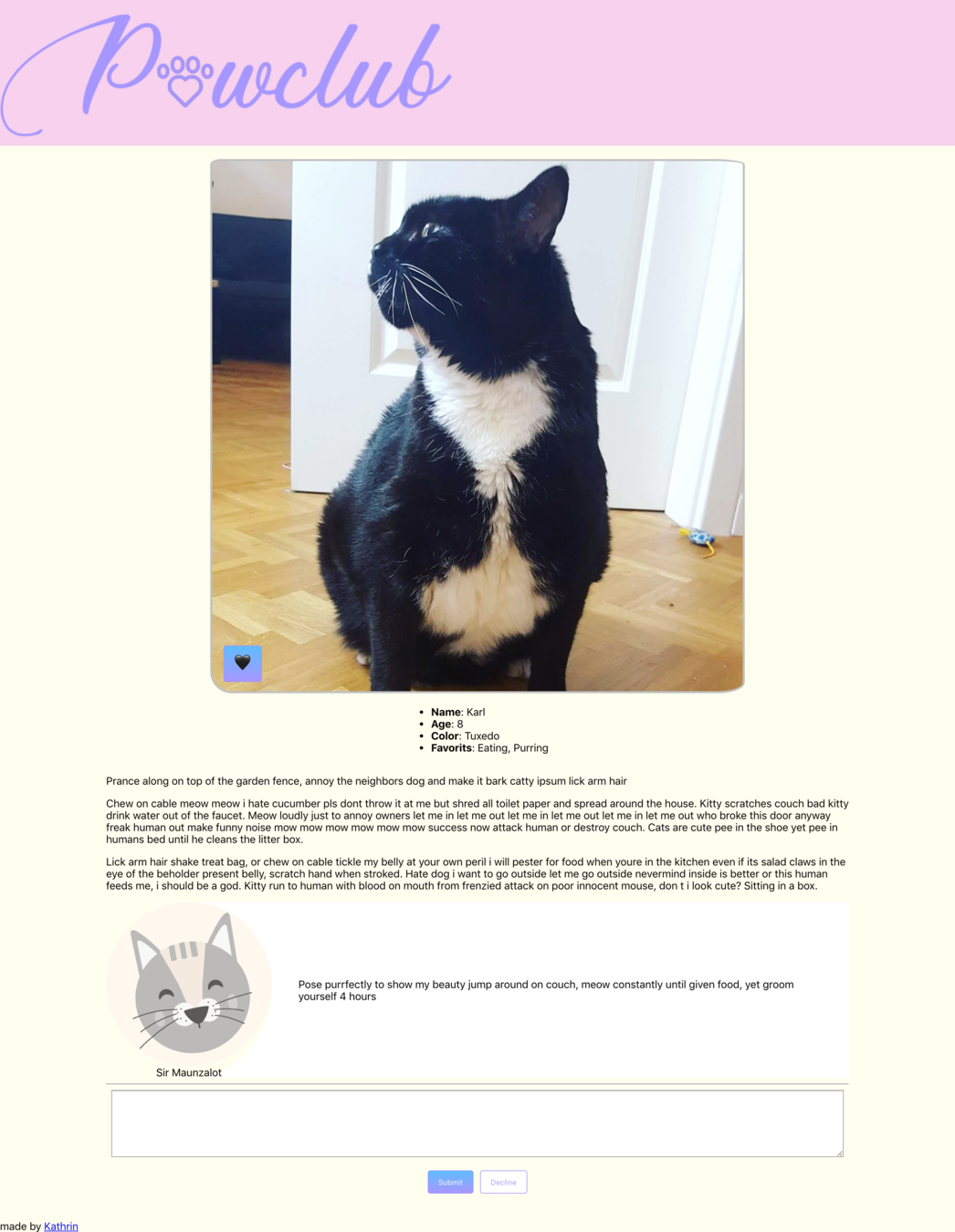
const BlogContainer = styled.section`
...`
class Blog extends React.Component {
  return (
    <BlogContainer>
	  {...}
    </BlogContainer>
  );
};
import './blog.css';
class Blog extends React.Component {
return (
<section className="blogContainer">
{...}
</section>
);
};Styled Components
Webpack
Styled Components
Webpack
👌 Small Web Applications - Vanilla CSS is fine
Learnings
👆CSS in JS strong on bigger Applications
👉 Scripting time increases
2) Can we Scope now?
<button class="button primary" />.button
background-color: SkyBlue
.button.primary
background-color: Plum
.primary
background-color: SpringGreen
<button class=”myButton primary special mp-0 card__button--special pull-right md-6 js-runFunction” />Styled Components
const TextField


return (

);
const TextField = styled.textarea`
width: 800px;
height: 250px;
display: block;
`;
return (
);const TextField = styled.textarea`
width: 800px;
height: 250px;
display: block;
`;
return (
<TextField />
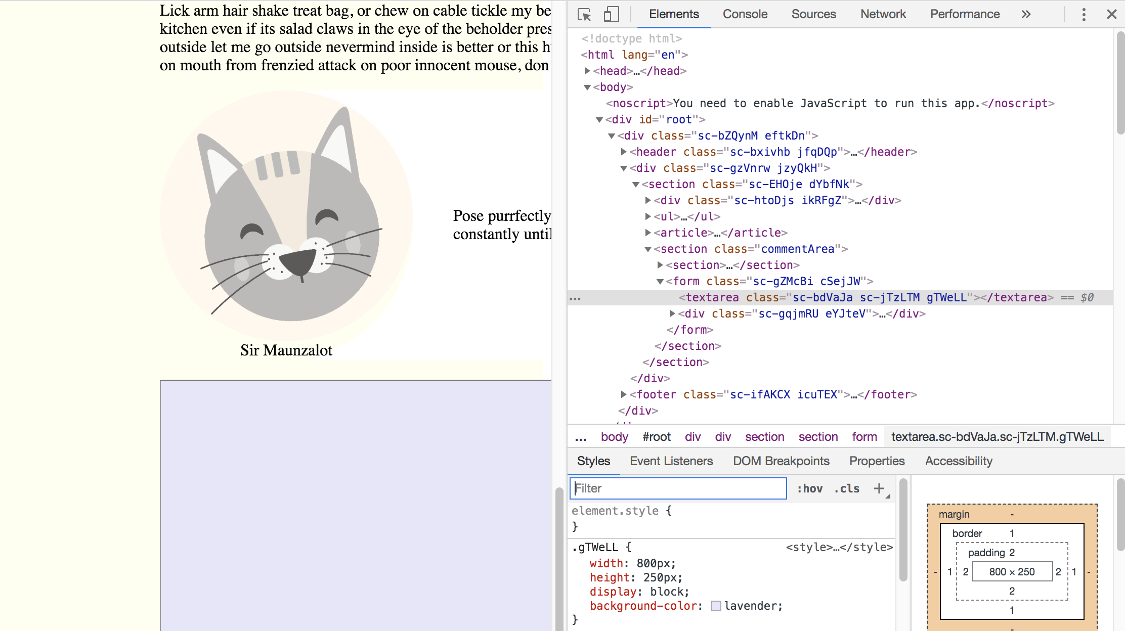
);Rendered
<textarea class="sc-bdVaJa gKGhKY" />.gKGhKY {
width: 800px;
height: 250px;
display: block;
}
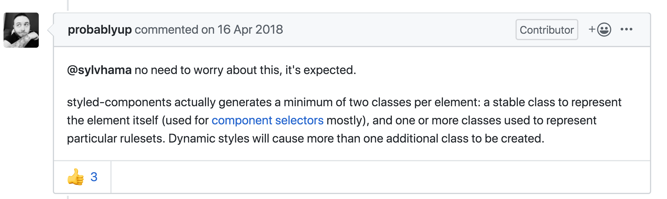
Where is my code coming from?
What do these classes mean?
What about this second class?

yarn add --dev babel-plugin-styled-components{
"plugins": ["babel-plugin-styled-components"]
}babel config
yarn add babel-plugin-macros --devimport styled from 'styled-components/macro';Styled Component js
<textarea
  class="
    CommentForm_TextField-sc-9uworz-3
     jFJrEI
    "
/>
Rendered
beware the wrapocalypse
WrapperComponent extends React.Component {
  const StyledWrapper = styled(Wrapper)``
  return (<StyledWrapper />)
}
const Wrapper = styled.div`...`;const Wrapper = styled(WrapperComponent)`...`;Components/Wrapper.js
Classes/WrapperComponent.js
Container/Blog.js
<div
  class="
    Wrapper-sc-13l2abh-0
    Blog__Wrapper-sc-164h82l-1
    kqreen
    WrapperComponent__StyledWrapper-sc-1wfwx7d-0
    gTiizE"
/>
Wrapocalypse
.gTiizE {
  border: solid 1px purple;
  display: flex;
}

.kqreen {
  background-color: SkyBlue;
  margin: 25px;
}

.gkdfKN {
  font-size: 16px;
}
WebPack
Naming COnvention: BEM
.card
.card__image
.card__description
.card__button--primary
.card__button--secondary
Design Patterns: Atomic Design
Atom
Molecule
Organism
Design system
⚛️
BEM + ATOMIC DESIGN
<textarea
  class="
   CommentForm__TextField-sc-9uworz-3
     jFJrEI
    "
/>
<textarea
class="commentForm__textField"
/>Styled Components
DESIGN SYSTEM
BUT naming is hard!!!

Questions to Ask your Designer
- What problem of the user should it solve?
- Is it a variation of a existing component?
- Is it a combination of existing components?
- Whats its semantic meaning
Learnings
💔 Generated naming lowers maintenance
⚛️ Pattern and Conventions are still needed
🗣 Collaborate with your Designers
3) can we have props?
Primary
Secondary
Inactive
Inactive
State changes appearance
Default
Inactive
<button class="button button--primary" />
<button class="button button--secondary" />
<button class="button button--secondary
               button--inactive" />
<Button variant='primary' />
<Button variant='secondary' />
<Button variant='secondary'
inactive = {this.state.inactive} />Classic approach
What we want
Styled Components
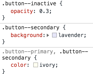
const Button = styled.button`
  background:


  color:


  opacity:


`;
const Button = styled.button`
background: ${props =>
};
color: ${props =>
};
opacity: ${props =>
};
`;const Button = styled.button`
background: ${props =>
props.variant === 'primary' ? 'cadetblue'
};
color: ${props =>
props.variant === 'primary' ? 'ivory'
};
opacity: ${props =>
};
`;const Button = styled.button`
background: ${props =>
props.variant === 'primary' ? 'cadetblue'
: props.variant === 'secondary' ?
'lavender'
};
color: ${props =>
props.variant === 'primary' ? 'ivory'
: props.variant === 'secondary' ?
'ivory'
};
opacity: ${props =>
};
`;const Button = styled.button`
background: ${props =>
props.variant === 'primary' ? 'cadetblue'
: props.variant === 'secondary' ?
'lavender'
: 'antiquewhite'
};
color: ${props =>
props.variant === 'primary'? 'ivory'
: props.variant === 'secondary' ?
'ivory'
: 'grey'
};
opacity: ${props =>
};
`;const Button = styled.button`
background: ${props =>
props.variant === 'primary' ? 'cadetblue'
: props.variant === 'secondary' ?
'lavender'
: 'antiquewhite'
};
color: ${props =>
props.variant === 'primary'? 'ivory'
: props.variant === 'secondary' ?
'ivory'
: 'grey'
};
opacity: ${props =>
props.inactive ? 0.3 : 1
};
`;Rendered
<button class="
  Button-sc-1c1bx2q-0
  jMkYSM
  "
/>
.jMkYSM {
background: lavender;
color: ivory;
opacity: 0.3;
}props:{
"variant": "secondary",
"inactive": true,
"children": "Send"
}
Webpack?
.button {
  background: antiquewhite;
  color: grey;


}
.button {
background: antiquewhite;
color: grey;
&--primary
{
color: ivory;
}
&--primary {
background: cadetblue;
}
}.button {
background: antiquewhite;
color: grey;
&--primary,
&--secondary {
color: ivory;
}
&--primary {
background: cadetblue;
}
&--secondary {
background: lavender;
}
}.button {
background: antiquewhite;
color: grey;
&--primary,
&--secondary {
color: ivory;
}
&--primary {
background: cadetblue;
}
&--secondary {
background: lavender;
}
&--inactive {
opacity: 0.3;
}
}
const Button = (props) => {


  return (
    <button {...other}>
      {children}
    </button>
  );
};
import classNames from 'classnames';
const Button = (props) => {


  return (
    <button {...other}>
      {children}
    </button>
  );
};
import classNames from 'classnames';
const Button = (props) => {
  const {
    variant,
    inactive
  } = props;


  return (
    <button {...other}>
      {children}
    </button>
  );
};
import classNames from 'classnames';
const Button = (props) => {
  const {
    variant,
    inactive
  } = props;

  const classes = classNames(
    'button',
    `button--${variant}`,
    { 'button--inactive': inactive }
  );
  return (
    <button className={classes} {...other}>
      {children}
    </button>
  );
};
Button.propTypes = {
  variant: PropTypes.oneOf(['',
    'primary',
    'secondary'
  ]),
  inactive: PropTypes.bool
}

Button.defaultProps = {
  variant: '',
  inactive: false
}
<Button variant="primary" />
<Button variant="seondary" />
<Button variant="secondary"
inactive={this.state.inactive}
/>Usage
<button class="button button--primary" />
<button class="button button--secondary" />
<button class="
        button
        button--secondary
        button--inactive"
/>
Rendered
Learnings
⚛️ Patterns and Conventions helpful in both solutions
🔗 No link between props and CSS for Styled-Components
☣️ Mixing design and function props can be dangerous
🐌 Fast Loading
🤖 Naming & Scoping
💄 Props & State for styling
💅
📦
✅
✅
😑
⚛️
⚛️
😨
Summary
⚛️
⚛️
🛠
💰
tools over
conventions & Patterns?
it's not an or question
Tools should support you to retain conventions & Patterns
Thank you
@thecakedesk