The Styleguide
and You
HTML & CSS at Attune
Olex, Oct 2020
This Talk...
- Attune's philosophy around HTML/CSS
- Gotchas (readme overview)
- What's in the styleguide?
- How and when to add to the styleguide?
-
What's next?
Philosophy
- HTML should be terse
-
Do not mess with specificity, use it!
- Use the cascade
- Assume styles are global within an app
- CSS should be deletable
Specificity
Attune's Styleguide targets default, "unstyled" elements with broad selectors such as element selectors.
<h1>This is a headline</h1>Attune's Styleguide provides "utility" classes to override some defaults, mainly for typography.
<h1 class="h3">This is a headline</h1>This looks like an h3, as classes are more specific
Specificity
Some looks require more than the bare html, e.g. to distinguish a label that wraps a checkbox, from a label above a text input. This is done via classes.
<label for="cool-beans" class="checkbox">
  <input id="cool-beans" type="checkbox">
  <span>Cool beans</span>
</label>
<label for="spill-beans">Spill the beans:</label>
<input id="spill-beans" type="text" placeholder="...">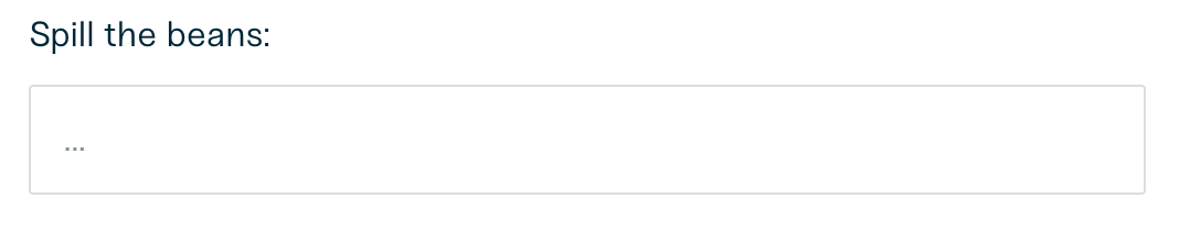

note the class="checkbox"
Specificity
Styleguide uses lower levels of specificity and classes
Application CSS should be loaded after Styleguide CSS
Application CSS should be 90% class selectors, which will always override the styleguide defaults
Modified / special-cases of components should use a second class to increase specificity
Deletable CSS
.is-active {
  border: 2px dashed orange;
  filter: contrast(120%);
}

.hab-carousel-active {
  border: 2px dashed orange;
  filter: contrast(120%);
}
A good gut-check: looking only at this selector,
do you know when it might get removed from the repo?
Modifier Syntax
/* Bad */
.coverage-info-box {
  &.hidden {
    /* ... */
  }
}

/* Good */
.coverage-info-box {
  &.coverage-info-box__hidden {
    /* ... */
  }
}
Avoid Parent Selectors
It's always better to create a novel, modified version of a component instead of relying on parents' classes
/* 2x specificity, bad */
.cool-sidebar {
  .button {
    ...
  }
}

/* 2x specificity, good */
.button {
  &.button__cool-sidebar {
    ...
  }
}
/* e.g. class="button button__cool-sidebar" */
1-class vs Modifier
/* Specificity too low */
.cool-sidebar-button {

}

/* Correct */
.button {
  &.button__cool-sidebar {
    ...
  }
}
Modifying components with existing class names should be done using modifier classes, not a novel class.
Otherwise, your novel class will be lower specificity than existing modifiers.