The History of Putting Things Side by Side
Olex Ponomarenko ~ olex.co ~ @tholex
Why?
How to parse the tips and tricks
spanning 25 years of CSS features? 🤷♀️
When struggling with the options of flexbox, it's easy to say "this is impossible and too complex"
and not appreciate the long road to acquire them
We live in a golden age of layout design 🍕
The History
- Inline – (1993-)
- Tables – (1995-)
- Tables as Layout – (1996-2006)
- Absolute / Relative / Fixed – (1997-)
- Floats – (1999-)
- Floats as Layout – (2000-2013)
- Absolute + JS – (2007-2014)
- Inline-Block – (1998-)
- Inline-Block as Layout – (2006-2013)
- Flex Layout – (2014-)
- Columns property – (2012-)
- Grid Layout – (2018-)
- Surprise * – ????
Dates based on browser support / developer sanity
* Slides in this deck
* IMO "Deprecated"
* Not in this deck
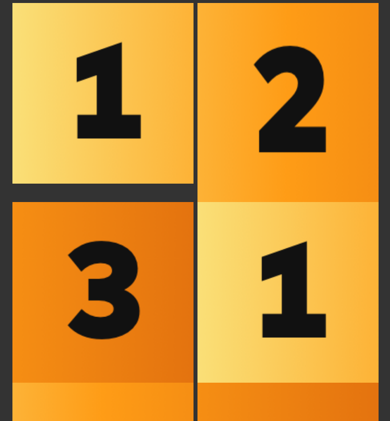
Tables as Layout (CSS 2)
<center>
  <table>
    <tbody>
      <tr>
        <td class="item"><img src="first.png"></td>
        <td class="item"><img src="second.png"></td>
        <td class="item"><img src="third.png"></td>
      </tr>
    </tbody>
  </table>
</center>
199X to ~2006
table {
  border-collapse: collapse; /* Circa 2001 */
}
Tables as Layout

Tables as Layout
A lot of HTML, no CSS
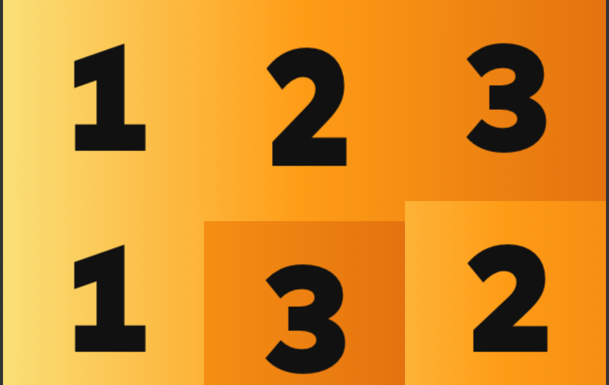
Floats
Floats
Purple box has inline content that floats around floated content that precedes it.
Width restrictions or
clear: right;
places the second orange image onto a new row
clear: right;
Floats as Layout (CSS 2)
199X to ~2015
<div class="container">
  <div class="item"><img src="first.png"></div>
  <div class="item"><img src="second.png"></div>
  <div class="item"><img src="third.png"></div>
  <div class="clearfix" />
</div>
.item {
float: left;
width: 33.333333%;
}
.clearfix {
clear: both;
}
/*
.container:after {
content: '';
display: block;
clear: both;
}
*/"Perfect"!

Uh oh...

JS + Absolute (Masonry, et. al.)
2007 to ~2014
<div class="container">
  <div class="item"><img src="first.png"></div>
  <div class="item"><img src="second.png"></div>
  <div class="item"><img src="third.png"></div>
  <div class="clearfix" />
</div>
.item {
float: left;
width: 33.333333%;
}
.clearfix {
clear: both;
}$('.container').masonry({
itemSelector: '.item',
columnWidth: 200
});Fixed!?
Text
Masonry Downsides
- One-trick pony for "cards"
- Finicky
- DOM style="" updates
- JavaScript dependency
- CSS / JS mismatches ⚠️
- Requires knowledge of both CSS and JS
Masonry Upsides
- Dynamic container, sorta responsive
- Main way to accommodate 3-4 sizes in a grid
(at the time)
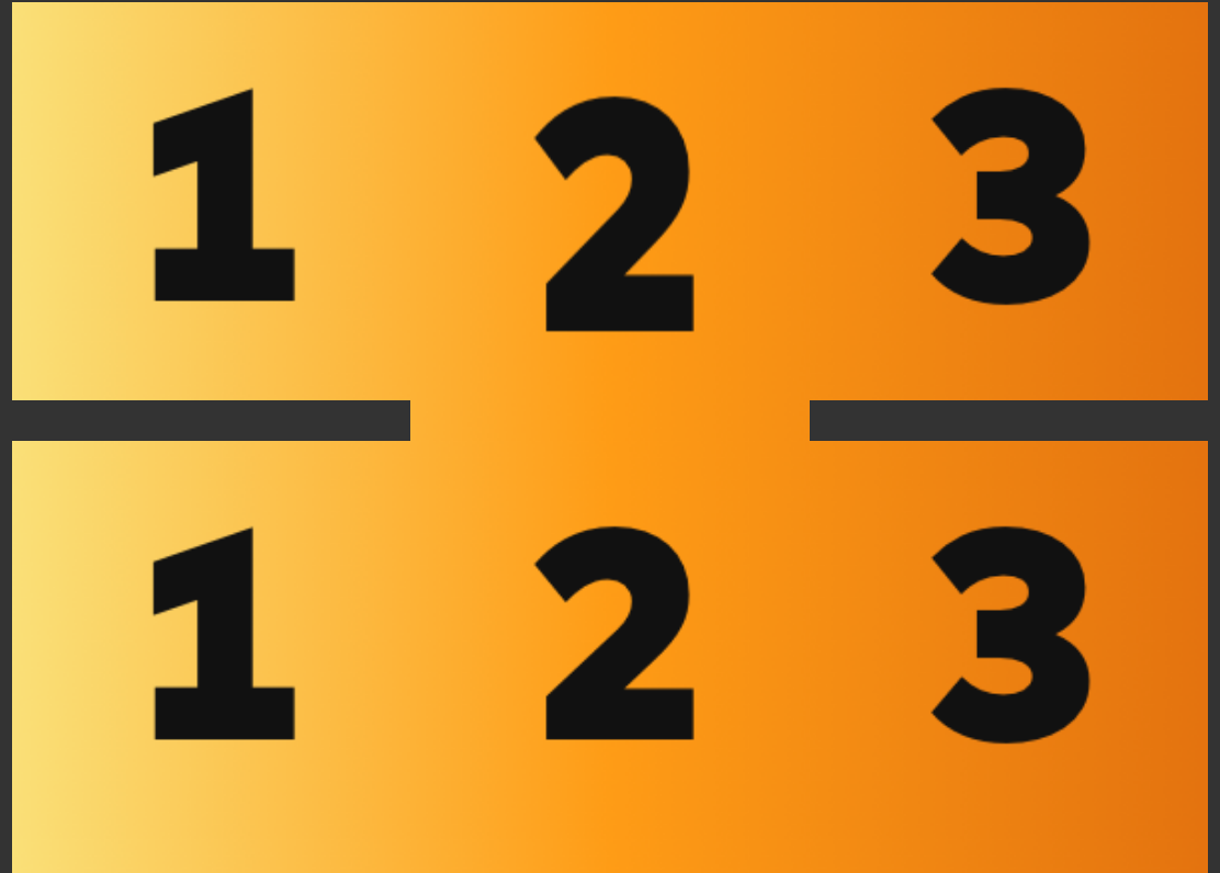
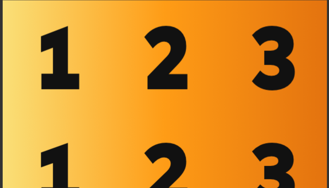
Inline Block as Layout
2006 to ~2015
.item {
  display: inline-block;
  vertical-align: top;
  width: 33.333333%;
}
.container {
  word-spacing: -0.3em;
  /* or spacing hack of your choice */
}
<div class="container">
<div class="item"><img src="first.png"></div>
<div class="item"><img src="second.png"></div>
<div class="item"><img src="third.png"></div>
</div>Great!
Inline-block spacing woes
Wait what was that -0.3em?
White space = real space with inline block siblings
.container {
  font-size: 0;
  /* REM or PX Styleguide-dependent! */
}
.container {
  word-spacing: -0.28em; /* FONT! dependent */
}
<div>...</div><div>...</div>
<!-- no space - no problem! -->Flex Layout
2014-
.container {
  display: flex;
  flex-wrap: wrap;
}
.item {
  width: 33.333333%;
  /* or flex: 1 0; */
}
<div class="container">
<div class="item"><img src="first.png"></div>
<div class="item"><img src="second.png"></div>
<div class="item"><img src="third.png"></div>
</div>"You want it, you got it!"
You want that?...
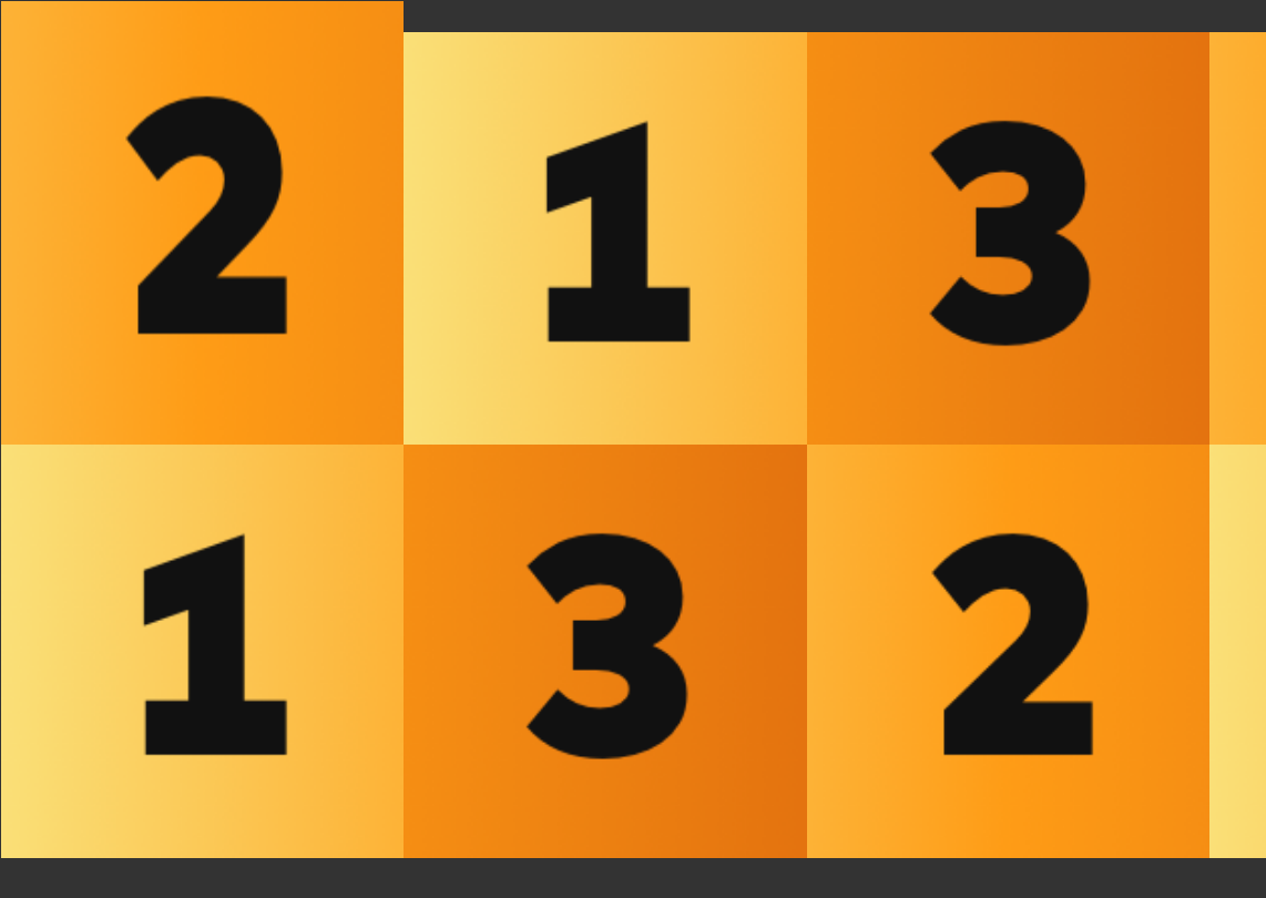
you got it!
(shoutout to inline-flex)
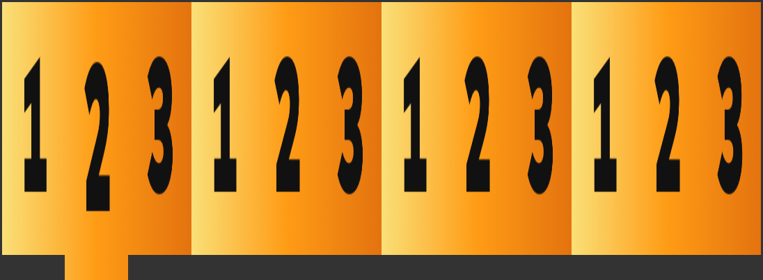
Grid Layout
.container {
  grid-template-columns: 33.33333% 33.33333% 33.33333%;
}
.item {}
2018-
Watch this space!
Columns Property
p {
  columns: 12em auto;
}
<p>Lorem ipsum...</p>2012-

Columns property is useful
... but not for page layout.
Surprise
HTML align property
(big 👎 on MDN)
https://www.w3schools.com/tags/att_div_align.asp
HTML align property
<img align="left" src="first.png">
<img align="right" src="third.png">
<table width="200" align="left">
<tbody>
<tr>
<td class="item"><img src="first.png"></td>
</tr>
</tbody>
</table>
<table width="200" align="right">
<tbody>
<tr>
<td class="item"><img src="third.png"></td>
</tr>
</tbody>
</table>HTML align property
<img align="left" src="first.png">
<img align="right" src="second.png">
<table width="200" align="left">
<tbody>
<tr>
<td class="item"><img src="first.png"></td>
</tr>
</tbody>
</table>
<table width="200" align="right">
<tbody>
<tr>
<td class="item"><img src="second.png"></td>
</tr>
</tbody>
</table>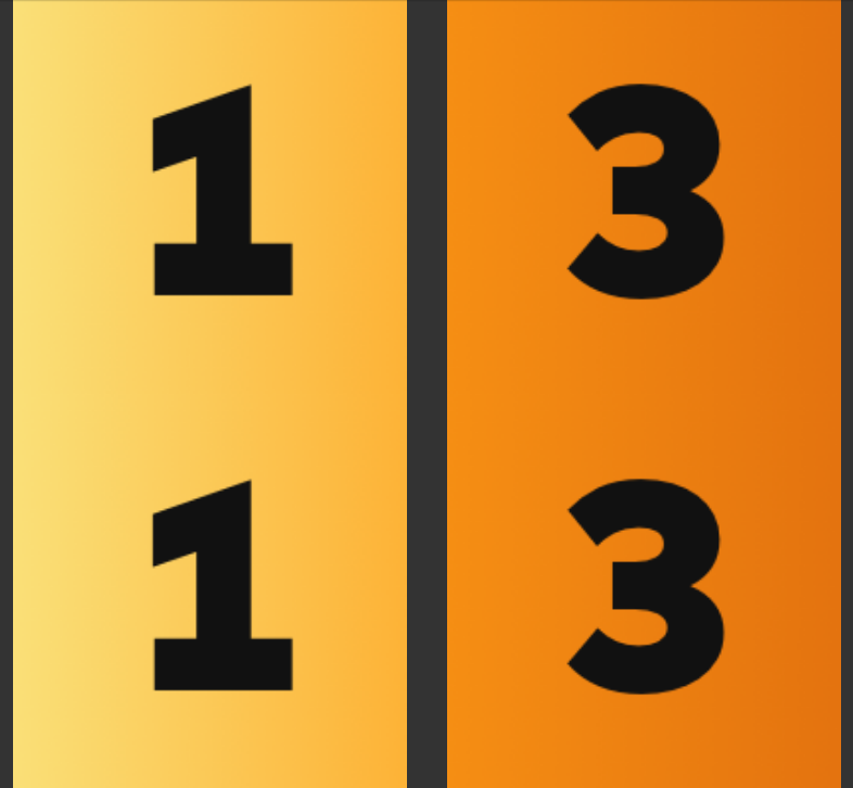
HTML align property
- Can be used for side-by-side layout
- Nothing to do with "text alignment", float!
- Doesn't get stripped out by email applications
when placed on tables
- Works in the oldest Outlook email browsers
to this day
- Behavior be overriden in modern browsers
using "float: none" and so on
The History
- Inline – (1993-)
- Tables – (1995-)
- Tables as Layout – (1999-2006)
- Absolute / Relative / Fixed – (1997-)
- Floats – (1999-)
- Floats as Layout – (2000-2013)
- Absolute + JS – (2007-2014)
- Inline-Block – (1998-)
- Inline-Block as Layout – (2006-2013)
- Flex Layout – (2014-)
- Columns property – (2012-)
- Grid Layout – (2018-)
- Table align property – (1995-)
Dates based on browser support / developer sanity
The History
Dates based on browser support / developer sanity
* The modes I'd recommend knowing the best
and second best
- Inline – (1993-)
- Tables – (1995-)
- Tables as Layout – (1996-2006)
- Absolute / Relative / Fixed – (1997-)
- Floats – (1999-)
- Floats as Layout – (2000-2013)
- Absolute + JS – (2007-2014)
- Inline-Block – (1998-)
- Inline-Block as Layout – (2006-2013)
- Flex Layout – (2014-)
- Columns property – (2012-)
- Grid Layout – (2018-)
- Table align property – (1995-)
(also display: block)
So long...
- class="clearfix"
- cellspacing, cellpadding, ...
- <img src="/spacer.gif" />
- <spacer>
- jScrollPane
- Masonry
- letter-spacing (for grid)
- word-spacing (for grid)
- font-size: 0
- align
The golden age of layout
With IE10 sunset, 2020-1-24...
flex is now supported by all browsers!
With IE11 sunset, 2025-10-14...
grid will be supported by all browsers!
(+ the other 6-7 good ways to put things side by side)
Thanks!
P.S. Firefox Dev Tools > Chrome