6.What have you learnt about technologies from the process of constructing this product?

On Indesign I used the drop shadow effect to make my contents title stand out more than the rest of the text on the page.
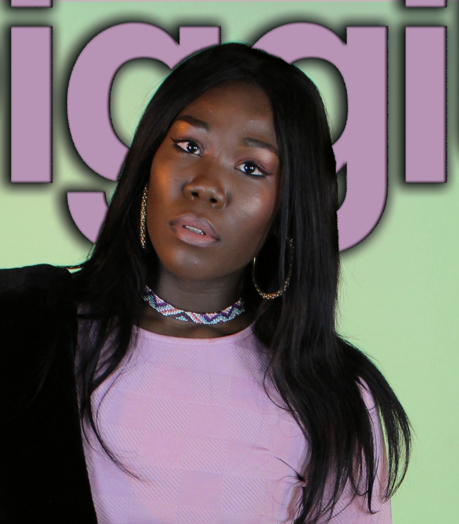
I also used a drop shadow on Photoshop when creating my FC's header. This was also to make it stand out and draw attention to it.
Also, while using photoshop I wanted to cover some of my masthead with my central image (as done in multiple other R&b magazines). In order to do this I had to have my text on a different layer to my image so that I could then use the eraser tool to rub out some of the text.
Before placing the image in place I used the mask tool to rub around the images outline and then refined the edges to pick up all of the extra hair fibres that were cut off when I cropped the picture.
On my double page spread which I crated using Indesign I used the text wrapping tool twice which just added variation to my magazine making it more appealing to the eye.
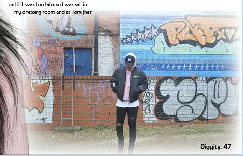
For one of my graphic images on my DPS I used the feathering tool to fade out the edges of the picture and manipulate its harshness. This made the picture blend into the background better and therefore not stand out as much which looked odd.
I also used a number of various different creative technologies to relay my research.
Each of them taught me unique ways to present information which is good because then your information doesn't get boring or repetitive.
Some technologies I used:
- Slid.es
- Prezi
- Emaze
- Voice Thread
- Google Slides
- Popplet
- Polyvore
- Spiderscribe
- Piktochart
- Survey Monkey