CSS basics
CSS
- Cascading stylesheet
- Styles the content on website
CSS with HTML
- Inside the document
- Inline styles
- Separate file
Inside the document
<!doctype html>
<html>
<head>
  <style>
    p {
      color: red;
    }
  </style>
</head>
<body>
  <p>This is my paragraph.</p>
</body>
Inline styles
<html>
  <head>
    <title>Example </title>
  </head>
  <body>
    <div style="width: 100px;">
    </div>
  </body>
</html>
Separate file
<html>
  <head>
    <title>Example </title>
    <link rel="stylesheet" href="yourcssfile.css">
  </head>
  <body>

  </body>
</html>
Everybody do it like this
CSS syntax
selector {
  property: value;
}

body {
  background-color: #000;
}
Never forget comas!
Selecting nested elements
<html>
  <head>
    <title>Example </title>
  </head>
  <body>
    <div>
      <ul>
        <li>
          <a href="#">
            <span> I am span </span>
          </a>
        </li>
      </ul>
    </div>
  </body>
</html>
ul li a span {
  display: block;
}

div span {
 text-align: center;
}
Selecting classes
<span class="black"> Span </span>.black {
color: black;
}
/* with more specificity */
span.black {
color: black;
}Selecting ids
<span id="black"> Span </span>#black {
color: black;
}
/* with more specificity */
span#black {
color: black;
}Only one ID per element
Comments
/* I am css comment :D */<html>
<head>
<title>Example </title>
</head>
<body>
<p> Paragraph </p>
<!-- I am HTML comment -->
</body>
</html>
Inheritance
- HTML nesting principle
- styles are inherited from other previous elements
Inheritance
<html>
  <head>
    <title>Example </title>
  </head>
  <body>
    <p> Paragraph </p>
  </body>
</html>
body {
  font-size: 42px;
}
All elements inside body will have font-size of 42px,
in our case that is paragraph
Example
<html>
  <head>
    <title>Example </title>
  </head>
  <body>
    <p> Paragraph </p>
  </body>
</html>
body {
font-size: 42px;
}
p {
font-size: 22px;
}Paragraph will have font-size of 22px
Combining selectors
p, h1, h2, li, a, h5 {
  font-size: 22px;
}
Selecting more elements at once and giving them the same value for same property
Cascade
p {
  text-align: center;
}

/* some other styles */


p {
  text-align: left;
}

h1 {
  color: white;
  font-family: Verdana;
  display: inline-block;
  color: black;
}
Paragraph will finally be aligned to the left
Cascading from top to bottom
Heading will be black
Element with higher specificity wins
<p class="home"> Home paragraph </p>p {
font-size: 22px;
}
.home {
font-size: 18px;
}Paragraph will have font size of 18px
Element with higher specificity wins
<p class="home"> Home paragraph </p>p.home {
color: white;
}
p {
color: black;
}
Paragraph will be white
Id always wins
<p id="home" class="home"> Home paragraph </p>#home {
color: green;
}
.home {
color: black;
}
p.home {
color: red;
}
div p.home {
color: yellow;
}
Paragraph will be green
Multiple classes
<p class="home myHome"> Home paragraph </p>/* stronger than .home selector */
.home.myHome {
color: green;
}
.home {
color: black;
}
/* stronger than .home.myHome selector */
p.home {
color: red;
}
Paragraph will be red
Box model
- Every HTML element is a rectangular box
- Default value of every block element is block
- Default value of every inline element is inline
Block vs inline vs inline-block elements
- Block elements force a line break and respect margins and padding
- Inline elements can not have width and height set, allow other elements to be to their left or right
- Inline-block elements allow other elements to be to their left or right and you can specify them width and height
Block vs inline vs inline-block elements
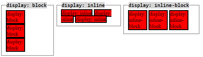
Source: (http://dustwell.com/div-span-inline-block.html)
https://jsfiddle.net/tonkec/8o9bs6ne/
Box model
- It may have: width, height, padding, border, margin
- The total size of the element is the sum
Box model
- Total width of element = margin-left + border-left + padding-left + width + padding-right + border-right + margin-right
- Total height of the element = margin-top + border-top + padding-top + height + padding-bottom + border-bottom + margin-bottom
Width
<div class="box">
  some content
</div>
.box {
width: 200px;
margin: 20px;
border: 2px solid black;
padding: 20px;
}Width of the box will be the sum of width, margin, padding and border = 244px
Height
<div class="box">
  some content
</div>
.box {
height: 200px;
margin: 20px;
border: 2px solid black;
padding: 20px;
}Height of the box will be the sum of width, margin, padding and border = 244px
Border-box
<div class="box">
  some content
</div>
.box {
height: 200px;
width: 200px;
margin: 20px;
border: 2px solid black;
padding: 20px;
box-sizing: border-box;
/* default value is content-box */
}Height and the width of the box will be 200px
Positioning
<div class="box">
  some content
</div>
.box {
/* default value for every element */
position: static;
}
Every HTML element is positioned static by default
Static positioning
<div class="box">
  some content
</div>
.box {
/* default value for every element */
position: static;
}
Element is not positioned in any special way.
Static positioning
<div class="static box">
    <div class="static2 box">

    </div>
</div>
<div class="box static3">

</div>
.box {
width: 100px;
height: 100px;
position: static;
}
.static {
background: yellow;
}
.static2 {
background: green;
margin-left: 50px;
}
.static3 {
background: red;
}
https://jsfiddle.net/tonkec/1gzrokdg/
Elements sit on top of each other
Relative positioning
<div class="box">
  some content
</div>
.box {
position: relative;
}
Relative position is like static position, no special positioning unless you give an element special properties
Elements sit on top of each other
Relative positioning
<div class="box" id="box1">
  some content
</div>

<div class="box" id="box2">
 some content
</div>
.box {
width: 100px;
height: 100px;
position: relative;
}
#box1 {
background-color: green;
border: 1px solid #000;
}
#box2 {
/*UNCOMMENT ME
top: -40px;
left: 100px;*/
background-color: yellow;
}https://jsfiddle.net/tonkec/gzk6t19d/
Absolute positioning
<div class="box">
  some content
</div>
.box {
position: absolute;
}
- Takes the element out of the flow of the document
- Elements do not seat on top of each other
- Element is not connected to any element except the document itself
- He can go wherever he wants to
Absolute positioning
<div class="box">
  some content
</div>
.box {
position: absolute;
background: #000;
border: 1px solid #ccc;
width: 100px;
height: 100px;
top: 200px;
left: 200px;
}
https://jsfiddle.net/tonkec/pbs8v7kj/
Relative and absolute
<div class="relative box">
    <div class="absolute box">

    </div>
</div>
box {
border: 1px solid #ccc;
width: 100px;
height: 100px;
}
.relative {
position: relative;
}
.absolute {
background: yellow;
top: 50px;
position: absolute;
left: 100px;
}
https://jsfiddle.net/tonkec/zw90d8yk/
Absolute and relative
<div class="absolute box">
    <div class="relative box">

    </div>
</div>
.box {
border: 1px solid #ccc;
width: 100px;
height: 100px;
}
.absolute {
background: #000;
position: absolute;
}
.relative {
background: #aaa;
left: 300px;
top: 100px;
position: relative;
}
https://jsfiddle.net/tonkec/xaso1gvh/
- Absolute is untouchable
- Can't touch this :D
Absolute and absolute
<div class="absolute box">
    <div class="absolute2 box">

    </div>
</div>
.box {
border: 1px solid #ccc;
width: 100px;
height: 100px;
}
.absolute {
background: #000;
position: absolute;
}
.absolute2 {
background: #aaa;
left: 300px;
top: 100px;
position: absolute;
}https://jsfiddle.net/tonkec/htazfgrz/
- Absolute elements don't affect each other
- Can't touch this :D
Fixed positioning
<div class="box">
  some content
</div>
.box {
position: fixed;
}
- Positioned relative to the viewport
- Stays always on the same position
Fixed positioning
<div class="main">
    <div class="fixed"></div>
    <div class="text">
        Lorem ipsum dolor sit amet, consectetur adipisicing elit. Accusantium numquam repellat neque nostrum rerum iste delectus molestiae cum eveniet optio consequuntur veritatis quae omnis! Reprehenderit itaque dignissimos consequuntur velit repellat a recusandae rem culpa! Doloribus neque quae consequuntur fugiat eveniet porro voluptatum ipsum expedita consectetur quis quam aliquid rem culpa.
    </div>
     <div class="text">
        Lorem ipsum dolor sit amet, consectetur adipisicing elit. Accusantium numquam repellat neque nostrum rerum iste delectus molestiae cum eveniet optio consequuntur veritatis quae omnis! Reprehenderit itaque dignissimos consequuntur velit repellat a recusandae rem culpa! Doloribus neque quae consequuntur fugiat eveniet porro voluptatum ipsum expedita consectetur quis quam aliquid rem culpa.
    </div>
    <div class="text">
        Lorem ipsum dolor sit amet, consectetur adipisicing elit. Accusantium numquam repellat neque nostrum rerum iste delectus molestiae cum eveniet optio consequuntur veritatis quae omnis! Reprehenderit itaque dignissimos consequuntur velit repellat a recusandae rem culpa! Doloribus neque quae consequuntur fugiat eveniet porro voluptatum ipsum expedita consectetur quis quam aliquid rem culpa.
    </div>
</div>
html,body {
height: 100%;
padding: 0;
margin: 0;
}
.main {
height: 1000px;
background: #ccc;
}
.fixed {
position: fixed;
background: #000;
width: 100%;
height: 50px;
margin-top: 40px;
}https://jsfiddle.net/tonkec/pr0bnwkd/
Floats
- Floats take an element out of the flow of the document
- Pulls the element to the left or to the right
Floats
<header>
    I am header
</header>

<aside class="left">
    Left
</aside>

<aside class="right">
    Right

</aside>
header {
background: #26A65B;
height: 50px;
color: #fff;
text-align: center;
font-size: 22px;
}
aside {
width: 50%;
height: 100px;
}
.left {
float: left;
background: #81CFE0;
}
.right {
float: right;
background: #3498DB;
}https://jsfiddle.net/tonkec/6Ljf4npu/
Layout is very important for CSS
Muy importante
Sehr wichtig
очень важный
très important
jako važan
More about layout here:
http://learnlayout.com/
...and here:
http://learn.shayhowe.com/html-css/positioning-content/
Learn it!
Read it!
Build it! :P
Some cool css stuff
Pure CSS animations:
- http://codepen.io/jonitrythall/pen/kzcnC
- http://codepen.io/DawidKrajewski/pen/GgErVO
- http://codepen.io/WithAnEs/pen/Fxzei
- http://codepen.io/mgitch/pen/pECcD
- http://codepen.io/mariosmaselli/pen/ghmwq
- http://codepen.io/judag/pen/zxKVQR
- http://codepen.io/CharlesSmart/pen/gbdaOa
- http://codepen.io/yy/pen/YPjEZw
- http://codepen.io/thisisroger/pen/mskhL
Some cool css stuff
CSS puns:
- http://saijogeorge.com/css-puns/
Danger: very funny :D
Let us start building our page!
Weeeeee :D
Open your code editors
Thank you for you patience
If you have any questions while learning, please don't hesitate to contact me. I'll be glad to answer your questions. I mean it :)