Flexbox
Made by Antonija with
What?
- Flexible Box Layout
- CSS3 layout mode
How?
- container always has display:flex
- at least container is set to flex
Why?
- floats are messy
- clearfixes </3
- masonry layout :(
- (grid showed up after flexbox)


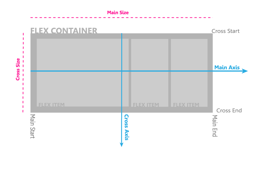
Flex axes
.flexContainer {
    display: flex;
}
Initialisation
Flex directions
.flexContainer{
   display:flex;
   flex-direction: row;
}
row/column
Flex children
.flexContainer {
   display: flex;
}

.flexChild {
  flex-grow: 1;
}flex-grow: number
flex-grow defines how much will a child item grow relative to other children in the flex container
Flex children
.flexContainer {
   display: flex;
   width: 300px;
}

.flexChild {
  flex-shrink: 3;
}flex-shrink: number
flex-shrink defines how much will a child item shrink relative to other children in the flex container
Flex children
.flexContainer {
   display: flex;
   width: 300px;
}

.flexChild {
  flex-basis: 200px;
}flex-basis: number
flex-basis defines the initial size of the flex item
Flex children
.flexContainer {
   display: flex;
   width: 300px;
}

.flexChild {
  flex: 0 1 50px;
}
flex: flex-grow / flex-shrink / flex-basis
sets flex-grow, flex-shrink, and flex-basis all at once
Flex alignment
.flexContainer {
   display: flex;
   flex-direction: row;
   justify-content: center;
}justify-content: flex-start / flex-end / center / space-between / space-around
justify-content aligns all the children items along the x-axis.
Flex alignment
.flexContainer {
   display: flex;
   flex-direction: row;
   align-items: center;
}align-items: flex-start / flex-end / baseline / center / stretch
align-items aligns all the children items along the y-axis.
Flex children
.flexContainer {
   display: flex;
   flex-direction: row;
   align-items: center;
}

.flexChild {
  align-self: flex-end;
}align-self: auto / flex-start / flex-end / baseline / center / stretch
align-self aligns individual flexbox item/child