In what ways does your music magazine use, develop, or challenge forms and conventions of real music magazines?
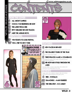
Contents Page

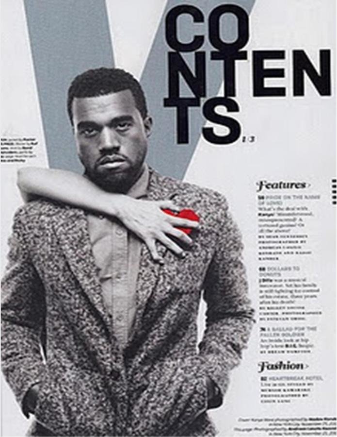
This is my final contents page, I used the two real contents pages to the right as inspiration.
Magazine use
Own use

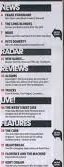


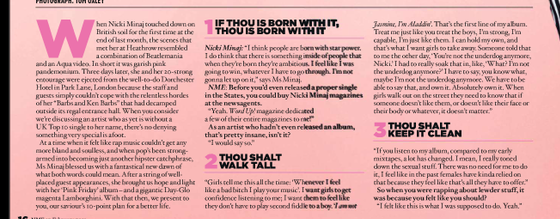
Magazines align text in columns so that it is read in order - I have also done this. In addition I've used page numbers and section headers.
Hip-hop magazines generally stick to a minimalist colour scheme, which have a pop of colour - I have done this as well to attract the reader.
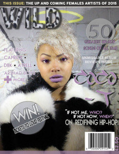
The title of the magazine is displayed in the top left corner of the page.
I've also included a subscribers box, which will further entice readers in hopes they will want to buy copies of the magazine if they are on offer.
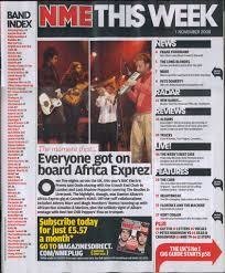
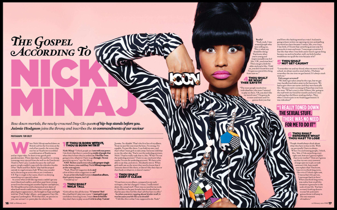
Front Cover
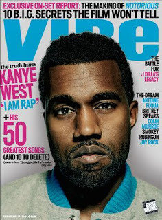
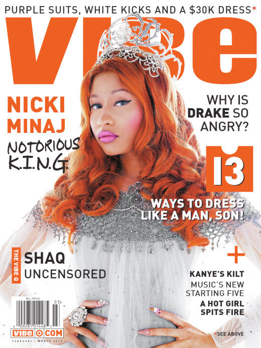
I used these two front covers as inspiration for my own magazine front cover.


Own use
Magazine use
Like the Hip hop magazines I used for inspiration, I included a skyline with key information to entice the audience.
They also feature a countdown of some sort, with the number being separate from the rest of the information. This is eye catching to the audience.
I also arranged the artists in a similar layout, down the side. I also used the plus symbol which adds some more interest to the cover.
How I challenged these conventions through out my magazine

My masthead is aligned left unlike the other Hip hop magazines I used, whereas there's were in the middle and behind the central image.
My colour scheme isn't as bold and garish as other Hip-hop magazines. I used slightly more pastel like colours which are more feminine in order to attract the female audience.
I featured a competition on the cover in hopes of drawing in more people by having this offer.
I've used a shape to add a 'wild' feel which isn't common within Hip-Hop magazines.

It's unconventional for the central image to not be contained in one page - so I have challenged this.
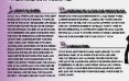
This is my final DPS, and I used the Nicki Minaj DPS for inspiration.
Double Page Spread
Magazine Use
Own Use
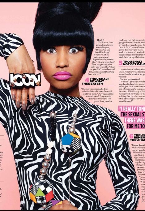
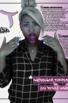

Like the Double page spread I used for inspiration, the central image is placed in the middle of the page - this creates a captivating image to the audience.
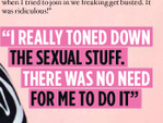
I've also used a pull quote - which draws in the audience as they have an idea of what the text will be about.
Finally, I have arranged the article in a similar way with columns and numbers and headers.