Music Magazine Analysis
Front Covers
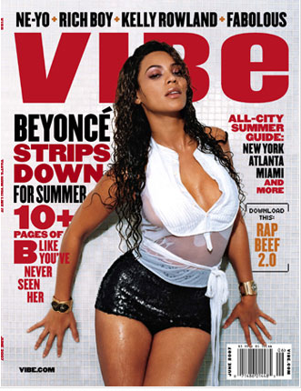
Aimed at older people - due to the sexualisation of Beyonce. Probably aimed
speciffically at men as well due to this.
Aimed at fans of Hip-hop/RnB, as there are artists such as Ne-yo ect.
Beyonce's being represented
in a sexual way. Looking down at the
camera seductively, with a parted mouth which adds to the look which the magazine is aiming for.
Image infront of the mast head, meaning Beyonce is most important - which I like and may use in my magazine.
Bright red and black together, creatures a mature look which pops over the grey background. The magazines house style uses colours I may use on my own magazine.
Red has connotations of lust which the magazine is trying to evoke with the images of Beyonce 'stripping down'.
Front Covers
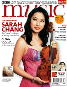
Serif styled font on the mast head which adds formality, links with the classical brand. I wouldn't like to use this font as it creates formality and wouldn't suit the genre of music my magazine will cover.
Central image of woman smiling, holding a violin - connotations of formality
Language used in the plugs is about classical music - artists ect - would attract the target audience.
Aimed at an older audience, of all genders who enjoy classical music. As woman is smiling, holding a violin and looks conservative.
White background, is very safe and doesn't clash with the black and red typography.
BBC's a big company, and the magazine is the best selling classical magazine, which means the content such as 'Sarah Chang on the insane challenges of playing' would be ideal for the audience.
Front Covers
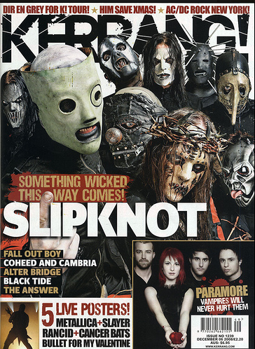
Aimed at an audience of rock fans, - central image is of Slipknot looking scary and agressive due to the masks - fits in with the genre and stereotypes of rock.
Dark colours, links to the rock/heavy metal music.
Mast head lettering has a cracked effect, links to theme of destruction and danger which the magazine is creating.
Sky line talks about which bands are featured in the magazine - would attract the target audience of mostly males of all ages who enjoy rock.
Front Cover
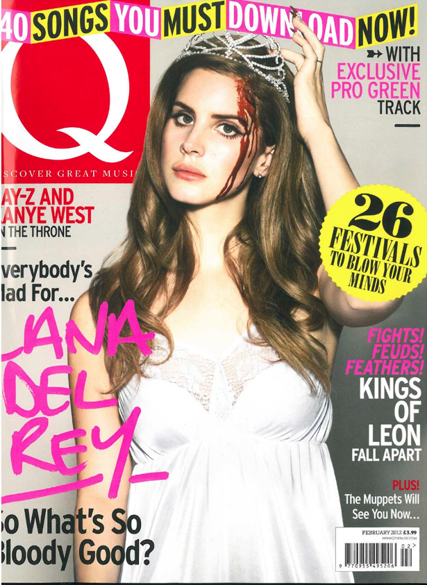
Described as being the UK's biggest magazine, so varied genres to fit wide target audience
- Lana Del Rey
- Kings of Leon
- Kanye West
Bright colour scheme, yellow and pink clash but creates an effect which grabs attention - which will interest readers of all ages and genders.
Pun 'whats so bloody good' as the central image - Lana Del Rey - has a bloody head - will make the reader laugh and want to read it.
Colours which stand out would be something I'd like to use to grab attention (the bright pink amongst black and red)
Front Cover
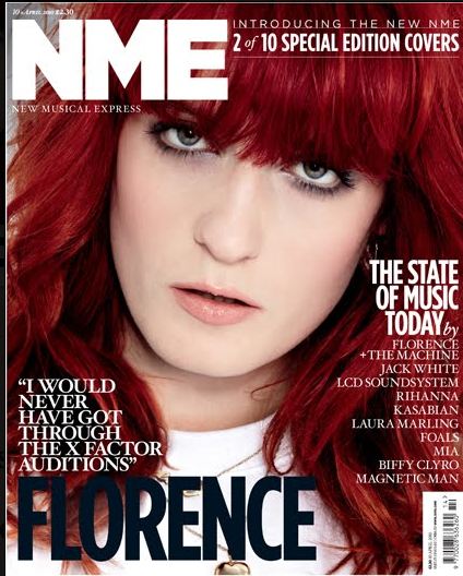
Central image is a close up taking up whole front cover, makes Florence seem very important.
Monochramatic colour scheme(of mast head and plugs), contrasts with the bright red hair colour.
Image looks quite angry - links to cover story "I would never get through the X Factor auditions".
As she is taking up all the cover, represents the magazine as focusing on biggest stars.
Contents Page
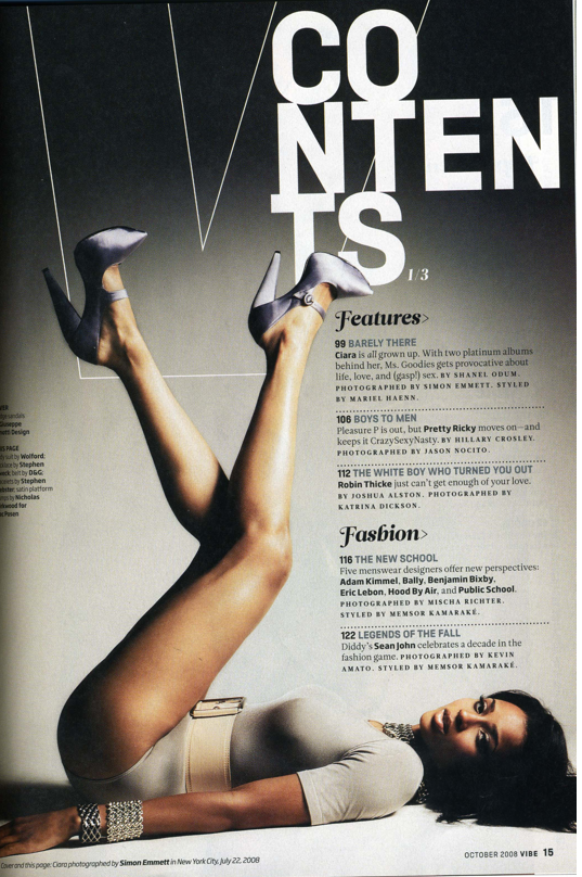
Sexualised central image - Ciara not wearing much clothes, the long shot allows her whole body to be seen and legs are the main focus . Shows the magazine is trying to aim itself at older prodominitely males who would be attracted to Ciara, but also women who would idolise her and want to look like her.
Dark colour scheme, creates a romantic/sexualised mood - fits in with the genre of RnB/Hip-Hop.
Minimal amount of text - makes the audience focus on the central image.
Aimed at teenagers and above due to the sexualisation of Ciara, which wouldn't be aimed at younger people.
Disconjoined text of coverline "contents" adds to the maturity of the magazine. I like this use of typography which I'd like to use in my magazine.
Contents Page
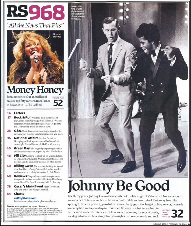
Black and white photo, indicating it was a long time ago - could suit the target audience as they cover all chart music. Image of Beyonce in colour, showing contrast between time and catering to a wide audience of ages.
Also covers current events - sections on "national affairs"
Both images portray happiness - invites the reader to want to know what it's about.
Dark colour scheme, with pops of colour(pink), - gender neutral so would attract male and female.
Serifed font - creates a formal feel.
Contents Page
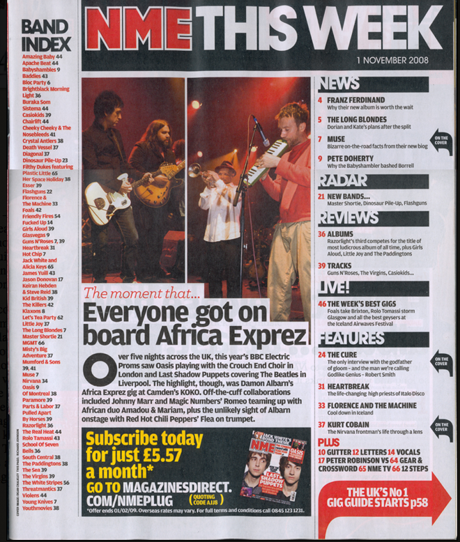
Dark colour scheme - links to the 'darker' genres of music featured in issue "Kurt Cobain".
Plug used to advertise subsribing to magazine - has brighter colours to draw attention.
Also features news to draw in a wide audience. (news will draw in older people)
Image of band playing instruments - represents the magazine as playing real music.
Contents page
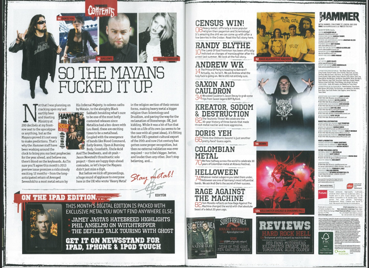
black white and red colour scheme - fits in with the dark theme - metal
'Helloween' has negative connotations.
content shows target audience.
Profanity used - attracts older audience
lots of images - allows fans to find favourite artists.
Contents page
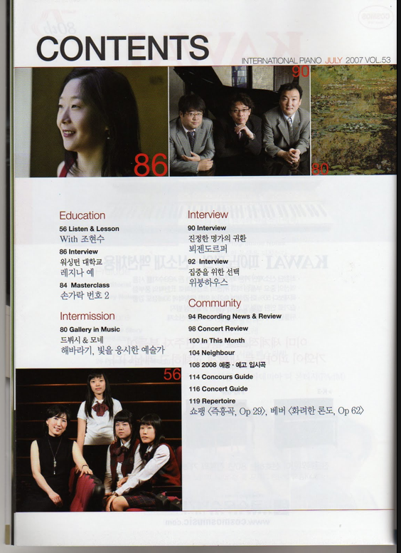
International - in japanese aswell as English
minimalistic look - only a few images. fits in with the formality of classical music
Small size, and consistent font - formality as aimed at an older audience who do not need to be attracted with bright colours and interesting fonts
dressed in smart clothes - reflects the profesionalism of the magazine.
not many words or images - focusing on the music
Double page spreads
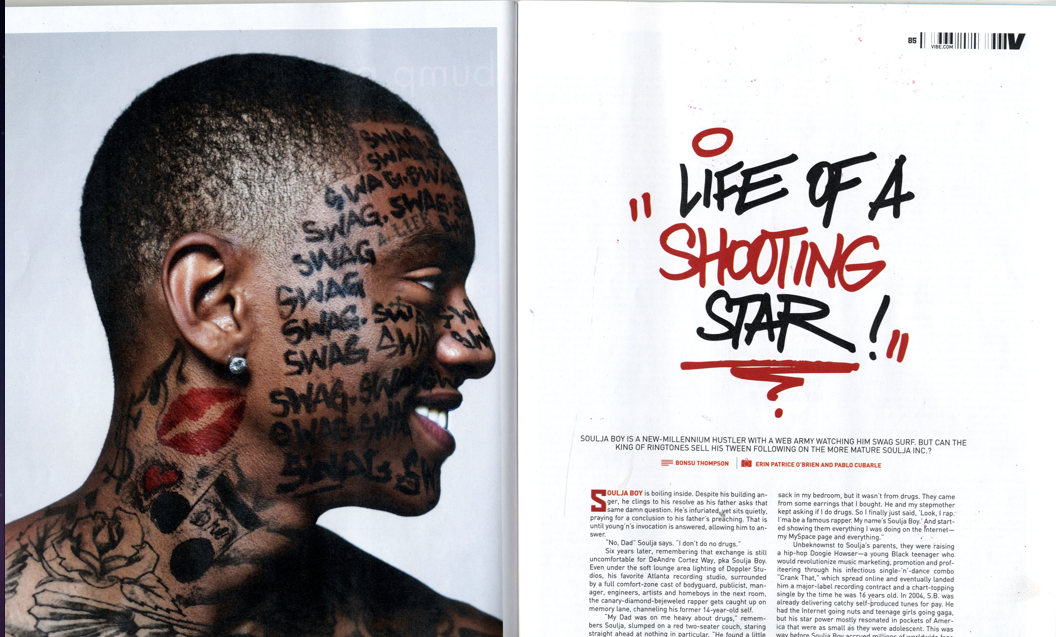
'swag' is slang of young people who would use this language too and would attract them.
Doodle like fonts - reduces formality and will attract the young target audience
Large image of Soulja Boy, popular amongst younger people who enjoy rap/hip-hop music - then the article is about him also and the target audience would want to read about it.
Red in the font matches the red in Soulja Boy's tatoo's - ties the double page spread together looking asthetically pleasing
Double Page Spreads
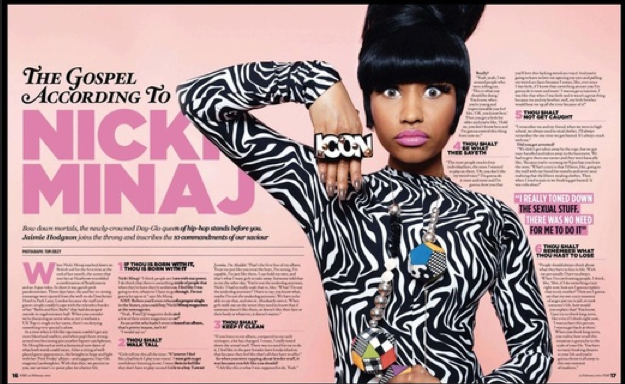
Pink colour scheme - links to the 'barbie'' theme of Nicki Minaj
Magazine trying to represent Nicki as iconic, due to the 'icon' ring she is wearing.
Bright colours could be used to attract a younger female audience
Image takes up a lot of the DPS - symbolises Nicki's large personality. This is also displayed by the wide eyed pose she is doing which makes her look quite strange which is what she is known for.
Use of drop cap adds personality and visual strength - draws attention so audience will want to read it.
Double Page Spread
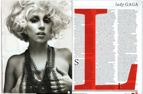
Text flows through the page easily so reader wouldn't get confused
Large red 'L' used behind the text as well as drop caps used in the S and I which grabs the readers attention
Image of Lady Gaga takes up whole page, shows she's important - aimed at an older audience as she isn't very covered up and is covered by chains of some sort which add a sexual view on the image.
Contrast of black and white image against red L which fits in with the minimalistic theme which is aimed at an older audience
Double Page Spread
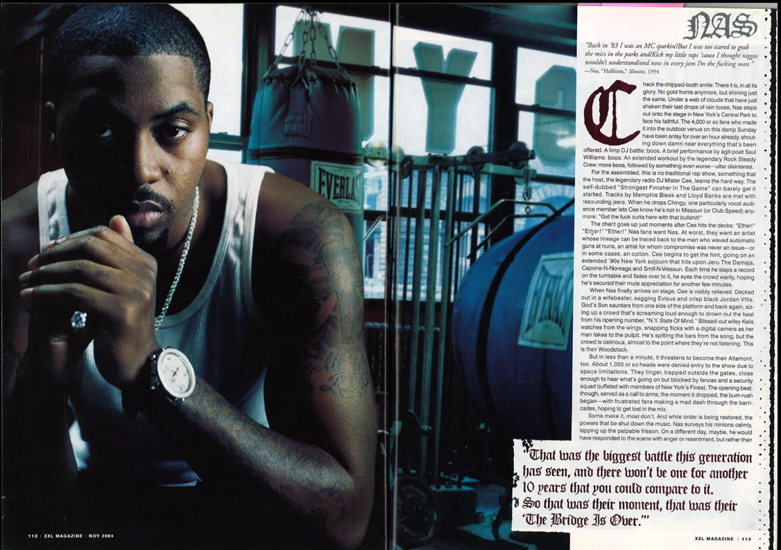
Same font used throughout DPS which matches the font which is always used fot Nas's name
Image takes up more than half the DPS show;s the text is less important but Nas is a very important artist as people will want to read the article to see the picture even if there isn't much text.
setting of a boxing gym - significant as article about challenges in Nas's life i.e "the biggest battle of my life" so it mirrors the theme of the article.