Python Workshop
av Peder Bergebakken Sundt og Torje Hoås Digernes

Programvareverkstedets
Plan
- Om scipy
- Matplotlib
- Pandas
- Numpy
- Ipython
- Linalg
- Distributive funksjoner
-
Eksempel
- Dekomponering
- Diagonalisering og transisjonsmatriser
- Enkelt plott
- Merkelapper
- Plot-titler
Intro
Matplotlib
Numpy
Least squares i numpy
En funksjon for ditt formål
Klarte ikke lage en egnet oppg :(
- Lesing fra csv/excel
- Dataframes
- Pulsdata
Pandas
Om scipy
Paraplyprosjekt for flere
- Matplotlib
- Numpy
- Pandas
- IPyhton
- Sympy
Matplotlib
- Grafer og plot
- Visualisering
Numpy
- Numerikk i python
- Distributive mattefunksjoner
import numpy
import numpy.linalg as linalg
A = numpy.reshape(numpy.array([1,2,-1,3]),(2,2))
e,v = linalg.eig(A)
vi = linalg.inv(v)
print(vi)
A2 = numpy.matmul(numpy.matmul(v,numpy.diag(e)),vi)
print(numpy.round(A2,10))
Pandas
- Leser data for deg
- Dataframes
import pandas
import matplotlib.pyplot as plt

data_frame = pandas.read_csv("Torje_pulsdata.csv",header=2)
print( data_frame[0:-1][0:5] )
data_frame = data_frame.drop(labels=["Stride length (m)","Cadence","Altitude (m)","Power (W)", "Temperatures (C)","Unnamed: 11"], axis=1)
print( data_frame[0:-1][0:5] )
#print(pandas.to_datetime(data_frame["Time"]))
data_frame["Time"]= pandas.to_datetime(data_frame["Time"])


plt.plot(data_frame["Time"], data_frame[["HR (bpm)","Speed (km/h)"]])
plt.show()
IPython
- Et python-skall for utforskning
De andre pakkene kan være nyttige
- Scipy - numeriske metoder for optimalisering og signalbehandling.
- Sympy - symbolsk matematikk, høres nyttig ut, men jeg kan ikke hjelpe noe særlig.
Installere
Om dere lastet ned fra python.org
pip3.exe install matplotlib
Om dere installerte via anaconda, så skal visst dette være installert for dere
(Windows)
Installere
Om dere lastet ned fra python.org
pip3 install numpy matplotlib scipy pandas
Om dere installerte via anaconda, så skal visst dette være installert for dere
MacOs
pip3 installasjon
Matplotlib
Virker det?
import matplotlib.pyplot as plt
from math import pi, sin
xs = [ i*0.01 for i in range( 0 , 2*314 )]
ys = [ sin(x) for x in xs ]
plt.plot(xs,ys)
plt.show()
Prøv dette i IDLE (kopier innholdet i matplotlib_test.py) og lim inn
Matplotlib
Hva er delene?
import matplotlib.pyplot as plt
from math import pi, sin
xs = [ i*0.01 for i in range( 0 , 2*314 )]
ys = [ sin(x) for x in xs ]
plt.plot(xs,ys)
plt.show()
Matplotlib
Marger
Lagre
Matplotlib
Vi kan nå både lage og lagre et enkelt plot
Matplotlib
import matplotlib.pyplot as plt
from math import pi, sin
xs = [ i*0.01 for i in range( 0 , 2*314 )]
ys = [ sin(x) for x in xs ]
plt.plot(xs,ys)                  # Vi gir data som skal plottes
plt.show()                       # Først nå vises dataen
Et enkelt plot
Matplotlib
import matplotlib.pyplot as plt
from math import pi, sin
xs = [ i*0.01 for i in range( 0 , 2*314 )]
ys = [ sin(x) for x in xs ]
plt.plot(xs,ys)
plt.savefig("sinus.png")
Dette kan også gjøres programmatisk
pyplot.savefig(filnavn)
Matplotlib
Vi mangler noen elementer:
- Figurtittel
- Aksebeskrivlse
- Legende
Matplotlib
import matplotlib.pyplot as plt
from math import pi, sin
xs = [ i*0.01 for i in range( 0 , 2*314 )]
ys = [ sin(x) for x in xs ]
plt.plot(xs,ys)                  # Vi gir data som skal plottes
plt.title("Enkelt plot")         # Figurtittel
plt.xlabel("Tid [s]")            # x-aksens tittel
plt.ylabel("Bølgehøyde [m]")     # y-aksens tittel
plt.show()                       # Først nå vises dataen
Et enkelt plot
Matplotlib
import matplotlib.pyplot as plt
from math import pi, sin
xs = [ i*0.01 for i in range( 0 , 2*314 )]
ys = [ sin(x) for x in xs ]
plt.plot(xs,ys,label="line 1" )                  # Vi gir data som skal plottes
plt.title("Enkelt plot")         # Figurtittel
plt.xlabel("Tid [s]")            # x-aksens tittel
plt.ylabel("Bølgehøyde [m] CO$_2 $")     # y-aksens tittel
plt.legend(loc = "lower right")
plt.show()                       # Først nå vises dataen
Et enkelt plot, med legende
Matplotlib
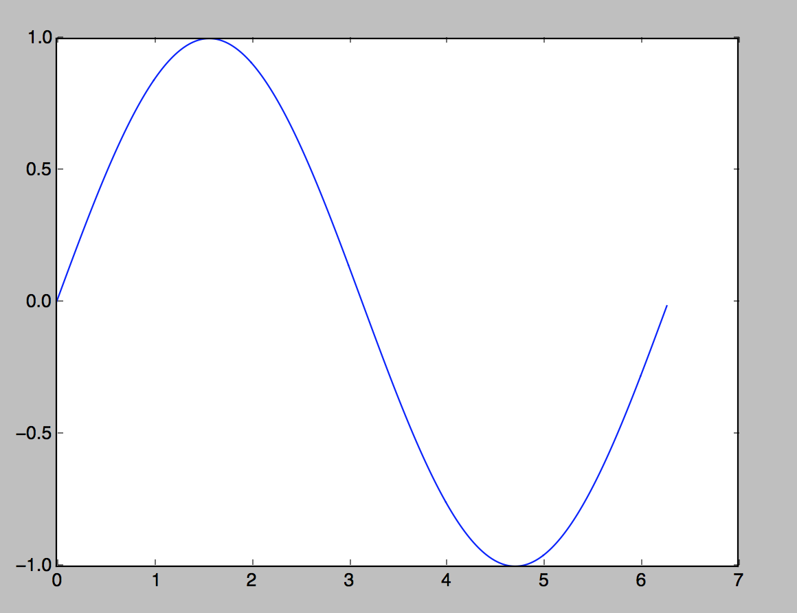
import matplotlib.pyplot as plt
from math import pi, sin
xs = [ i*0.01 for i in range( 0 , 2*314 )]
ys = [ sin(x) for x in xs ]
plt.plot(xs,ys)
plt.title("Utvikling av sinus")
plt.savefig("sinus.png")
Tittel er ganske greit.
Matplotlib
import matplotlib.pyplot as plt
from math import pi, sin
xs = [ i*0.01 for i in range( 0 , 2*314 )]
ys = [ sin(x) for x in xs ]
plt.plot(xs,ys)
xs2 = [ i*0.1 for i in range( 0 , 2*32 )]
ys2 = [ -sin(x) for x in xs2 ]
plt.plot(xs2,ys2,"-+")
plt.show()
Matplotlib
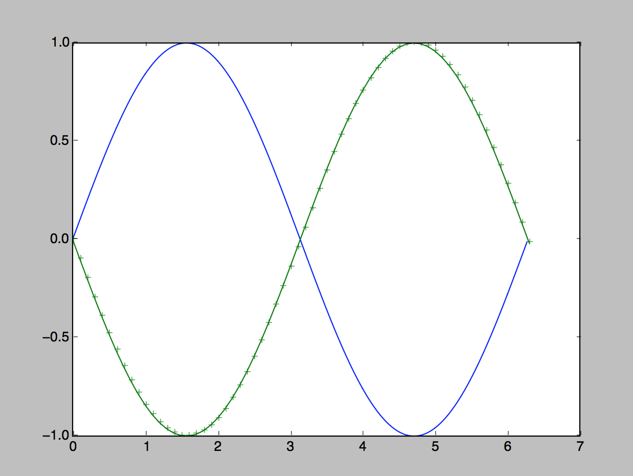
linjeplot
Akser
Matplotlib
Liten oppgave:
Lag en funksjon som tar inn en tittel, data for x-aksen og y-aksen og lager et plot av det.
Matplotlib
import matplotlib.pyplot as plt
def simplePlot( title, xdata, ydata):
plt.plot(xdata,ydata)
plt.title(title)
plt.show()
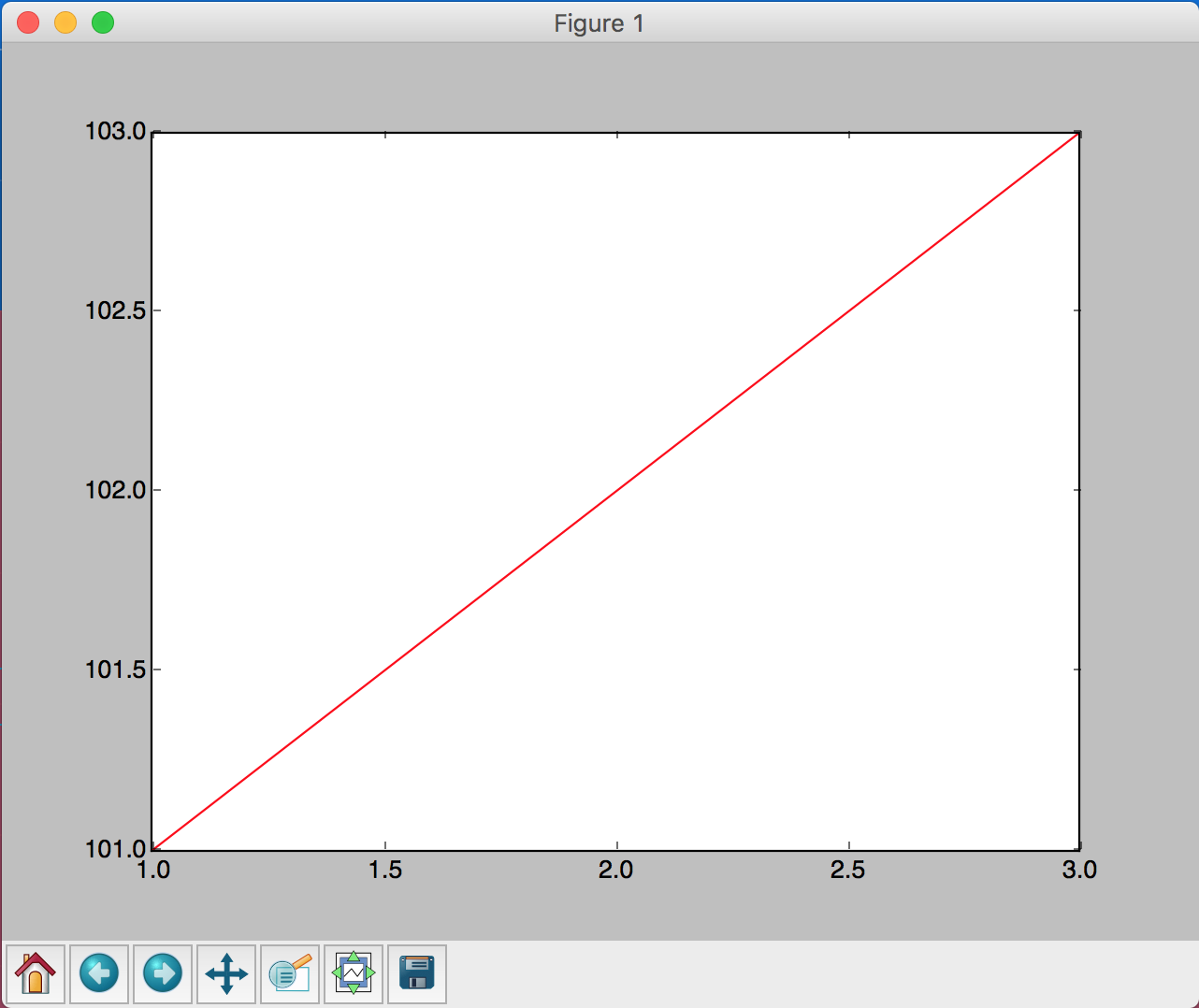
simplePlot("Rare data", [1,2,3],[3,1,2])Numpy
Eksempel for å sjekke om modulen virker
from numpy.fft import fft
from numpy import arange,sin,pi
sig = fft(sin(arange(0,2*pi,0.01)))
Numpy
- Numerikk i python
- Distributive funksjoner (virker på lister og lignende)
- Lineær algebra
- Dekomponering
Numpy
Distributive funksjoner
from math import sin,pi
xs = [ 0.01*i for i in range( 0, 314) ]
ys = [ sin(x) for x in xs ]
print(ys)
from numpy import sin, arange, pi
xs = arange(0,pi,0.01)
ys = sin(xs)
print(ys)Vanlig Python
Med Numpy
Linalg
Finnes i to deler, den enkle finnes direkte i numpy.
numpy.matmul( a , b)
import numpy

a = [[1,2],[-1,3]]
b = [[1,2],[3,4]]
c = numpy.matmul(a,b)
print(c)
Dekomponering
Egenverdier
import numpy
import numpy.linalg as linalg
A = numpy.reshape(numpy.array([1,2,-1,3]),(2,2))
e,v = linalg.eig(A)
vi = linalg.inv(v)
print(vi)
A2 = numpy.matmul(numpy.matmul(v,numpy.diag(e)),vi)
print(numpy.round(A2,10))
Pandas
Formål
- Lese og skrive data
- Excel, csv, hdf samme interface
- Alt leses inn til DataFrames
Pandas
Virker det?
- Du trenger nå en enkel csv-fil,
import pandas
import os
from os.path import expanduser
home = expanduser("~")
os.chdir(home)
file = open("panda_test_pvv_kurs.csv","w")
file.write("navn,alder\n")
file.write("kari,29\n")
file.write("ola,28\n")
file.close()
doc = pandas.read_csv("panda_test_pvv_kurs.csv")
print(doc["navn"])
Pandas
- de to øverste linjene er imports, men den andre er ikke veldig viktig
- de tre neste linjene er for å bytte arbeidskatalog til hjemmemappen
- så åpner vi og skriver til en csv-fil, (Comma Separated Values) og lukker filen
- de to siste leser inn filen vi nettopp skrev, men nå som en Dataframe
import pandas
import os
from os.path import expanduser
home = expanduser("~")
os.chdir(home)
file = open("panda_test_pvv_kurs.csv","w")
file.write("navn,alder\n")
file.write("kari,29\n")
file.write("ola,28\n")
file.close()
doc = pandas.read_csv("panda_test_pvv_kurs.csv")
print(doc["navn"])
Pulsdata
import pandas as pd
import matplotlib.pyplot as plt

dataframe = pd.read_csv('Torje+Hos_Digernes_2018-04-04_15-35-03.csv', skiprows=2,parse_dates=['Time'])
plt.plot(dataframe["Time"],dataframe[["HR (bpm)"]])
axes2 = plt.twinx()
axes2.plot(dataframe["Time"],dataframe[["Speed (km/h)"]], color="red")
plt.show()
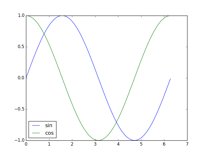
Legend outside the plot
This solution works for 4 labels, if the labels are short enough.
It gets a bit more complicated for more labels, as we need to rescale the axes to fit.
import matplotlib.pyplot as plt
import numpy as np

xs = np.arange(0, 2 * np.pi, 0.01)
ys1 = np.sin(xs)
ys2 = np.cos(xs)
plt.plot(xs, ys1, label="sine")
plt.plot(xs, ys2, label="cosine")
plt.legend(loc="lower left",
    mode="expand",ncol=2,
    bbox_to_anchor=(0.0,1.0,1.0,1.0))
plt.show()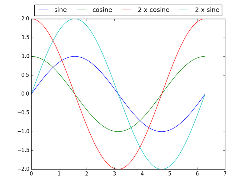
We should probably use the more complex solution always, as this puts it outside the borders we started with.
Legend outside the plot
import matplotlib.pyplot as plt
import numpy as np

xs = np.arange(0, 2 * np.pi, 0.01)
ys1 = np.sin(xs)
ys2 = np.cos(xs)
plt.plot(xs, ys1, label="sine")
plt.plot(xs, ys2, label="cosine")
plt.legend(loc="lower left",
    mode="expand",ncol=2,
    bbox_to_anchor=(0.0,1.0,1.0,1.0))
plt.show()