Emotion In Practice
- @emotion/core
- @emotion/styled
- emotion
@emotion/core
@emotion/styled
emotion
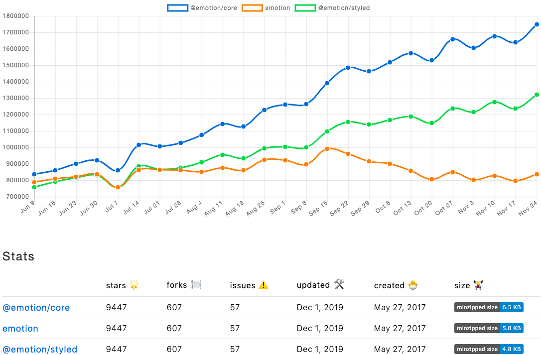
6.5KB
4.8KB
5.8KB
@emotion/core
/** @jsx jsx */
import { jsx, css } from '@emotion/core';

const styles = {
  camelCase: {
    display: 'flex',
    alignItems: 'flex-start',
  },
  origin: css`
    display: flex;
    align-items: flex-start;
  `,
};

function Example() {
  return (
    <div
      css={[
        styles.camelCase,
        styles.origin,
      ]} />
  );
}
emotion
import React from 'react';
import { css, cx } from 'emotion';

const classes = {
  origin: css`
    display: flex;
    align-items: flex-start;
  `,
  compose: css`
    justify-content: flex-start;
  `,
};

function Example() {
  return (
    <div className={cx(classes.origin, classes.compose)} />
  );
}
@emotion/styled
import React from 'react';
import styled from '@emotion/styled';

const Wrapper = styled.div`
  display: flex;
  align-items: flex-start;
  justify-content: ${({ center }) => (center ? 'center' : 'flex-start')};
`;

function Example() {
  return (
    <Wrapper center />
  );
}
Why not using styled-component ?
- Styled-component
- Your components
- Library components
Why not using styled-component ?
const Paragraph = styled.p`
  font-size: 16px;
  font-weight: 300;
  color: #1a1a1a;
  letter-spacing: 1.5px;
  line-height: 29px;
`;

function Example() {
  return (
    <Paragraph as="span">
      Lorem ipsum dolor sit amet,
      consectetur adipiscing elit,
    </Paragraph>
  );
}
<p> should have default margin
Why not using styled-component ?
const Button = styled.button`
  // button styles
`;

function Example() {
  return (
    <Button>
      Click me!
    </Button>
  );
}
eslint will not tell you
"Missing an explicit type attribute for button"
@emotion/core
- The “@emotion/core” package requires React and is recommended for users of that framework if possible.
- Server side rendering with zero configuration.
emotion
- The emotion package is framework agnostic and the simplest way to use Emotion.
- Server side rendering requires additional work to set up
React Dev tool
@emotion/styled
React Dev tool
@emotion/core
React Dev tool
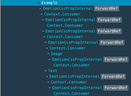
emotion
React Dev tool

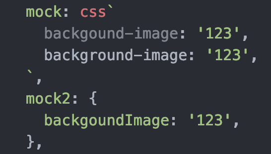
camel case v.s. kebab case
const styles = {
  wrapper: {
    fontSize: 16,
    fontWeight: 300,

    ':hover': {

    },
  },
};
const styles = {
wrapper: css`
font-size: 16px;
font-weight: 300;
&:hover {
}
`,
};:after
:before
:hover
:hover #element
:last-child
radium ?
...
style composing
const activeWrapper = css`
  border-top: 1px solid #1a1a1a;
`;

const classes = {
  wrapper: isActive => css`
    font-size: 16px;
    font-weight: 300;
    cursor: pointer;

    ${isActive ? activeWrapper : null};

    &:hover {
      ${activeWrapper};
    }
  `,
};

function Example() {
  const [isActive, setActive] = useState(false);

  return (
    <div className={classes.wrapper(isActive)} />
  );
}
const styles = {
  wrapper: {
    fontSize: 16,
    fontWeight: 300,
    cursor: pointer,

    ':hover': {
      borderTop: 1px solid #1a1a1a,
    },
  },
  ...
  ...
  activeWrapper: {
    borderTop: 1px solid #1a1a1a,
  },
};

function Example() {
  const [isActive, setActive] = useState(false);

  return (
    <div
      css={[
        styles.wrapper,
        isActive && styles.activeWrapper,
      ]} />
  );
}
Summary
html tag + css = styled-component
= @emotion/styled