Creating Worlds
General Points
- Always have mood board/playlist adj. while working!
- Get feedback from block-out onwards, push them to give you something to improve upon
Character Analogy
Defining "Stylized"
Here defined it = COLORFUL TEXTURES + CURVED (“adjusted”?) GEOMETRY + POST-PROCESSING
But continue to look at 80lv stylized search results
Sources
https://youtu.be/ql7vRNVAKu8
https://youtu.be/r4t7rO-nhOw
https://youtu.be/WWXsmnlmADc
https://youtu.be/nEZasf6Mnto
https://80.lv/articles/stylized-environment-production-in-unity
https://magazine.artstation.com/2017/03/game-environment-artist
https://80.lv/articles/rogelio-delgado-on-building-great-environments
https://80.lv/articles/the-stages-of-environment-art-in-gamedev - Main Article
https://80.lv/articles/environment-design-modularity-color-composition
https://youtu.be/FqX-UMVTLHI - Riot Concept Art Video
https://youtu.be/37LVhP15zGw - Riot Environment Art Video
https://cgsociety.org/news/article/3310/the-art-of-creating-a-game-with-brandon-martynowicz - Edith
https://youtu.be/R75g3elj7y4
1
Concept
The key is finding something within that idea you can be excited and inspired about. Maybe you like the lighting within the environment or you care about the story being told. Whatever it is, find that aspect of the environment in any way you can. - WoLD
v1.0 - Level Brief
Goal: exciting yet ambiguous enough to afford exploring ideas
[ ] 1-2 lines that summarize the goals of the...
[ ] Narrative: dramatic question and/or "dragon" to slay
[ ] Gameplay: start, PEPSI (pickups, enemies, stores), end
[ ] Context: how it links adjacent areas and the story's theme
[ ] Setting/Lore: what the area's residents got + get out of it
[ ] Constraints: prereqs that all such levels need in this game
v1.1 - "Key Art" aka Main Refs
Goal: find the threads linking the inspiring, exciting refs/chats
- Thematic look & feel lock: mood, color palette, broad design
- Pick a main ref by reviewing an R&D search, writing down what you like and dislike - see what tallies the most +'s
- Main refs arbitrate decisions based on which looks closest
v1.2 - High-level Layout
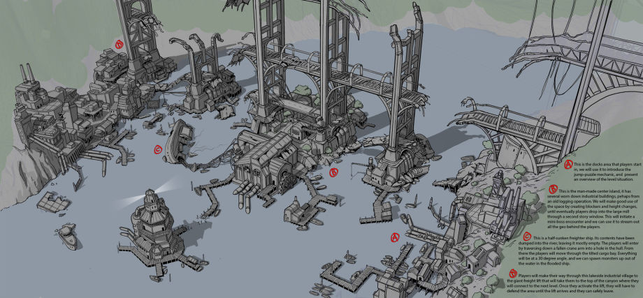
Goal: level/gameplay beats with only broad callouts and pathing
- Focus on traversing the area in fun, interesting ways
- Focus on stationing major encounters (see ED docs!)
- Start it monochromatic, picture living/standing in each area
- Estab. scene w/symmetry, then imply a story w/asymmetry
2
Spec
Goal: a master level board you can show to anyone, by using the preceding section's Concept to put together...
Answers the art questions:
- How to light an area: what colors, intensity, saturation, shadows
- What to model for it
- How to paint a surface
Answers the LD questions:
- Scope (from below two)
- Major objectives: how it fits into game's total arc
- Major beats: esp. note the distances b/t them
Sources
3D blockouts, image ref, 2D sketches, public concepts, Arch[Viz], phone pics, gameplay/scripting scenarios, your game’s demo level, fave game’s location/level, film clip
Tips and Tricks for both
- Like with high-level before, lock in on main references!
- Use the Closing Doors tactic of localizing KNKL variants around effective ideas - not as in "which do you like more?" but e.g. "which is the scariest?"
- Get feedback often to course-correct w/o wasted time
- Mix distinct ideas with the Shovel Knight mindset
- Find a personal touch to add into the mix after extracting a form, color, etc. in a given reference
- Ask what we haven't seen before, but don't reject an unoriginal idea if you'd wholeheartedly love it = shine!
- Stick to 2 tones to pump out 50-100 fast, loose options like KNKL's bootcamp -- goal of so many is to grok all the possibilities this concept could convey visually
- For use in block-outs, favor line arts w/clear 3D angles
2a. Totten
- Risk-reward v. Safe motif
- Circulation spaces b/t ^
- Maze-eme morphology
- WoLD station points
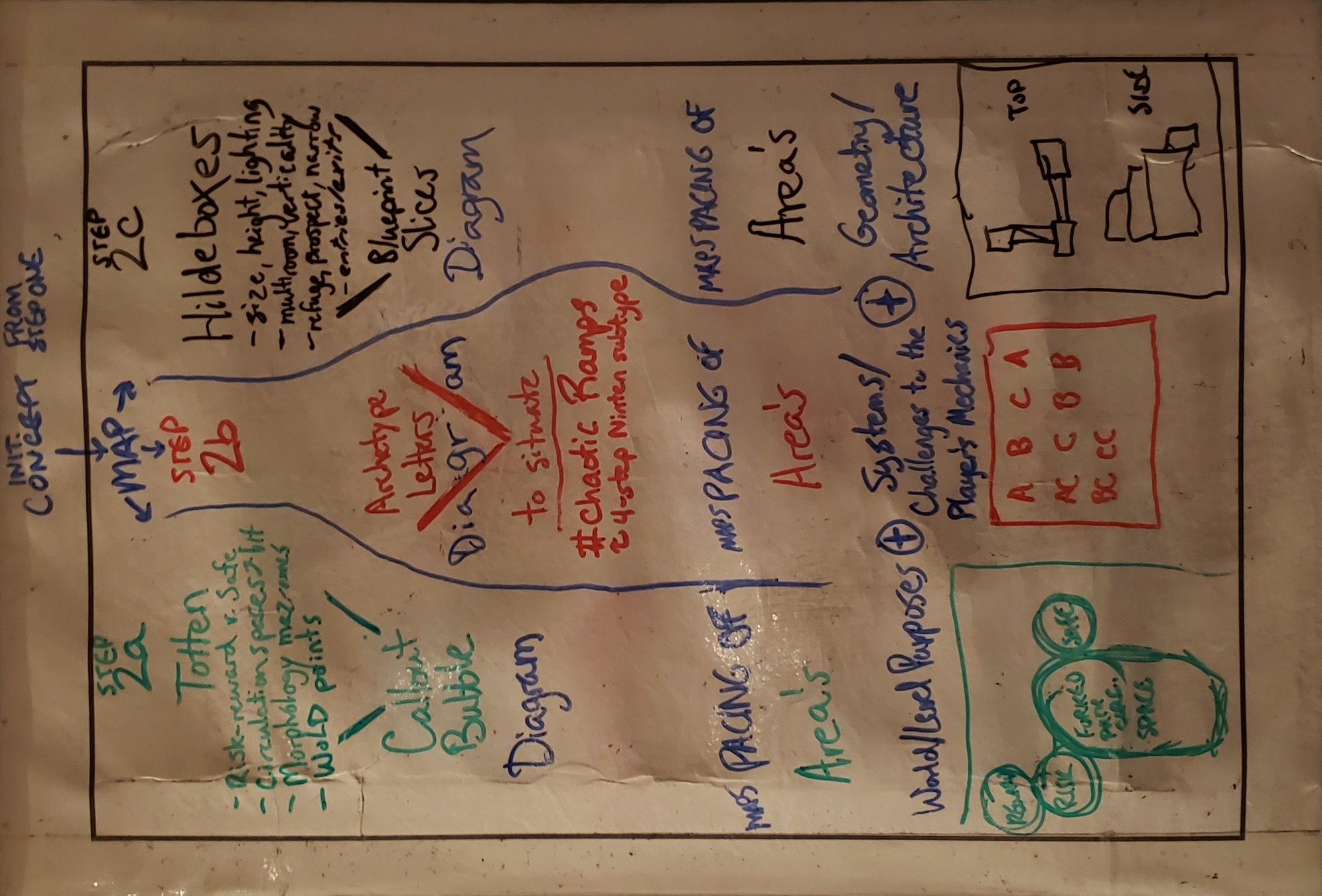

Callout
Bubbles
Pacing an area's Purposes, maps their function inside the world and level design
2b. #chaotic


To situate
- #chaotic-stupid Ramps
- 4-step Nintendo subtype
Archetype
Letters
Pacing an area's Systems via Challenges to the player's game mechanics
2c. Hildeboxes


- Size, height, lighting
- Multi-room, verticality
- Refuge, prospect, narrow
- Entry point(s), exit point(s)
Blueprint
Slices
Pacing an area's Geometry, or Architecture moving over to the environment/level art blockout in the next step 3
Pacing Aporias & EE Rewards
-
Beats are AdvanceNext spots that aren't just walking, and/or major encounters.
- Watch out for distances between them: too close/complex or too distant/boring
-
Bubbles affords having 2+ functions, intents, purposes (i.e. bubbles) regardless of walls!
- But pace this complexity: 360-deg of options trips choice paralysis (Fallout: NV!)
- Always consider an object relative to its next largest context: chair/room/house.
- ==================================================================
- Edith: (1) entry/exit points, (2) story interest points, (3) spatial flow b/t 1+2
-
Nintendo Power callouts + "circulation spaces" b/t them for Differences in Kind
- e.g. breathers of movement, obstacles, exploration, puzzles, recharging
- WoLD: note the choke, spawn, player/AI-objective, and cinematic points
-
Hildebrand's alternating spatial sequences
- Narrows (ex. choke points), Refuges, Prospects - Size, Height, Lighting
-
4-step Nintendo pacing => #chaotic-stupid
- Spectrums > Archetypes > Setups > ABCs > Ramps
- Totten's Risk-Reward Junction = uncertainty a player can know the nature of
- Multiroom-verticality > One Boxy Room
- Exploring <=> Figuring Out the Unknown
- Applying the Totten risk reward junction motif to all Hildebrand instantiations
3
Block
Goal: figure out the spatial look & feel overlooked by map.
Making the Block World
- Translate map bubble(s) into an empty block rooms:
- Decide the overall shape of the box's outer "hull"
- Mind how each adj space relates and what that transition's communicating (e.g. stairs) <=> the flow!
- Drop the boxes in - starting at the scene origin.
- Drop in a character mannequin model and spawn, ensure it can jump & run along rooms (i.e. correct scale metrics).
- Once you have a room you know nails your spatial L&F, you can then use it to compare/cut if others live up to it.
Goal: making the space itself before picking and placing things into it, i.e. ask how player flow connects w/beats. -- Does the hull work against what it and adjacent spaces need to accomplish?
- Be ever willing to cut, whether just blockworld, or also walkthrough, or also concept! (Like KNKL variants!)
- After you get to a very rough draft, move to next step
4
Type
Goal: think in 4 big environment art types...
...then work out the bad ideas (KNKL-style!), but also scene's daily life = the objects in and flow through it
Hero
Tiles
Prop
Vista
(It's own project => Repeat stages 1-4!)
Focus on composition as a story tool, remind players of their active goal, nods to preceding/future areas (Souls!)
Can use vert blending/decals masks repetition, e.g. a door has color variants, [no] handle, [no] glass, metal/wood surface type variations -- all same asset w/altered material params
Ref/Concept Mix -> Spec
Take a concept image and break it into major textures, minor textures, and decals/details
- Differentiate materials based on their would-be bump maps (vs. a vert color variant)
- Vertex colors can also fake shadows, lighting, AO, and two-texture blends (cf. terrains)
- Rule of Thirds 201: on 2-3 grid lines => artist primarily wanted your eye to go there!
Modeling the Art Assets
Start with a base prim and extrude/drag verts, add edge loops, etc. into desired broad shape:
-
Focus on silhouette, shape, and beware noise ratios (KNKL 10-S, 20-M, 70-L) esp. in arenas. -- i.e. Proportion of noise first, not detail. Framing should help keep elements from fighting for eye's attention
-
Frame elements to be fun to walk around in!
-
Pre-texture pass, assign all basic gray “Base_Material”
-
PIE frequently to vet path clarity and collision snags (walk up to every mesh!)
-
If unsure about something, go back for more refs!
A nexus of design + art creates the best constraint-solving results
(vs. an emotionless/unconnected asset salad)
Pixeling the Art Assets
-
Sculpt, don't draw: nail big shapes w/blobs, and then subtract from the form, like #knkl on drawing bangs!
-
Originality check: add personal touch to your ref mix,
-
3D Pixel tips: small palette, pixel density (cup != barrel's #px), surpass 2D (ex. bookshelf/fridge depth)
-
Use the #pixel-textures channel-end Slynyrd clustering (i.e. start w/KNKL S/M/L -> outlines -> adj clusters)
-
Reminder to revisit one-offs in #pixel-textures to eval!
5
Detail
6
Light
Goal: evoke a strong mood of light/dark to push a player's eye through an area!