S3-3: Technology
Picking 1-2 Big Per-Project Tech Goals
Low-Hanging Accessible Fruit
- Main Resource: gameaccessibilityguide.com
- "Skip Combat" Buttons -- try AI autopilot to not compromise on the player experience!
- An Epic Primer on Game Accessibility -- focus especially on the Top Helpful 10 here!
Don't forget to add your notes!
Asynchronous Netgifts
From How Games Move Us where a daughter would leave grays in her mom's inbox on World of Warcraft.
-
"I made your lunchbox" type of [anonymous?] gift-leaving...
-
Dark Souls' in-and-out way of seeing players/comments.
-
The Words With Friends database-driven model of networking.
Only Needs a Database to Implement?
Don't forget to add your notes!
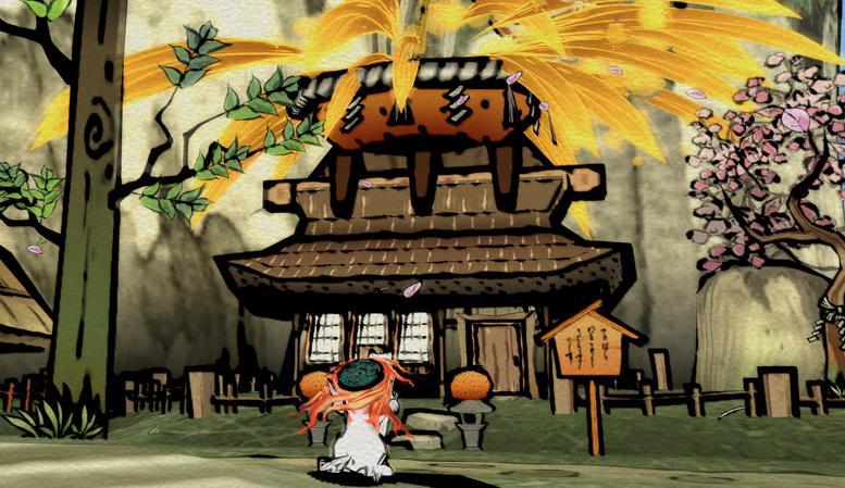
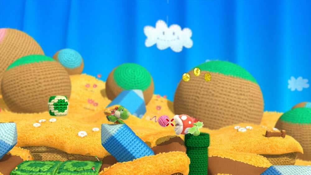
Non-Photorealistic Rendering


Don't forget to add your notes!
The 3 C's
Camera
2D
3D
Controls - Pillar #1: Feedback
Each action that the player makes, should have a clear reaction on screen to lessen flow-killing 'what do I do now' moments.
Controls - Pillar #2: Responsive
Not necessarily "fast," but providing constant, significant feedback.
- "Imagine the frustration of a game that required you to wait two whole seconds before you could jump [e.g. wind-up animations], especially without any feedback to indicate to you that you’ve pushed the button." (The second sentence here is what I'm getting at by citing Wertle in that you can do slow -- just have good feedback over that duration! Yet wind-up animations don't seem to count... why is that, I wonder?)
- Ryan Jenkins: "I think that part of it comes down to whether or not the slow controls hinder the player or fit well with the mechanics of the game. I've seen slower controls praised as 'weighty' or 'impactful'. Gears of War is an example. Since it is a cover based shooter where enemies move relatively slowly, the slower controls are fine and make the player feel like a soldier in heavy gear. If that same game was trying to be a twitchy shooter like Unreal Tournament, then they would be described as sluggish."
Controls - Pillar #3: Mapping
The most-used actions should be at the most accessible places.
This requires the most playtesting, as people have very personal feelings about this -- so it's vital to be as empirical as possible here.
For further consideration:
* Bateman & Boon's thesis against modal controls
* Leap Motion's intuitive-vs-abstracted gestures
* GMTK's Controllers Control Everything episode
* RGD's atomic parametrization
* Minimalism's discretized vs continuous controls
* Totten's explanation of comfortable-vs-strained metrics
Character
How does each ability convey something about the character, e.g.
* Hoisting -- is it a struggle? is it effortless?
* Sonic's Idle Animation, etc...
Don't forget to add your notes!
| Camera | Controls | Character | |
| Traversing | x | x | x |
| Directing | x | x | |
| Abilities | x | x |
(VR) Condensed Interactions
Focus on having fewer interactions total, but making those few interactions that much richer with the effort you save in doing so.
Don't forget to add your notes!
(VR) Arcadey Clay
Sometimes making the game more arcade-y, e.g. by adding the constraints of a puzzle grid to Mouse Playhouse, is exactly what design needs.
Don't forget to add your notes!
