Question 7
Looking back at your preliminary task, what do you feel you have learnt in the progression from it to the full product?
Front Covers

Comapring Front Covers
Overall, in my opinion I feel there is a huge contrast between my school magazine front cover and music magazine front cover. My music magazine looks far more stylish and sophisticated due the extra preparation and planning I did before constructing the product. I feel my school magazine front cover looks very amateur and basic meaning it would not sell well against other similar products. I did not use enough conventions such as coverlines or skyline which would have increasingly absorbed a readers full attention.
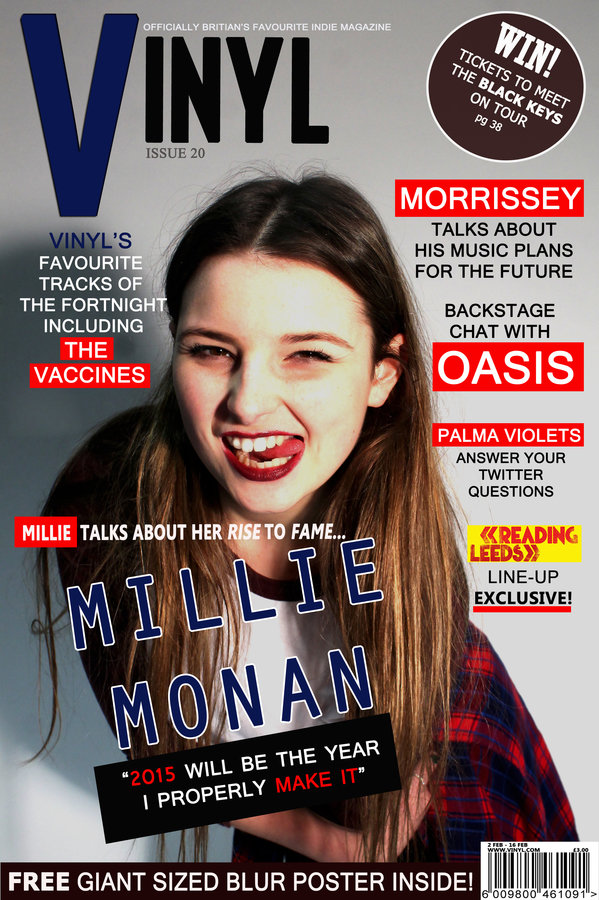
Compared to my music magazine, the main image does not look professional as it was taken outside which is not usually done for front cover image. I did not leave enough room around the model’s meaning all the coverlines overlap over the subject matters making the layout look very poor. However for my music magazine I the main image was taken against a white background using studio lighting adding professionalism to the image. I ensured I left a sufficient amount of background space around my model in order to add coverlines and other conventions during the construction planning. This shows my lack of planning and research for school magazine photo shoot. In addition, none of the coverlines actually relate to the main image, possibly making the reader confused as why there is picture of three random girls. This again shows that I did not think through how I was going present my cover model’s and they related to the rest of the magazine.
Overall, in my opinion I feel there is a huge contrast between my school magazine front cover and music magazine front cover. My music magazine looks far more stylish and sophisticated due the extra preparation and planning I did before constructing the product. I feel my school magazine front cover looks very amateur and basic meaning it would not sell well against other similar products. I did not use enough conventions such as coverlines or a skyline which would have increasingly absorbed a reader's full attention.
Compared to my music magazine, the main image does not look professional as it was taken outside which is not usually performed for a front cover image. I did not leave enough room around the models meaning all the coverlines overlap over the subject matters making the layout look very poor. However for my music magazine the main image was taken against a white background using studio lighting adding professionalism to the image. I ensured I left a sufficient amount of background space around my model in order to add coverlines and other conventions during the construction process. This shows my lack of planning and research for my school magazine photo shoot. In addition, none of the coverlines actually relate to the main image, possibly making the reader confused as why there is picture of three random girls. This again shows that I did not think through how I was going present my cover model’s and how they were related to the rest of the magazine.
Comparing Front Covers
Overall, in my opinion I feel there is a huge contrast between my school magazine front cover and music magazine front cover. My music magazine looks far more stylish and sophisticated due the extra preparation and planning I did before constructing the product. I feel my school magazine front cover looks very amateur and basic meaning it would not sell well against other similar products. I did not use enough conventions such as coverlines or skyline which would have increasingly absorbed a readers full attention.
Compared to my music magazine, the main image does not look professional as it was taken outside which is not usually done for front cover image. I did not leave enough room around the model’s meaning all the coverlines overlap over the subject matters making the layout look very poor. However for my music magazine I the main image was taken against a white background using studio lighting adding professionalism to the image. I ensured I left a sufficient amount of background space around my model in order to add coverlines and other conventions during the construction planning. This shows my lack of planning and research for school magazine photo shoot. In addition, none of the coverlines actually relate to the main image, possibly making the reader confused as why there is picture of three random girls. This again shows that I did not think through how I was going present my cover model’s and they related to the rest of the magazine.
Another key difference between my two products is that my music magazine is far more detailed. I spent time on designing the barcode of the magazine where I added text to the original image, including the website address, price and issue date. On my school magazine however these conventions were randomly spread out and not located in one place, meaning the reader would have to search the page for these key bits of information. Especially the 20p cannot even be seen very well as it is white text against a bright background, a fault of mine when designing the page.
I can now easily pick out the faults of my school magazine as I have far more knowledge about the correct layout of a front cover. It is apparent that my school magazine does not meet the same conventions as well as a music magazine does now. The page does not demand enough attention from the reader due the lack of exciting advertisement or buzz words. My school magazine does not sell the company very well either which is reflected from the dull masthead I created that connotes nothing about the company. It could also be argued that ‘Chislehurst Times’ reflects a newspaper more than a magazine as it is very similar to ‘The Times’ newspaper. This would repel the young audience the magazine is aimed as well as making them immediately think the full content will very formal and therefore dull.
When constructing my magazine I used more evidently thirds to divide up my page into clear organised sections. This was largely helped by using rulers on Photoshop to ensure all my text was equally aligned and straight.
Contents Pages
Comparing Contents Pages
Overall, in my opinion I feel there is a huge contrast between my school magazine front cover and music magazine front cover. My music magazine looks far more stylish and sophisticated due the extra preparation and planning I did before constructing the product. I feel my school magazine front cover looks very amateur and basic meaning it would not sell well against other similar products. I did not use enough conventions such as coverlines or skyline which would have increasingly absorbed a readers full attention.
Compared to my music magazine, the main image does not look professional as it was taken outside which is not usually done for front cover image. I did not leave enough room around the model’s meaning all the coverlines overlap over the subject matters making the layout look very poor. However for my music magazine I the main image was taken against a white background using studio lighting adding professionalism to the image. I ensured I left a sufficient amount of background space around my model in order to add coverlines and other conventions during the construction planning. This shows my lack of planning and research for school magazine photo shoot. In addition, none of the coverlines actually relate to the main image, possibly making the reader confused as why there is picture of three random girls. This again shows that I did not think through how I was going present my cover model’s and they related to the rest of the magazine.
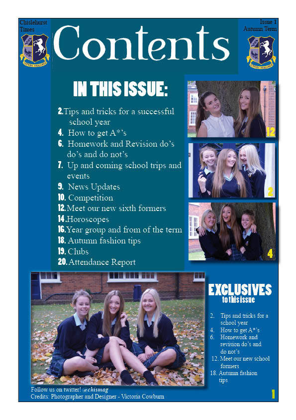
Again, I strongly feel I have made a significant amount of progress looking back at school magazine contents page and my new current product. My preliminary contents page lacks any sense of style or sophistication as the layout of the page is very basic. There are no conventions at all that demand attention from the reader such as advertisement of exciting articles or subscription offers. I feel I managed the space of the page very badly as there is a lot of blank space that could have been filled with useful information. By contrast, on my music contents page I filled the whole page with standard conventions that are coloured appropriately to my consistent colour scheme.
The colour scheme of preliminary products is very poor due the fact I had little knowledge of colour connotations. I also had little knowledge of the colour wheel meaning I have used colours that clash very harshly against each other e.g. blue and yellow. Learning from this I ensured my music magazine had a better colour scheme that did not contain clashing colours but still looked aesthetically pleasing.
Comparing Contents Pages
Overall, in my opinion I feel there is a huge contrast between my school magazine front cover and music magazine front cover. My music magazine looks far more stylish and sophisticated due the extra preparation and planning I did before constructing the product. I feel my school magazine front cover looks very amateur and basic meaning it would not sell well against other similar products. I did not use enough conventions such as coverlines or skyline which would have increasingly absorbed a readers full attention.
Compared to my music magazine, the main image does not look professional as it was taken outside which is not usually done for front cover image. I did not leave enough room around the model’s meaning all the coverlines overlap over the subject matters making the layout look very poor. However for my music magazine I the main image was taken against a white background using studio lighting adding professionalism to the image. I ensured I left a sufficient amount of background space around my model in order to add coverlines and other conventions during the construction planning. This shows my lack of planning and research for school magazine photo shoot. In addition, none of the coverlines actually relate to the main image, possibly making the reader confused as why there is picture of three random girls. This again shows that I did not think through how I was going present my cover model’s and they related to the rest of the magazine.
When constructing my preliminary contents page I did not plan out the layout as much as I should have. This altered my audiences perception of the company as a lack of planning can mean the articles will be of a poor quality. I used random font styles that were not the best, causing my typography not to be fluent. When designing my font for my music magazine I considered style, size, spacing and colour in much more depth after understanding more thoroughly how important typography is. The typography of the page has a huge impact on the page, through presentation and the ability of understanding the text. The purpose of a contents page is to inform the reader about the articles further on inside the product therefore the page must legible.
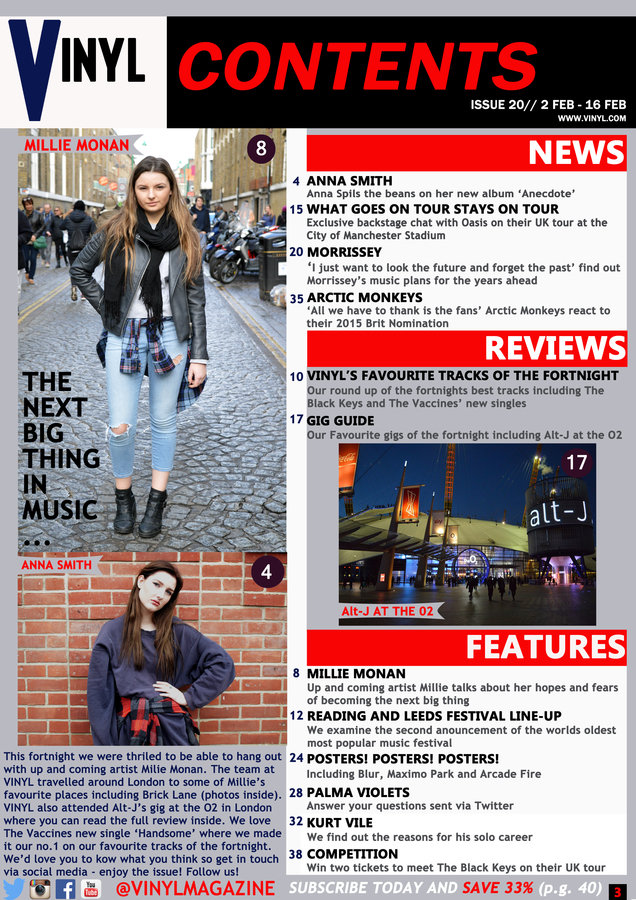
I did however on my school contents page follow the standard form of making the page consist of 50% images and 50% text. However the images I used were taken from the same shoot as the front cover, lacking costume changes. The contents page should also have pictures of other aspects of the magazine instead of just the cover models. Now knowing this, I made sure I performed more than one shoot for my music magazine so that I would have a wide selection of images to choose from for my contents. I took photographs of the O2 arena, 'Millie Monan down Brick Lane and 'Anna Smith' against a brick wall.
Summarising
Overall, in my opinion I feel there is a huge contrast between my school magazine front cover and music magazine front cover. My music magazine looks far more stylish and sophisticated due the extra preparation and planning I did before constructing the product. I feel my school magazine front cover looks very amateur and basic meaning it would not sell well against other similar products. I did not use enough conventions such as coverlines or skyline which would have increasingly absorbed a readers full attention.
Compared to my music magazine, the main image does not look professional as it was taken outside which is not usually done for front cover image. I did not leave enough room around the model’s meaning all the coverlines overlap over the subject matters making the layout look very poor. However for my music magazine I the main image was taken against a white background using studio lighting adding professionalism to the image. I ensured I left a sufficient amount of background space around my model in order to add coverlines and other conventions during the construction planning. This shows my lack of planning and research for school magazine photo shoot. In addition, none of the coverlines actually relate to the main image, possibly making the reader confused as why there is picture of three random girls. This again shows that I did not think through how I was going present my cover model’s and they related to the rest of the magazine.
By feeling more competent with using software publications such as Photoshop and InDesign I felt put an advantage when constructing my music magazine. The school magazine taught me the basic techniques in order to construct a magazine which only made my product look very simple and minimalistic. I wanted to further my skills and show my full potential therefore I tried using new tools such as adding shadows and strokes. This increased the sophisticated of the page and showed that I was capable of using such software's at a higher degree.
My music magazine is very similar and more inspired by other authentic products from the same genre. I researched heavily into other indie magazines such as NME, Q and Rolling Stone where I gained lots of knowledge on how the indie culture was represented through each product. Looking back at both of my preliminary products I feel they lack the persona of the school and its morals which would be a bad representation to new parents.
Time Management and Planning
Overall, in my opinion I feel there is a huge contrast between my school magazine front cover and music magazine front cover. My music magazine looks far more stylish and sophisticated due the extra preparation and planning I did before constructing the product. I feel my school magazine front cover looks very amateur and basic meaning it would not sell well against other similar products. I did not use enough conventions such as coverlines or skyline which would have increasingly absorbed a readers full attention.
Compared to my music magazine, the main image does not look professional as it was taken outside which is not usually done for front cover image. I did not leave enough room around the model’s meaning all the coverlines overlap over the subject matters making the layout look very poor. However for my music magazine I the main image was taken against a white background using studio lighting adding professionalism to the image. I ensured I left a sufficient amount of background space around my model in order to add coverlines and other conventions during the construction planning. This shows my lack of planning and research for school magazine photo shoot. In addition, none of the coverlines actually relate to the main image, possibly making the reader confused as why there is picture of three random girls. This again shows that I did not think through how I was going present my cover model’s and they related to the rest of the magazine.
During the process of my school magazine I struggled with managing my time as I did not have a clear schedule making me realise at the last minute I had lot of work to do in a short period of time. I made sure for my music magazine I made a schedule that was realistic enough to stick to with realistic deadlines. This meant I had to spend more time outside of school working on the task in order to finish everything in time. I did feel some pressure towards the end of the course as I worried if I would finish in time.
As well as organising myself, organising my chosen models was another aspect that had to be considered. I made sure I gave each model enough notice in advance so that we could settle on a date. I also made sure I investigated train times and planned my route in order to get to my location easily. I also visited my location of my first photo shoot to make sure it was sufficient enough and matched what I had envisioned after researching Brick Lane on the internet. This is unlike my school magazine where I improvised last minute with location and model’s causing my photo shoots to be rushed, decreasing the quality of my work
What have I learnt?
Overall, in my opinion I feel there is a huge contrast between my school magazine front cover and music magazine front cover. My music magazine looks far more stylish and sophisticated due the extra preparation and planning I did before constructing the product. I feel my school magazine front cover looks very amateur and basic meaning it would not sell well against other similar products. I did not use enough conventions such as coverlines or skyline which would have increasingly absorbed a readers full attention.
Compared to my music magazine, the main image does not look professional as it was taken outside which is not usually done for front cover image. I did not leave enough room around the model’s meaning all the coverlines overlap over the subject matters making the layout look very poor. However for my music magazine I the main image was taken against a white background using studio lighting adding professionalism to the image. I ensured I left a sufficient amount of background space around my model in order to add coverlines and other conventions during the construction planning. This shows my lack of planning and research for school magazine photo shoot. In addition, none of the coverlines actually relate to the main image, possibly making the reader confused as why there is picture of three random girls. This again shows that I did not think through how I was going present my cover model’s and they related to the rest of the magazine.
From my preliminary task all the way through to my evaluation of music magazine I feel my skills have developed massively. I now feel more competent in using software publications such as Photoshop and InDesign where I feel I could easily construct another magazine. On Photoshop I feel I know what the majority of the tools on the tool bar do and how to use them.
I have learnt how closely connected magazines and their audiences are, which is impacted largely by the publishing company and the layout the product. I have also learnt about different camera angles, techniques and how important images are to a magazine. The design and style of the magazine also has a large impact on the genre of the magazine which is very important when attracting a niche audience. Before starting this course I had little knowledge about music magazines as I had never read one before. I know now about all the important conventions and the links between representation and audience. I will now continue to read music magazines and study them in the same amount of detail after thoroughly enjoying this task.