I Hate Beamer
An Undistinguished Display of Frustration
UDLS @ UBC CS
Victor Sanches Portella
Please, do interrupt!
And there won't be any bread or rice

What is Beamer?
How everything started

What is LaTeX?

Typesetting system designed by Donal Knuth
"My book looks awful. Hold my beer"
Focus on formatting
"Set of macros" built on top of TeX
Focus on content
Widely used in papers and books from STEM and other fields
Built-in math typesetting
What is LaTeX?
\documentclass{article}

\title{Your Paper}
\author{You}

\begin{document}
\maketitle

\begin{abstract}
Your abstract.
\end{abstract}

\section{Introduction}

Hello world!

\end{document}
What is LaTeX?
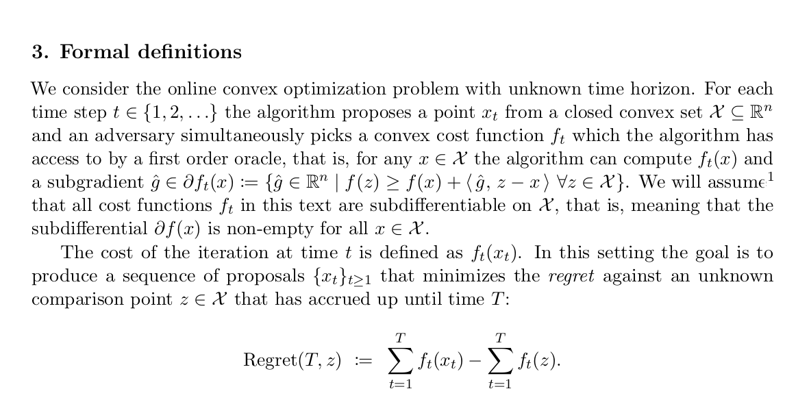
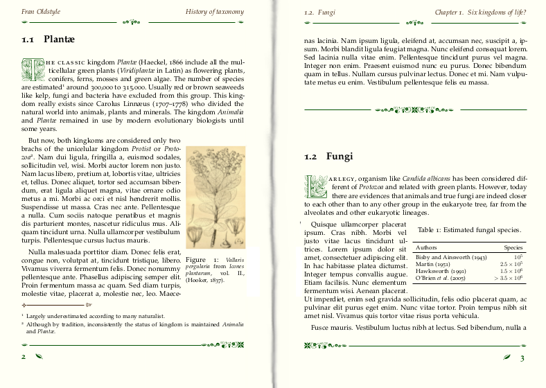
What is Beamer?
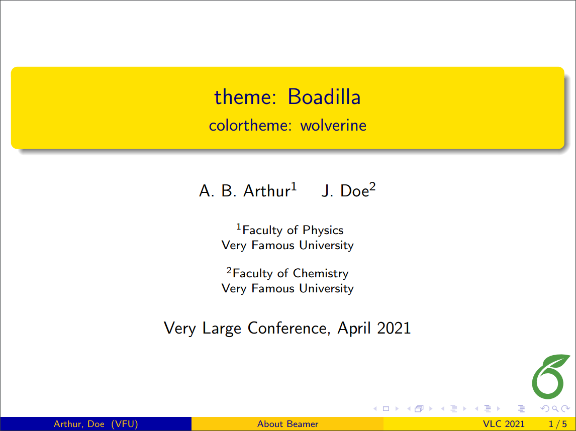
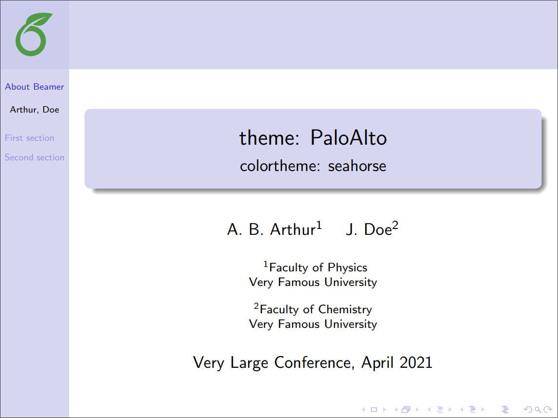

What is Beamer?
Beamer is a document class for LaTeX to create slides (and posters)
Very well documented
Plenty of themes and features
Actively mantained
Many examples of good slide decks
LaTeX focuses on content by design
We (should) want to control format in slides
Why do I Hate it?
It is about who it makes us be
#1: Used For the Wrong Reasons
" I want to use math in my presentations"
"I will live in the sea because I want to have fish"
"I am used to LaTeX"
The work you need to make it look decent is not worth it
"I can Copy & Paste stuff from my paper"

#2: Too Standardized
Beamer slide decks look awfully identical
Even with different themes
In a conference, you want to be memorable
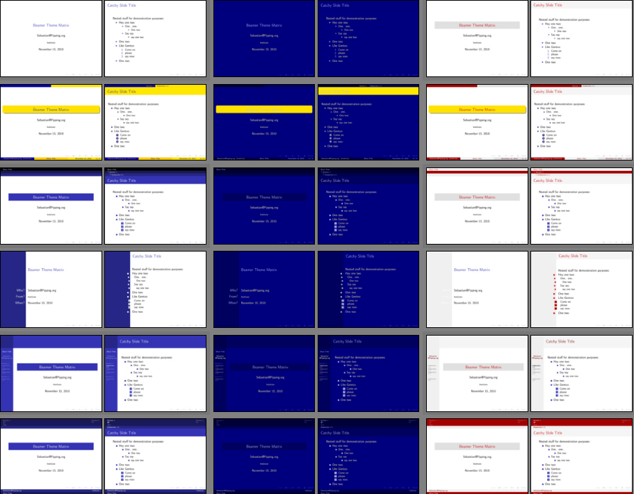
Hard to make it look good

I haven't watched The Office


Me in a conference

#3: Visual Tweaks are Hard
LaTeX is built for users to focus on content
Changes in format are possible, but not the main use case
Visual aids need to be made outside LaTeX
This incentivizes people to not use visual aids
"OoOoOoH, WhAt AbOuT TikZ?"

#3.5: TikZ is Pain
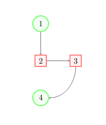
Looks easy enough, right?
\begin{tikzpicture}[
roundnode/.style={circle, draw=green!60, fill=green!5, very thick, minimum size=7mm},
squarednode/.style={rectangle, draw=red!60, fill=red!5, very thick, minimum size=5mm},
]
%Nodes
\node[squarednode]      (maintopic)                              {2};
\node[roundnode]        (uppercircle)       [above=of maintopic] {1};
\node[squarednode]      (rightsquare)       [right=of maintopic] {3};
\node[roundnode]        (lowercircle)       [below=of maintopic] {4};

%Lines
\draw[->] (uppercircle.south) -- (maintopic.north);
\draw[->] (maintopic.east) -- (rightsquare.west);
\draw[->] (rightsquare.south) .. controls +(down:7mm) and +(right:7mm) .. (lowercircle.east);
\end{tikzpicture}
This is the f***ing beginners tutorial
#3.5: TikZ is Pain

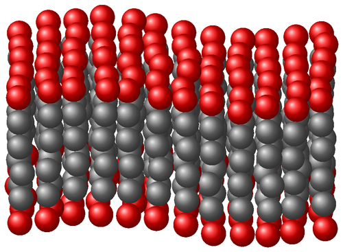
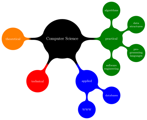
Very powerful, but seldomly worth it (IMO)
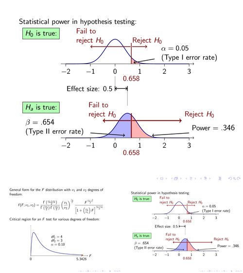
#4: AWFUL BULLET POINTS
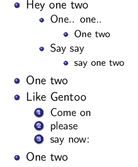
Most Beamer bullet points look bad
and SO MANY PEOPLE USE IT

But the "3D" ones are AWFUL
Bad Examples from Me
Do what I say, not what I do
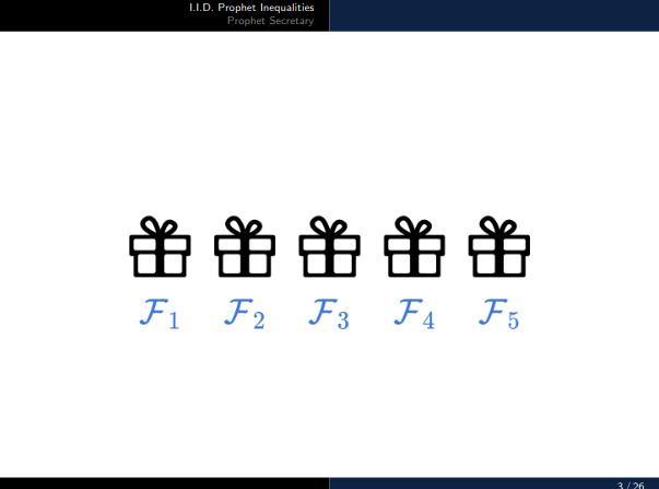
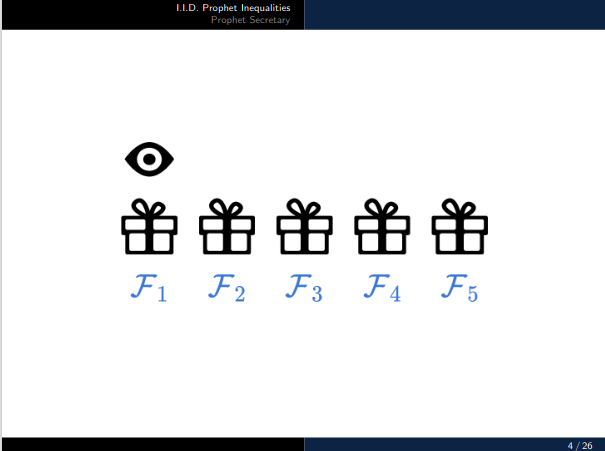
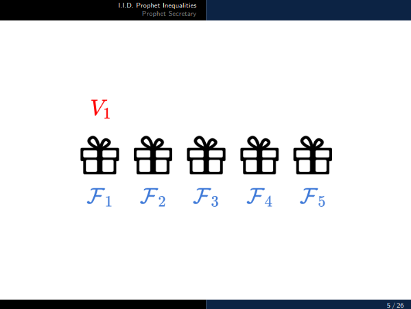
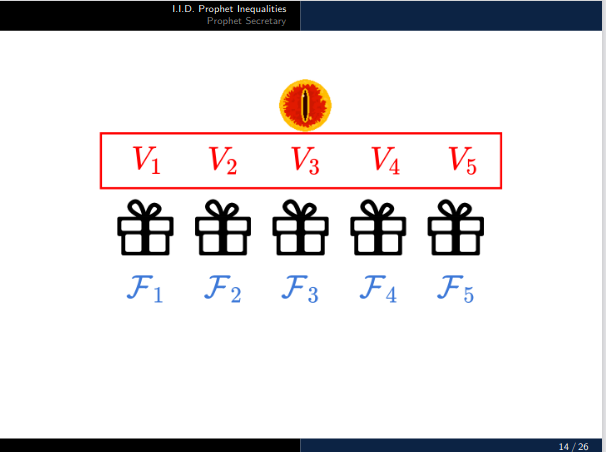
Made outside LaTex
Each slide is a diff img
Images were done on another slide software
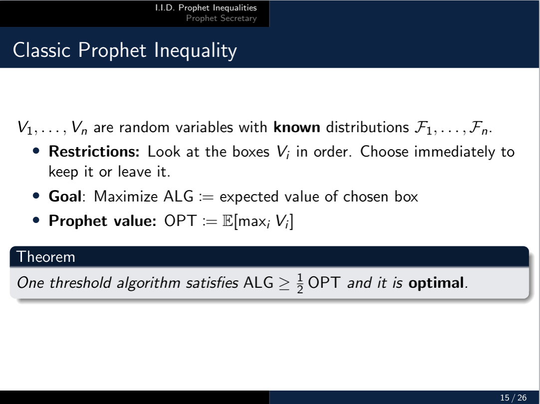
No visual aids (Too much trouble)
No Colors (not hard in LaTeX, but not easy)
Beamer induced us to make our slides "boring"
Huge blank space because moving text around is hard
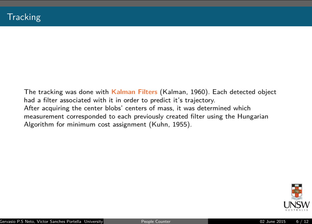
Citing in slides with BibTeX is pointless
Copying algorithms from paper was ""easier""
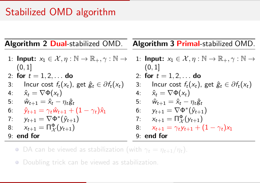
Double column was a pain
No visual aids again.
Standard template
Why do I Hate Beamer?
I do not exactly hate the Beamer class itself
I hate the idea of building slides with LaTeX
LaTeX is buit so we can emphasize on content
With slides we SHOULD want to tweak with format
LaTeX "gives cookies" to people that don't bother with format
Beamer slides end up being dry and very similar to each other
What are the Alternatives?
If not, why bother?
PowerPoint
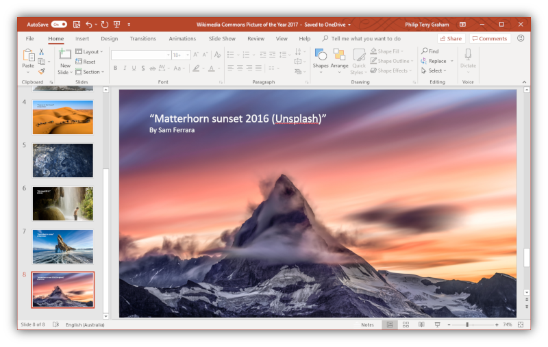
Heavy AF
VERY Powerful
"""Paid"""
Famous - A lot of online help
Microsoft
LibreOffice Impress
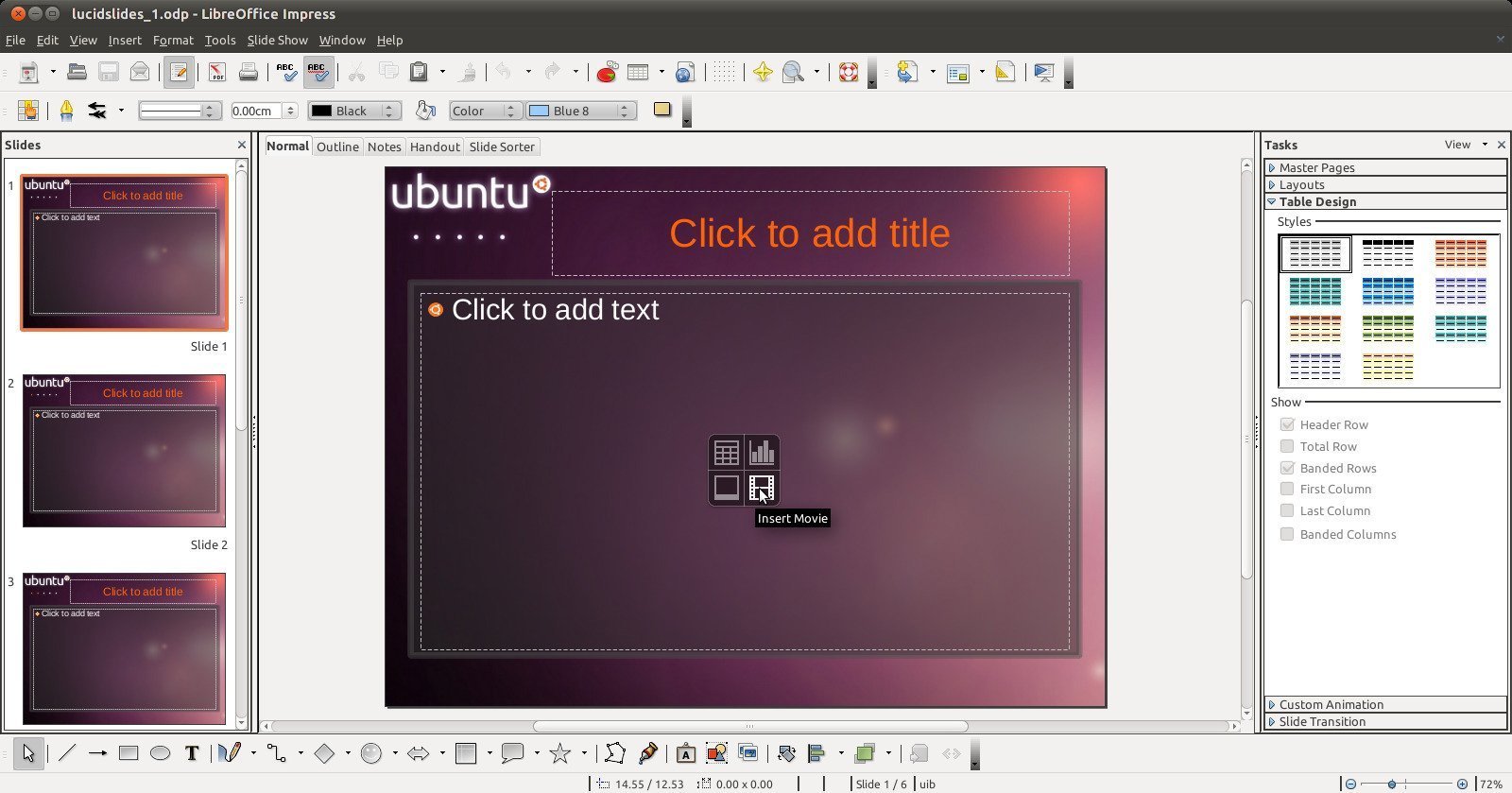
AKA That thing that opens when you open a .ppt on Ubuntu
I don't know anyone that has used it
Google Slides
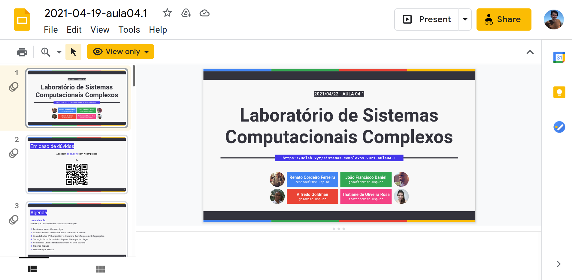
Web Based
Web Based
Very Good for Colaboration
Add-ons of Varying Quality
Keynote
Requires Apple product
I've heard it is pretty good
I've seen really good presentations that used it

Please I don't want to hear about how good Apple's ecosystem is
Reveal.js
Crazily powerful
Flexible API
Markdown

Extensible
No GUI (kinda)
KaTeX support built-in
Might suffer from same problems from Beamer
Reveal.js / Slides.com
Free version of editor doesn't allow you to have a offline presentation
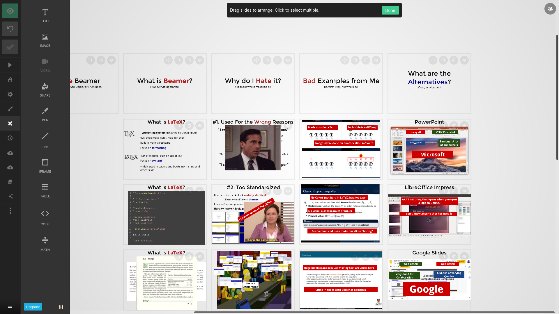
Very nice UI
Easy to learn
Crazily powerful
KaTeX support built-in
Might suffer from same problems from Beamer without editor
Other options...?
I Hate Beamer
An Undistinguished Display of Frustration
UDLS @ UBC CS
Victor Sanches Portella