CSS ANIMATIONS KICKSTARTER
Why Should we care
-
Enables users to accomplish a variety of tasks and interact with the product in an intuitive and effective way.
-
The experience of using a product is more rewarding
-
It enables us to redirect users attention.
-
User interaction is tied on an animation and It helps report about an element state.
- Allow developers to convey complex concepts and ideas with animations.
- Enables developers to create marketing campaigns.

BuT ultimately
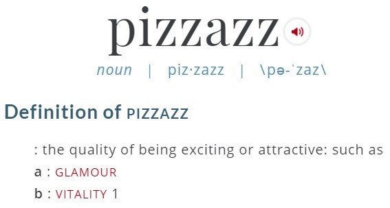
it gives pIzazz to OUR apps

we care because


animation-timing-function: ease-in;
animation-delay: 0s;
animation-iteration-count: infinite;
animation-duration: 2s;
Also: cubic-bezier() (http://cubic-bezier.com/)
- Configuring the animation -

animation-direction: normal;
animation-fill-mode: backwards;
animation-play-state: running;
animation-name: circleAnimation;

animation: 2s ease-in 0s infinite normal backwards running circleAnimation;

 @keyframes circleAnimation {
      0% {
	   border-color: #094a49;
      }
      50% {
	   border-color: #00fffc;
      }
      100% {
	   transform: rotate(-360deg);
	   border-color: #094a49;
      }
 }
- CREATING THE ANIMATION STEPS -


-webkit-animation: 2s ease-in 0s infinite normal backwards running circleAnimation;
-moz-animation: 2s ease-in 0s infinite normal backwards running circleAnimation;
-o-animation: 2s ease-in 0s infinite normal backwards running circleAnimation;
animation: 2s ease-in 0s infinite normal backwards running circleAnimation;
- Vendor prefixes -

Browser Compatibility

- SHOW ME THE COOL STUFF -


Now you KNOW

- Create an animation
- Some best practices
- Prefixing and B.C.
- Animation Debugging
Now go animate something
