Storytelling for ux research
Packaging insights for impact
V. Sri, Content Designer

This was my first job
This was my boss
You need to tell the right story
Is this you?
Is this your audience?


Imagine: this reaction


- Nuts and bolts
- Stories are about tension
- Shelves
- Some simple story frameworks
- Renovation
- Let's workshop our stories
Today
the data
The Greatest Sales Deck I’ve Ever Seen
Want a Better Pitch? Watch This.
For Startups, the Power of “Why Now”
Zak, P. (2015). Why Inspiring Stories Make Us React: The Neuroscience of Narrative. Cerebrum: The Dana Forum On Brain Science, 2015. Link
Lin, P., Grewal, N., Morin, C., Johnson, W., & Zak, P. (2013). Oxytocin Increases the Influence of Public Service Advertisements. Plos ONE. Link
How storylines can aid memory. (2012). the Guardian. Retrieved 17 October 2018 Link
Stephens, G., Silbert, L., & Hasson, U. (2010). Speaker-listener neural coupling underlies successful communication. Proceedings Of The National Academy Of Sciences. Link
Paul, A. (2014). Opinion | The Neuroscience of Your Brain on Fiction. Nytimes.com. Retrieved 17 October 2018. Link
Young, K., & Saver, J. (2001). The Neurology of Narrative. SubStance, 30(1/2), 72-84. Link
Nuts and bolts
Stories are about tension
If nothing else, remember this
But
Therefore
Our expectations were upended when...
...so because of that, this happened
tension makes a story a story
Shelving
Simple story frameworks
five-part Pitch
Marketing consultant Andy Raskin created this five-part pitch to help businesses create better sales deck. I liked it so much, I created a Star Wars based summary of Raskin's framework.
Kishōtenketsu
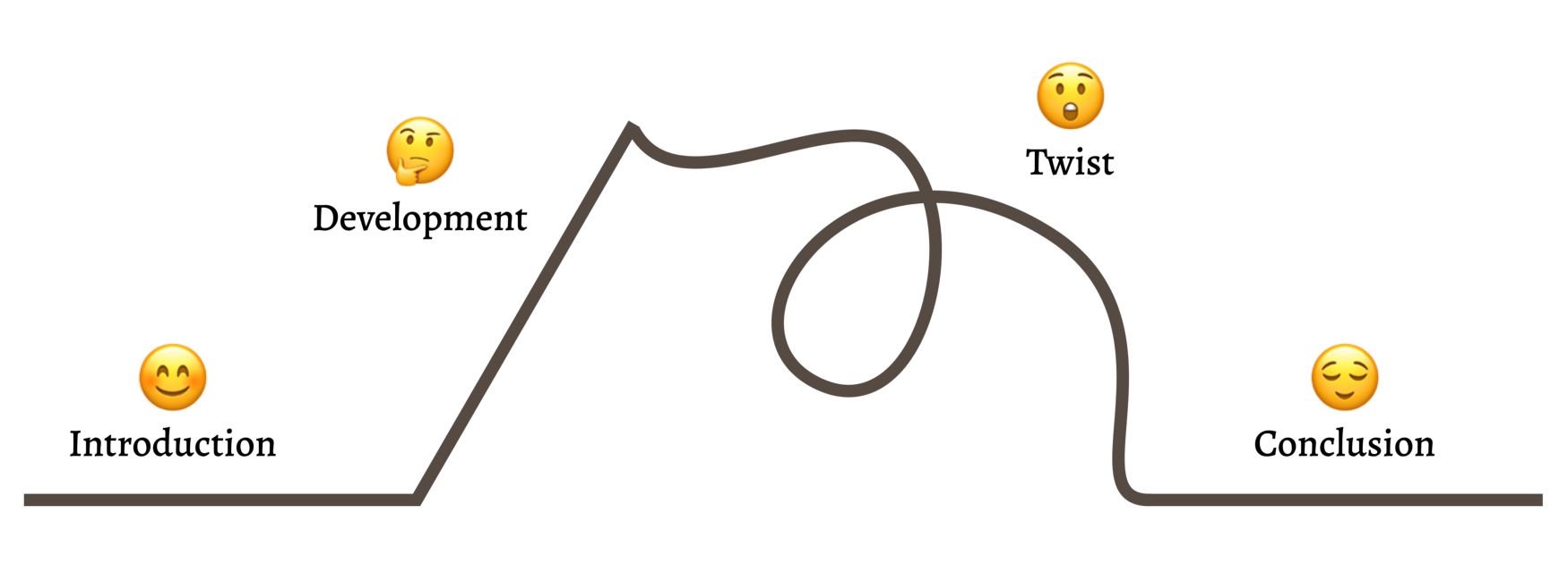
UX researcher Amy Rogers writes about Kishōtenketsu, a four-stage narrative structure from Japan with roots in classical Chinese poetry.
AIDA
AIDA is the oldest trick in a copywriter's toolbelt.
It's also an easy way to subdivide a piece of content for maximum influence.
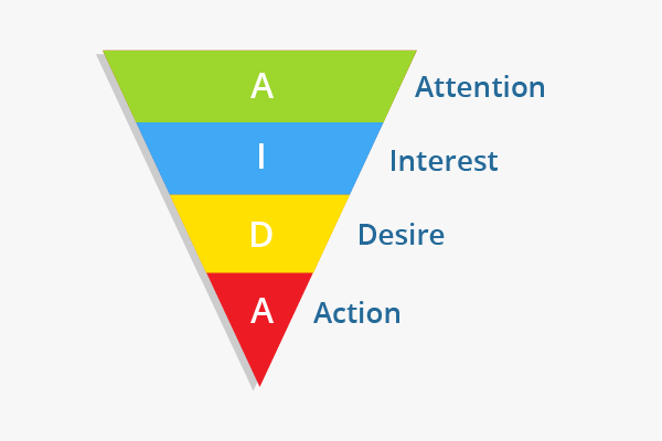
Renovation
Let's workshop our stories
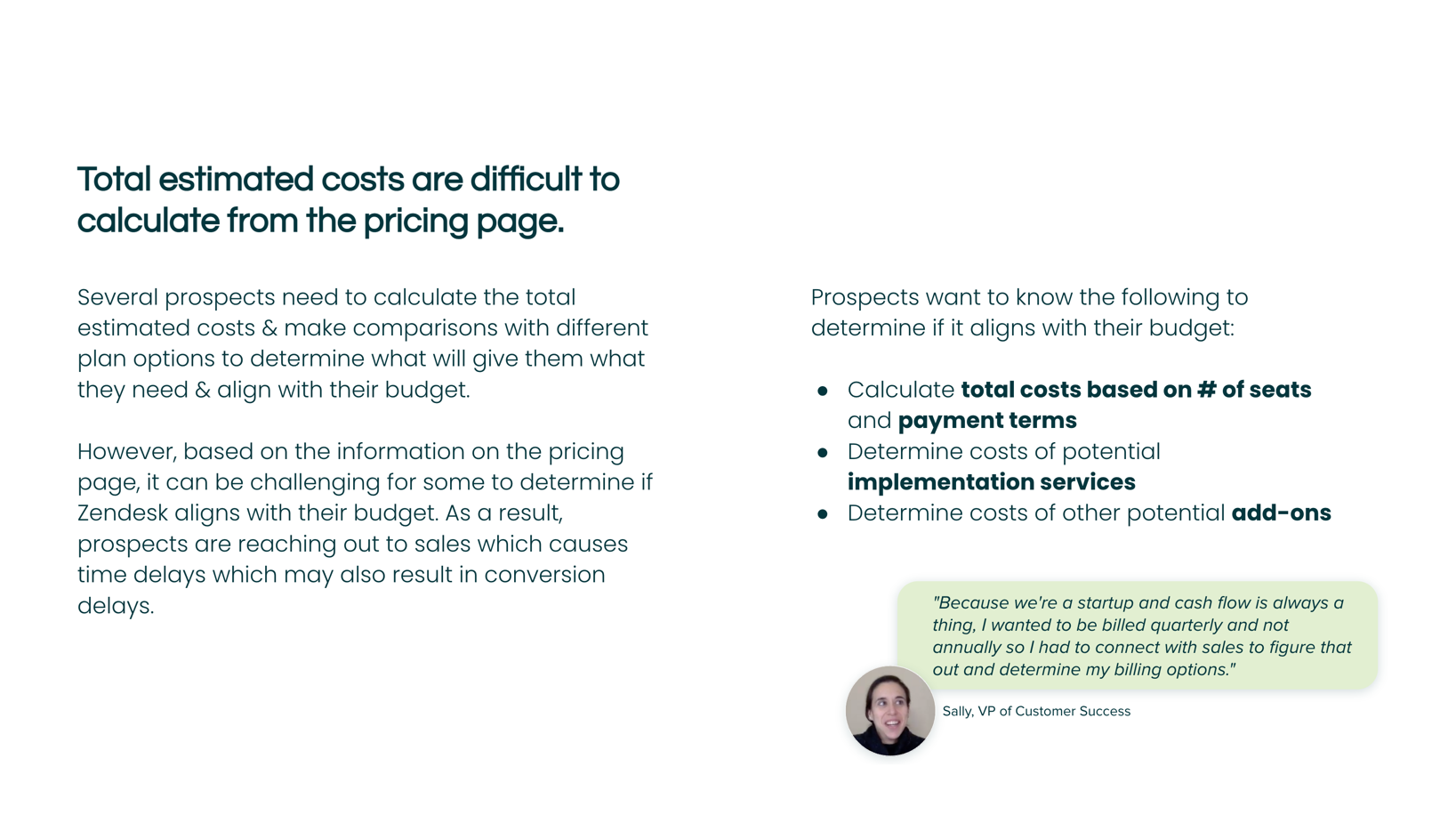
Example of a UX research summary slide

Name the enemy
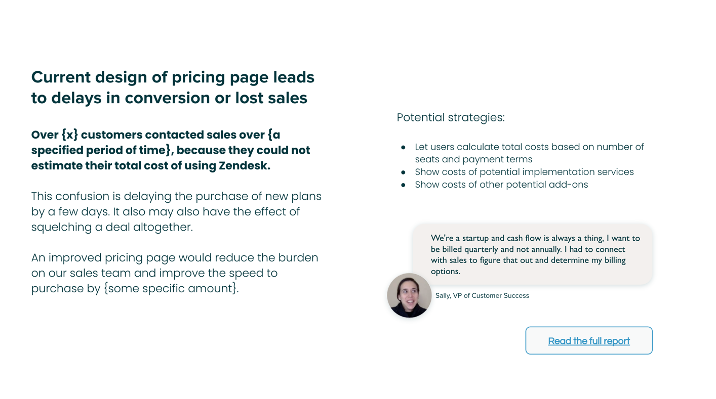
...and give it teeth
Why now?
Show the promised land
Renovated version (same info, clearer story)

Identify obstacles (and how to overcome them)
Provide evidence
Why now?
Promised land

Obstacles / Evidence
ready to work on yours?
Sentence stacking
Write out each sentence on a separate line. Instead of a continuous snake of sentences, start with a vertical list.
When you stack your sentences in a column, they become easier to see and move around.
This line-by-line approach can bring clarity to your writing.
ShopEZ is an emerging ecommerce platform
We did usability testing, surveys, Google analytics review
Their current checkout experience has high cart abandonment
There is confusing navigation between checkout steps
We evaluated their entire checkout flow
Lack of payment options
No guest checkout options
The task completion rate was 60%
Shipping costs too high
Lack of payment options
To rectify this we can simplify the checkout
Build in more transparency for shipping costs
Increase payment options
Implement guest checkout
hey@lookandpoint.com
