dnd-kit
A modular toolkit for building drag & drop interfaces for React
Crash Course!
What
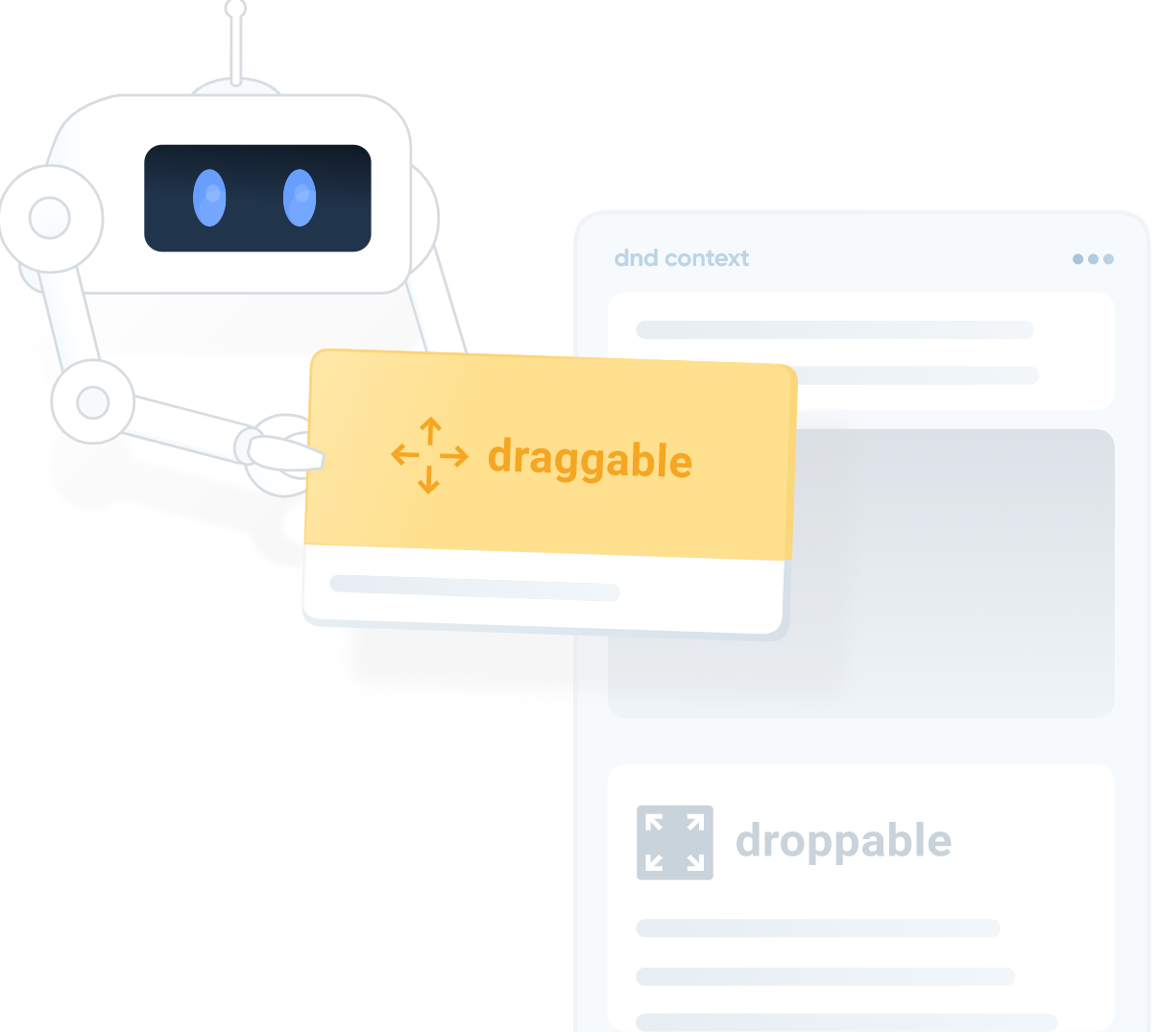
What is dnd kit
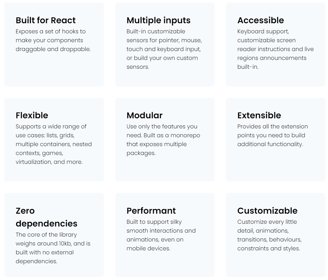
"A modular, lightweight, performant, accessible and extensible drag & drop toolkit for React."
Stats
| No | Item | Description |
|---|---|---|
| 1. | Total Commits | 259 |
| 2. | Last Commit | 20 days ago |
| 3. | Opened Issues | 74 out of 155 |
| 4. | Opened Pull Requests | 11 out of 122 closed |
| 5. | Total Stars | 2.7k |
| 6. | Total Fork | 96 |
| 7. | First Public Release | 3rd Jan 2021 (v1.0.0) |
| 8. | Latest version | v3.1.1 |
Contributers

Why
Motivation
- Drag & Drop functionality is important for an interactive & user friendly user interface
- Current solutions are
- too difficult to use
- not flexible for many uses cases
- not modular and customizable enough
Comparing to Existing library - Stats
| No | Item | react-dnd | react-beautiful-dnd (rbd) | dnd-kit |
|---|---|---|---|---|
| 1. | Owner | atlassian | shopify | |
| 2. | Total Commits | 2,170 | 785 | 259 |
| 3. | Last Commit | 3 days ago | 2 months ago | 20 days ago |
| 4. | Opened Issues | 243 out of 1,233 | 399 out of 985 | 74 out of 155 |
| 5. | Opened Pull Requests | 8 out of 1,810 | 66 out of 852 | 11 out of 122 |
| 6. | Total Stars | 16.2k | 24.5k | 2.7k |
| 7. | Total Fork | 1.7k | 1.8k | 96 |
| 8. | First Public Release | 19 May 2015 (v1.0.0) | 11 Aug 2017 (v1.0.1) | 3rd Jan 2021 (v1.0.0) |
| 9. | Latest version | v14.0.3 | v13.1.0 | v3.1.1 |
Comparing to Existing library - Overview
| No | Item | react-dnd | rbd | dnd-kit |
|---|---|---|---|---|
| 1. | Use Cases | ❤️ Anything | List, Kaban | ❤️ Anything |
| 2. | Learning Curve | High | ❤️ Low | ❤️ Low |
| 3. | Flexibility | ❤️ High | Low | ❤️ High |
| 4. | Sensor/Backend | HTML5 | ❤️ Pointer, Mouse, Touch, Keyboard | ❤️ Pointer, Mouse, Touch, Keyboard |
| 5. | Performance | Low | ❤️ High | ❤️ High |
| 6. | Accessibility | Low | ❤️ High | ❤️ High |
| 7. | Modularity - Styling/ Animation - Collision Detection - Overlay/Constrains - Drag Handles - Presets |
Low | Medium | ❤️ High |
Backend / Sensors
-
dnd-kit is not using HTML5 Drag and Drop API by design since it does not support:
- touch devices / keyboard
- lock dragging / bounds to container
- custom collision detection strategies
- dragged item preview
- performance/accessibility improvements
- Trade off is won't be able to drag from desktop or between windows
Features
How
Overview Concept
DndContext
import React from 'react';
import {DndContext} from '@dnd-kit/core';

import {Draggable} from './Draggable';
import {Droppable} from './Droppable';

function App() {
  return (
    <DndContext>
      <Draggable />
      <Droppable />
    </DndContext>
  )
}
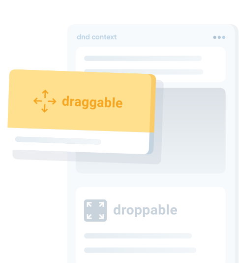
In order for your Droppable and Draggable components to interact with each other, you'll need to make sure that the part of your React tree that uses them is nested within a parent <DndContext> component.
import React from 'react';
import {useDroppable} from '@dnd-kit/core';

function Droppable(props) {
  const {isOver, setNodeRef} = useDroppable({
    id: 'droppable',
  });
  const style = {
    color: isOver ? 'green' : undefined,
  };


  return (
    <div ref={setNodeRef} style={style}>
      {props.children}
    </div>
  );
}
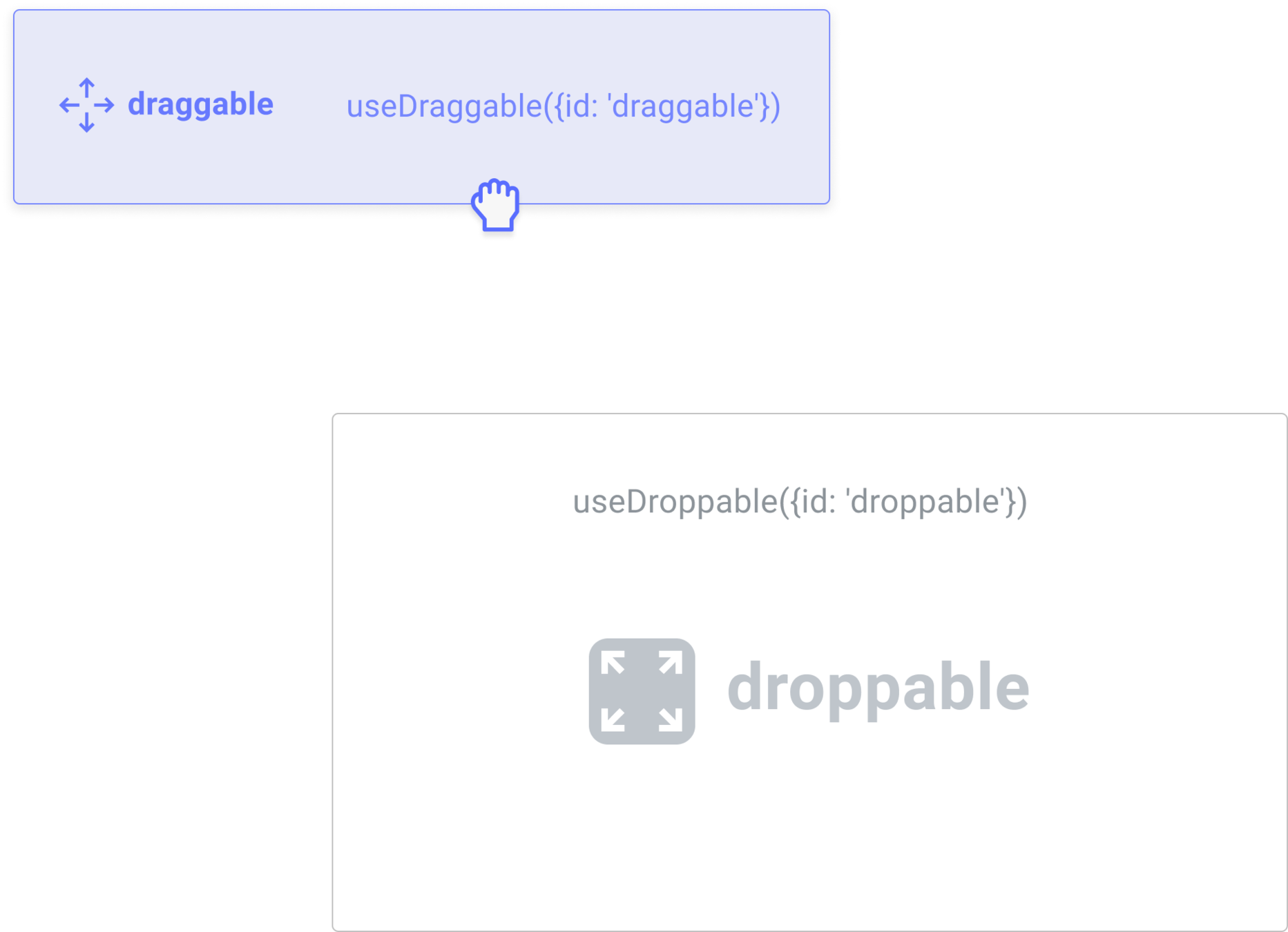
Let's set up your first Droppable component. When a draggable element is moved over your droppable element, the isOver property will become true.

Change the bg to green when isOver
import React from 'react';
import {useDraggable} from '@dnd-kit/core';

function Draggable(props) {
  const {attributes, listeners, setNodeRef, transform} = useDraggable({
    id: 'draggable',
  });
  const style = transform ? {
    transform: `translate3d(${transform.x}px, ${transform.y}px, 0)`,
  } : undefined;


  return (
    <button ref={setNodeRef} style={style} {...listeners} {...attributes}>
      {props.children}
    </button>
  );
}
Next, let's take a look at implementing our first Draggable component. After a draggable item is picked up, the transform property will be populated with the translate coordinates you'll need to move the item on the screen.

Putting the Pieces Together
Next we need to define what happens when draggable is dropped into droppable.
onDragEnd
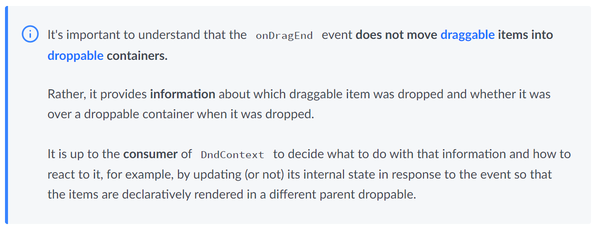
- Fires after a draggable item is dropped.
- Contains information about the active draggable item
import React from 'react';
import {DndContext} from '@dnd-kit/core';

import {Droppable} from './Droppable';
import {Draggable} from './Draggable';

function App() {
  const [isDropped, setIsDropped] = useState(false);
  const draggableMarkup = (
    <Draggable>Drag me</Draggable>
  );

  return (
    <DndContext onDragEnd={handleDragEnd}>
      {!isDropped ? draggableMarkup : null}
      <Droppable>
        {isDropped ? draggableMarkup : 'Drop here'}
      </Droppable>
    </DndContext>
  );

  function handleDragEnd(event) {
    if (event.over && event.over.id === 'droppable') {
      setIsDropped(true);
    }
  }
}
onDragEnd
Define a onDragEnd handler to update isDropped state.
if isDropped is true, show Draggable item inside the Droppable area.
Demo
import React from 'react';
import {DndContext} from '@dnd-kit/core';

import {Droppable} from './Droppable';
import {Draggable} from './Draggable';

function App() {
  const containers = ['A', 'B', 'C'];
  const [parent, setParent] = useState(null);
  const draggableMarkup = (
    <Draggable id="draggable">Drag me</Draggable>
  );

  return (
    <DndContext onDragEnd={handleDragEnd}>
      {parent === null ? draggableMarkup : null}

      {containers.map((id) => (
        // We updated the Droppable component so it would accept an `id`
        // prop and pass it to `useDroppable`
        <Droppable key={id} id={id}>
          {parent === id ? draggableMarkup : 'Drop here'}
        </Droppable>
      ))}
    </DndContext>
  );

  function handleDragEnd(event) {
    const {over} = event;

    // If the item is dropped over a container, set it as the parent
    // otherwise reset the parent to `null`
    setParent(over ? over.id : null);
  }
};
Multiple Droppables Example
DndContext: Props
interface Props {
  announcements?: Announcements;
  autoScroll?: boolean;
  cancelDrop?: CancelDrop;
  children?: React.ReactNode;
  collisionDetection?: CollisionDetection;
  layoutMeasuring?: Partial<LayoutMeasuring>;
  modifiers?: Modifiers;
  screenReaderInstructions?: ScreenReaderInstructions;
  sensors?: SensorDescriptor<any>[];
  onDragStart?(event: DragStartEvent): void;
  onDragMove?(event: DragMoveEvent): void;
  onDragOver?(event: DragOverEvent): void;
  onDragEnd?(event: DragEndEvent): void;
  onDragCancel?(): void;
}
Presets: Sortable
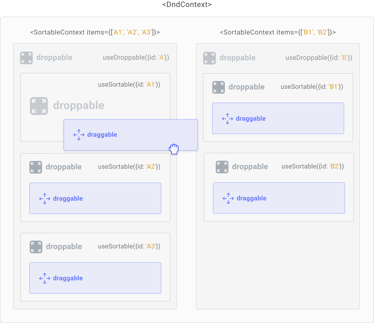
dnd-kit provides all the building blocks to build a sortable interface from scratch but there's already a preset for that.
more presets for common uses cases are coming in the future.

Resources

