Designing for the High Density Web
SO.... WHAT IS A
HIGH DENSITY DISPLAY?
Device pixel
is the smallest physical
unit displayed.
Pixel density
is the number of pixels
displayed in a given space.
Resolution
is the number of pixels across the
entire width or height of a device.
Pixels per inch
(ppi or dpi)
is the amount of pixels you get when
you divide the physical width of the
display by the number of horizontal
pixels displayed.
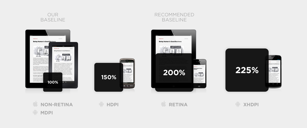
High DPI
is a display density of
200 pixels per inch or greater.
SO?
SAME PHYSICAL SIZE BUT MORE PIXELS.
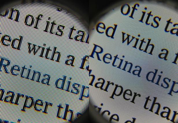
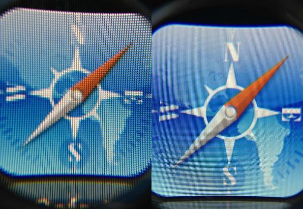
Retina Display
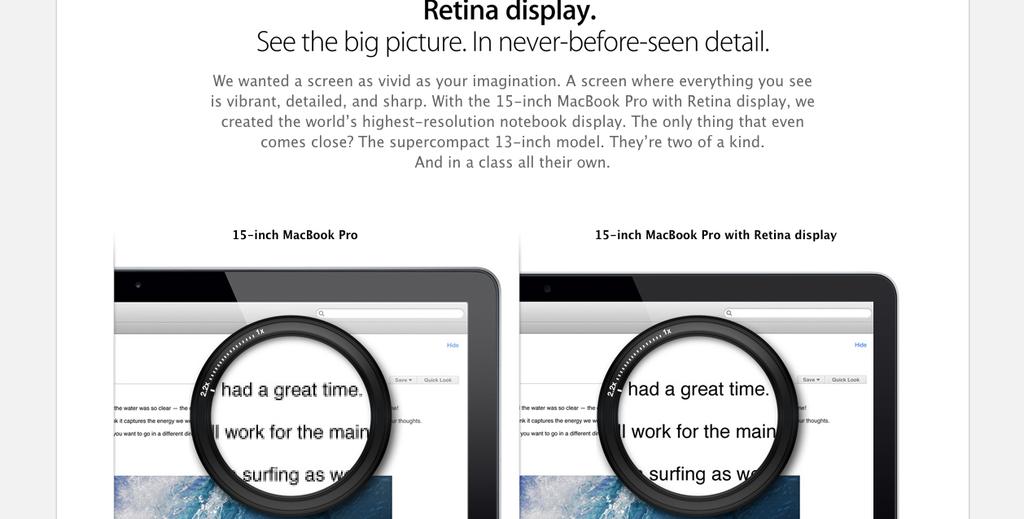
Retina Display is a brand name used by Apple for liquid crystal displays which they claim have a high enough pixel density that the human eye is unable to notice pixelation at a typical viewing distance.
HIGH DENSITY goes beyond just APPLE & retina
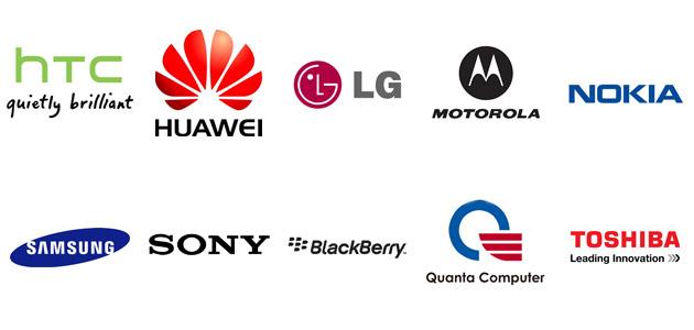
+ 100s more
all have high density displays
It IS
Mobile
DESKTOp
LAPTOP
FRIDGE :)
and whatever else we think up!
So...
WHY DO WE HAVE TO
design for it?
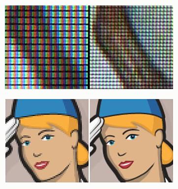
easy...
Shit looks bad on it
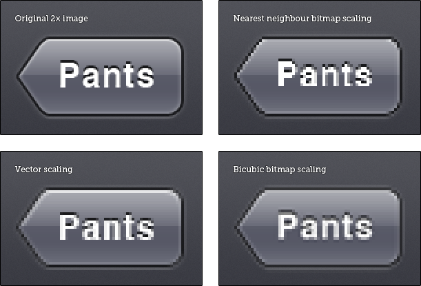
EXAMPLE 1
EXAMPLE 2
EXAMPLE 3
SO...
What can we do about it?
THERE IS...
NO ABSOLUTE SOLUTION
WHY? BECAUSE OF THIS
THERE IS however...
THINGS WE CAN CHANGE
IN OUR PROCESSES
Lets START IN
PHOTOSHOP
SOLUTION #1
SCALE UP / SCALE DOWN
SCALE UP
- Easier to handle file sizes.
- Everything is at a 1:1 grid size.
- It will fit on your screen.
- Personal preference.
SCALE DOWN
- Allows you to get deep into the fine,
pixel-level details right for the onset.
-
Personal preference.
TIPS
- Design at an even pixel.
- Keep Layer Styles even.
- Don't use Bitmaps, use vectors
- Turn on Snap to Pixel
- Use smart objects as much as possible.
- Use Actions (more to come)
BUT...
Can’t I just design at 2× and
bitmap scale down to 1×?
YOU CAN..
So to sum up
-
Yes you have to create multiple images.
What sizes & how many... that's up to you! -
No there is no awesome easy solution.
You want the detail that the awesome apps have,
spend the time, create the images! - No you don't have to do this if you don't want to.
SOLUTION #2
The 150% SOLUTION
http://alistapart.com/article/mo-pixels-mo-problems
Simple
- Build everything at 150% the size.
- Average out the images
- Slightly larger size than 100%
- Slightly less quality than 200%+
- Easier development process
- Great for CMS site
SOLUTION #3
DO NOTHING
(not really a solution)
NEXT
DEVELOPMENT
I'm no expert in this section
but felt obliged to add it :D
NATIVE APP
IT'S ALL THE DEVELOPER
THE ISSUE IS...
HTML / CSS / JS
ONCE AGAIN...
NO ABSOLUTE SOLUTION
Tip #1
USE MEDIA QUERIES
@MEDIA ONLY SCREEN AND (-WEBKIT-MIN-DEVICE-PIXEL-RATIO: 2), (MIN-RESOLUTION: 192DPI) {/* HIGH-RES STYLES GO HERE */}
OR
<!-- High pixel density displays --> <link rel='stylesheet' href='highRes.css' media='only screen and (-webkit-min-device-pixel-ratio: 2), only screen and (min-resolution: 192DPI)' />
Note that for the moment vendor prefixes are required.
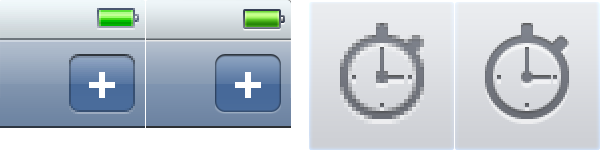
TIP #2
USE 2 CSS SPRITES
Standard and x2
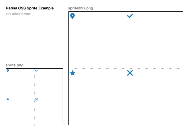
BEYOND THAT
JAVASCRIPT / SERVER SIDE
is A BIT beyond me
PICTURE ELEMENT
<picture width="500" height="500">
   <source media="(min-width: 45em)" srcset="large-1.jpg 1x, large-2.jpg 2x">
   <source media="(min-width: 18em)" srcset="med-1.jpg 1x, med-2.jpg 2x">
   <source srcset="small-1.jpg 1x, small-2.jpg 2x">
   <img src="small-1.jpg" alt="">
   <p>Accessible text</p>
</picture>
The picture element is an image container whose source content is determined by one or more CSS media queries.
REFERENCES
ACTION
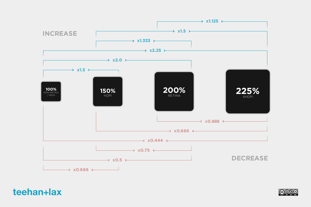
Scale by 50%, 66.6%, 150% and 200%
Scales the document by exactly 50%, 66.6%, 150% or 200%, then (optionally) runs the
Scale Patterns to 100% script and appropriate Mask Feather scaling scrip
Scale Patterns to 100% script and appropriate Mask Feather scaling scrip
+ Heaps more!
AND I'm DONE
Questions?
t: @warwickck