CSS is Magic
Style HTML elements with CSS
- Include a <style> element in the <head> of your HTML document or a <link> element with reference to a stylesheet
- Uses inspector tool to debug problems and test CSS
- Style elements, classes, pseudo-elements, and pseudo-classes
What is CSS?
What is CSS?
What is CSS?
Cascading Style Sheets, most of the time abbreviated as CSS, is a stylesheet language used to describe the presentation of a document written in HTML or XML (including various XML languages like SVG or XHTML). CSS describes how the structured element must be rendered on screen, on paper, in speech, or on other media.
- MDN
CSS provides structure and style
What is CSS?
But if I'm not going to be a designer I don't really need to know CSS, right?

Getting Started
Getting Started
You can apply CSS in multiple ways.
<head>
  <title>My Awesome Page</title>
  <style>
    /* CSS goes here! */
  </style>
</head>
<p style="[ put your styles here ]">Hi!</p><head>
<title>My Awesome Page</title>
<link rel="stylesheet" href="/path/to/css">
</head>Getting Started
CSS allows you to describe the look and layout of the elements on your page
Hello, CSS!
color: red;Hello, CSS!
Hello, CSS!
font-weight: bold;Hello, CSS!
width: 200px;
border: 3px solid blue;Getting Started
selector {
    rule: value;
}
h1 {
color: red;
}
h1#heading {
color: orange;
}
h1 #heading {
color: yellow;
}a:hover {
color: blue;
}
a:active, a:visited {
color: green;
}
a, a:active, a:visited, a:hover {
text-decoration: none;
}p {
font-size: 24px;
}div.success {
border: 1px solid blue;
}Getting Started
We can apply CSS to all elements of a page.
<body>
  <p>Hello, <span>CSS!</span></p>
  <span>You're perfect!</span>
</body>
<body>
<p>Hello, <span>CSS!</span></p>
<span>You're perfect!</span>
</body>span {
/* ... */
}<body>
<p>Hello, <span>CSS!</span></p>
<span>You're perfect!</span>
</body><body>
<p>Hello, <span>CSS!</span></p>
<span>You're perfect!</span>
</body>p span {
/* ... */
}We can specify the selection as well.
<body>
  <p>Hello, <span>CSS!</span></p>
  <span>You're perfect!</span>
</body><body>
<p>Hello, <span>CSS!</span></p>
<span>You're perfect!</span>
</body>p {
/* ... */
}Selections will cover all sub-elements.
Getting Started
If there are two competing rules, the last one applies.
<body>
  <p>Hello, <span>CSS!</span></p>
  <span>You're perfect!</span>
</body>
<body>
<p>Hello, <span>CSS!</span></p>
<span>You're perfect!</span>
</body>span {}
span {}<body>
<p>Hello, <span>CSS!</span></p>
<span>You're perfect!</span>
</body><body>
<p>Hello, <span>CSS!</span></p>
<span>You're perfect!</span>
</body>With different selections, we can create complex styling.
p {}
span {}<body>
<p>Hello, <span>CSS!</span></p>
<span>You're perfect!</span>
</body><body>
<p>Hello, <span>CSS!</span></p>
<span>You're perfect!</span>
</body>It can also get a bit confusing.
p {}
span {}
p span {}Getting Started
By attaching style to specific elements or a specific sequence of elements, our CSS becomes tightly coupled with our HTML.
<body>
<p class="yellow">
Hello,
<span class="red">
CSS!
</span>
</p>
<span class="blue">
You're perfect!
</span>
</body>.blue {}
.yellow {}
.red {}Instead, it's better to use classes.
<body>
<p class="yellow">
Hello,
<span class="red">
CSS!
</span>
</p>
<span class="blue">
You're perfect!
</span>
</body>Getting Started
Classes are more descriptive and aren't tied to HTML structure, but that doesn't mean they won't cascade.
<body>
<p class="yellow">
Hello,
<span class="red">
CSS!
</span>
</p>
<span class="blue">
You're perfect!
</span>
</body>.blue {}
.yellow {}
.red {}<body>
<p class="yellow red">
Hello,
<span class="red blue">
CSS!
</span>
</p>
<span class="yellow blue red">
You're perfect!
</span>
</body>What color will each element be?
Let's Take a Break
Specificity
Specificity
Cascading Style Sheets
By cascading, we mean that multiple styles can be applied, from the most general to the most specific
CSS specificity is determined by the following*:
id
class
inline
element
!important
* for the most part
Specificity
CSS specificity is determined by the following, in order*:
element
class
id
inline
!important
* for the most part
Specificity
So, when in doubt, just use !important then?

Specificity
Specificity for any given selector is an aggregate number.
Specificity
p {
/* ... */
}
p span {
 /* ... */
}
p .red {
/* ... */
}
#red {
/* ... */
}0 0 1
0 0 2
0 1 1
1 0 0
p.red {
  /* ... */
}

article #new {
  /* ... */
}

ul li a.current {
  /* ... */
}

#slides .show {
  /* ... */
}
0 1 1
1 0 1
0 1 3
1 1 0
this is the most specific
More Selectors & Rules
More Selectors & Rules
selector {
    rule: value;
}
h1 {
color: red;
}
h1#heading {
color: orange;
}
h1 #heading {
color: yellow;
}a:hover {
color: blue;
}
a:active, a:visited {
color: green;
}
a, a:active, a:visited, a:hover {
text-decoration: none;
}p {
font-size: 24px;
}div.success {
border: 1px solid blue;
}More Selectors & Rules
selector {
    rule: value;
}
p span {
/* some rules */
}
<p>Visit my <span>Shop</span></p>
<selector>This is selected.</selector>div.warning a {
/* some rules */
}<div class="warning">
<a href="#">My Link</a>
</div>.errors .msg {
/* some rules */
}<div class="errors">
<div class="msg">A Message</div>
</div>form input[type="checkbox"] {
/* some rules */
}<form>
<input type="checkbox">
</form>More Selectors & Rules
p {
    display: none;
}
ul.sub-menu li {
display: inline-block;
}div.warning div.message p {
opacity: 0;
}img {
margin: 10px 0 15px;
}p::before {
content: "-";
}img + p {
border: 1px dashed blue;
border-bottom: none;
}div.success > p:nth-child(2n+2) {
text-transform: uppercase;
}* {
margin: 0;
padding: 0;
}Let's Take a Break
Display & Boxes
Display & Boxes
.box {
  height: 50px;
  width: 75px;
}
.box {
margin: 10px;
height: 50px;
width: 75px;
}css
css
.box {
  margin: 10px;
  padding: 5px;
  height: 50px;
  width: 75px;
}
css
.box {
  border: 3px solid red;
  margin: 10px;
  padding: 5px;
  height: 50px;
  width: 75px;
}
css
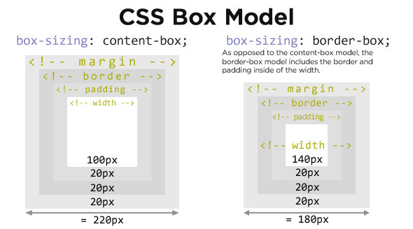
But what's the width of all of these boxes?
Display & Boxes
Most people are choosing border-box these days.
Display & Boxes
Some elements are blocks. That is, each one takes up a new line on the page regardless of their width.
actual width
actual width
actual width
actual width
Display & Boxes
Other elements are, by default, inline. That is, they sit next to each other as they can fit. Inline elements can't have a width or a height.
inline element
inline
inline element
element
inline element
inline element
inline element
Display & Boxes
We can also change the display to inline-block which allows inline elements to have a width and height.
actual width
actual width
actual width
actual width
It will also allow block elements to appear next to one another.
Display & Boxes
display: block;
display: inline;
aside
article
nav
section
form
p
ul
li
a
img
span
label
input
em
b
And many more!
Display & Boxes
Between block elements, margin collapsing occurs.
image
img {
    display: block;
    margin: 50px 0;
}
<div>
<img src="images/cat.png">
<img src="images/dog.png">
</div>image
image
image
Floats
Floats
Inline-block elements are not meant for layout. Instead, we use floating which allows for content to flow around the floated element.
block
block
block, floating right
block
Floating can be tricky. The process is something like:
block
block
block, floating right
block
block, floating right
block
the right block is removed from the normal flow
the left block goes up to replace the removed item
Floats
Floated elements will float up to the next block element. Many elements can be floated near each other -- and we do so in order to create interesting layouts.
The best way to learn is to try it. So let's do it!

Floats
Floating is great until we want to stop floating. We'd expect for it to be something like this:
Floats
floating left
block
floating right
floating left
ah fuck
floating right
Instead:
It's actually not that mysterious. Floating removes the element from the normal flow. Other elements must take their place. What's actually happening is this:
Floats
floating left
oh okay
floating right
the element non-floating element moves up
We can add clear: both to the block element to make it "clear" the floating elements.
floating left
cleared element
floating right
Give it a try on your own with the following exercise.
Floats

Sometimes it's like this...
