The Power of CSS
Cool Things To Do With Styles
Assumption:
Pseudo Elements
Creates elements that do not exist in the document
::after
::before
::first-line
::selection
::placeholder
Pseudo Classes
Changes the display of existing elements
:focus
:hover
:checked
:only-of-type
::before & ::after
.comment-body::before {
    border-width: 0 15px 15px 0;
    border-color:
        transparent
        rgba(158, 158, 158, 0.33);
    border-style: solid;
    content: '';
    display: block;
    left: -17px;
    position: absolute;
    top: 35px;
}

.bypostauthor > .comment-body::before {
    border-color:
        transparent
        rgba(158, 158, 158, 1);
}
:first-child
.alignfull {
    margin: 2em calc(50% - 50vw);
}
.wp-block-cover:first-child {
	margin-top: 0;
}:last-of-type
p {
    margin-bottom: 2em;
}
.comment-content p:last-of-type {
	margin-bottom: 0;
}:not()
.comment.parent
  .comment-body::after,
.comment.parent .children
 .comment:not(:last-child)::after {
    border-left:
      2px dashed rgba(158, 158, 158, 0.15);
    content: '';
    display: block;
    height: 100%;
    left: -48px;
    position: absolute;
    top: 56px;
    width: 2px;
}Properties
Content:


ul > li::after {
  content: ", ";
}
ul > li:not(:last-child):after {
  content: ", ";
}object-fit:
.wp-block-gallery img {
    width: 180px;
    height: 120px;
}
.wp-block-gallery img {
    width: 180px;
    height: 120px;
    object-fit: contain;
}
.wp-block-gallery img {
width: 180px;
height: 120px;
object-fit: cover;
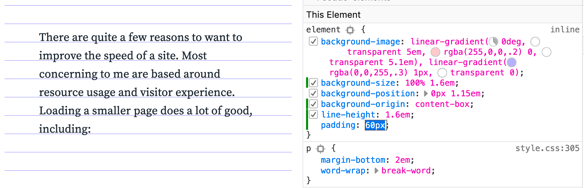
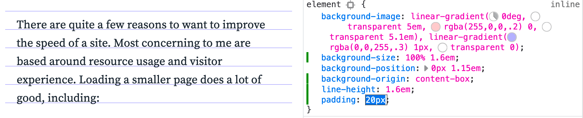
}background-origin:
background-origin: content-box;
Animation
<div class="typewriter">
  <h1>WP Y'all!!!</h1>
</div>

.typewriter h1 {
  font-family: monospace;
  overflow: hidden;
  border-right: .15em solid orange;
  white-space: nowrap;
  margin: 0 auto;
  letter-spacing: .15em;
  animation:
    typing 3.5s steps(30, end),
    blink-caret .5s step-end infinite;
}
/* The typing effect */
@keyframes typing {
  from { width: 0 }
  to { width: 100% }
}
/* The typewriter cursor effect */
@keyframes blink-caret {
  from, to { border-color: transparent }
  50% { border-color: orange }
}
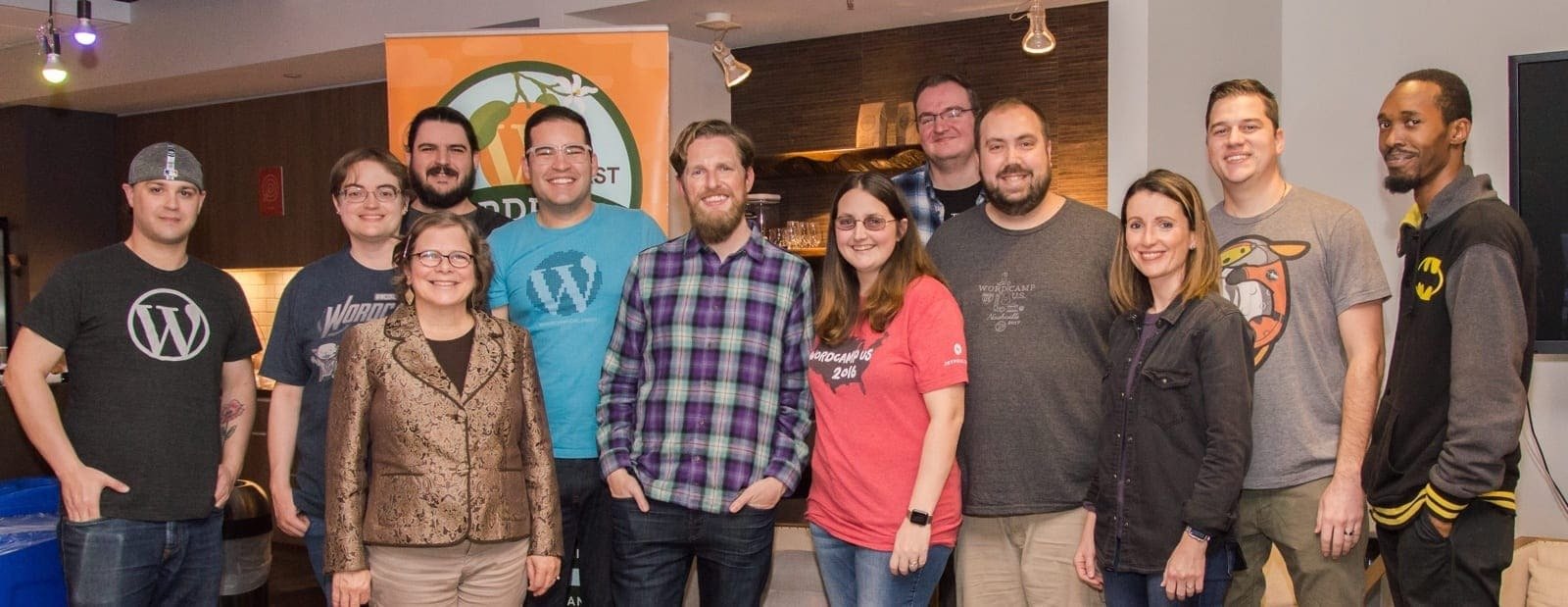
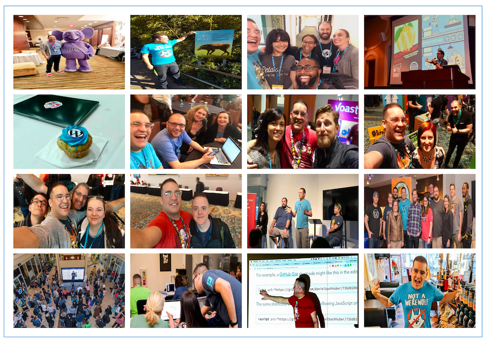
Thank You WordCamp US!