CSS for JS
Anatomy of style
- property
- selector
- first declaration
- rule
- unit
- second declaration
- first rule
p {
	margin:32px;
	padding:12px;
}

.apple {
	color:red;
}- property -> (margin, padding)
- selector -> (p, .apple)
- first declaration (margin:32px)
- rule (Line 1-4)
- unit (px)
- second declaration (padding:12px)
- second rule (line 6-8)
Media Query
5" phone to 72" TV
// Javascript
if (condition) {
  // Some JS that will run if the condition is met.
}

/* CSS */
@media (condition) {
  /* Some CSS that'll run if the condition is met. */
}
How to decide which to use? (max-width or min-width)
if your default layout is for large screen & you want to add something for small screen then max-width, vice-versa.
/* 🚫 Not valid, since `font-size` can't be queried */
@media (font-size: 32px) {
}
Selectors
- pseudo class (:hover, :focus)
- apply css based on element's state
- we can create similar experience by registering event listeners like (mouseover, mouseout etc), but that would require explicit state management
- :focus
- primarily useful for people who don't use touch devices
- primarily useful for people who don't use touch devices
- pseudo elements (::placeholder)
- target "sub-elements" within element
- by placing attribute "placeholder", pseudo element is created
- called pseduo because they were not explicitly created (didn't use <placeholder> tag)
- :placeholder
- criticised because text is typically very light
- forms should be flexible & support wide range of user inputs
- form should be useful without placeholder
<style>
  p::before {
    content: '→ ';
    color: deeppink;
  }

  p::after {
    content: ' ←';
    color: deeppink;
  }
</style>

<p>
  This paragraph has little arrows!
</p>
<style>
.pseudo-pseudo {
color: deeppink;
}
</style>
<p>
<span class="pseudo-pseudo">→ </span>
This paragraph has little arrows!
<span class="pseudo-pseudo"> ←</span>
</p>2.1 psuedo elements: before & after
- just syntactic sugar
- Use with empty content, only for decoration
- Reason: some screen reader vocalize, some ignore
=
Combinator
- a character than combines multiple selectors
- Space: Descendant selector
- > : Children Selector
Children -> element that is only 1 level down from parent
Descendant -> element that maybe 1 level, 2 level down..
Color
-
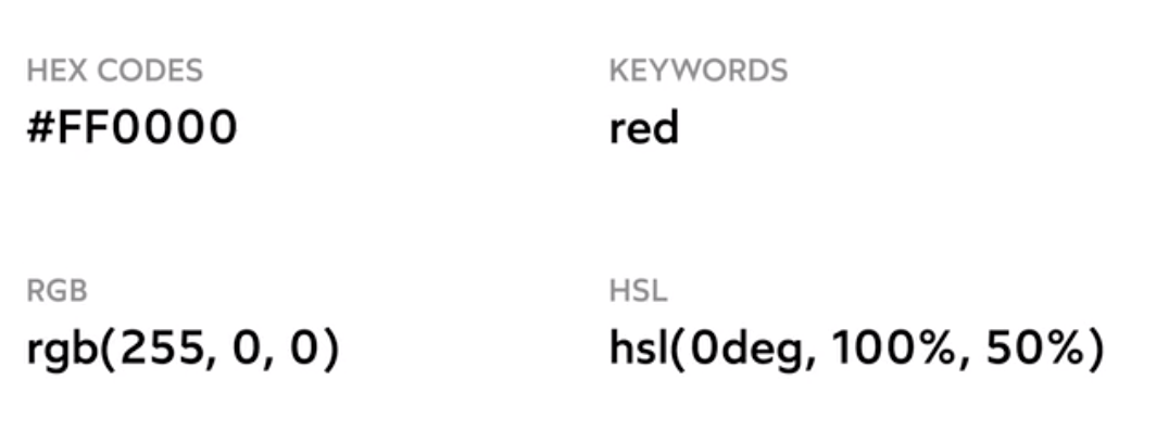
keywords: red
-
easy to remember, no maths
-
useful in tutorials
-
no way to get shades
-
-
hex : #ff0000
-
terse(short to write)
-
inscrutable - don't know what color it will show up
-
-
rgb: rgb(255,0,0)
-
no way to pick shade
-
-
hsl: hsl(0deg, 100%, 50%)
-
hue - pigment, saturation - how much color, lightness
-
when you are inside ide, really easy to derive number for shadow / other cases
-
humans don't see colors linearly, our perception changes on frequency
-
Units
- px:
- use with most things, except typography
- em:
- relative to font-size of current element
- eq. if font-size:20px, padding:2em -> 40px;
- component's UI will change based on font-size of container it is placed in
- useful for tiny cases
- rem:
- relative to root element
- shouldn't set px value on html, it should always be in em/rem otherwise we are overriding user's default choice
- use: typography
- percentage
- width/height to consume portion of available space
- typography -> rem
- accessibility benefits
- box model properties(padding, margin, etc) -> px
- more intuitive than rem, no clear accessibility win
- width/height: px or %
- color: hsl
Typography
- font-family: 'Roboto', sans-serif;
- websafe fonts - Arial, Times New Roman, Tahoma
- 3 styles
- serif: curled tips
- common on print, less on web
- sans-serif: without curled tips
- simpler, good for web
- monospace
- serif: curled tips
- font-weight: bold
- default-> 400, bold -> 700
- 1 to 1000
- <strong>: has different semantic meaning
- font-style: italic
- text-decoration: underline
- should not use much as it denotes links
- should not use much as it denotes links
- text-align: left
- can align other elements (like images), but reserve it for text
- can align other elements (like images), but reserve it for text
- text-transform: uppercase;
- spacing
- letter-spacing: 3px;
- line-height: 2;
- unitless