HTML & CSS WORKSHOP
WEEK 2
content
- Required knowledge explanation
- Demonstration
GOAL

HERO
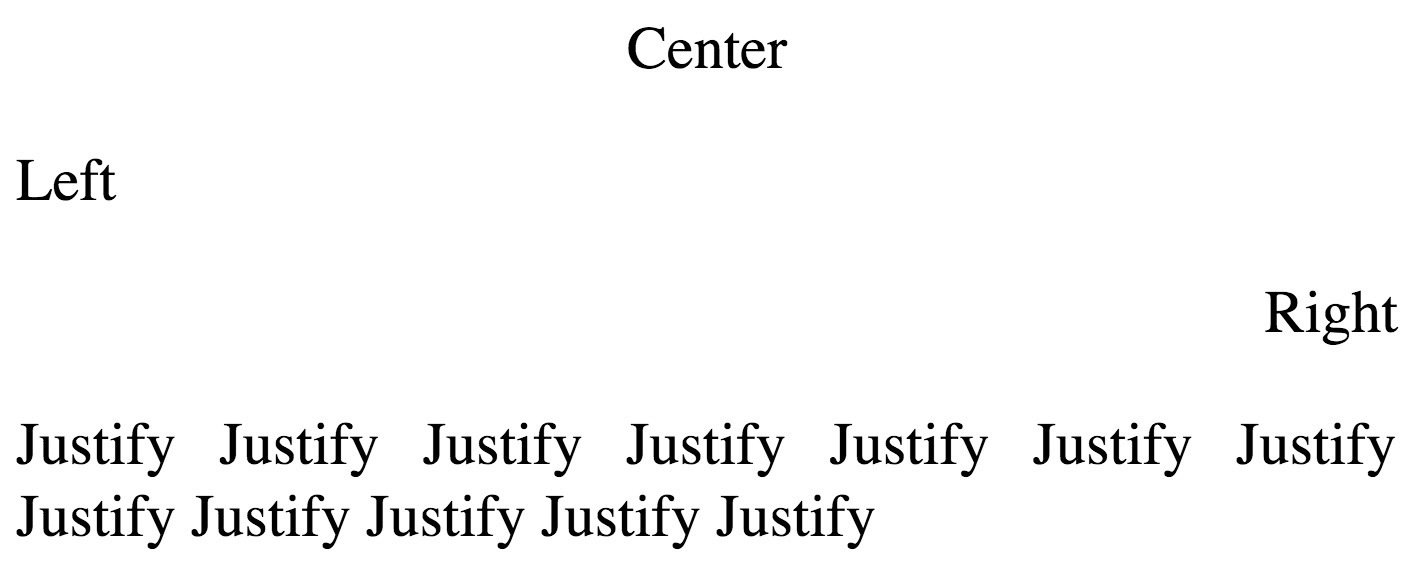
text-align
text-decoration
a {
    text-decoration: none;
}
h1 {
text-decoration: overline;
}
h2 {
text-decoration: line-through;
}
h3 {
text-decoration: underline;
}

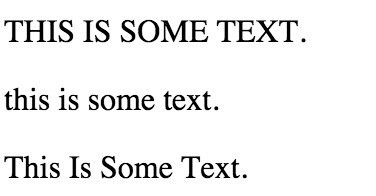
p.uppercase {
    text-transform: uppercase;
}

p.lowercase {
    text-transform: lowercase;
}

p.capitalize {
    text-transform: capitalize;
}
text-transform
text-Indentation
p {
    text-indent: 50px;
}
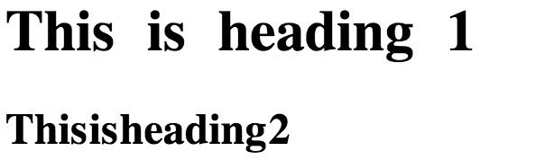
Letter Spacing
h1 {
    letter-spacing: 3px;
}

h2 {
    letter-spacing: -3px;
}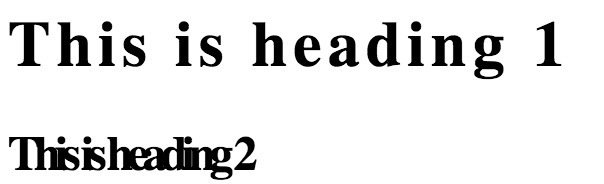
Word Spacing
h1 {
    word-spacing: 10px;
}

h2 {
    word-spacing: -5px;
}
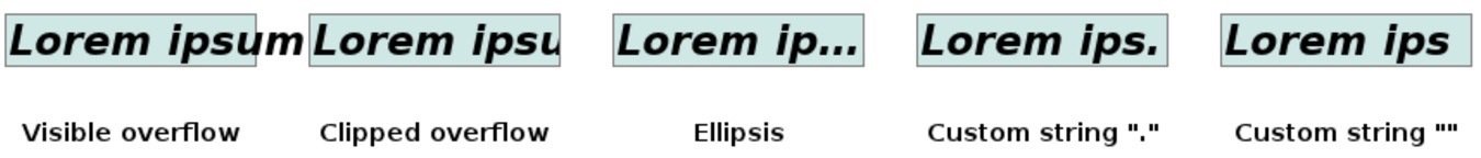
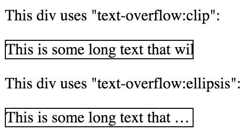
text overflow
#div1 {
    white-space: nowrap;
    width: 12em;
    overflow: hidden;
    text-overflow: clip;
    border: 1px solid #000000;
}

#div2 {
    white-space: nowrap;
    width: 12em;
    overflow: hidden;
    text-overflow: ellipsis;
    border: 1px solid #000000;
}
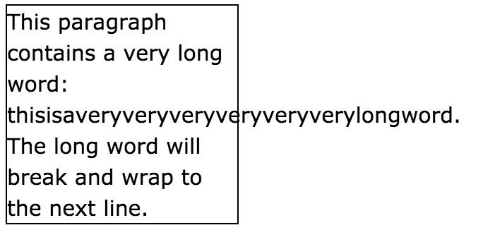
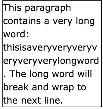
word wrap
p {
    word-wrap: break-word;
}
CSS colors
| Hexadecimal | #RRGGBB | {background-color: #ff0000;} |
| RGB | rgb(red, green, blue) | {background-color: rgb(255, 0, 0);} |
| RGBA | rgba(red, green, blue, alpha) | {background-color: rgba(0, 0, 255, 0.3);} |
| HSL | hsl(hue, saturation, lightness) | {background-color: hsl(120, 100%, 25%);} |
| HSLA | hsla(hue, saturation, lightness, alpha) | {background-color: hsla(120, 100%, 50%, 0.3);} |
opacity
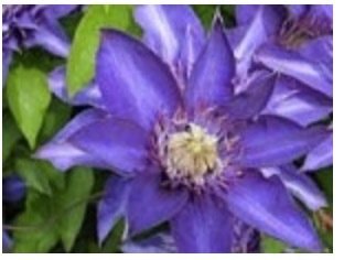
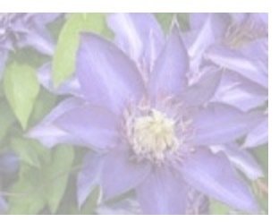
img {
    opacity: 0.4;
}
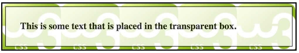
<div class="background">
    <div class="transbox">
        <p>This is some text that is placed in the transparent box.</p>
    </div>
</div>
div.background {
background: url(images/w3css.gif) repeat;
}
div.transbox {
margin: 5px;
background-color: #ffffff;
opacity: 0.8;
}
background
-
background-color
-
background-image
-
background-repeat
-
background-attachment
-
background-position
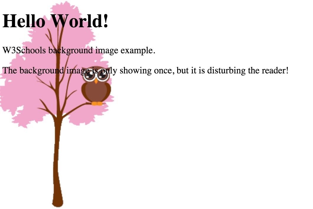
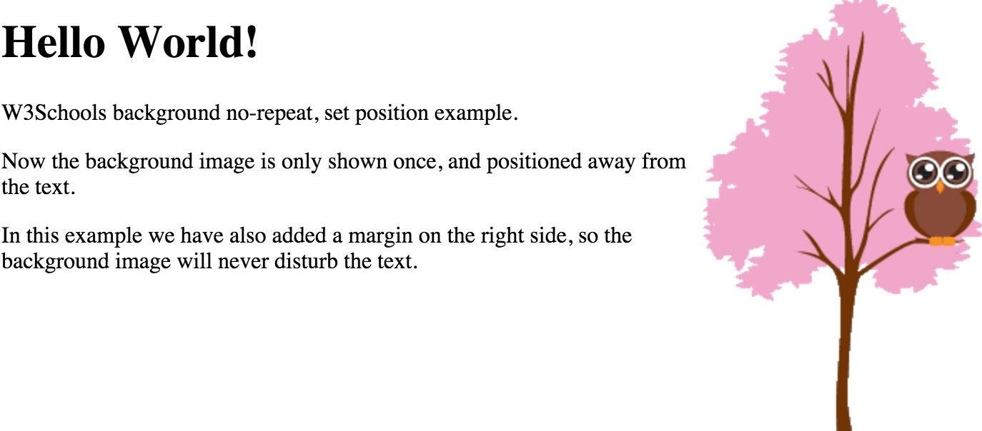
background-position: right top;
background-attachment: fixed;
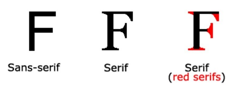
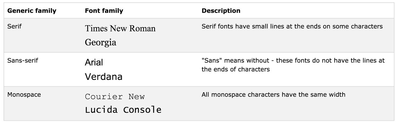
background-size: cover;fonts
font-family: "Times New Roman", Times, serif;CSS Units
- em
- rem
- px
- cm
- mm
relative
absolute
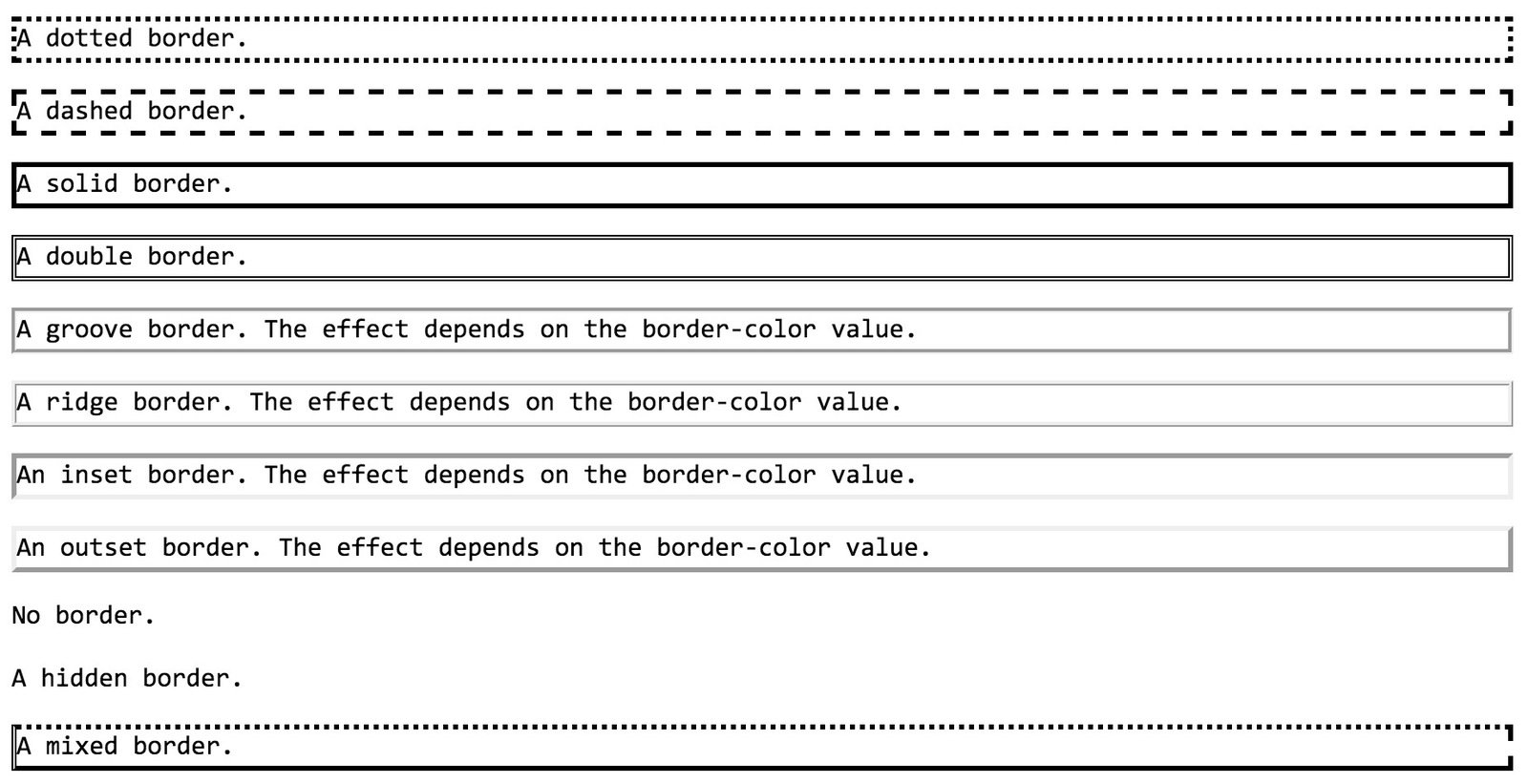
borders
-
border-style
-
border-width
-
border-color
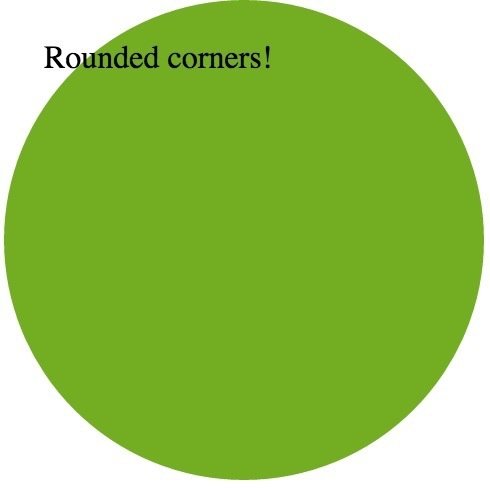
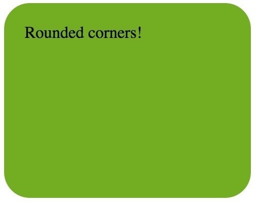
border-radius
div {
    border-radius: 25px;
}
div {
border-radius: 50%;
width: 200px;
height: 200px;
}
Pseudo-class
selector:pseudo-class {
property:value;
}
p:first-child {
    color: blue;
}| :first-child | p:first-child |
|---|---|
| :hover | a:hover |
| :nth-child(n) | p:nth-child(2) |
| :not(selector) | :not(p) |
Pseudo-Element
<div>
    <i class="icon-ok"></i>
    I am the ok icon!
</div>
.icon-ok:before {
content: "\f00c";
}
Pseudo-Element
selector::pseudo-element {
property:value;
}
p::first-line {
    color: #ff0000;
    font-variant: small-caps;
}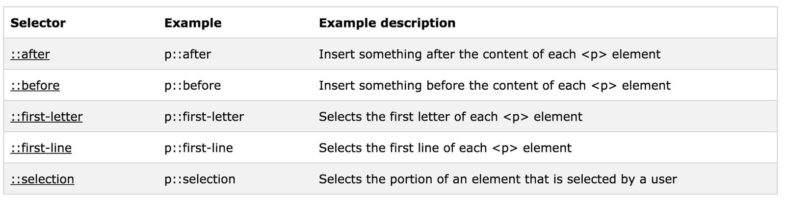
::selection {
    color: red;
    background: yellow;
}
Advanced CSS
SASS
Sass is the most mature, stable, and powerful professional grade CSS extension language in the world.
Variables
$font-stack:    Helvetica, sans-serif;
$primary-color: #333;

body {
  font: 100% $font-stack;
  color: $primary-color;
}
body {
font: 100% Helvetica, sans-serif;
color: #333;
}Nesting
nav {
  ul {
    margin: 0;
    padding: 0;
    list-style: none;
  }

  li { display: inline-block; }

  a {
    display: block;
    padding: 6px 12px;
    text-decoration: none;
  }
}
nav ul {
margin: 0;
padding: 0;
list-style: none;
}
nav li {
display: inline-block;
}
nav a {
display: block;
padding: 6px 12px;
text-decoration: none;
}Partials & Import
// _reset.scss

html,
body,
ul,
ol {
   margin: 0;
  padding: 0;
}
// base.scss
@import 'reset';
body {
font: 100% Helvetica, sans-serif;
background-color: #efefef;
}html, body, ul, ol {
margin: 0;
padding: 0;
}
body {
font: 100% Helvetica, sans-serif;
background-color: #efefef;
}Mixins
@mixin border-radius($radius) {
  -webkit-border-radius: $radius;
     -moz-border-radius: $radius;
      -ms-border-radius: $radius;
          border-radius: $radius;
}

.box { @include border-radius(10px); }
.box {
-webkit-border-radius: 10px;
-moz-border-radius: 10px;
-ms-border-radius: 10px;
border-radius: 10px;
}Extend/Inheritance
.message {
  border: 1px solid #ccc;
  padding: 10px;
  color: #333;
}

.success {
  @extend .message;
  border-color: green;
}

.error {
  @extend .message;
  border-color: red;
}

.warning {
  @extend .message;
  border-color: yellow;
}
.message, .success, .error, .warning {
border: 1px solid #cccccc;
padding: 10px;
color: #333;
}
.success {
border-color: green;
}
.error {
border-color: red;
}
.warning {
border-color: yellow;
}Control Directives
@each $animal in puma, sea-slug, egret, salamander {
  .#{$animal}-icon {
    background-image: url('/images/#{$animal}.png');
  }
}
.puma-icon {
background-image: url('/images/puma.png'); }
.sea-slug-icon {
background-image: url('/images/sea-slug.png'); }
.egret-icon {
background-image: url('/images/egret.png'); }
.salamander-icon {
background-image: url('/images/salamander.png'); }Bourbon
A simple and lightweight mixin library for Sass.
// Bourbon mixin with Sass

section {
  @include linear-gradient(to top, red, orange);
}
/* Compiled CSS */
section {
background-color: red;
background-image: -webkit-linear-gradient(bottom, red, orange);
background-image: linear-gradient(to top, red, orange);
}