BFC入门
By 覃业博
Link me
BFC是个什么东西

仅仅是块级盒布局规则的一个描述
Google关键词"w3.org BFC"
几个有疑惑的术语
- formatting context
- containing block
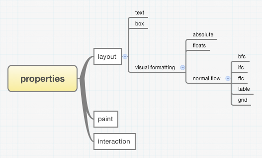
formatting context(布局上下文)
formatting这个词来自文本排版,在CSS中应该理解为布局或排版,winter有讲起过这个问题,formatting context就是布局上下文,包含了一系列相应的布局规则
有好几个FC
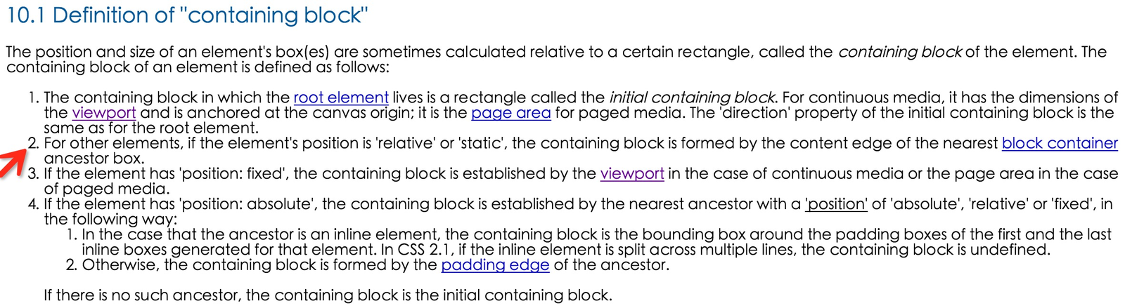
containing block(包含块)
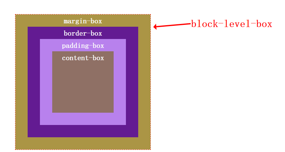
具体解释BFC相关概念前,还需要搞清一个概念-盒模型
除了table外的通用盒模型
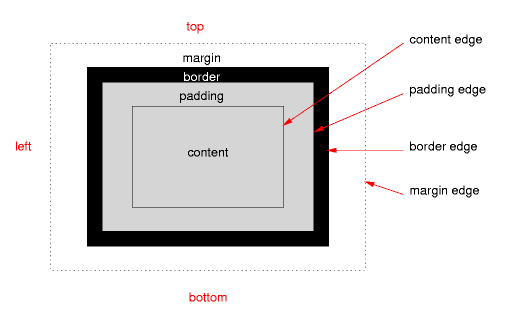
块级盒的盒模型
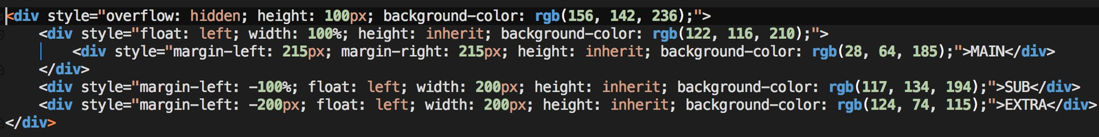
理解块级盒里的margin-box对理解BFC至关重要,这里看一个案例
双飞翼布局

解读正文
第一段
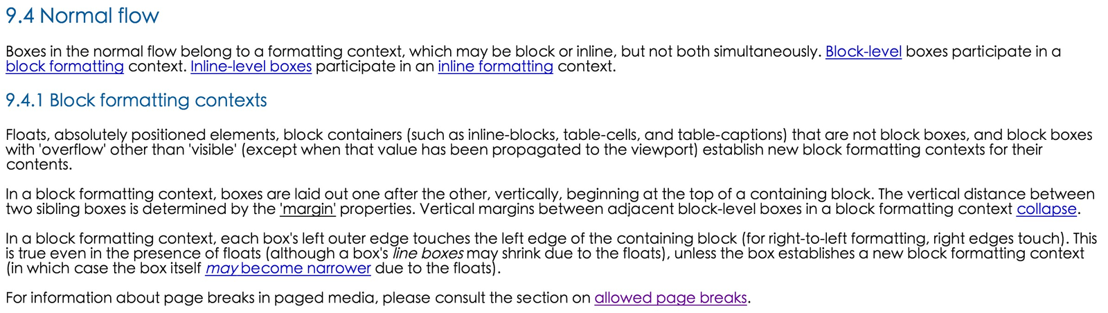
Floats, absolutely positioned elements, block containers (such as inline-blocks, table-cells, and table-captions) that are not block boxes, and block boxes with 'overflow' other than 'visible' (except when that value has been propagated to the viewport) establish new block formatting contexts for their contents.
解读
浮动元素、绝对定位元素,不是块级盒的块级包含块(比如inline-block、table-cell、table-capation)和overflow值不为visible的块级盒子(除非是根盒子,因为根盒子本身就创建了一个BFC,它是最外层的BFC,根盒子不是html元素下的盒子,但它受html的CSS属性影响)为它们的内容建立了一个新的块级布局上下文,里面的块级盒按照BFC相关规则进行排布。
第二段
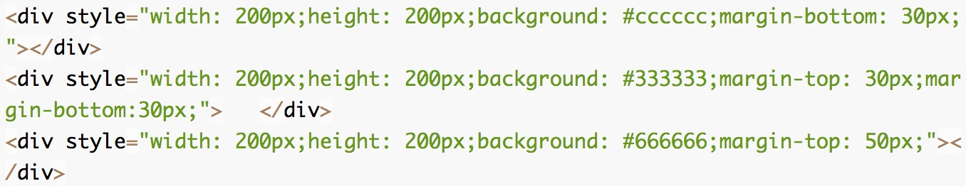
In a block formatting context, boxes are laid out one after the other, vertically, beginning at the top of a containing block. The vertical distance between two sibling boxes is determined by the 'margin' properties. Vertical margins between adjacent block-level boxes in a block formatting context collapse.
解读
第三段
In a block formatting context, each box's left outer edge touches the left edge of the containing block (for right-to-left formatting, right edges touch). This is true even in the presence of floats (although a box's line boxes may shrink due to the floats), unless the box establishes a new block formatting context (in which case the box itself may become narrower due to the floats).
解读
BFC中,每个块级盒都是尽可能往包含块的左边靠拢的,对于从右向左的排版(受wrrting-mode\direction属性影响),则尽可能往右边靠拢,即使是在float盒子参与的情况下,除非你给受浮动影响的盒子里面设立了一个BFC,然后它自身会变短 DEMO
第四段
For information about page breaks in paged media, please consult the section on allowed page breaks.
解读
在屏幕阅读器上,是会分多个viewport的,不像浏览器端,只有一个viewport,相邻两viewport之间的块级盒,会被分别强制将它们的margin-bottom和margin-top重置为0。这点与浏览器端的规则不同,不过CSS3中将改善这一问题
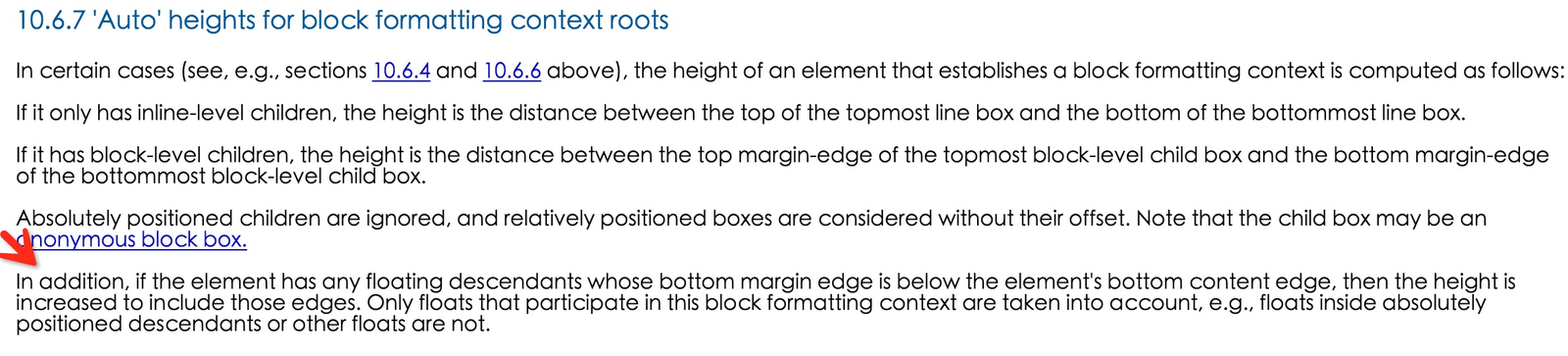
float盒子也参与BFC下盒子高度的计算
BFC的另一个重要特性-"作用域"绑定
BFC内的盒子只在当前BFC下遵循BFC相关布局规则,当前BFC内的盒子不会和这个BFC外的盒子按照BFC的相关规则发生关系,也就是说一个BFC环境是跟一堆对应的盒子绑定在一起的,这些盒子的"作用域"绑定在了当前BFC内。所以,当前BFC内的盒子不会和这个BFC外的盒子发生外边距折叠。DEMO
BFC的应用范围总结
The last
BFC并不神秘,它只是一个描述块级盒该怎么排布的布局规则或者说上下文,知道它只是一个布局规则后,剩下的就是去理解它里面的具体的布局规则了