Analyze current weather and climate conditions around the world
By Yijia Liu (Lily)
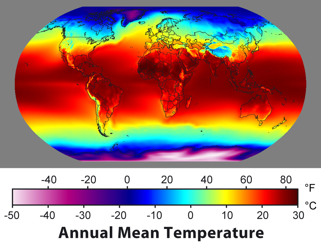
Global Temperature
This map shows the temperature of the capital cities of various countries around the world. On the map, we can see some small dots of different shades. The darker the color of these dots, the higher the local temperature. We can also use this to analyze the impact of geographical location on temperature.
Global Humidity
This map shows the humidity index of capital cities around the world. On the map, we can see some small dots of different shades. The darker the color of the dots, the higher the local humidity index. We can also use this to analyze the impact of geographical location on humidity.
Global Precipitation
This map shows the precipitation in the capitals of various countries around the world. On the map, we can see some small dots of different shades. The darker the color of these dots, the more abundant the local precipitation. We can also use this to analyze the impact of geographical location on precipitation.
Global PM 2.5
This map shows the PM2.5 index of capital cities around the world. On the map, we can see some small dots of different shades. The darker the color of the dots, the higher the concentration of PM2.5 in the local area. We can also use this to analyze whether the geographical location has an impact on the release and accumulation of PM2.5.

Global Ozone
This map shows the Ozone concentration in the capitals of various countries around the world. On the map, we can see some small dots of different shades. The darker the color of these dots, the higher the local Ozone concentration. We can also use this analysis to understand the impact of geographical location on the generation and accumulation of Ozone.