Creating React Components
Young Bae, young.gratia@navercorp.com
NAVER Place Service Dev 2
with BEM & styled-component

Naver
SmartPlace
Front-end
Before we start, Why bother?

Comparison
| Old-fashined way | Brand-new way | |
|---|---|---|
| Dev Scope | Page 📄 | Component 🍱 |
| CSS Tools | Sass (+ style-loader, css-loader, etc) | CSS-in-JS 💅 |
| CSS Style Conflict Possibility | I hope not! 😫 | What is it? 🤗 |
| Finger Fatigue ✌️ | High | Low |

Things to consider
- Can we use CSS Methodologies?
- What kind of CSS-in-JS tools shall we use?
- How about the project structure?

Reusing CSS Methodologies
BEM & Atomic Web Design
Methodology List
- OOCSS
- SMACSS
- Atomic CSS
- MCSS
- FUN
https://css-tricks.com/methods-organize-css/

BEM!

LEGO Blocks!
BEM Applied to React
- First, Build the Element components first.
- Combine elements to make Blocks.
-
Use prop, or CSS class as Modifier.
Atomic
Web Design
Atoms can also include more abstract elements like color palettes, fonts and even more invisible aspects of an interface like animations.
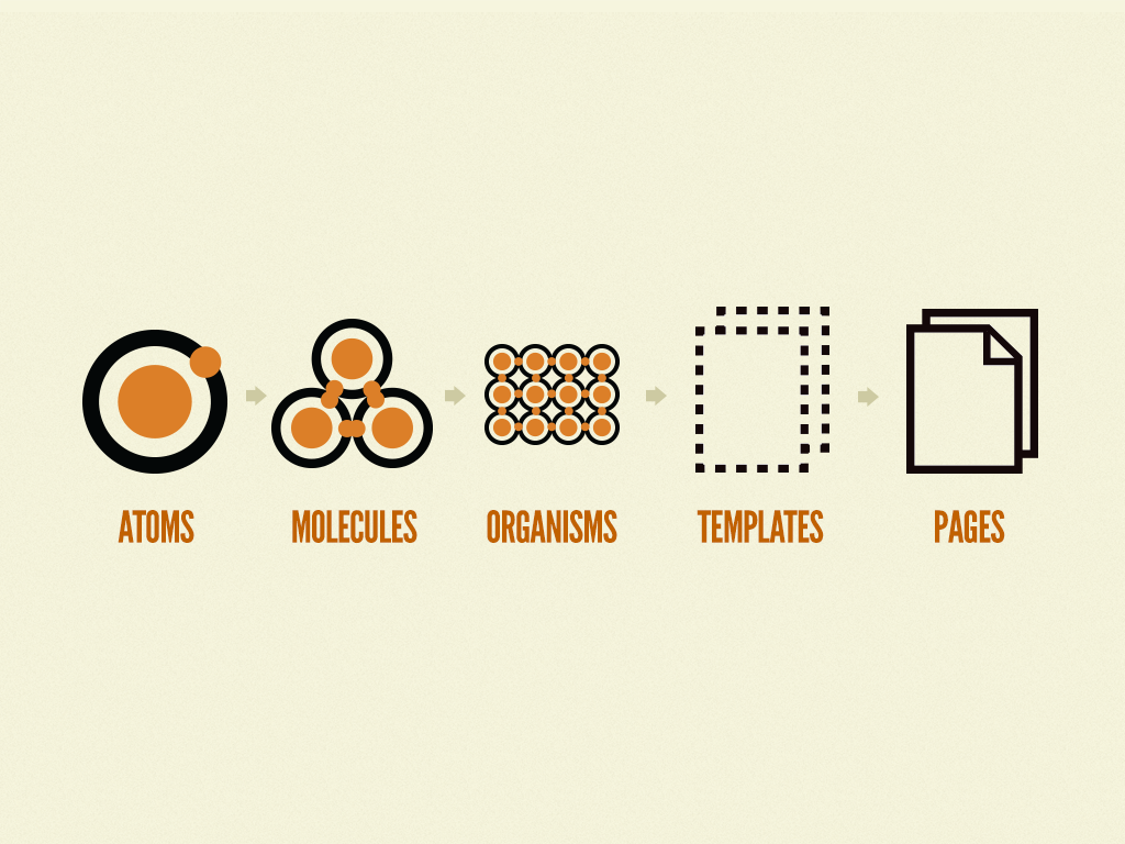
http://bradfrost.com/blog/post/atomic-web-design/#atoms
Conclusion
- Use the similar concept to BEM,
but the elements should not be restricted to blocks. - Like from 'Atomic Web Design',
let's put abstract atoms into elements.

Choosing the Right Tools
styled-components & storybook

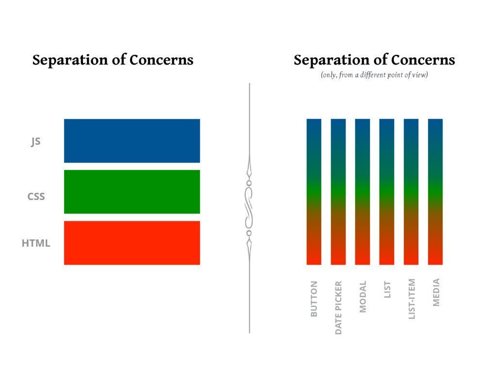
CSS-in-JS
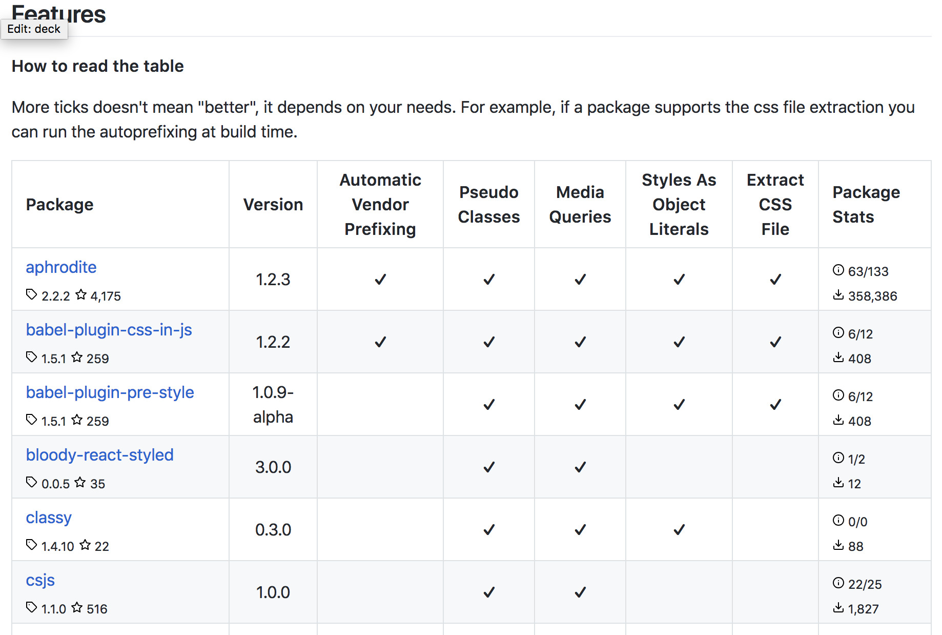
styled-components
CSS Class Generated by
styled-components
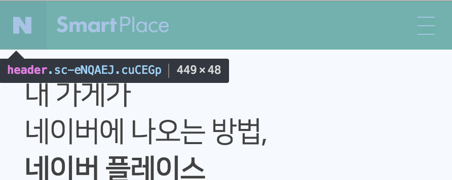
static class
dynamic class
Using JS object to store style info
export const Z_INDEX = Object.freeze({
  alertDialog: 500,
  address: {
    dialog: 100,
    form: 100,
  },
  bizphoneSelector: 10,
  dimmed: 1000,
  floatingButton: 500,
  drawer: 1000,
  drawerHeader: 10,
  gnb: 1000,
  modal: 10000,
  modalStickyHeader: 100,
  opening: 1100,
  openingFormBorder: 1,
  thumbButton: 10,
})
const Color = {
background: '#e8edf0',
backgroundLight: '#f4f7f8',
backgroundFooter: '#f4f6f7',
backgroundGray: '#fafbfc',
backgroundLightGray: '#f5f9ff',
black: '#000',
blackTransparent: alpha => `rgba(0,0,0,${alpha})`,
blue: '#14a0fa',
blueDark: '#0068c3',
blueLight: '#7abeea',
border: '#d9dadb',
borderLight: '#ecf0f2',
borderOuter: '#e2e5e8',
borderSkyblue: '#90d4ff',
green: '#00c73c',
greenDark: '#0abe16',
mainText: '#424242',
navy: '#0068c3',
red: '#ff3c4c',
redLight: '#ffe0e1',
subText: '#8f8f8f',
subTextLight: '#a9a9a9',
title: '#242424',
white: '#fff',
disabled: '#ccc',
}
export default ColorGlobal Styling
import { createGlobalStyle } from 'styled-components'
import Font from 'assets/Font'
import Color from 'elements/Color'

// Thigns to include:
// - font-face rule
// - reset CSS
// - util classes, etc.

const GlobalStyle = createGlobalStyle`
@font-face {
	font-weight: 300;
	font-family: 'NanumSquare';
	src: url(${Font.nanumSquareLight}) format("truetype");
}
@font-face {
	font-weight: 400;
	font-family: 'NanumSquare';
	src: url(${Font.nanumSquareRegular}) format("truetype");
}
// ...
Where should we put those components?
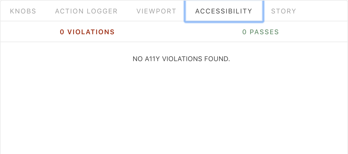
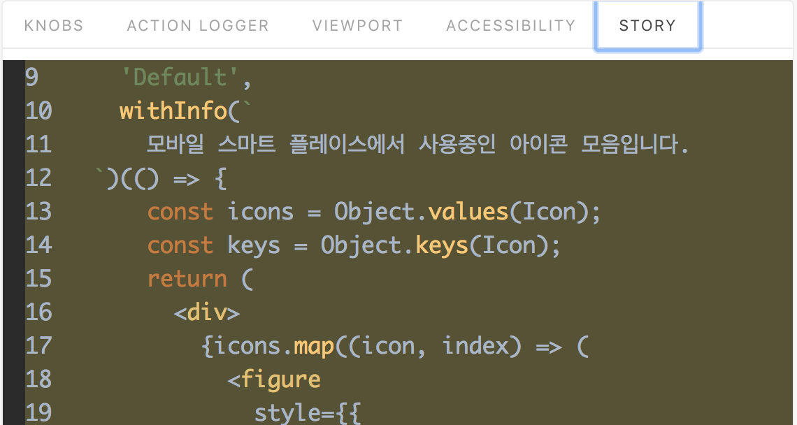
storybook
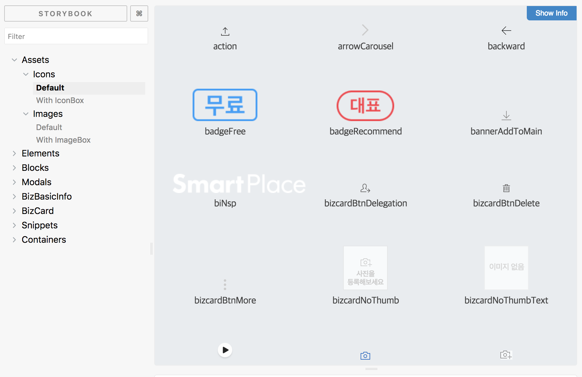
Component Classification
- Assets
- Elements
- Blocks
- Containers
Storybook
Project
src/
├── assets/
│   ├── Font/
│   ├── GlobalStyle/
│   ├── Icon/
│   └── Image/
├── blocks/
│   ├── Accordion/
│   ├── AgreementList/
│   ├── AlertDialog/
│   ├── BizCard/
│   └── ...
├── containers/
│   ├── Businesses
│   ├── Footer
│   ├── Gnb
│   └── ...
├── elements/
│   ├── Button/
│   ├── Checkbox/
│   └── ...
├── modals/
│   ├── BizDelegation/
│   ├── BizDelete/
│   └── ...
├── ...
👶👶
👦👦
👧👧
...
Personal Favorite 💖
import styled from 'styled-components'
import Color from 'elements/Color'

const Hr = styled.hr`
  margin: 0;
  border-top: 1px solid ${Color.borderOuter};
  border-bottom: 1px solid ${Color.borderOuter};
  height: 9px;
  background-color: ${Color.background};
`

export default Hr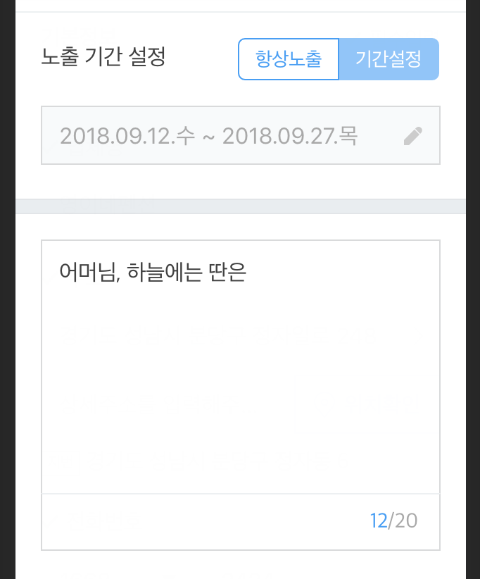
References
References
Food for Thought
Things to consider

Working Process
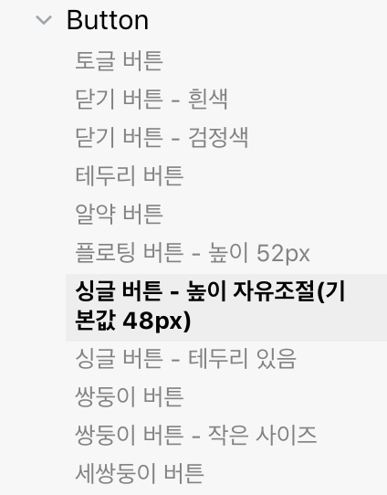
- At the early stage of the project, make the components focusing on the elements.
- For the convenience of the development process, the design guide should be focused on the element components 🙂
- High priorities
- Buttons
- Forms (e.g., input elements such as text, radio, select)
Working Process
- Don't make the independent block components in advance.
- If you are sure it's going to be reused without any big modification, then it's okay to separate the component as a block.
- If not sure, just put the components below the container component directories.
Working Process
- Example: Refactor Navigation Block Component


Testing
- Start with 'storyshot'
- But it took so long. 😐
- Is it my fault? Or theirs?
- Lack of Testing Knowledge
- Need to dig more! 📖
- https://frontendmasters.com/courses/testing-react/
Maintenance
- Concerns for newly joined people 👀
- Lost in Components.
- Tell them about the criteria about the categorization.
- Don't push them too much to reuse exisiting components.
Maintenance
-
New Request: Please make us new components! 🙇
- Ask First:
- Do you just want "UI"💄? Or the "features"🤖?
- Don't be under pressure.
- Refactoring is always waiting for you.
- Ask First:
Make Your Own
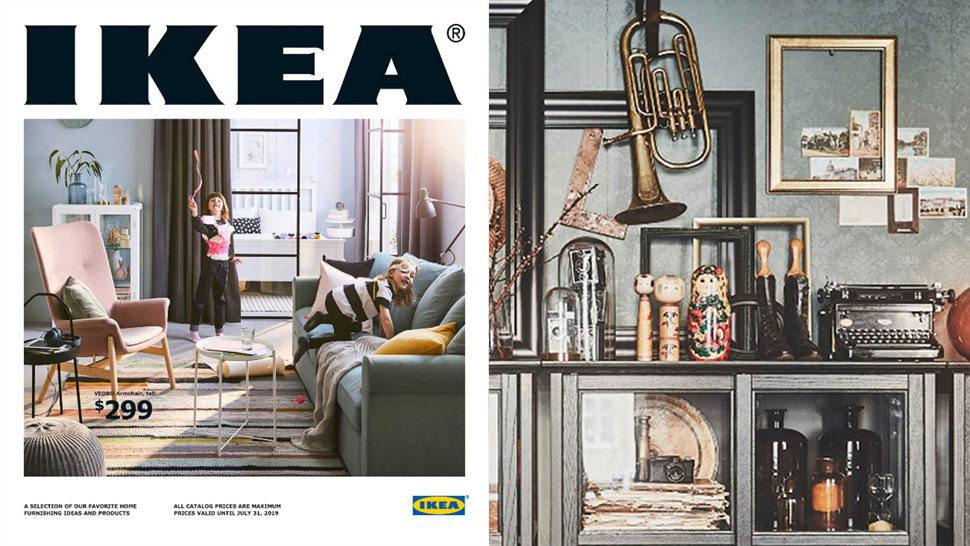
IKEA Storybook Catalogue
STORYBOOK
