{the jump}
Layout
Session 7a
Purposes of Layout
- To bring information to the fore quickly
- To guide users visually through a process
- To create pleasing/appealing design
Layout on the Web (History)

CSS Properties for Tables
| border | As per box model |
| border-collapse | Specifies whether or not table borders should be collapsed |
| border-spacing | Specifies the distance between the borders of adjacent cells |
| caption-side | Specifies the placement of a table caption |
| empty-cells | Specifies whether or not to display borders and background on empty cells in a table |
| table-layout | Sets the layout algorithm to be used for a table |
Table Layout
- In the beginning there was little CSS, so html had to be used.
- Tables were used to hold things in place
- Example
- They are still used in HTML Emails, with limited CSS
- But there were problems with this approach
- heights & widths must be shared by siblings of rows and columns
- Padding (space between content and element) can only be created by adding a nested table with cellpadding="npx"
- It was and is a total ballache
CSS Box Model
- In came CSS! YAY!!
- Box model (micro layout) (recap)
- We started to use elements (usually divs) instead of tables.
- With tables the width and size of elements were related to their row/column peers. Now we could escape that!
- The boxes themselves stretch to accommodate child content by default.
- Unless you are doing something like a sticky header or scrollable box then do not put widths and heights on things
-
N.B. This model is crap at dealing with relative heights. Unless there is a concretely specified height somewhere in the ancestry, dynamic heights (e.g. 100%) will not work!
- make sure the display value is correct to, inline elements will not take dimensions.
CSS Position
How to position things
- Use position only when necessary!
- docs & demo
- Values:
- static - the default. Also cancels other types of position
- fixed - positions the element relative to the viewport
-
relative - Element remains where it is (ie its space is reserved) but it is drawn visually in a different place
- All measurements (like widths, etc.) of child elements are calculated relative to this element
- absolute - takes element out of the flow of the document and positions it relative to the nearest non-statically-positioned ancestor. (aka containing block)
- sticky - moves when in contact with the viewport
- To be used with top, bottom, left & right: <CSS length>;
- offsets x amount from <whatever> side of containing block
Stacking Order
- When things go above each other they form a stack
- This process is called 'compositing' (see browser process in previous deck)
- The natural order for stacking is:
- by HTML injection order
- but then non-static positioned elements, transitioned, ordered, etc. come higher
- There is a property in CSS to override this behaviour called z-index
- Everything has an initial z-index of auto (0)
- Higher numbers will raise an element in the stack
- -1 puts it behind everything else
- z-index is tricky! There are lots of rules that change its behaviour and it is not that intuitive! We'll cover it more later in the course...
CSS Overflow
When the content is larger than the parent!
Demo
Overflow and how to control it.
- Overflow is when the a child element's size exceeds that of its parent.
- Maybe the parent has a fixed height/width
- Maybe the child is floated
- Maybe the child is positioned absolutely (see next)
- Values
- visible (default)
- hidden (will be cut off visually if parent has a height or width; or the parent will expand to enclose)
- scroll - both sets of scrollbars will appear (when element is interacted with).
- auto - scrollbars may appear (depends on the browser)
- overflow-x - ctrls horizontal overflow with values above (CSS3)
- overflow-y - ctrls vertical overflow with values above (CSS3)
Now we can understand the next method
Floats
Floats
- Box model, but still no way to put things next to each other
- CSS Had a property called float
- Float allows text to flow around an image.
- This can be used to make divs flow past each other
- Floats Demo
- Further reading on floats
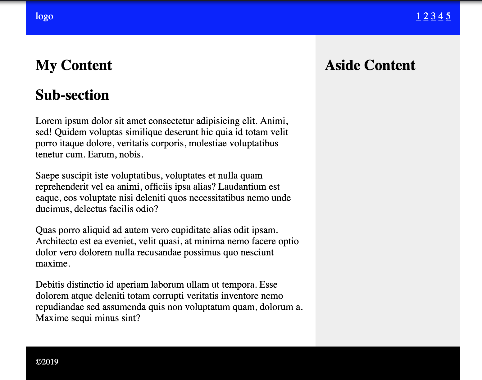
- Float Layout Demo
N.B. Inline-block (a later replacement for this use) can be used BUT there are problems with it and it was not widely adopted