James Sherry
Web Development Tutor and Co-Founder of { The Jump } Digital School
Session 7b
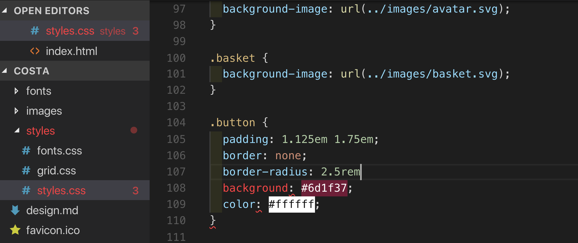
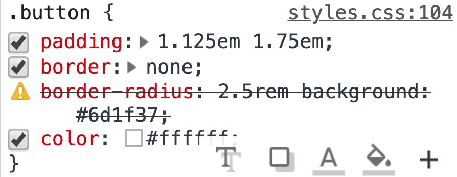
Missing Semicolon
Red Squiggles
Missing Semicolon
Red Squiggles
.something {
  display: block;
  display: flex; /* non-supporting browsers will ignore */

/* because of missing closing brace all rulesets below fail to be parsed
p {
  width: 50%;
  inline-size: 50%; /* non-supporting browsers will ignore */
}The major browsers use the following prefixes to allow them to trial things before committing themselves on the official property name:
p {
  -webkit-transition: all 4s ease;
  -moz-transition: all 4s ease;
  -ms-transition: all 4s ease;
  -o-transition: all 4s ease;
  transition: all 4s ease;
}By James Sherry
Flexbox


