{the jump}

CSS declarations

Things we need:

  • A way to represent colour
  • A way to represent size & spacing
  • A way to change the font

Colours

Read later: Nerds guide (by my Design hero Sarah Drasner)

CSS Colours Systems

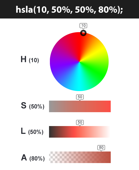
In css we can specify a colour in 7 different ways (N.B. a is for alpha (transparency)):

  • keyword: red, lightblue, rebeccaPurple (unprofessional)
  • Hex code: #ff0000 (not case sensitive) (#f00 is the short form)
    • hex is short for hexidecimal (base 16 - explain!)
  • RGB(a): rgb(255, 255, 255, .5) or rgba(255, 255, 255, 0)
    • rgb is hex but in decimal format
    • 0 to 255 (because 256 colours: FF is 255, plus 1 for 0)
    • alpha (0 = transparent, 1 = opaque)
  • HSL(a): hsl(<angle deg, [g]rad, turn>, <%>, <%>,<number/%>)
    • e.g. hsl(270, 60%, 30%, 0.5)
    • Hue, Saturation & Lightness/Luminance (vs HS[B/V])
    • useful for animation because you can never 'run off the end' - in production prefer HSL values!

From a background of neutral lighting (so, grey)...

  1. Pick a colour (hue)
    • red (0deg)
    • green (120deg)
    • blue (240deg)
  2. Determine how much colour is injected (saturation)
  3. Then adjust lighting conditions (luminance)
  4. Add transparency (alpha) if needed

New: CSS Colour 4 *

  • Spec
  • Smashing Magazine Article
  • (rebeccaPurple😢)
  • hex(a) 00 = transparent, FF = opaque
  • rgb()/hsl(): alpha parameter
    • These 2 don't need commas BUT if you want to add the new alpha param you need a /, so:
      • rgb(255, 122, 127, .8); or rgb(255 122 127 / .8); 
      • (%s are required for hsl)
  • hwb() - Hue, Whiteness, Blackness - browser support is good
  • lab() & lch() - The photoshop color model LABCIE - browser support is not there yet.
  • oklab() & oklch() - perpetual color model - browser support not there yet

Color Picker Tool

Quick note: opacity

*

Let's start to apply these...

Foreground (text) Colour

p {
    color: hsl(0, 100%, 50%);
}
  • Must, sadly, be spelled the American way
    • If you're really petty there are build tools that allow you to write it in English (aka French). ;)

*

Challenge

  1. Quickly make a page and on that page add a heading; some paragraphs, and a list of links
  2. Set color (not background-color!) on the body to hsl(0deg, 100%, 50%) (red)
  3. What happens?
  4. Why do the elements go red if we put that on the body?
  5. Why do the links stay blue?

CSS Inheritance

CSS Inheritance

  • Useful, otherwise you'd have to set properties on every element individually.
  • The style closest to that 'DOM node' wins.
  • You can choose to select the inherited style with the inherit keyword.
  • To get the default value (from user agent styles) use the initial keyword.
/* STRUCTURE: ul > li > p */

ul {
    color: rebeccaPurple;
}

li {
    color: goldenrod;
}

/* <p> colour will be goldenrod */


/* STRUCTURE: div > p */

/* generic style on ancestor */
div {
    color: red;
}

/* directly targeting style */
p {
   color: green; 
}

/* get the red instead of green */
p.myParagraph {
    color: inherit;
}

Properties that are naturally inherited

  • border-collapse
  • border-spacing
  • caption-side
  • color
  • cursor
  • direction
  • empty-cells
  • font
  • font-family
  • font-stretch
  • font-size
  • font-size-adjust
  • font-style
  • font-variant
  • font-weight
  • letter-spacing
  • line-height
  • list-style
  • list-style-image
  • list-style-type
  • quotes
  • text-align
  • text-indent
  • text-transform
  • white-space
  • word-spacing

Generally [text-based and] properties where you'd repeat yourself

Working with Colours

Accessibility Check:

Ensure sufficient contrast between foreground & background

Chrome DevTools:

  • devtools
  • shift + click on colour box to change format
  • If you move to a different part of the page you can then 'eyedropper' and the adjust with the controls
  • You can see WCAG lines for colour contrast
    • N.B. Sometimes this doesn't work because of plugins and needs a reset. See here for what you're looking for

*

Size Measurements

aka CSS Lengths

CSS Lengths - Absolute Units

  • px - pixels (Different from device pixels!!)
  • mm - millimetres
  • cm - centimetres
  • in - inches. One inch (2.54 centimeters).
  • pt - points. One point (which is 1/72 of an inch).
  • pc - picas. One pica (which is 12 points).


Except for px, these measurements don't hold true on a screen, e.g:

  • 1in is always 96px,
  • 3pt is always 4px,
  • 25.4mm is always 96px.


Avoid where possible

*

But how do you say: 1/3 of the width?


Also, sometimes, we want things to respond to their environment (e.g. screen size and orientation), so...

CSS Lengths - Relative Units 

  • % (percentages) - relative to the width of the parent element
  • font-based
    • em (1em is generally equivalent to 16px)
      • This unit represents the calculated font-size of the element. If used on the font-size property itself, it represents the inherited (see later) font-size of the element.
    • rem (Root EM - will not multiply (see https://codepen.io/jmsherry/pen/NNJMPy), which is good!)
      • This unit represents the font-size of the root element (e.g. the font-size of the <html> element). When used on the font-size on this root element, it represents its initial value
    • ch (width of an 'O' character)
      • ​max-width stops lines becoming too long #readability. Apply to text elements, not containers. 45-75 (55-65)

*

CSS Lengths - Viewport Relative Units 

  • v[h/w] - 1/100th of the height/width of the viewport. (5vh = 5% height)
    • vi / vb are the 'logical property' equivalents
  • vmin - 1/100th of the minimum value between the height and the width of the viewport.
  • vmax - 1/100th of the maximum value between the height and the width of the viewport.
  • Can be a bit buggy (fix)
     
  • For phones: sv[h/w]/lv[h/w]/dv[h/w]
    • ​(small/large/dynamic viewport height/width)
    • Takes address bar into account
    • browser support low

*

*

Sidenote: CSS calc()

  • Ever wanted to say that something was 50% - 30px?
  • css calc allows us to perform difficult CSS maths
  • it is very handy
  • docs
  • guide

*

Background

Background Declaration

  • Properties:
    • background-color - any css colour (default: transparent).
    • background-image - url(<path to image>) (default: none)
    • background-repeat - of image across bg (default: repeat)
      • no-repeat
      • repeat (both x & y)
      • repeat-x
      • repeat-y
    • background-position - (default: center) from top left, using
      • keywords [center; or x y]: top, bottom, left, right, center 
      • a css length (px, %, em, rem, etc.)
      • can add offset: bottom 10px right 20%
    • background-attachment - fixed or scroll - does it move when you scroll?? (default: scroll) (demo)

Background cont...

  • background-size (default: auto auto)
    • contain - images appears 'letter-boxed' as large as possible inside the container whilst maintaining aspect ratio, with background colour covering any shortfall.
    • cover - image spreads to cover area of the container maintaining aspect ratio with overflow possible
    • <css length> (positive values only)
      • ​1 value: width
      • 2 values: width, height 
    • auto - sets it to the image's natural dimensions

With image backgrounds the container needs to be the size of the image or greater to see the full image


Demo

Background Shorthand Syntax


  background: no-repeat center/80% url("../img/image.png");
  • Any/all in single command
  • reference
  • position and size have to have a '/' between them
  • When you set with any shorthand notation (bg, font, border, etc.), any values you don't specify are filled in by the default values the browser would expect. 
  • That means that they are set, even if you didn't
  • That can cause you a problem

Difference between a foreground and a background image

  • Foreground images should be images key to your product, like 'pictures of the hotel room'
    • The user can right-click and save the image
  • Background images should be for decoration only
    • A normal user cannot save these images

Accessibility Warning

Spacing

The Box Model

A way of spatially arranging elements on a page

The Box Model

CSS Box Model Properties

  • margin
    • Pushes elements away from parent or sibling elements.
    • Can be negative, then it pulls 'up and over' previous content
  • padding
    • Gives space INSIDE the element
  • border
    • Puts a border around an element. Its value has 3 properties:
      • Thickness (CSS Length)
      • Style (keywords: solid, dotted, etc.)
      • Colour (CSS Colour)
  • width/height
    • See 2 slides time

DAM

River

Log/element 1

Log 2

HTML Injection Order

Log 3

Log 4

Margin/Padding: Number of Values

  • 1 value - All sides
  • 2 Values - top/bottom & left/right
  • 3 values - top & left/right & bottom
  • 4 values - clockwise: top, right, bottom, left


'auto' (margin only) works on block level elements to take out the rest of the space on the line with margin and center the element.

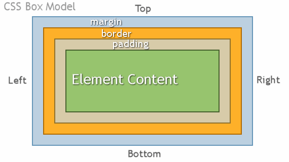
As with many CSS properties, box-model props can be targeted individually to a fully granular level. E.g.
margin-left: 20px;  border-top-width: 5px;

Logical Properties

  • We keep putting margin-left and margin-right BUT what happens if our page is translated into a different language that runs in the opposite direction (rtl)?
  • Also, what about vertical direction (writing modes)
  • Our site may be required to serve both simultaneously!
  • There are ways to solve it using the [dir="rtl"] selector BUT there is a new and better way called 'logical properties
  • Demo
  • Full List
  • Overriding non-logical properties

*

CSS Width & Height

  • width (inline-size)
    • Don't confuse with html width/height attributes
    • Naturally depends on display state of a box, and; content size
    • Sets the width of the content inside the element (unless 'box-sizing' is set differently. See next slide)
    • Values can be set as positive css lengths
  • min-width (min-inline-size) - the element can be any size (and will respond fluidly) down to this width.
  • max-width (max-inline-size) - the element can be any size (and will respond fluidly) up to this width.
    • max-width overrides width, but min-width overrides max-width. (min-width > max-width > width)
  • height (block-size), min-height, max-height - same as above.

When to use Margin vs Padding

  • You use padding when there's space INSIDE an element, moving the border away from the content.
  • You also use padding when you want that element to occupy/'have control of' that area.
  • Margins create dead space which only shows the backgrounds of ancestor elements
  • Padding gives extra space and will show the background styles (inc. images) of that element
  • https://codepen.io/jmsherry/pen/YqJymj
  • on anchors use padding because 'hit area'

Margin Collapse, Escape & Grounding

  • Got problems with your margin poking out of your header?
  • Paragraph spacing not what you expected?

You got margin collapse:

http://codepen.io/jmsherry/pen/zrvjyd


Solution: put a border around it or padding

*

Things that affect the box model

Box Sizing

CSS DISPLAY

  • Display describes how an element should behave both outwardly and internally.
    • i.e. a setting may turn on/off parts of the box model
  • We'll look at 4 basic outward values for now:
    • inline (DEFAULT)
    • block
    • inline-block
    • none
  • Read this and this in a few weeks after grid

Inline Elements

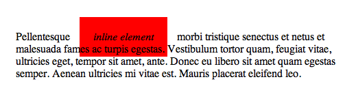
Things that go inside text or things that don't need a line of their own. ('Phrasing Content' in html5)

Block Level

Things that take up whole lines  ('Flow Content' in html5)

display: inline

An inline element will accept margin and padding, but the element still sits inline as you might expect.


Margin and padding will only push other elements away horizontally, not vertically. Although padding will appear vertically, margin does not.


An inline element will not respect height and width declarations.

display: block

Block level elements do not sit inline but break past them. By default (without setting a width) they take up as much horizontal space as they can.


For margin: auto to work the element must be displayed block and have a width < 100% of parent.

display: inline-block

An element set to inline-block still sits inline BUT  you are able to set a width and height which will be respected AND vertical padding and margins!


Beware the 1px gap!!
Solution here


Use Cases


Use this to put things next to each other for now...

Use this property with vertical-align: top; to avoid 'staircasing' (article)

display: none

  • DOM Tree
    •  Your HTML is translated into elements in memory, ready to go onto the page.
    • This process is known as parsing the HTML.
    • The created elements are called DOM Nodes
    • The DOM Tree contains all the nodes.
  • Render Tree
    • After the parsing comes rendering, where the browser turns the parsed elements into element entities on the page.
    • The render tree holds all the nodes which are flagged as 'currently included' in this page.
  • To take an element out of the Render Tree, and hence out of the rendered page, we use display: none;
  • An example might be a drop down menu - it is display:none; until the user hovers a menu item, then it is set to display:block;

How the browser renders:

Partial Credit

  • DOM Tree - every HTML element
  • Style Rules - the rules/props the cascade determines to have won
  • Render Tree - the elements that are to be displayed
  • Layout - Tessellating (fitting together) the element boxes
  • Paint - adding colour/glyphs
  • Composite - grouping in vertical layers (like 'bring to front')
  • Render - drawing the final product into the browser

display: none vs visibility: hidden

  • display: none; means it's not in the render tree.
    • So it doesn't go into the layout/draw phase
    • So, if it was in the page before d:n was applied to it it disappears and other elements move into the gap it left
  • visibility:hidden; means that it does go into the render tree
    • it is put through the draw phase BUT not the paint phase
    • so it's there, but not painted in (aka invisible), so
    • the space it visually occupies will remain (because it's just invisible)

Text Control

Text Control

Underlining, centering, indenting & changing case. (http://codepen.io/jmsherry/pen/GowvXy)

  • direction [ltr (default), rtl]
  • text-align [left (default), center, right, justify]
    • put on parent element - will apply to content
  • text-decoration [none (default: user agent stylesheets will add underline to <a>, <ins>, etc), underline, overline, line-through]
    • blink is rubbish, don't use it.
    • can use a few simultaneously (not 'none', obviously)
  • text-indent  (default: 0)
    • The amount from the edge of the paragraph that the first line is indented
    • Sometimes this is given a massive negative number to drag the text 'off-left', for accessibility text

Text Control cont...

  • text-transform
    • uppercase
    • lowercase
    • capitalize
    letter-spacing
    • normal or <css length>

Centering things

  • Horizontally
    • text-align: center; on the parent
      • can be used to center inline-block lists with a hard edge
    • margin: auto; on block level element (with < 100% width)
       
  • Vertically
    • It's a nightmare until flexbox
    • display: table; on grandparent; display:table-cell; on parent; vertical-align: middle; on element
    • demo
    • Don't worry about it for now...

Styling Lists

  • list-style
    • list-style-type (disc, square, latin, etc)
    • list-style-position (inside or outside)
    • list-style-image url('../img/dino.png')
  • Can be applied to:
    • <ul> or <ol> to affect whole list
    • individual <li>
  • list-style: (shorthand syntax)
    • none; switches all off
      • (You'll need to remove any padding from the user agent stylesheets too)


demo

Fonts

Fonts Explained

  • Fonts are actually just a massive collection of pictures of letters

  • That means that some fonts won't have some letters that the controls provide. (See font-weight: 100-900)

Font

(default in dark green)

  • font-style: [normal, italic, oblique (fallsback to italic if no oblique characters available)]
  • font-weight: [normal, bold, semi-bold, 100-900 (in 100s)]
  • font-size: size [medium, <other values>] - use <css length>
  • line-height: line spacing [normal, <css length>, <number (a font-size multiplier)>]
  • font-family: which font depends on OS.

Font Examples

Separately

.myText {
  font-style: italic;
  font-variant: small-caps;
  font-weight: bold; 
  font-size: 16px;
  line-height: 3;
  font-family: cursive;
}

Shorthand Syntax (slash between size & line-height)

.myText {
  font: italic small-caps bold 16px/3 "Goudy Bookletter 1911", sans-serif;
}

Font family declarations are comma separated and if they contain numbers or special characters then "" are required

font-family: Gill Sans Extrabold, sans-serif; /* GOOD */
font-family: "Goudy Bookletter 1911", sans-serif; /* GOOD */

font-family: Goudy Bookletter 1911, sans-serif; /* BAD */

Google Fonts

Pre-made fonts included as a stylesheet.

  1. https://www.google.com/fonts
  2. Add fonts to your 'collection;
  3. Click 'use' (at bottom of page)
  4. Include the generated stylesheet link in your page
  5. Use generated font-family declaration in css

Helpful CSS Starter Kit

  • Kit
    • Top right of the file there's a little 'copy' icon. Use it to copy the contents and paste into a generics.css

Putting all this into practice

For the rest of the lesson, go play with your CV

And remember...

{the jump} Full-Stack Bootcamp: Session 6

By James Sherry

{the jump} Full-Stack Bootcamp: Session 6

A basic intro to some CSS properties

  • 2,163