Elsevier.com
Discovery/usability findings
June 6, 2017 - Amsterdam

Note: All of the conclusions and opinions in this presentation are my own. They are assumptions & propositions based on exploring the current website, through discoveries online or from personal experience. These have not yet been validated nor properly tested.
- Aäron Sikkink
Disclaimer
June 6, 2017 - Amsterdam

Understanding
Before coming to any concrete conclusions and/or suggestions, we should be able to answer these essential questions first:
June 6, 2017 - Amsterdam

- Who or what are its target audiences?
- What message is Elsevier trying to convey?
- What are the business and user needs?
- What is Elsevier about, and its key strategy and focus?
- Who are its current users? (and their journeys?)
Strategy & Goals
- Stimulate collaboration? (between colleagues)
- E-commerce: Increase conversion (selling articles)
- Increase exploration (the discovery of knowledge/articles/books & digital solutions)
After a closer look at the site, the following strategy/goals seem important:
- Elsevier mission: Expanding the boundaries of knowledge
June 6, 2017 - Amsterdam

Target audience
- Governments
- Researchers
- Students
- Healthcare professionals
Not all questions can be answered, but it's clear the website focusses on the following target groups below. With that in mind, we can serve the content better, and convey the right tone of voice.
- Universities
June 6, 2017 - Amsterdam

- Improved usability & readability: Declutter the main navigation. Make 'Digital Solutions' better readable
- Increased findability: How can we help users find relevant content easier?
Without having access to website insights or user data & task flows (completed or uncompleted), it is obviously hard to make suggestions that can improve the strategy (measurable goals), and the relevance of the presented content. However, there are some improvements that can help the following:
June 6, 2017 - Amsterdam

Recommendations
- Overall improvements / Quick wins
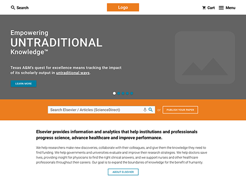
The main unique selling point (USP) for Elsevier is its content. Therefor it is of the utmost importance to make it easy for the users to find / read the content they need. In the Invision Prototype example below you can see some of my ideas.
June 6, 2017 - Amsterdam

Improvements
While scanning the site on desktop, mobile (ipad/iphone) I stumbled on some errors or design inconsistencies that really should be looked into.
June 6, 2017 - Amsterdam

Quick wins / observations
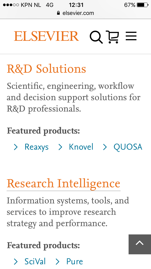
- Google Pagespeed insights: The overall performance is really poor. Especially on mobile. The website is far from being optimized for desktop or mobile.
- The toplevel navigation needs some work. Active state of the search function is shown with a hotspot border around it.

- Inconsistency: Science Direct (articles) has it's own styleguide/design. It feels like it's not connected to Elsevier.
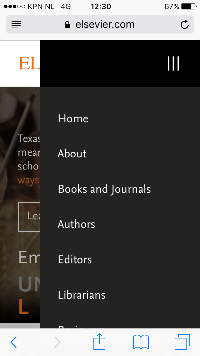
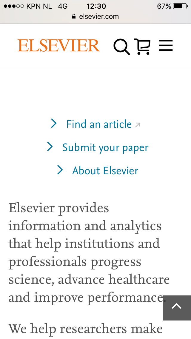
Besides optimizing for mobile, mobile design needs some adjustments to make it better readible. The touch areas (top level icons) are too small for navigation.
June 6, 2017 - Amsterdam

Quick wins / observations

June 6, 2017 - Amsterdam

Thank you!
For viewing my presentation.
Copy of Elsevier
By Aäron Sikkink
Copy of Elsevier
Usability scan
- 362
