Responsive Design Fundamentals
Aayush Arora
@angularboy

Why Responsive design?
Not a language, its a collection of techniques
<meta name="viewport" content="width=device-width, initial-scale=1">
Setting Viewport
CSS media queries for responsiveness
@media (query) {
  /* CSS Rules used when query matches */
}
Introducing Flex Box
.container {
display : flex ;
flex-wrap: wrap;
}
Codelab Part-1
width < = 480px
480px < width < = 720px
RESPONSIVE
DESIGN
PATTERNS
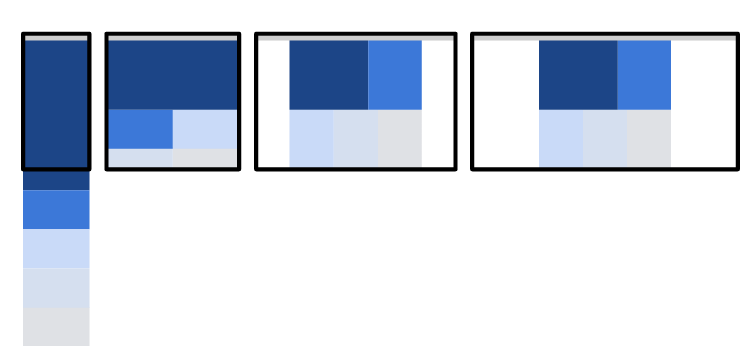
1. Mostly Fluid
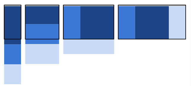
2. Column-drop
3. Layout-shifter
Mostly Fluid
Column Drop
Layout-Shifter

Bootstrap
- Predefined Classes
- Grid system
- Easy to use
- Quick Development
Bootstrap Codelab
Thank
You
Responsive Website
By aayush arora


