Origin CSS
Some Code
/* logo */
#logo {
    background-image: url("/images/logo.png");
}
@media all and (-webkit-min-device-pixel-ratio: 1.5) {
    #logo {
        background-image: url("/images/logo@2x.png");
        background-size: auto auto;
    }
}
#logo {
    background-image: url("/images/logo.png");
}
@media all and (-webkit-min-device-pixel-ratio: 1.5) {
    #logo {
        background-image: url("/images/logo@2x.png");
        background-size: 50px 100px;
    }
}

/* sink-footer */
#sink-footer {
    padding-bottom: 262px;
}
#sink-footer:before,
#sink-footer:after {
    content: " ";
    display: table;
}
#sink-footer:after {
    clear: both;
}

.sink-text {
    white-space: nowrap;
    overflow: hidden;
    text-overflow: ellipsis;
}

/* footer */
#footer-wrapper {
    position: absolute;
    left: 0;
    bottom: 0;
    width: 100%;
}

footer {
    padding: 0px 20px;
    min-height: 80px;
    background: #333;
    color: #b0b0b0;
    -webkit-box-shadow: 0 0 0 5px rgba(0,0,0,.1),0 1px 1px rgba(0,0,0,.35);
    -moz-box-shadow: 0 0 0 5px rgba(0,0,0,.1),0 1px 1px rgba(0,0,0,.35);
    box-shadow: 0 0 0 5px rgba(0,0,0,.1),0 1px 1px rgba(0,0,0,.35);
    box-sizing: border-box;
    -moz-box-sizing: border-box;
    -webkit-box-sizing: border-box;
}

footer .copyright {
    margin: 32px 0 0;
}

footer .copyright a {
    color: #eee;
}

footer.fixed-to-bottom {
    position: absolute;
    left: 0;
    bottom: 0;
    width: 100%;
}
make you confused
make you clear
@import '../node_modules/nib'

$footer-color = #b0b0b0
$copyright-color = #eee

// logo
#logo {
  image: '/images/logo.png'
}
#logo {
  image: '/images/logo.png' 50px 100px
}

// sink-footer
#sink-footer
    padding-bottom 262px
    clearfix()
    .sink-text
        overflow ellipsis

// footer
#footer-wrapper
    absolute bottom 0 left 0
    width 100%
    footer
        padding 0 20px
        min-height 80px
        background $footer-color
        box-shadow(0 0 0 0 5px rgba(0, 0, 0, 0.1), 0 1px 1px rgba(0, 0, 0, 0.35))
        box-sizing(border-box)
        &.fixed-to-bottom
            absolute bottom 0 left 0
        .copyright
            margin 32px 0 0
            a
                color $copyright-color
Origin CSS Advantage
- 书写灵活
- 无需编译,浏览器解析
Origin CSS Limit
- 无结构无作用域,难于维护
- 浏览器兼容&CSS3前缀规则复杂
- 无变量、函数复用概念,极易重复代码
- 难以直观看出DOM Render Tree结构
- CSS代码质量难以控制
CSS Preprocessors
Intro
CSS preprocessor解决了传统CSS代码的以下问题
- CSS结构化、模块化
- 代码复用继承
- CSS变量、变量插值
- 简易变量运算
- CSS prefixes处理
- 用于构造Keyframe一类的loop&conditions
- mixin函数封装
Some Code
for i in 1..12
   '.span' + i
        width -30+85*i px
for i in 1..12
   '.offset' + i
        margin-left 30+85*i px
.offset1 {
  margin-left: 115px;
}
.offset2 {
  margin-left: 200px;
}
.offset3 {
  margin-left: 285px;
}
.offset4 {
  margin-left: 370px;
}
.offset5 {
  margin-left: 455px;
}
.offset6 {
  margin-left: 540px;
}
.offset7 {
  margin-left: 625px;
}
.offset8 {
  margin-left: 710px;
}
.offset9 {
  margin-left: 795px;
}
.offset10 {
  margin-left: 880px;
}
.offset11 {
  margin-left: 965px;
}
.offset12 {
  margin-left: 1050px;
}
.span1 {
  width: 55px;
}
.span2 {
  width: 140px;
}
.span3 {
  width: 225px;
}
.span4 {
  width: 310px;
}
.span5 {
  width: 395px;
}
.span6 {
  width: 480px;
}
.span7 {
  width: 565px;
}
.span8 {
  width: 650px;
}
.span9 {
  width: 735px;
}
.span10 {
  width: 820px;
}
.span11 {
  width: 905px;
}
.span12 {
  width: 990px;
}
stylus
compiled css
$keyframe-name = 'editing-large'
@keyframes {$keyframe-name}
    for i in 0..10
        {10% * i}
            if i%2 == 0
                left (8*1+13)px
            else
                left (8*-1+13)px

$keyframe-name = 'editing-small'
@keyframes {$keyframe-name}
    for i in 0..10
        {10% * i}
            if i%2 == 0
                left (5*1+7)px
            else
                left (5*-1+7)px
@-moz-keyframes editing-large {
  0% {
    left: 21px;
  }
  10% {
    left: 5px;
  }
  20% {
    left: 21px;
  }
  30% {
    left: 5px;
  }
  40% {
    left: 21px;
  }
  50% {
    left: 5px;
  }
  60% {
    left: 21px;
  }
  70% {
    left: 5px;
  }
  80% {
    left: 21px;
  }
  90% {
    left: 5px;
  }
  100% {
    left: 21px;
  }
}
@-webkit-keyframes editing-large {
  0% {
    left: 21px;
  }
  10% {
    left: 5px;
  }
  20% {
    left: 21px;
  }
  30% {
    left: 5px;
  }
  40% {
    left: 21px;
  }
  50% {
    left: 5px;
  }
  60% {
    left: 21px;
  }
  70% {
    left: 5px;
  }
  80% {
    left: 21px;
  }
  90% {
    left: 5px;
  }
  100% {
    left: 21px;
  }
}
@-o-keyframes editing-large {
  0% {
    left: 21px;
  }
  10% {
    left: 5px;
  }
  20% {
    left: 21px;
  }
  30% {
    left: 5px;
  }
  40% {
    left: 21px;
  }
  50% {
    left: 5px;
  }
  60% {
    left: 21px;
  }
  70% {
    left: 5px;
  }
  80% {
    left: 21px;
  }
  90% {
    left: 5px;
  }
  100% {
    left: 21px;
  }
}
@keyframes editing-large {
  0% {
    left: 21px;
  }
  10% {
    left: 5px;
  }
  20% {
    left: 21px;
  }
  30% {
    left: 5px;
  }
  40% {
    left: 21px;
  }
  50% {
    left: 5px;
  }
  60% {
    left: 21px;
  }
  70% {
    left: 5px;
  }
  80% {
    left: 21px;
  }
  90% {
    left: 5px;
  }
  100% {
    left: 21px;
  }
}
@-moz-keyframes editing-small {
  0% {
    left: 12px;
  }
  10% {
    left: 2px;
  }
  20% {
    left: 12px;
  }
  30% {
    left: 2px;
  }
  40% {
    left: 12px;
  }
  50% {
    left: 2px;
  }
  60% {
    left: 12px;
  }
  70% {
    left: 2px;
  }
  80% {
    left: 12px;
  }
  90% {
    left: 2px;
  }
  100% {
    left: 12px;
  }
}
@-webkit-keyframes editing-small {
  0% {
    left: 12px;
  }
  10% {
    left: 2px;
  }
  20% {
    left: 12px;
  }
  30% {
    left: 2px;
  }
  40% {
    left: 12px;
  }
  50% {
    left: 2px;
  }
  60% {
    left: 12px;
  }
  70% {
    left: 2px;
  }
  80% {
    left: 12px;
  }
  90% {
    left: 2px;
  }
  100% {
    left: 12px;
  }
}
@-o-keyframes editing-small {
  0% {
    left: 12px;
  }
  10% {
    left: 2px;
  }
  20% {
    left: 12px;
  }
  30% {
    left: 2px;
  }
  40% {
    left: 12px;
  }
  50% {
    left: 2px;
  }
  60% {
    left: 12px;
  }
  70% {
    left: 2px;
  }
  80% {
    left: 12px;
  }
  90% {
    left: 2px;
  }
  100% {
    left: 12px;
  }
}
@keyframes editing-small {
  0% {
    left: 12px;
  }
  10% {
    left: 2px;
  }
  20% {
    left: 12px;
  }
  30% {
    left: 2px;
  }
  40% {
    left: 12px;
  }
  50% {
    left: 2px;
  }
  60% {
    left: 12px;
  }
  70% {
    left: 2px;
  }
  80% {
    left: 12px;
  }
  90% {
    left: 2px;
  }
  100% {
    left: 12px;
  }
}
Popular Repository
Less
Scss&Sass
Stylus
Myth
Repositories Activity
star 3249 watch 99 fork 104 issue 11 commits 148
Less:
Sass:
Stylus:
Myth:
star 5005 watch 234 fork 668 issue 150 commits 3561
star 4739 watch 416 fork 875 issue 119 commits 5847
star 11284 watch 626 fork 2497 issue 194 commits 1862
until 2014/9/16
Less
CSS语法扩展的保守派先驱 —— by 我自己

Less Hat
Recommend Reason
if ('你只是做简单的web app demo' ||
        '你是专业设计师' ||
        '仅仅想尝试下CSS Preprocessors' ||
        '你的项目中CSS需求较低' ||
        '你根本不懂CSS')
    return 'try it';
Less Design Philosophy
Less的设计目标是成为CSS的超集,语法向下兼容,一言以蔽之,less不做多余的事
Less Author
此人不熟
Less Features
- 提供强大的颜色处理内置函数
- 可在客户端编译(不推荐)
- 服务端编译依赖node环境
Less Limit
- built-in函数功能较弱
- operation操作较弱
- 数据结构较为基础
- 部分重要功能缺失
- 语法愚笨而不直观
Sass
来自ruby context的CSS强劲绞肉机 —— by 我自己


Recommend Reason
if ('你的前端工程量级很大' ||
        '你的CSS代码过度复杂难以维护' ||
        '你想要最多的社区支持' ||
        '你想要使用更多CSS3新特性')
    return 'try it';

if ('你使用rails或其它ruby webMVC框架')
    return 'enjoy it';
Sass Design Philosophy
Sass:Ruby-like语法
Scss:CSS-like语法(Sassy CSS)
- 提供丰富强大的语言特性(loop/condition)
- 提供灵活的可编程扩展特性(Sass scripts)
Sass Author
Compass Author
此二人均不熟
Sass Features
- 强大的Sass Scripts
- 丰富的第三方Sass函数库
- Compass的丰富函数支持
- Compass的杀手级特性 sprite-pack
- 周全的debug模式
Sass Limit
- Node-Sass版本无法支持Compass
- Sass少了Compass如断一臂
- 内置部分函数与CSS3新增属性名冲突
- 非ruby环境应用引入ruby成本较大
- 早期官网太丑,众人纷纷转向Less
简洁到极致却不失任何功能的CSS高速手术刀 —— by 我自己

Stylus

Recommend Reason
if ('你是使用coffeeScript的异端' ||
        '你是jade的拥趸' ||
        '你是TJ Holowaychuk的脑残粉' ||
        '你觉得ruby大法好' ||
        '你讨厌花括号和一切多余的字符' ||
        '你是我的好朋友')
    return 'You must use it';
Stylus Design Philosophy
- 提供简洁至极的语法
- 提供丰富而直接的操作符与运算方法
- 提供灵活的可编程特性
Stylus Author
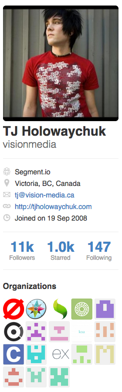
Jade,
Stylus,
Nib,
Component,
Express,
Koa,
Mocha,
Node-Canvas,
EJS,
Co,
Cluster,
Should.js,
Rework,
N,
Superagent,
Git-Extras,
Commander.js
...
Creator of the Luna programming language
此人是神
Stylus Features
- 内置强大的Function库
- Nib的扩展支持(css3-prefix, css trick...)
- 需要Node环境编译
Stylus Limit
- 语法不兼容CSS(编译器支持),学习成本增大
- 社区支持度与Less、Sass相比较低,国内常常无人问津
- Stylus cli程序功能有限,远比Compass弱
- 部分语言特性哗众取宠不实用
- Nib函数支持度与Compass相比稍弱
Myth

来自未来的CSS --harmony —— by 我自己
Recommend Reason
if ('你是FE Developer' ||
        '你想尝试CSS4的spec' ||
        '你就是想玩玩')
    return 'try it';
Myth Design Philosophy
- 按照w3c spec实现未来的CSS(CSS4)特性
- 使你的代码在得到浏览器支持的未来无需重写
Myth Author

Analytics.js
TJ的同事
Myth Features
- 满足W3C CSS spec规范,可编写未来的css代码
- 可对编译器选择浏览器支持度,从而使浏览器支持的代码无需编译
- 当浏览器完全支持CSS spec,可撤销Myth编译器,无需重构代码
Myth Limit
- 与其他css preprocessors相比功能严重缺失
- 没有css结构化嵌套,依旧难于维护
- 函数功能简单,没有mixin支持
- 没有extend支持
- 绝大多数特性目前浏览器均不支持
- 基于css spec的规范未来可能不被浏览器支持(最后这点是我意淫的,别信)
In Brief
Sass最强
Less最弱
Myth不现实
Stylus好像没人知道
Comparison Details
$ git clone git@github.com:abruzzihraig/CSS-Preprocessors-Comparison.git$ git branch$ git checkout <feature comparison>One More Thing

Build Your Own
CSS Preprocessor

My Preprocessor Ti
$ git clone git@github.com:abruzzihraig/Ti.git$ npm install ti-cli -g$ npm install ti -g$ git clone git@github.com:abruzzihraig/Ti-cli.git$ git clone git@github.com:abruzzihraig/rework-color-distinguish.git$ npm install rework-color-distinguishCSS-Preprocessors-Comparison
By Abruzzi Hraig
CSS-Preprocessors-Comparison
这个slide介绍了Less、Sass、Stylus以及Myth四种CSS preprocessor,分析了各自的优劣与项目适用情景,并和传统原生CSS代码做了相应比较。