Mastering CSS 3
www.xebialabs.com
Getting Started
After you have a design, start with a blank page content
Use a master stylesheet
--- master.css@import url("reset.css");
@import url("global.css");

@import url("flash.css");
@import url("structure.css");
<style type="text/css" media="Screen">
/**/ @import url("css/master.css");/**/
</style>
Keep a library of helpful CSS classes
.width100 { width: 100%; }
.width75 { width: 75%; }
.width50 { width: 50%; }
.floatLeft { float: left; }
.floatRight { float: right; }
.alignLeft { text-align: left; }
.alignRight { text-align: right; }
Organise your CSS-styles, making a table of contents
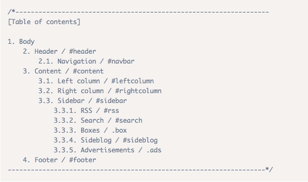
Organise your CSS-styles, ordering properties alphabetically
Separate code into blocks
/* Structure */ /* Typography */ /* Links */
All the styling for anchor tags
/* Lists, images, etc. */
The rest - like images, lists, and any other elements that didn't fit into the rest of the section.
Workflow: Handling IDs, Classes, Selectors, Properties
-
Keep containers to a minimum
- Keep properties to a minimum
- Keep selectors to a minimum
Name your classes and IDs properly, according to their semantics
Try to avoid names that imply presentational aspects
Example of bad name: right-col
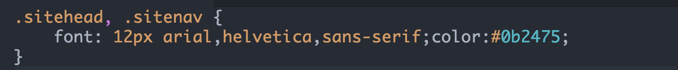
Group selectors with common CSS declarations
So instead of this
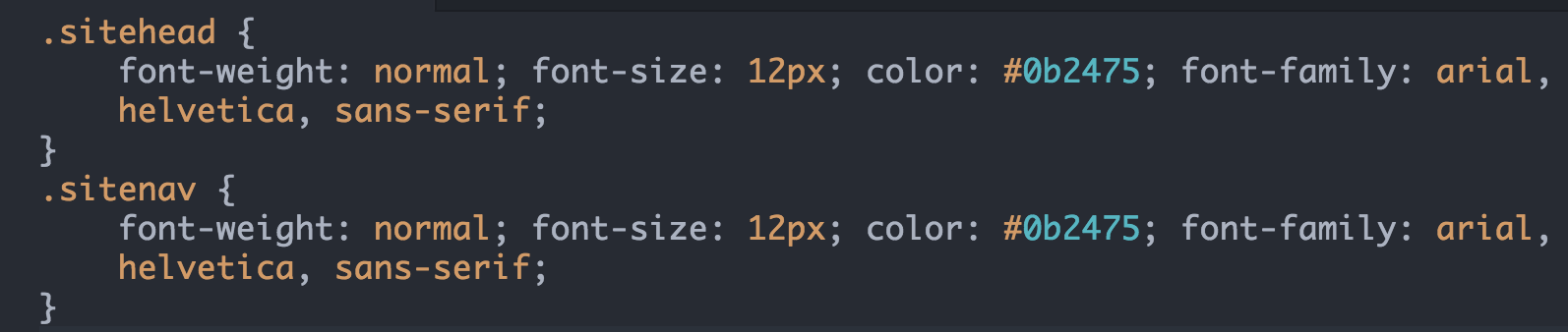
Do this, by grouping multiple selectors with common declarations:
Isolate single properties that you are likely to reuse a lot
Find an example is here
Move IDs and class naming as far up the document tree as you can
- Leverage contextual selectors as much as possible
- Longer selectors can make CSS documents easier to read while also cutting down the chances of developing class- or divits.
Use Your Utility Tags: <small>, <em> and <strong>
Instead of applying custom classes on divs use semantic tags.
Use shorthand notation
Shorten hexadecimal color notation
#000 is the same as #000000
#369 is the same as #336699
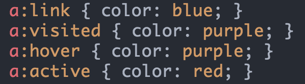
Define pseudo classes for links in LoVe/HAte-order
LoVe/HAte-order stands for Link,Visited, Hover, Active
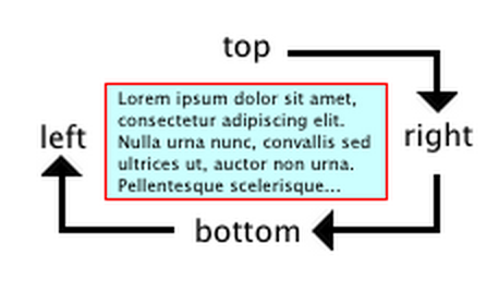
Define elements margin, padding or border in TRoBLed-order
When using shorthand to specify element's margin, padding or border, do it clockwise from the top: Top, Right, Bottom, Left
Setting up Typography
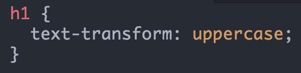
You can change capitalisation using CSS [Open example]
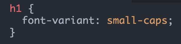
You can display text in small-caps automatically [Open example]
Set 100.01% for the html-element
- Setting default body font size in percent (instead of em) eliminates IE/Win problem with growing or shrinking fonts out of proportion if they are later set in ems in other elements
- Some version of Opera draw a default font-size of 100% too small compared to other browsers
- Safari, on other hand, has a problem with a font-size of 101%
You can hide CSS from older browsers
A common way of hiding CSS files from old browsers is to use
the @import trick
!important: How and When to Use It
An !important declaration provides a way for a stylesheet author to give a CSS value more weight than it naturally has
When should you use it? Never
When you use !important you're disrupting the natural flow of your rules, giving more weight to rules that are undeserving of such weight
Learn CSS Layout
The "display" property
The default for most elements is usually
block or inline.Block
A block-level element starts on a new line and stretches out to the left and right as far as it can
Common block-level elements: div, header, footer, section, etc.
Inline
An inline element can wrap some text inside a paragraph
<span>
like this
</span>
without disrupting the flow of that paragraph.
Inline-block
An element like inline but it can have a width and height
Position
Static (default)
Is not positioned in any specific way
Relative
Behaves the same way as static unless you add some extra properties [Example]
Fixed
A fixed element is positioned relative to the viewport, which means it
always stays in the same place even if the page is scrolled [Example]
Absolute
Behaves like
fixed except relative to the nearest positioned ancestor
instead of relative to the viewport. If an absolutely-positioned
element has no positioned ancestors, it uses the document body, and
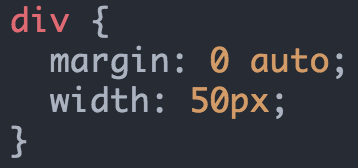
still moves along with page scrolling. [Example]Position the block in the middle of the screen
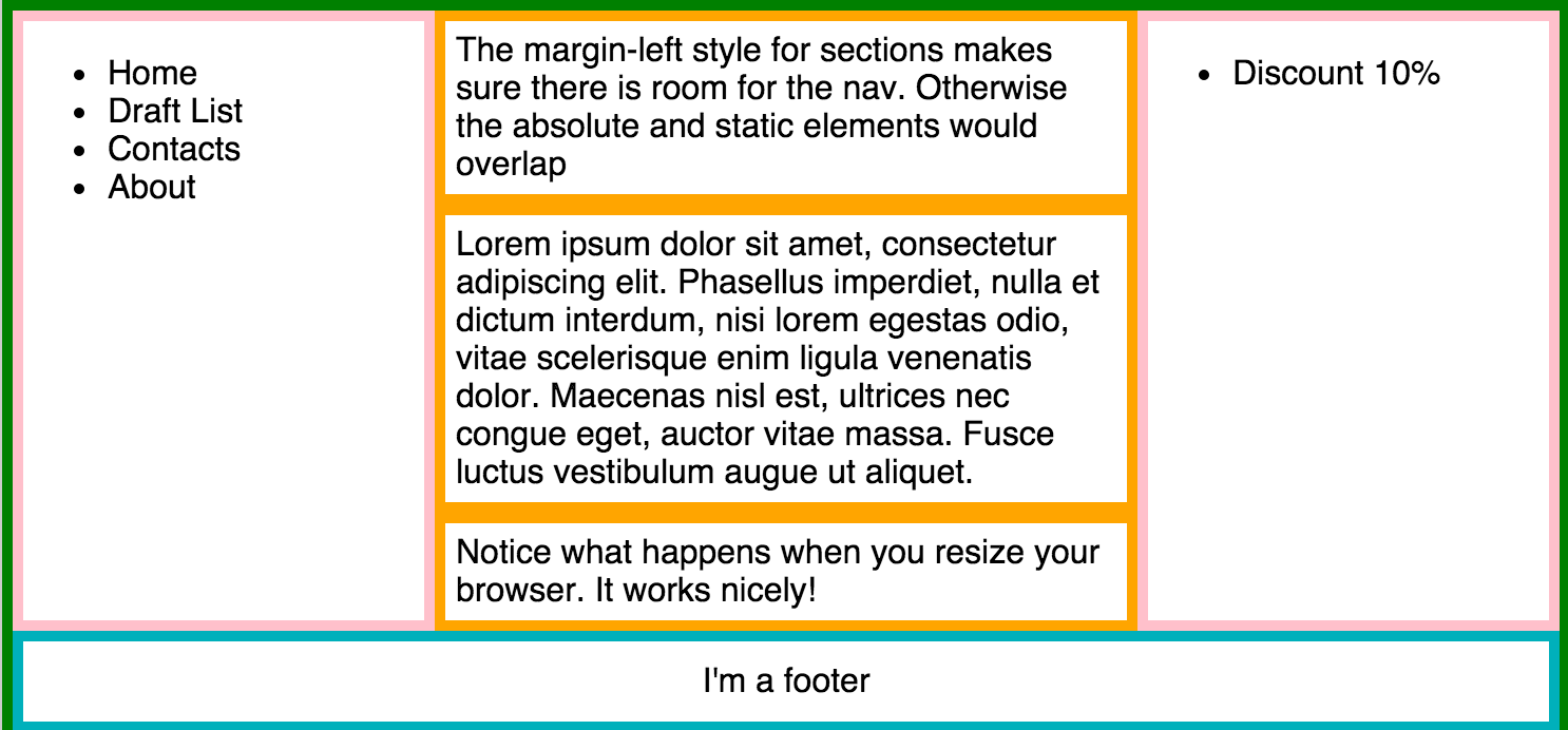
Page layout
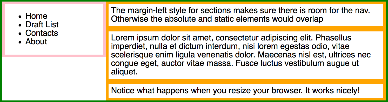
Look at example [here]
Exercise
Based on the previous example you need to create the next page layout:
float
Intended for wrapping text around images 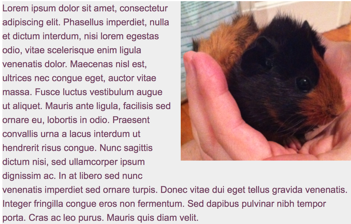
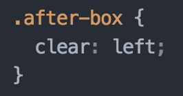
clear
Important for controlling the behaviour of floats. [Example]
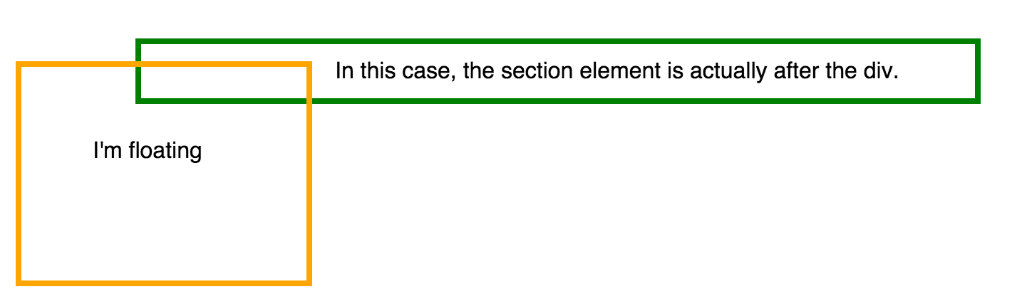
If we want section appear after floated element
You need to apply clear: left to the section [Full example]
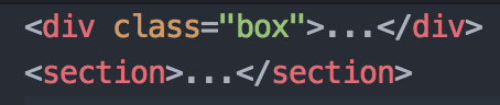
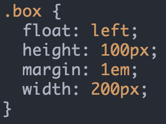
Exercise
Create the next float layout
Media Queries
Responsive Design is the strategy of making a site that responds to the browser and device that it is being shown on
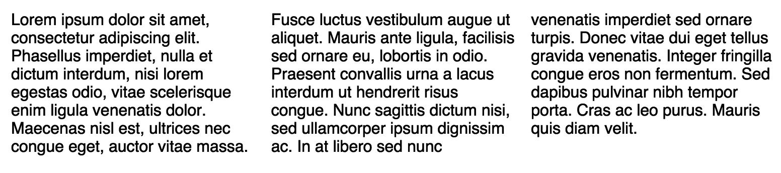
Column
There is a new set of CSS properties that let you easily make multi-column text [Example]
Exercise
-
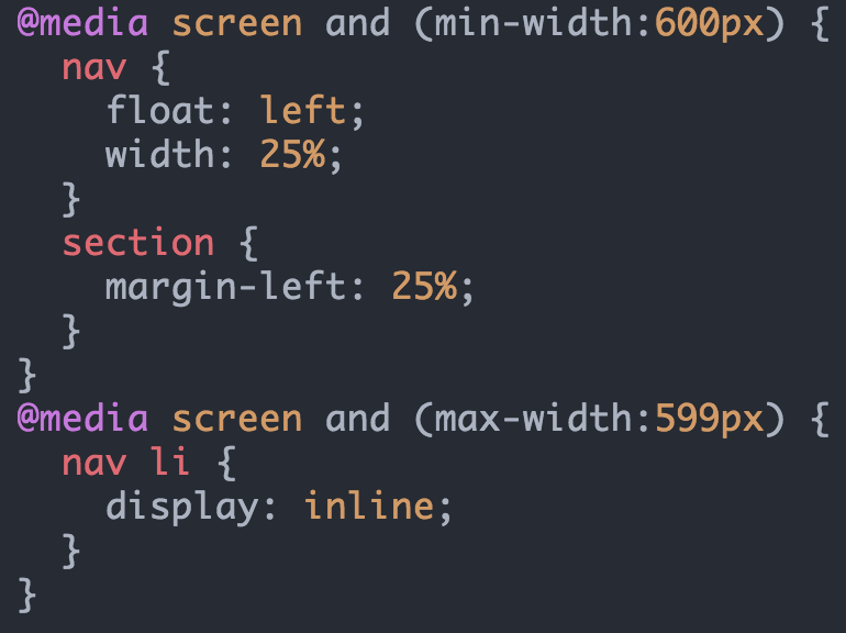
Show 4 columns if the page width is more than 800px
- Show 3 columns if the page width is between 600 and 800px
- Show only text with an image if page width is less then 600px
Animation
CSS animations are made up of two basic building blocks:
Keyframes - defines the stages and styles of the animation.
Animation properties - assign the @keyframes to a specific CSS elements and define how it is animated
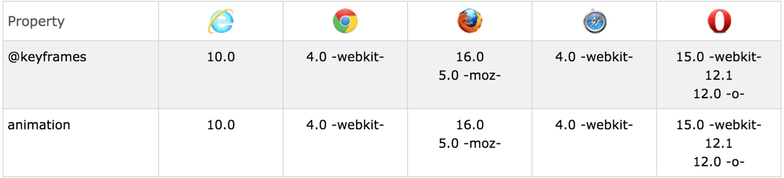
Browser support
Building Block #1: Keyframes
They define what the animation looks like at each stage of the animation timeline
Composed of:
- Name of the animation
- Stages of the animation
- CSS properties
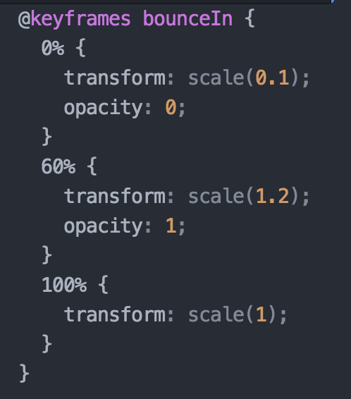
Simple @keyframes example
Building block #2: Animation Properties
Once @keyframes are defined, the animation properties must be added in order for your animation to function.
They do 2 things:
- They assign @keyframes to the elements that you want to animate
- They define how it is animated.
Animation to Take Effect
You should add following animation properties:
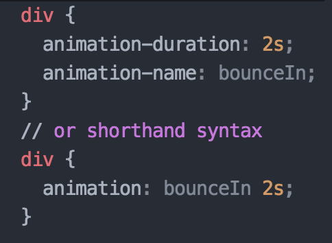
- animation-name: The name of the animation, defined in the @keyframes
- animation-duration: The duration of the animation, in seconds (e.g. 5s) or milliseconds (e.g. 200ms)
Working example [Open]
Additional Animation Properties #1
- animation-timing-function [Example]
- defines the speed curve or pace
- ease, linear, ease-in, ease-out, ease-in-out,initial, inherit
- animation-delay
- specify when the animation will start
- animation-iteration-count
- specify the number of times that the animation will play
- default is 1; infinite, inherit, initial
- animation-direction [Example]
- whether the animation should play forward, reverse, or in alternate cycles.
- normal, reverse, alternate, alternate-reverse
Additional Animation Properties #2
-
animation-fill-mode [Full description]
- specify if the animation styles are visible before or after the animation plays.
- backwards, forwards, both, normal
- animation-play-state
- specify whether the animation is playing or paused.
- playing, paused
Exercise
Create this animation, as a start use [this]

Mastering CSS
By acierto
Mastering CSS
CSS best practices, creation of page layouts and animation


