The Drupal admin experience
Plain and simple
Why modify Drupal's admin interface?
Picking up new technology is challenging.
Frustrated? Throw it out.
Good first impressions matter...a lot.
Disable overlay
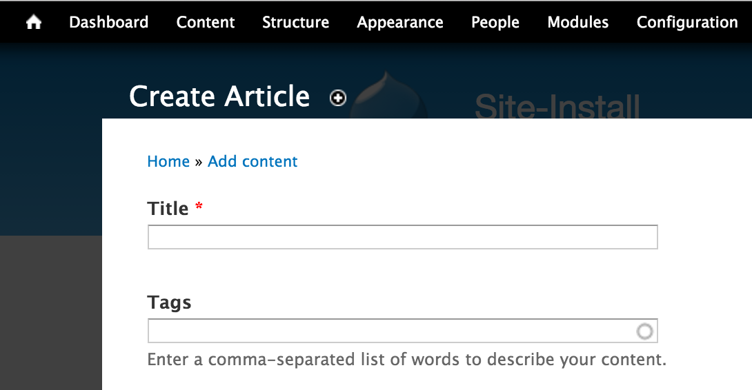
Overlay deal-breakers
Multiple page reloads
JavaScript issues galore
Useless use-case
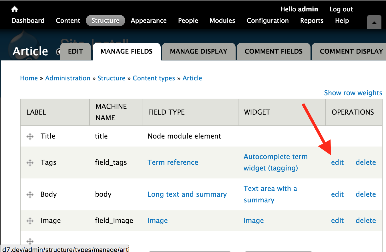
Disable toolbar
No power-user features
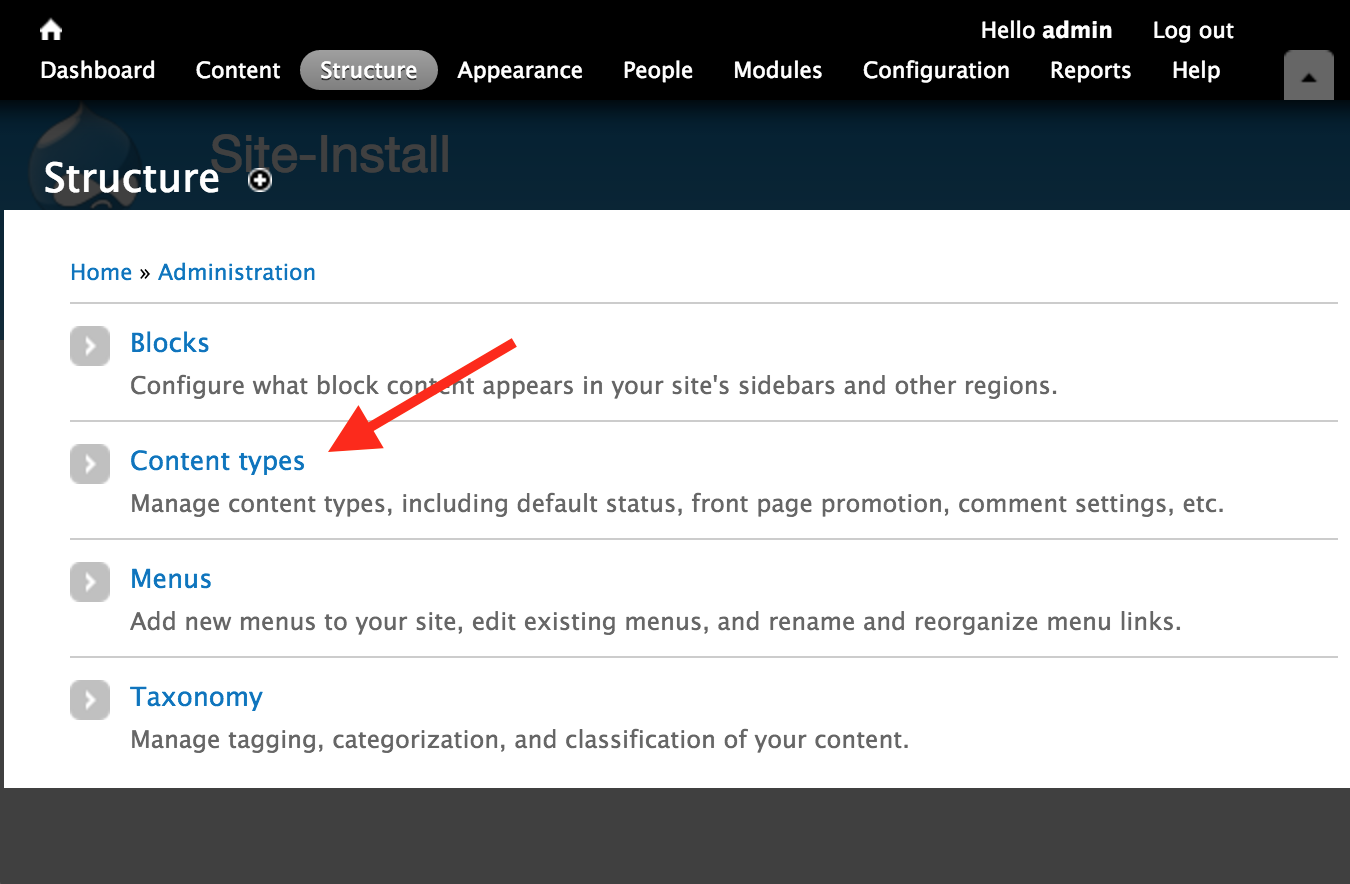
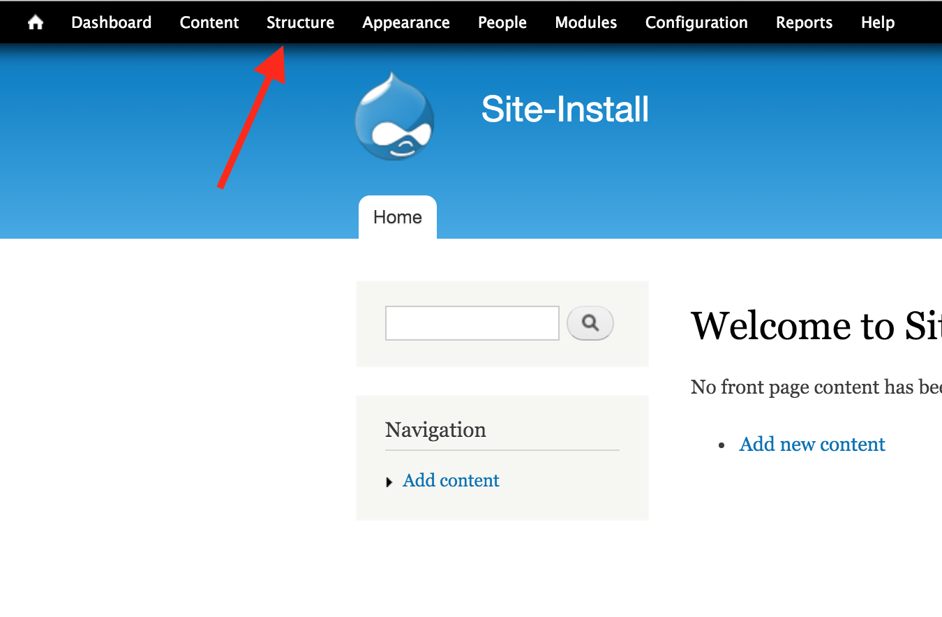
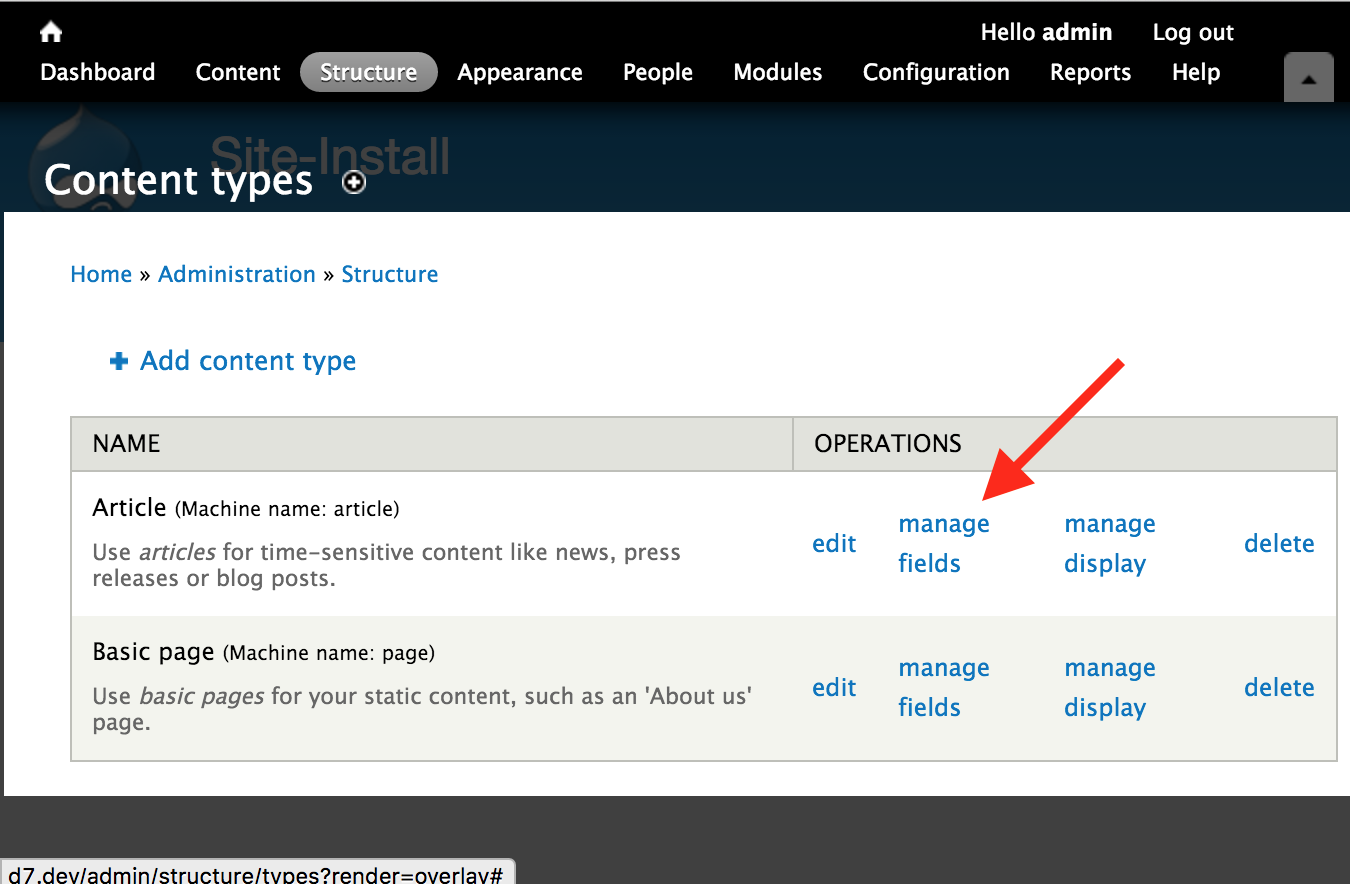
1
2
3
4
Disable toolbar
No power-user features
Enable Administration Menu (admin_menu) instead

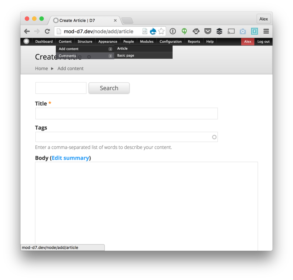
Careful hover, one-click
Should I use a mega-menu?
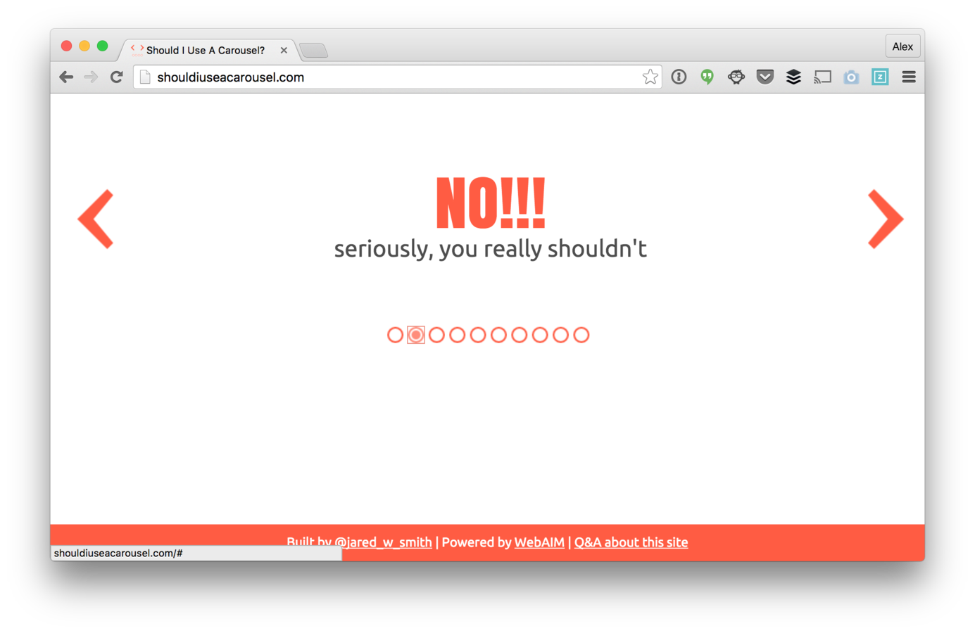
Not for average content managers
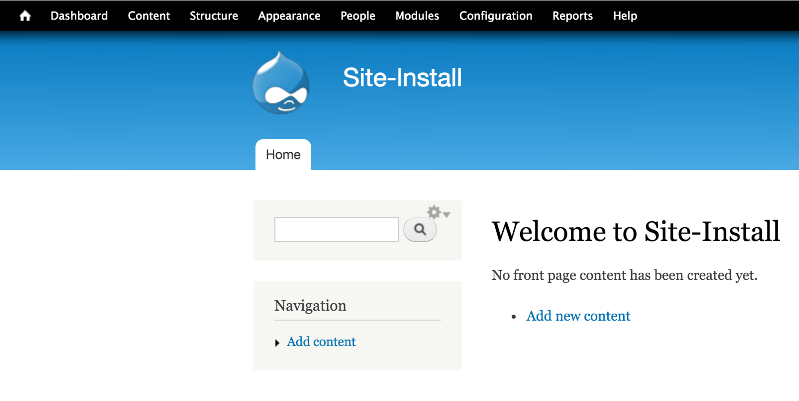

Not for average content managers

Careful hover, one-click
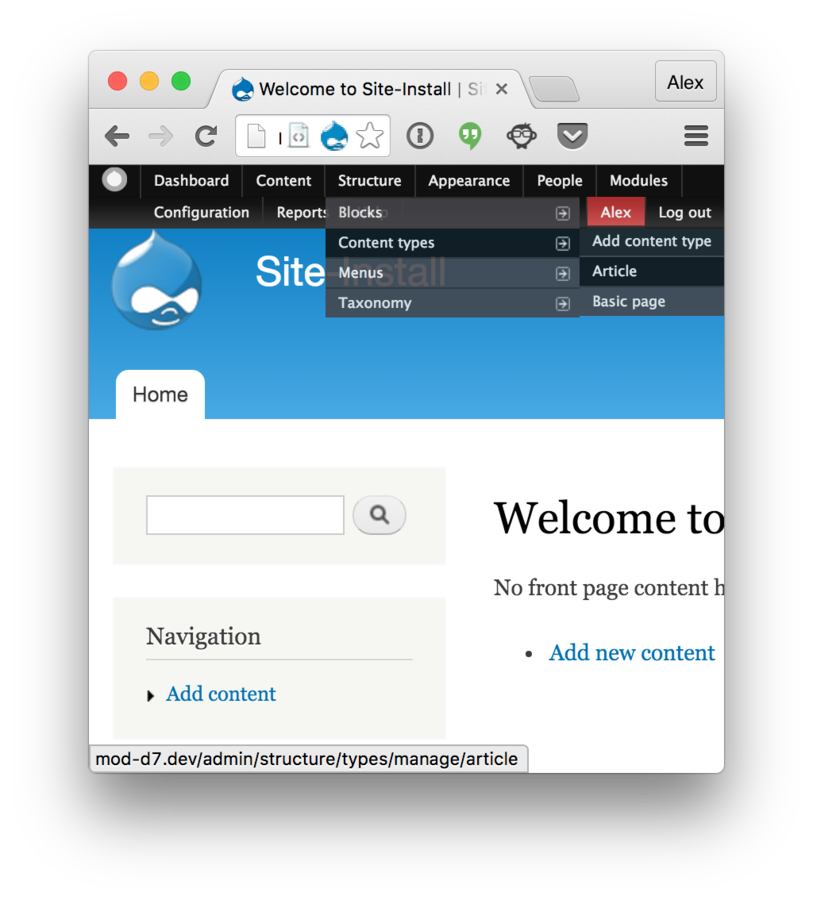
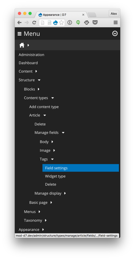
Structure >
Content types (Article) >
Manage fields (Tag) >
Edit
Enter Navbar
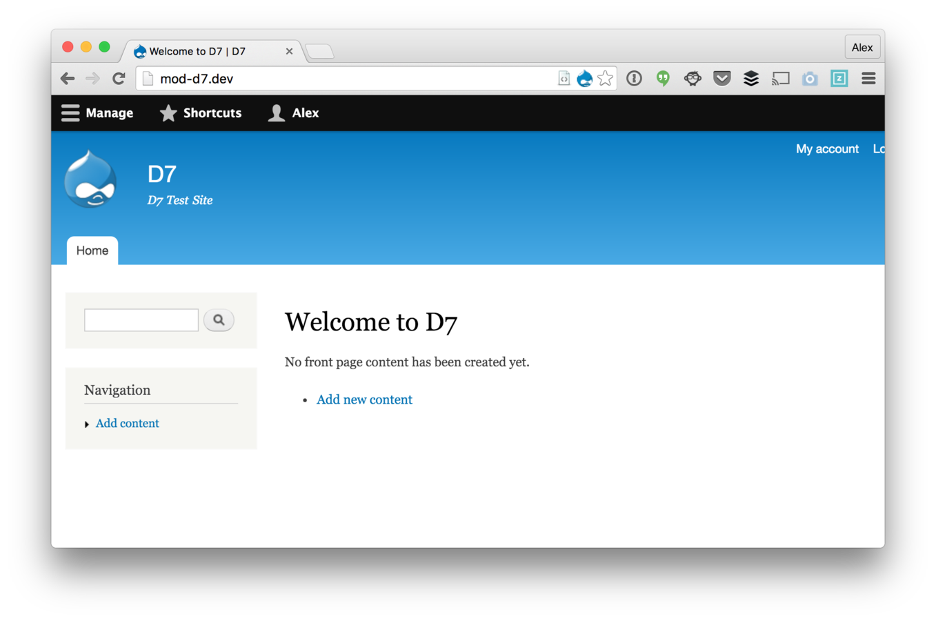
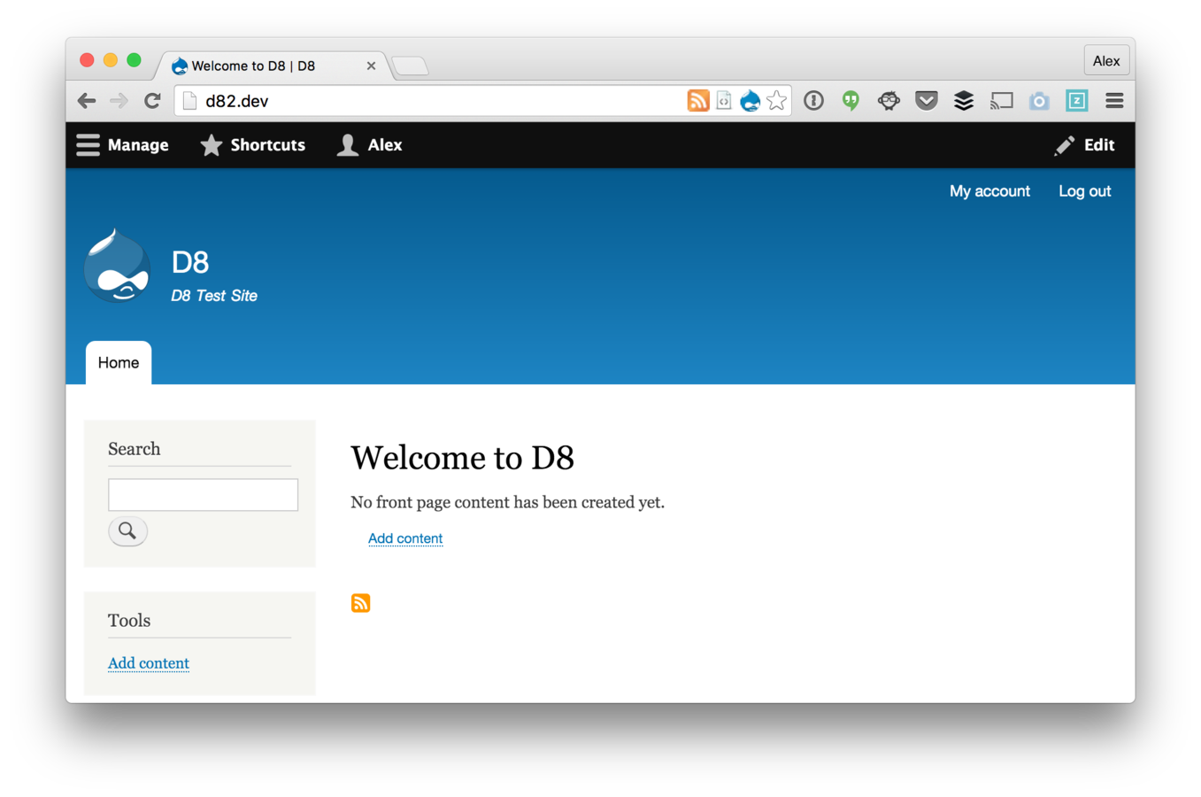

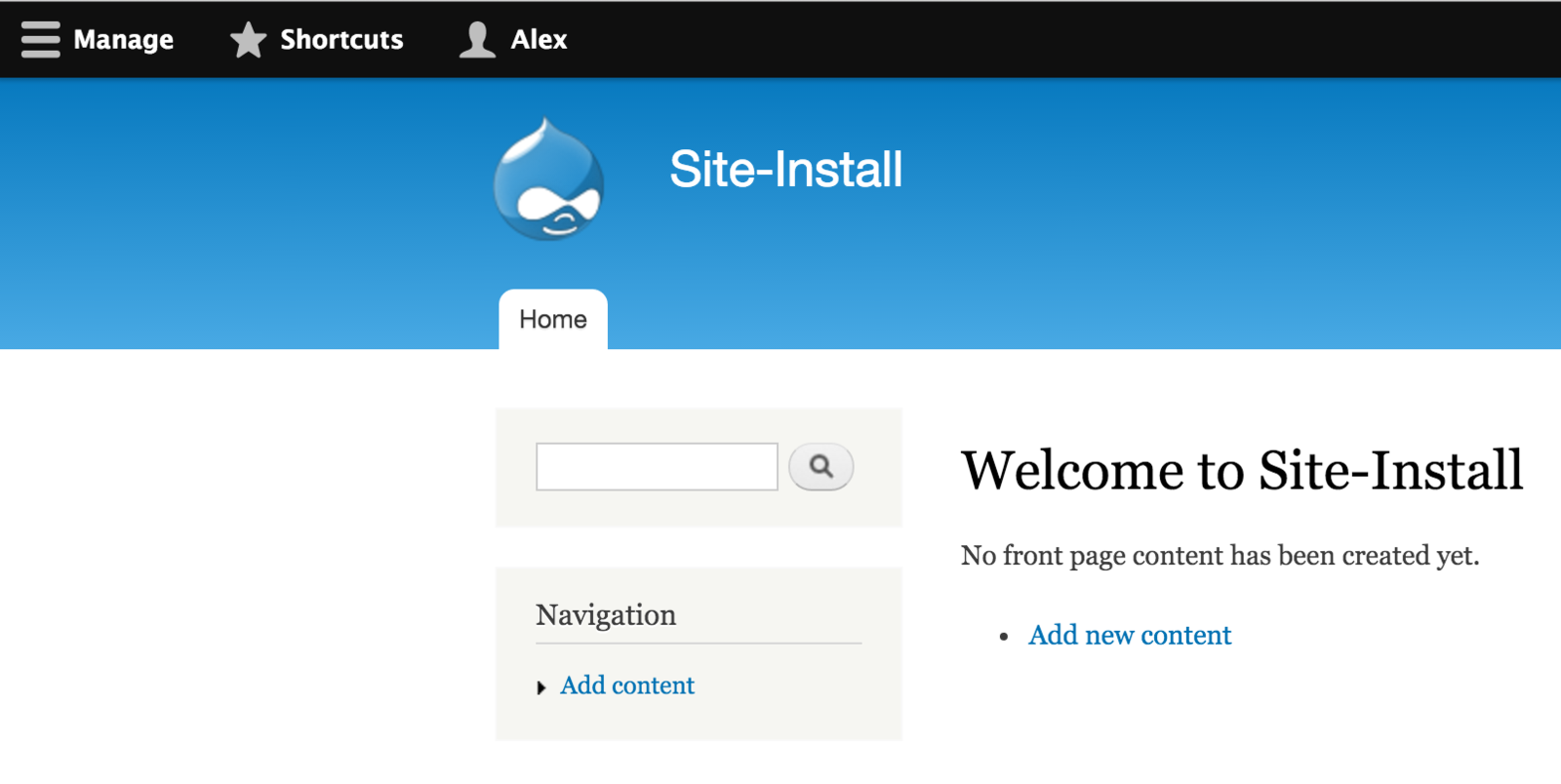
10
3
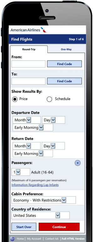
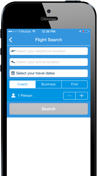
This is going to be painful
This is going to be a breeze

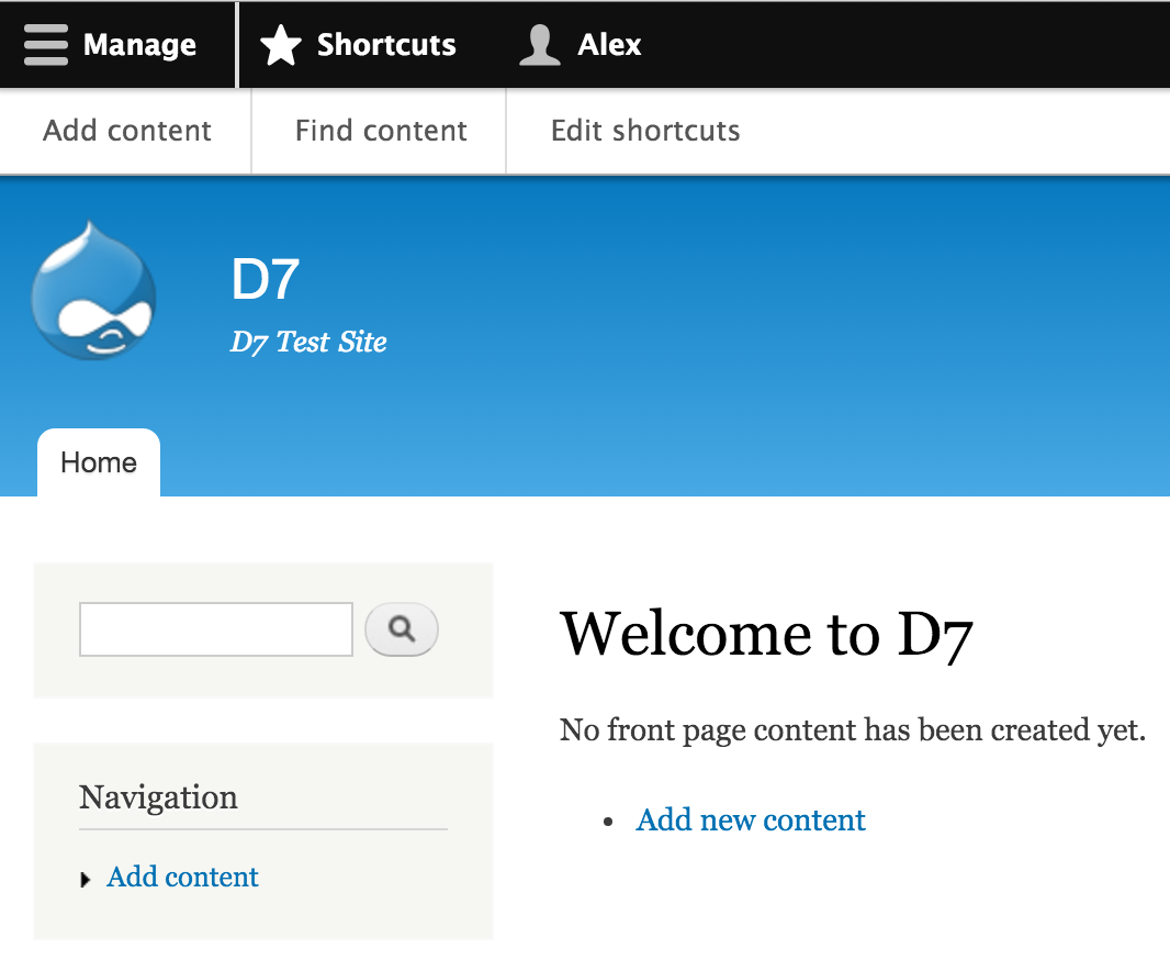
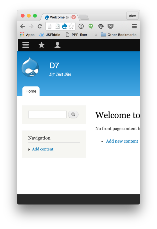
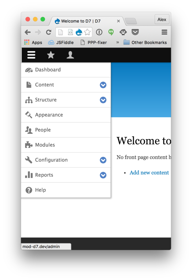
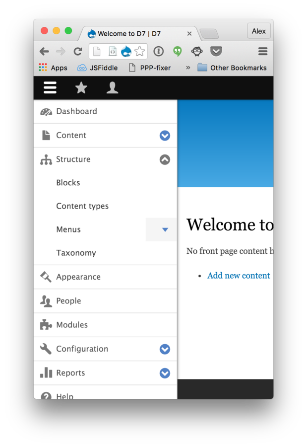
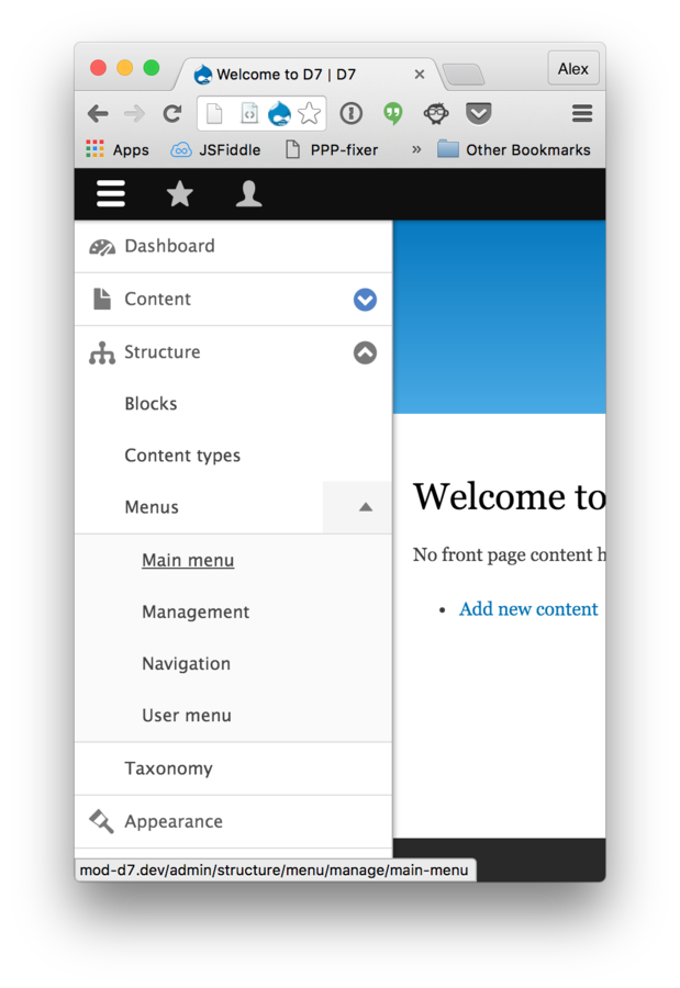
Admin Menu Recap
Shoot for a high "dive-in" factor
Visual queues aid in recall memory
Less is more
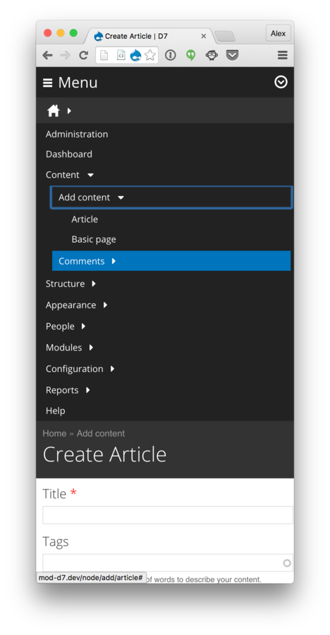
Mobile functionality is a must
Choose a good admin theme
Shiny (D7)
Ember (D7)
Adminimal (D7/D8)
Green means go

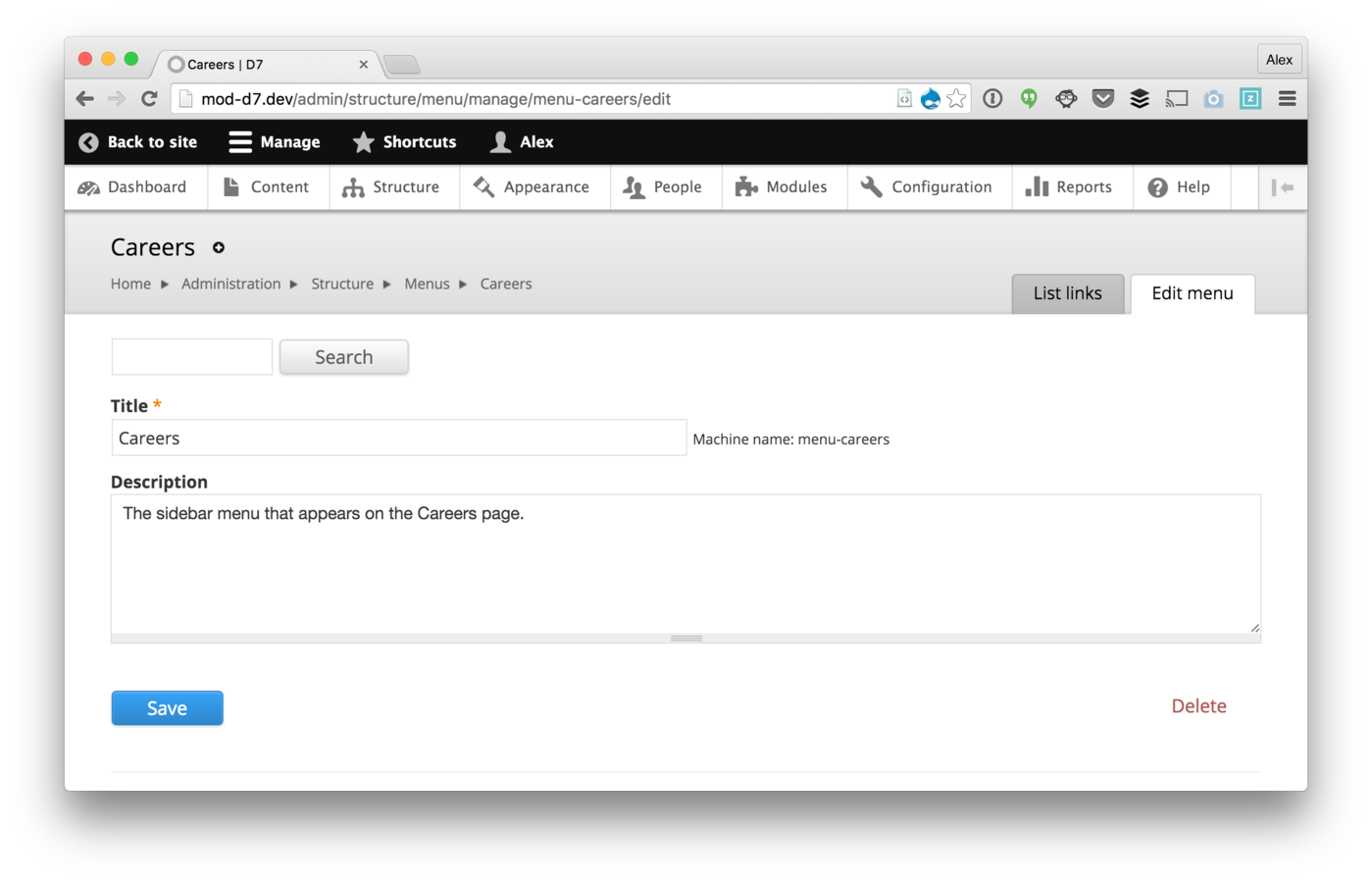
"Luxury Lanes"
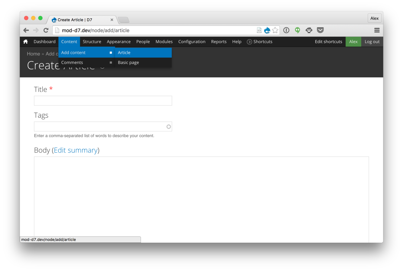
Mobile-friendly
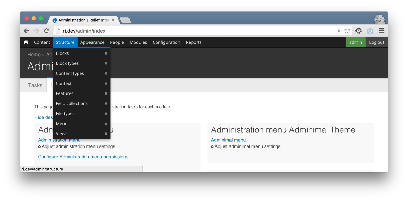
Limit permissions
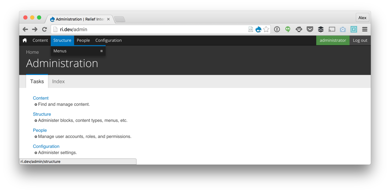
Simplify content creation
Field Group
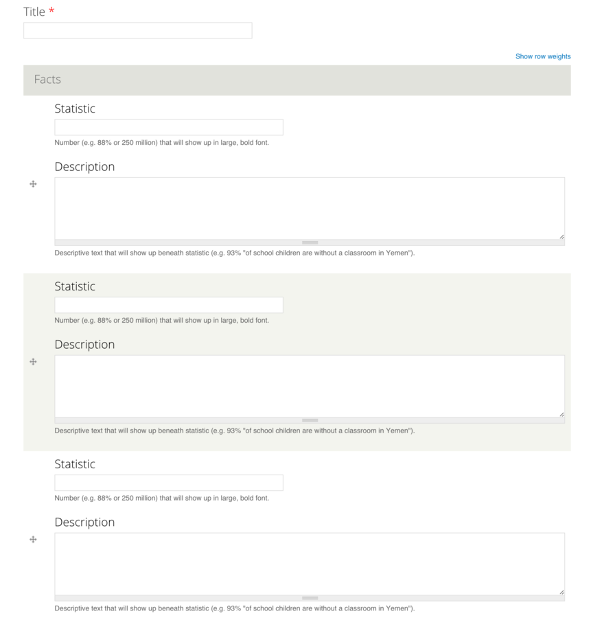


{
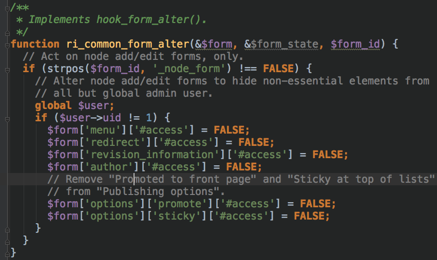

Bean > Block
Blocks or Blocks?
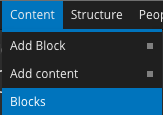

Bean module
Block module
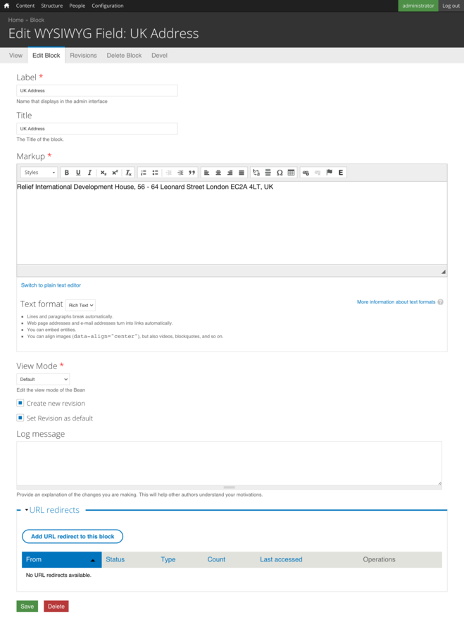
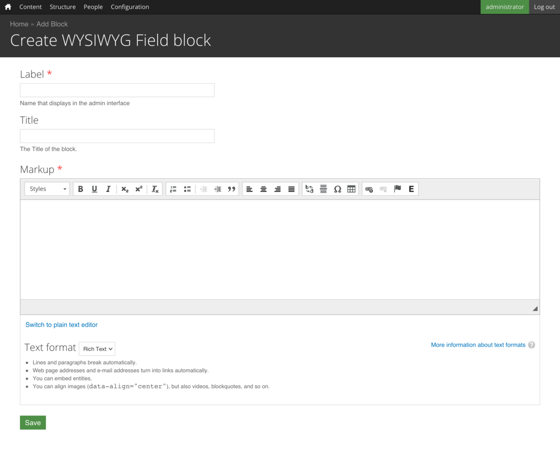
}
Just look at those savings
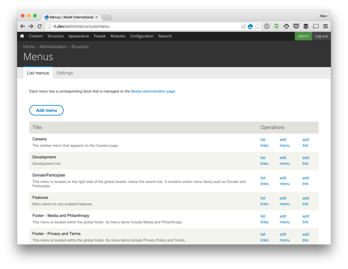
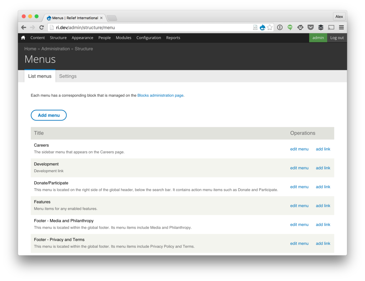
Enabled
Disabled
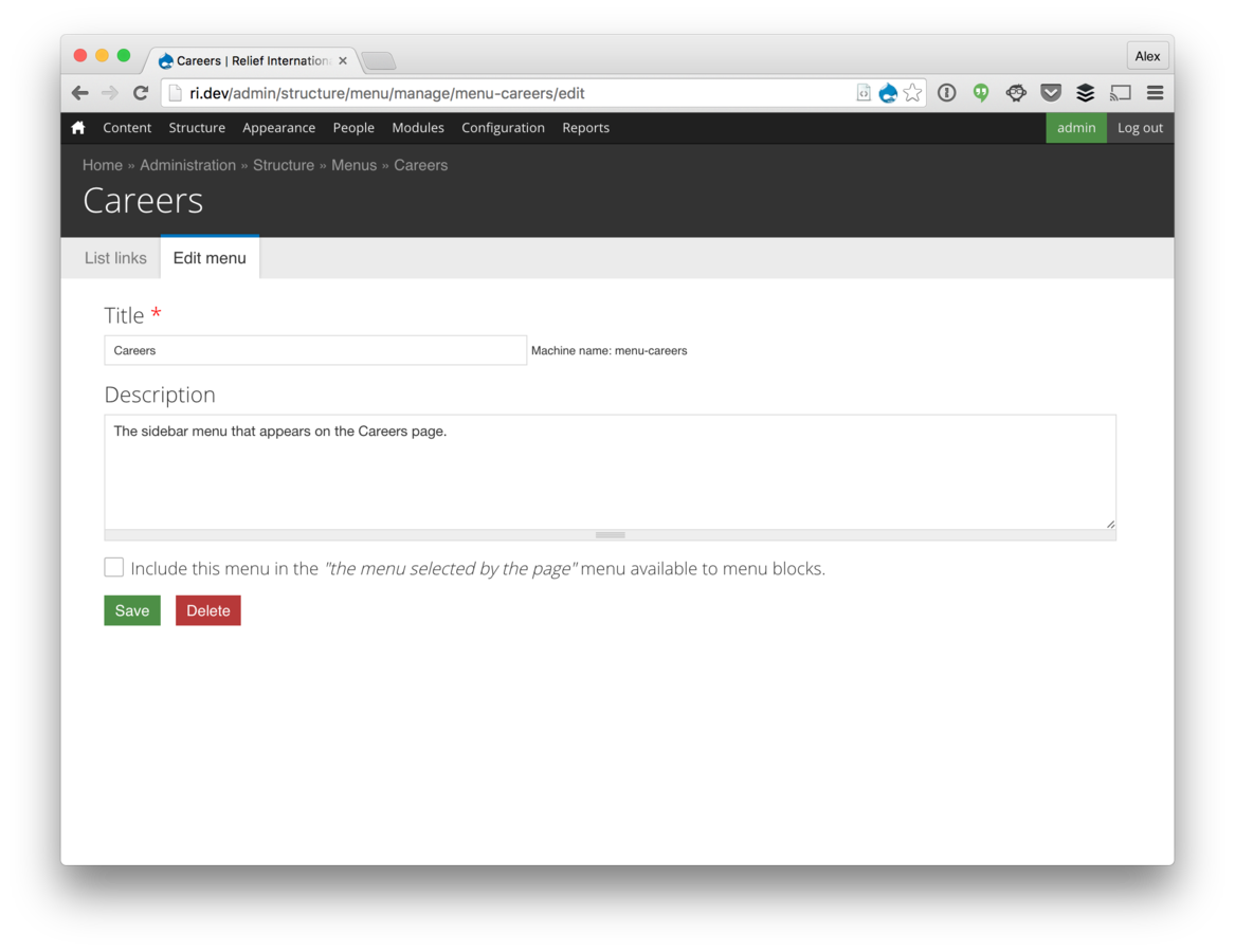
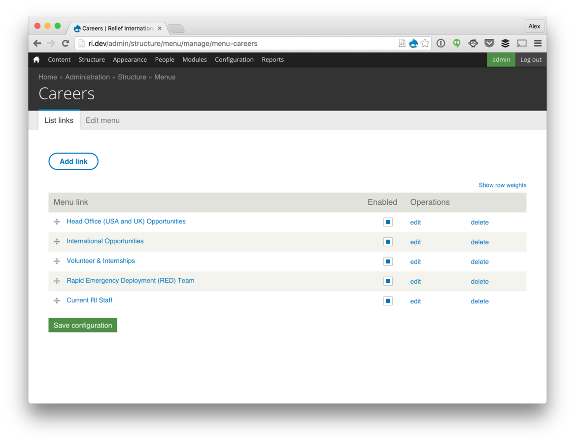
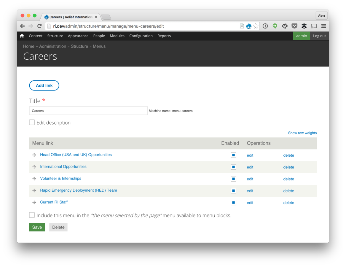
List links
Edit menu
Content Creation Recap
Field Group similar elements
Only show required fields by default
Less is more
Consolidate actions onto a single form
Hide settings that won't change
Improve ability to find content
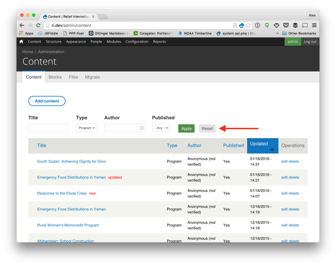
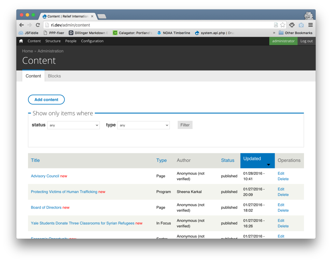
Enabled
Disabled
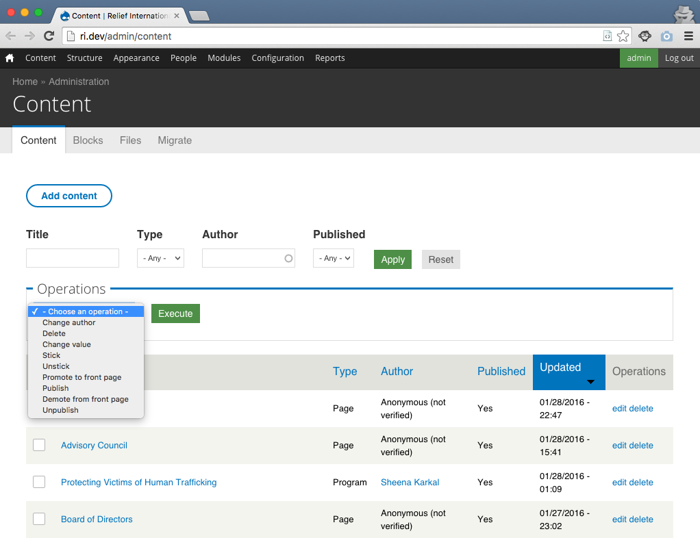
Allow in place editing
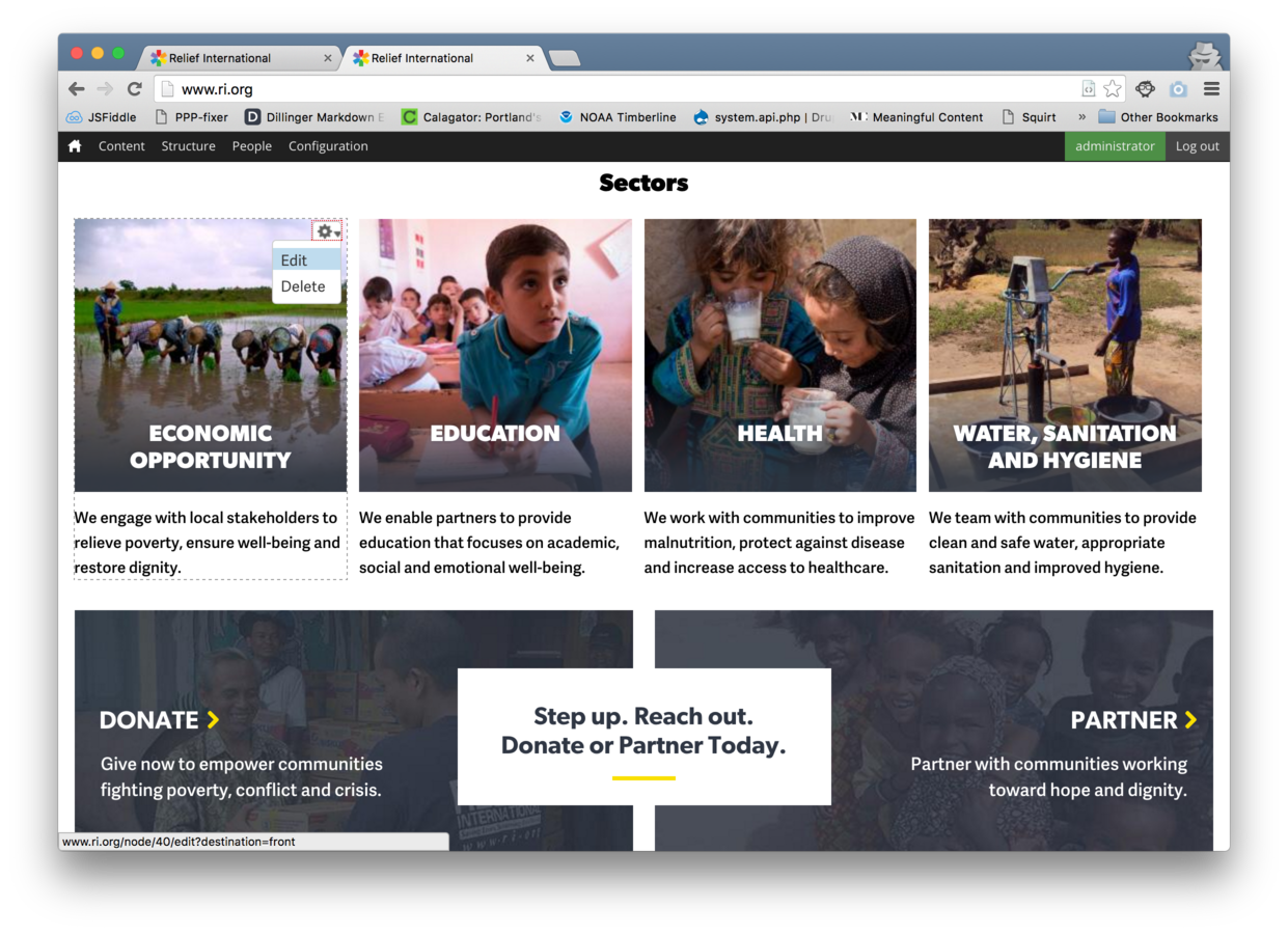

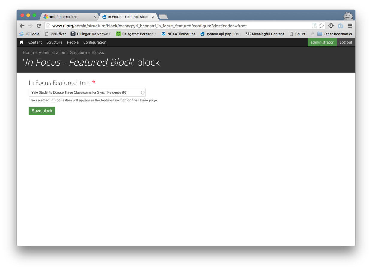
In-place Editing Recap
Use Contextual module
Don't use "promoted" or "sticky" toggles to determine placement of high visibility content
Less (clicking) is more
What did we do?
Improved "dive-in" factor of the admin menu
Simplified content creation
Enabled effective in-place editing
Improved ability to find content
What are the wins?
Lowered the learning curve for
site administrators
Built trust early
Allowed clients to stage content quickly
Cut down on hours spent training and providing trivial support
Thank you
@caxy4
Alex Ellison

Drupal admin UX: plain and simple
By Alex Ellison
Drupal admin UX: plain and simple
- 2,062
