Shadow DOM
A Quick Introduction
What is Shadow DOM?
Shadow DOM refers to the ability of the browser to include a subtree of DOM elements into the rendering of a document, but not into the main document DOM tree.
How does it work?
Document
<html>
<head>
<body>
<title>
Text: "My title"
<div>
<p>
Text: "My content"
<custom-tag>
<button>
Text: "Click me"
A quick example
class CustomTag extends HTMLElement {
  constructor () {
    super();
    // This enables the ShadowDOM ability for a custom element
    const shadowRoot = this.attachShadow({mode: 'open'});
    // This adds HTML code to the element
    shadowRoot.innerHTML = `<button>Click me, baby!</button>`;
  }
}

// The customElements API is used
/* more info here:
   https://developers.google.com/web/fundamentals/web-components/customelements
*/
customElements.define('custom-tag', CustomTag);
<!DOCTYPE html>
<html>
<head>...</head>
<body>
<custom-tag></custom-tag>
</body>
</html>Some more functionality
class CustomTag extends HTMLElement {
  constructor () {
    super();
    const shadowRoot = this.attachShadow({mode: 'open'});
    shadowRoot.innerHTML = `<button>Click me, baby!</button>`;
  }

  // This method is called when the element is inserted into the DOM
  connectedCallback () {
    // this.shadowRoot is the root of the DOM subtree
    this.shadowRoot.querySelector('button').addEventListener('click', () => {
      alert('Hello, world!');
    });
  }
}

customElements.define('custom-tag', CustomTag);
Let's add some CSS (wrong way)
<body>
<!-- This won't work, Shadow DOM encapsulates the CSS for components -->
<!-- The parent document can't edit the components' styling -->
<style>
button {
background: blue;
color: white;
padding: 10px;
border-radius: 5px;
border: none;
font-size: 14px;
}
</style>
<custom-tag></custom-tag>
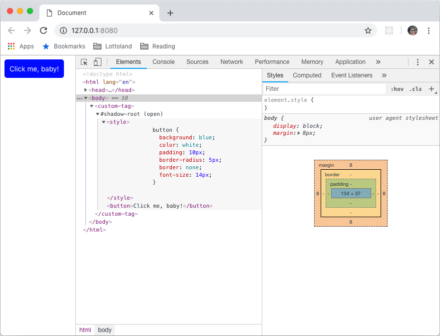
</body>Let's add some CSS (correct way)
class CustomTag extends HTMLElement {
  constructor () {
    super();
    const shadowRoot = this.attachShadow({mode: 'open'});
    // We'll add some CSS by hand
    shadowRoot.innerHTML = `
      <style>
        button {
          background: blue;
          color: white;
          padding: 10px;
          border-radius: 5px;
          border: none;
          font-size: 14px;
        }
      </style>
      <button>Click me, baby!</button>`;
  }

  connectedCallback () {
    this.shadowRoot.querySelector('button').addEventListener('click', () => {
      alert('Hello, world!');
    });
  }
}

customElements.define('custom-tag', CustomTag);
Result
What are the benefits?
- Isolated DOM: A component's DOM can't be accessed by the parent document, increasing the security.
- Scoped CSS: CSS defined inside shadow DOM is scoped to it and cannot be affected by other components.
- Simplified CSS: Scoped DOM means you can use simpler CSS selectors without worrying about naming conflicts.
- Productivity: The components are reusable, also the main DOM tree is easier to manage.
What are the drawbacks?
- Isolated DOM: A main css can't be used to style all components, it needs to be included in each component.
- Integration with 3rd party libraries: 3rd party scripts can't access the components (for example a Disqus comments plugin).
- Event propagation: a click on a part of a component can't be set from outside, custom events need to be used.
- Possible SEO issues: Server side rendering requires some hacks and libraries and is not a widely-used technique.
Can I use it today?
YES, but...
- The browsers that currently support it are:
- Chrome 53
- Opera 40
- Safari 10
- Firefox 63
- It needs a polyfill for the others:
- https://www.webcomponents.org/polyfills/
- https://github.com/webcomponents/
Further reading
- Shadow DOM v1: Self-Contained Web Components:
- Web Components and the future of Modular CSS:
- WebComponents.org:
Thanks!
Shadow DOM - Quick intro
By alininayeh
Shadow DOM - Quick intro
A quick intro to Shadow DOM, presented at the Gibraltar Software Development Community Meetup, the November 2018 edition


