Muhammad Ammar Hasan
- BE Software Engineering from NED University
- Application Developer at Recurship

Problem
*ngIf="screen === 'mobile'"
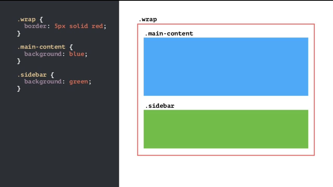
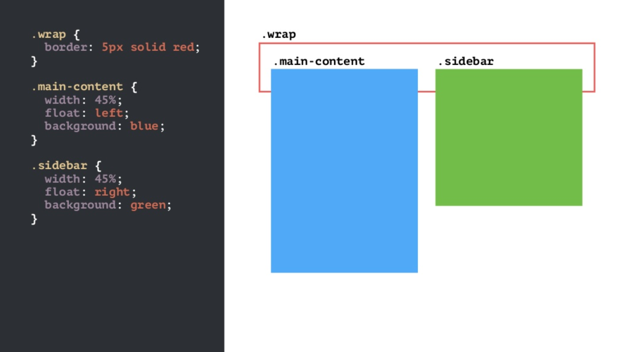
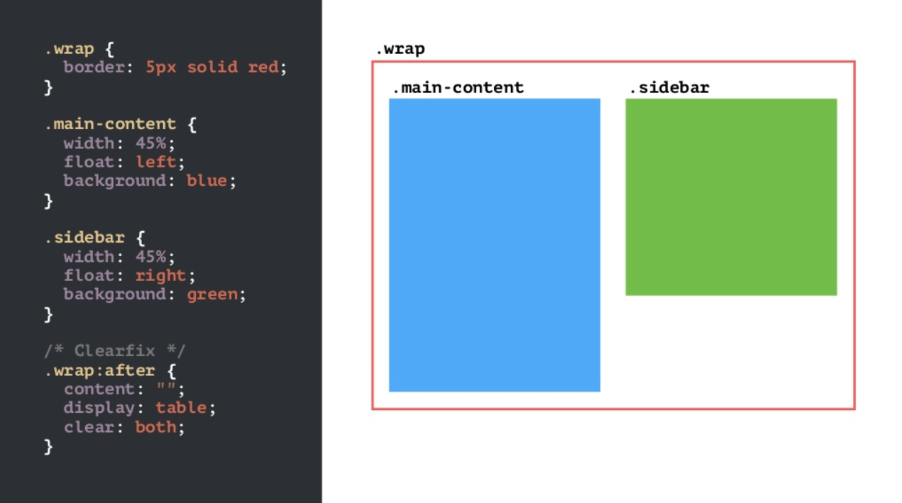
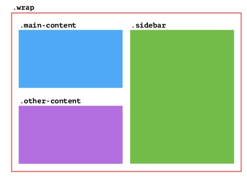
Web Layouts
- Tables
- Frames
- Floats and Clear
- Flexbox
- Grid

Why?
- Two dimensional
- Clean and readable CSS
- Layer items
- No additional row wrappers
- More Control
- Straight forward Responsive design
- Semantic HTML
- Readable HTML
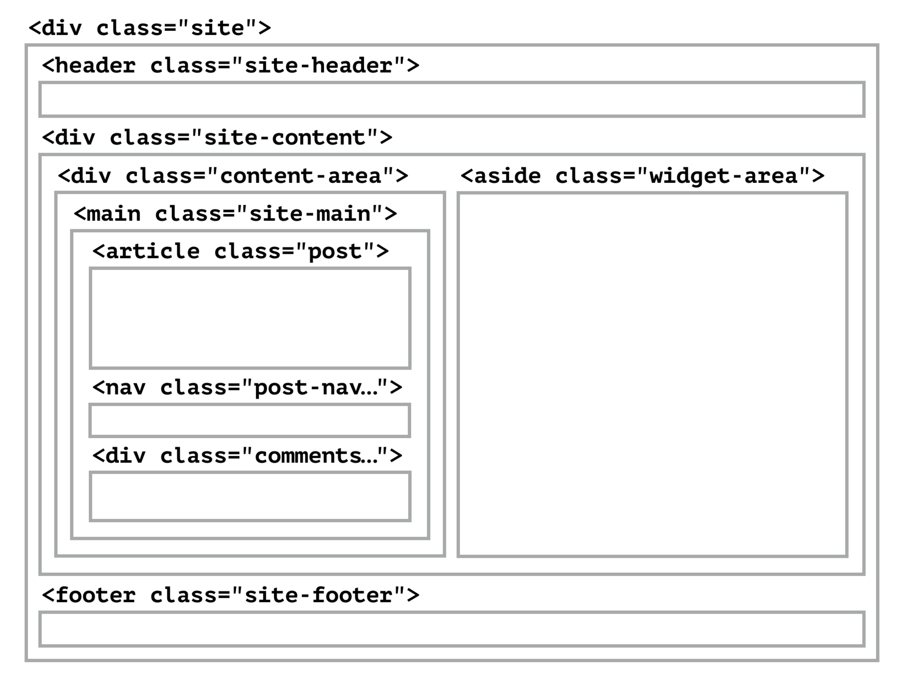

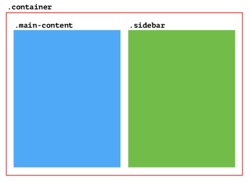
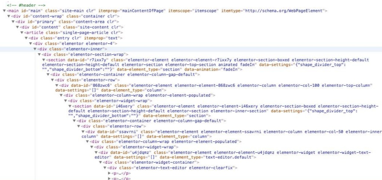
<div id="page" class="site">
    <header id="masthead" class="site-header"></header>
    <div class="site-content">
        <div class="content-area">
            <main id="main" class="site-main">
                <article class="post"></article>
                <nav class="post-nav"></nav>
                <div class="commnets"></div>
            </main>
        </div>
        <aside id="secondary" class="widget-area"></aside>
    </div>
    <footer id="colophon" class="site-footer"></footer>
</div>
<div id="page" class="site">
    <header id="masthead" class="site-header"></header>
    <main id="main" class="site-main">
       <article class="post"></article>
       <nav class="post-nav"></nav>
       <div class="commnets"></div>
    </main>
    <aside id="secondary" class="widget-area"></aside>
    <footer id="colophon" class="site-footer"></footer>
</div>
Vocabulary
1
2
3
4
1
2
3
Grid lines
The vertical and horizontal lines that divide the grid and separate the columns and rows.
Grid cell
A single unit of a CSS grid.
Grid area
Rectangular space surrounded by four grid lines. A grid area can contain any number of grid cells.
Grid track
The space between two grid lines. This space can be horizontal or vertical
Grid column
A vertical track of a grid.
Grid row
A horizontal track of a grid.
Gutter
The space between rows and columns in a grid.
Grid container
The container that holds the entire CSS grid. It will be the element that has the display: grid or display: inline-grid property on it.
Grid item
Any element that is a direct child of a grid container.
<div class="container">
  <div class="item item1"></div>
  <div class="item item2"></div>
  <div class="item item3"></div>
  <div class="item item4"></div>
</div>
Let's get started!
Defining a Grid
- display: grid;
- display: inline-grid;
With a grid defined on the parent element, all direct children become Grid Items.
.cards {
    display: grid;


}
Define rows and columns
- grid-template-columns
- grid-template-rows
With these properties we define an explicit grid. This one has 3 column tracks and 3 row tracks.
http://cssgrid.me/05161
.cards {
    display: grid;
    grid-template-columns: 250px 250px 250px;
    grid-template-rows: 200px 200px 200px;
}
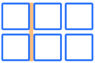
Define gap between items
- grid-column-gap
- grid-row-gap
- grid-gap
We can create a gap between rows and columns. This gap acts much like column-gap in multiple column layout.
http://cssgrid.me/05162
.cards {
    display: grid;
    grid-template-columns: 250px 250px 250px;
    grid-template-rows: 200px 200px 200px;

    grid-gap: 20px;
}
fr unit
The fr unit is a fraction unit, representing a fraction of the available space in the container.
I have created 3 equal width columns, each 1 fraction of the available space.
.cards {
    display: grid;
    grid-template-columns: 1fr 1fr 1fr;
    grid-template-rows: 200px 200px 200px;
    grid-gap: 20px;
}
fr unit
The fr unit is a fraction unit, representing a fraction of the available space in the container.
We have created 3 columns, the units add up to 4. The space is spilt into 4 equal parts, the first 2 tracks are given 1 part, the fine track 2 parts.
.cards {
    display: grid;
    grid-template-columns: 1fr 1fr 2fr;
    grid-template-rows: 200px 200px 200px;
    grid-gap: 20px;
}
fr unit
The fr unit is a fraction unit, representing a fraction of the available space in the container.
You can mix fraction units with other length units. Any tracks with a fraction unit share the space left after fixed size tracks and the gaps have been defined.
http://cssgrid.me/05164
.cards {
    display: grid;
    grid-template-columns: 500px 1fr 2fr;
    grid-template-rows: 200px 200px 200px;
    grid-gap: 20px;
}
repeat()
The repeat syntax lets us define a repeating pattern of tracks.
Here we are creating 3 1fr column tracks.
http://cssgrid.me/05165
.cards {
    display: grid;
    grid-template-columns: repeat(3, 1fr);
    grid-gap: 20px;
}
auto-fill keyword
Use the auto-fill keyword and grid will create as many tracks that will fit into the container.
http://cssgrid.me/05168
.cards {
    display: grid;
    grid-template-columns: repeat(auto-fill, 200px);
    grid-gap: 20px;
}
minmax()
The minmax() function enables the creation of flexible grids. The first value is the minimum size of the Grid Track, the second the max size - set that to 1fr to allow the track to take up remaining space.
http://cssgrid.me/05169
.cards {
    display: grid;
    grid-template-columns: repeat(auto-fill, minmax(200px,1fr));
    grid-gap: 20px;
}
Placing item on the Grid
Using line numbers
I have created a grid with 3 column tracks and 2 row tracks.
With no placement our blocks lay out one per grid cell.
.cards {
  display: grid;
  grid-gap: 20px;
  grid-template-columns: repeat(3,1fr);
  grid-auto-rows: 200px;
}
Using line numbers
To place an item on the grid I specify start and end lines using new properties:
- grid-column-start
- grid-column-end
- grid-row-start
- grid-row-end
.card:nth-child(1) {
  grid-column-start: 2;
  grid-column-end: 4;
  grid-row-start: 1;
  grid-row-end: 3;
}
Using line numbers
They can be expressed as one line using grid-area, the order of the values is:
- grid-row-start
- grid-column-start
- grid-row-end
- grid-column-end
.card:nth-child(1) {
grid-area: 1 / 2 / 3 / 4;
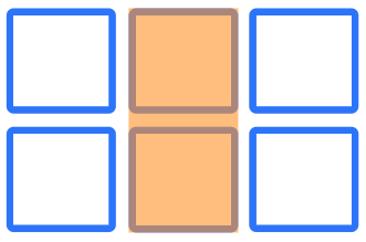
}Defining grid areas
This time I haven’t named my lines, I’ve just given each element a name.
.card:nth-child(1) {
grid-area: main;
}
.card:nth-child(2) {
grid-area: side1;
}
.card:nth-child(3) {
grid-area: side2;
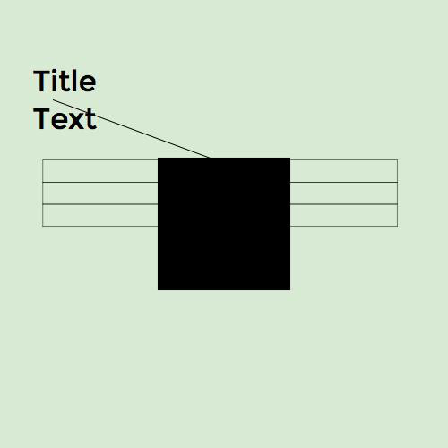
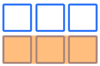
}grid-template-areas
I then use these names to describe my layout as the value of grid-template- areas.
http://cssgrid.me/051618
.cards {
  display: grid;
  grid-gap: 20px;
  grid-template-columns: repeat(3, 1fr);
  grid-template-rows: 200px 200px;
  grid-template-areas: "side1 main main"
                       "side2 main main";
}
Holy Grail
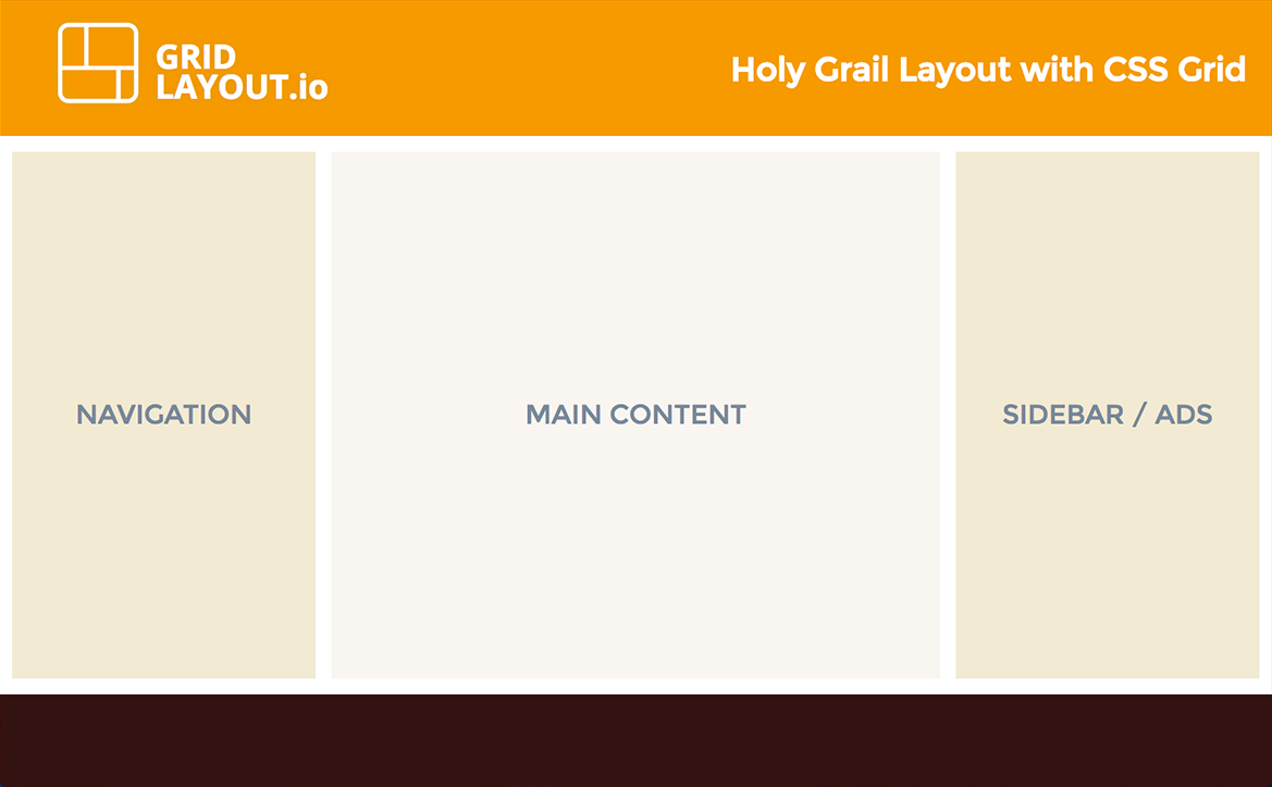
Remember Layer items?
CSS Grid in Production
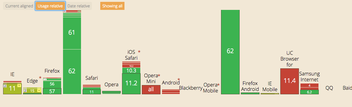
https://caniuse.com/#feat=css-grid
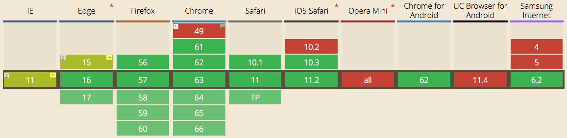
This is a rate of adoption we’ve never seen before for such a huge feature.
https://caniuse.com/#feat=css-grid
Fallbacks
Polyfill
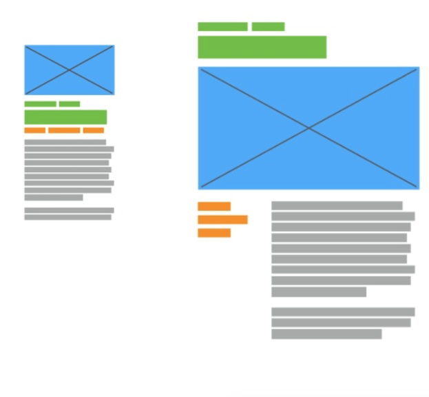
Outline for a practical process of development:
- Create accessible HTML with a sound hierarchical and semantic structure.
- Create a responsive single-column layout for all screen widths.
- Apply advanced layouts and functionality (grid, flex, JavaScript, etc.).
Worth Pursuing?
ThoughtWorks Technology Radar: Yes!
It is important to understand how to build up this capability. Enterprises should try this technology on a project that can handle the risk.
Examples
https://codepen.io/andybarefoot/post/isometric-layout-with-css-grid
Learning Resources
CSS GRID
By Ammar Hasan