


Andy Rutkowski
Visualization Librarian at USC Libraries
finding questions in and through the data
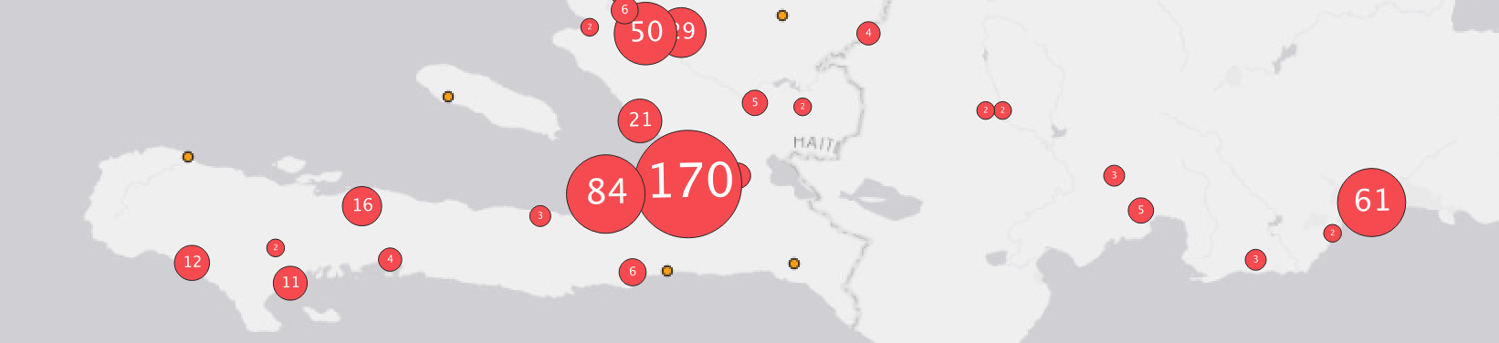
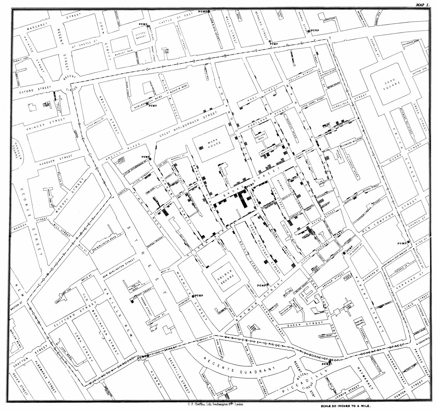
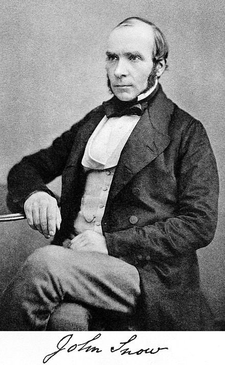
no not this jon snow . . .
map with just cholera deaths
map with water pumps
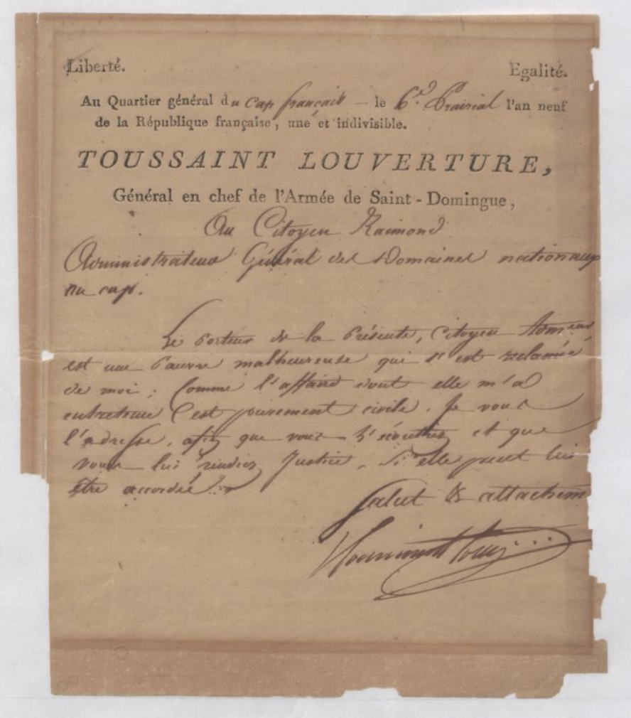
Is is possible to rethink the Haitian revolution? How it happened? When it happened? Where it happened? Who was involved?
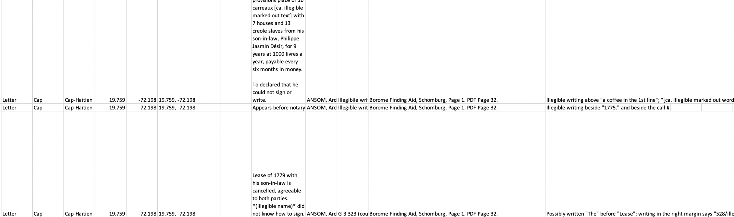
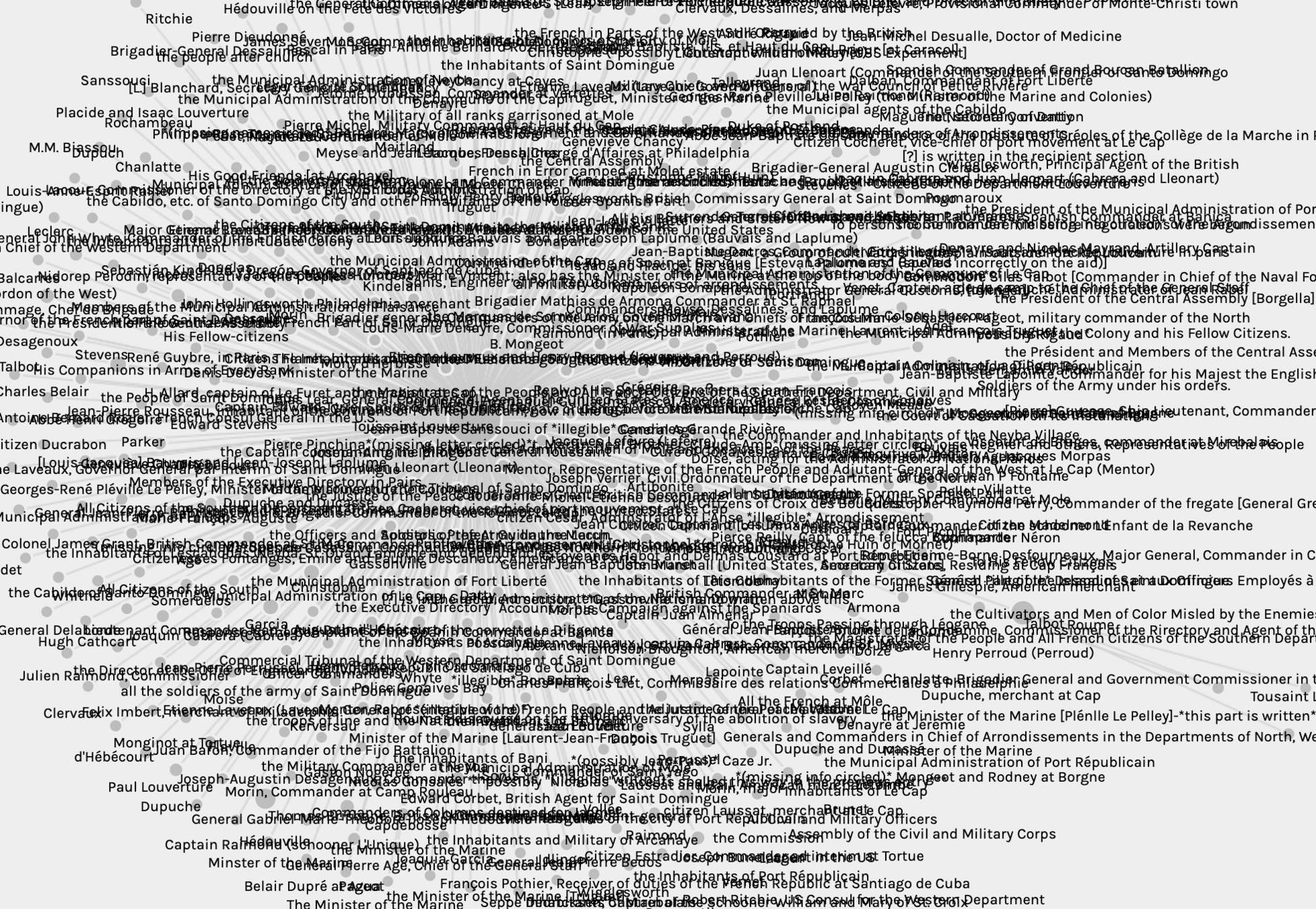
Hand coding letters into a spreadsheet with relevant data: dates, places, people, text, archival location, etc.
but also date, descriptions, people
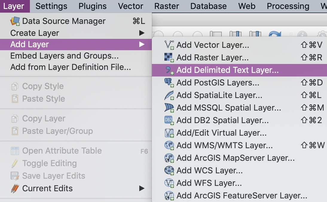
README:
Important to develop a strategy for documenting and keeping track of changes. Also important to consider how to structure data in order to visualize it.
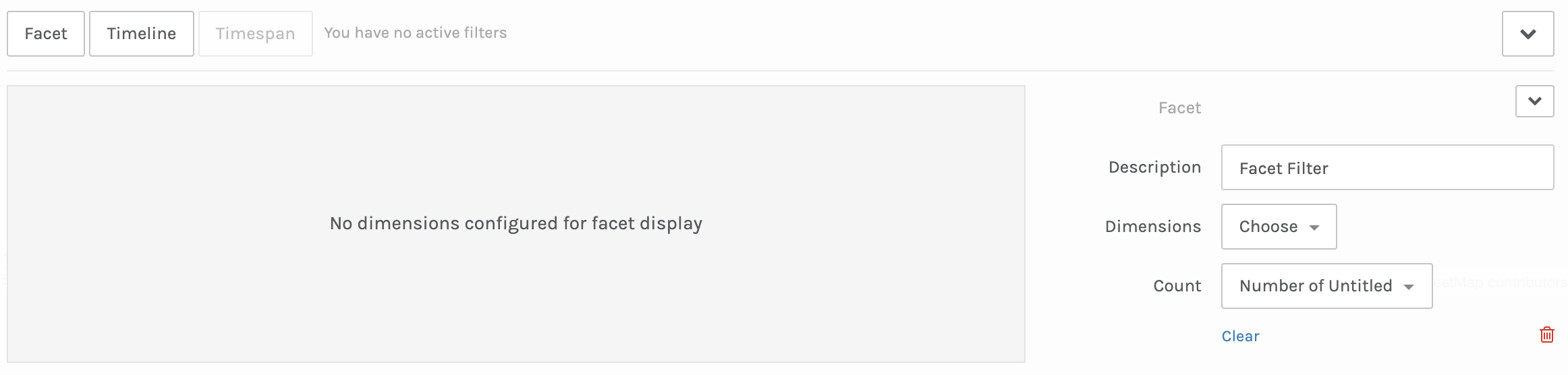
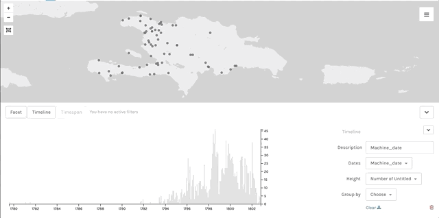
data exploration
data visualization
web based
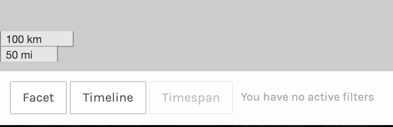
CSV file or Palladio file format
make maps
make networks
create interactive filters
metadata viewer
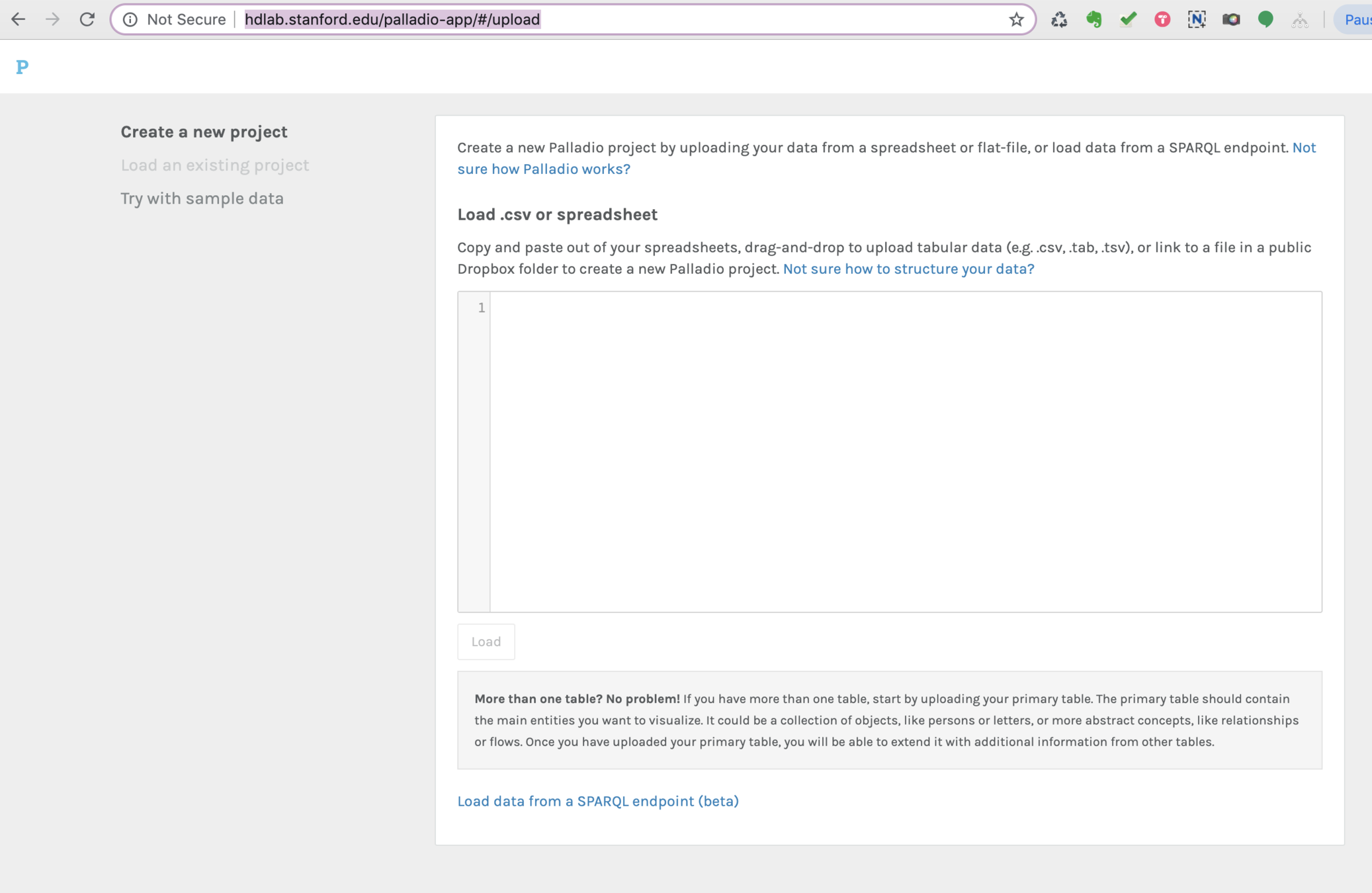
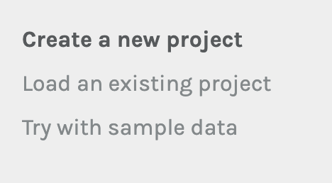
drag your louverture_palladio.csv file into here and then click "Load."
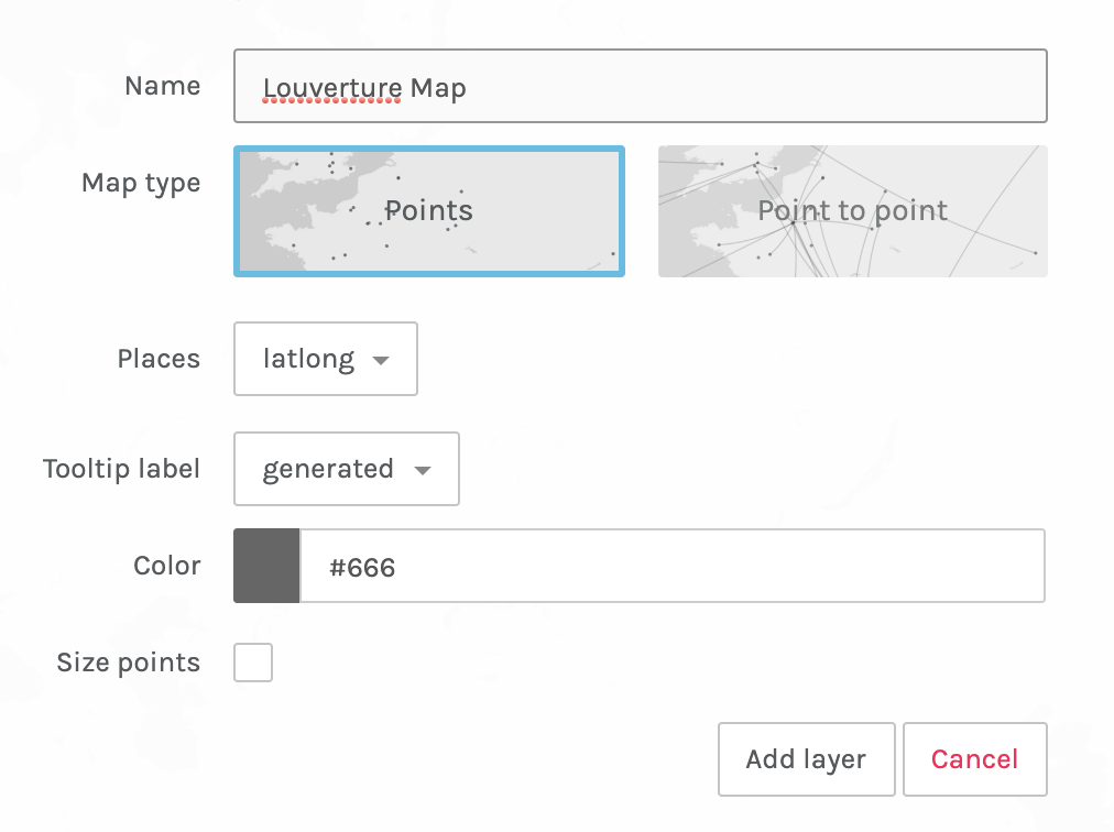
Once your data is loaded in you can provide a name for your project.
You can now preview your data quickly and also make sure it was imported correctly.
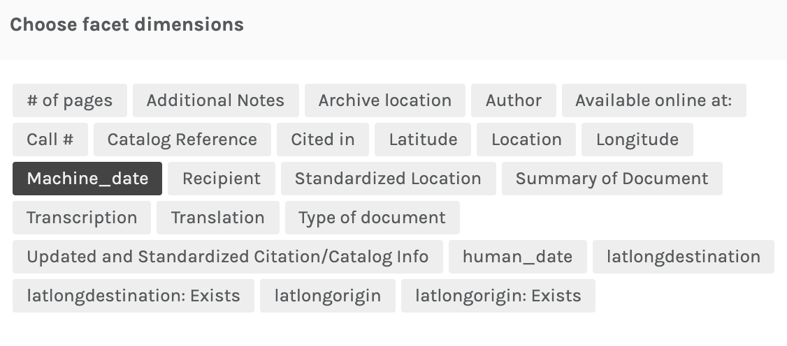
Most importantly make sure Machine_date is identified as Date and latlong is identified as Latlong
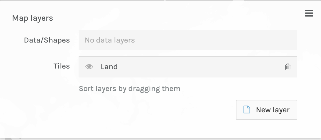
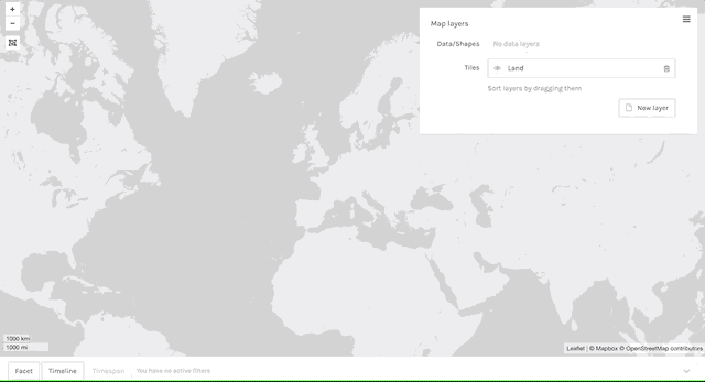
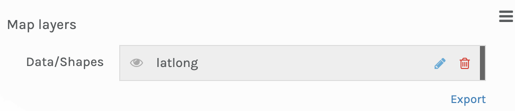
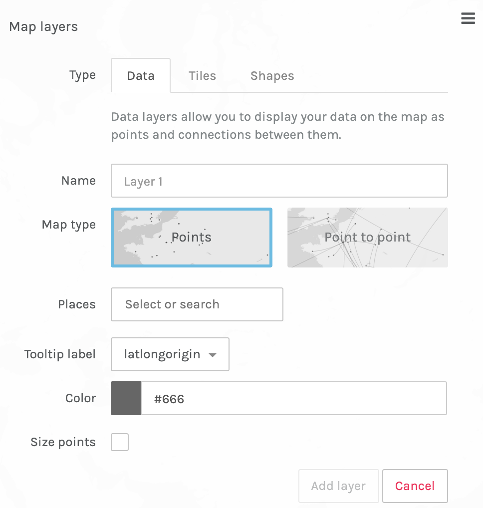
Click on "Map"
Then click "New layer"
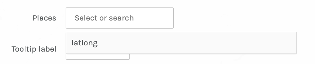
Then click on "Places" and select "latlong"
Then name your map and click on "Add layer"
Go back and click the pencil icon to edit the Map layer.
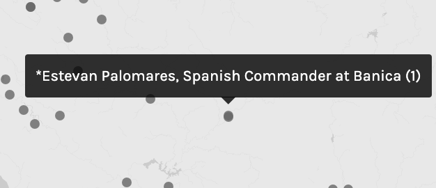
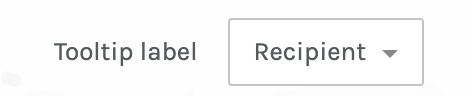
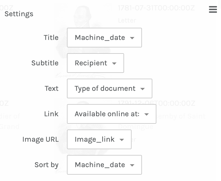
Then select the Tooltip label and choose a dimension to display. Choose "Recipient."
Click "Apply"
Now your tooltip will display the recipient field.
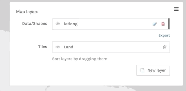
You can click on the hamburger icon to display or hide layer information
select and unselect recipient to filter points
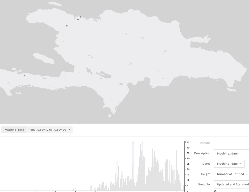
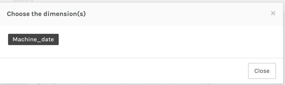
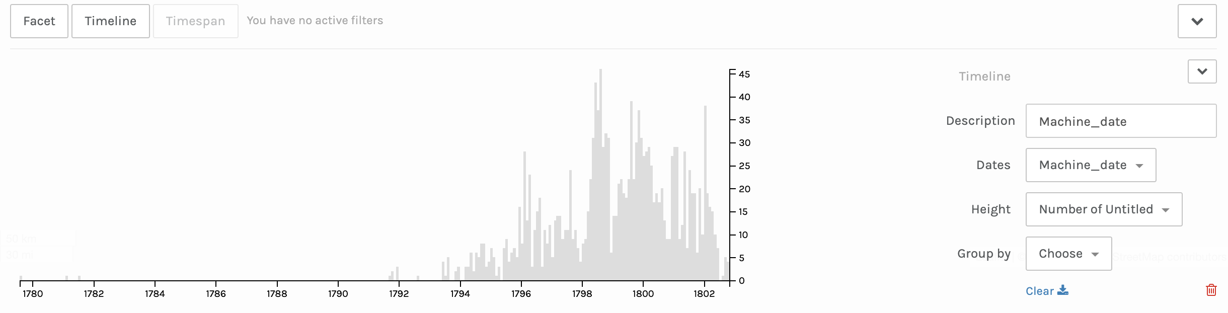
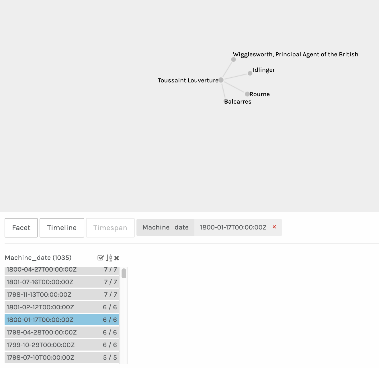
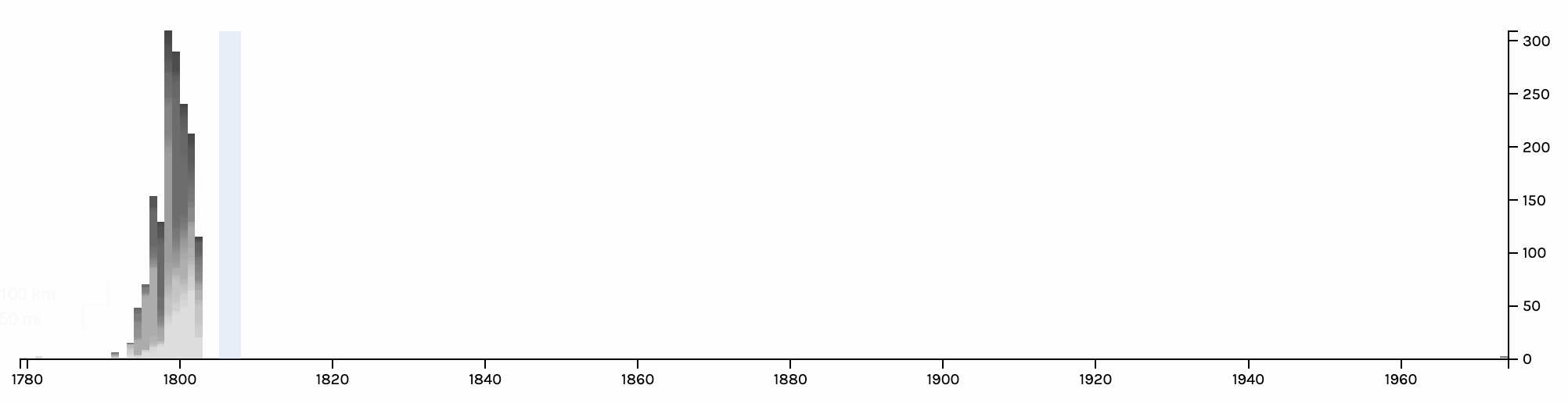
Choose "Machine_date" for date
You can click and drag to create a small bar to signify a date range which can then be dragged across the data to visualize it.
downloaded file will be named
"Data export.palladio.1.2.9.json"
rename it to something meaningful.
If yo load this as an existing project you should return to the settings, timeline, facet, etc. when you saved the project
Load in the CSV file called:
2019-05-02_LouvertureCSV_PalladioNetworks.csv
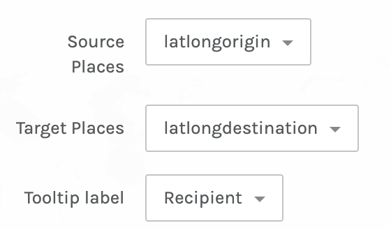
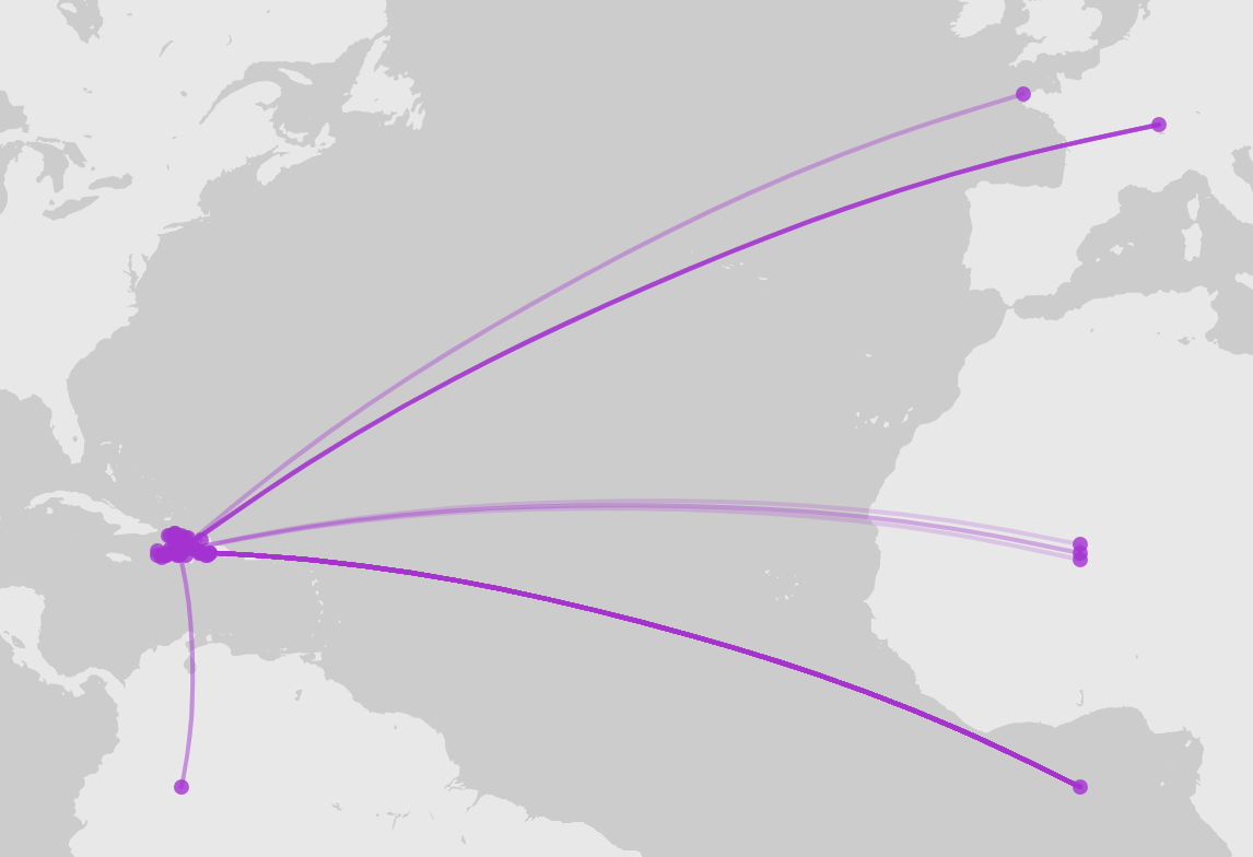
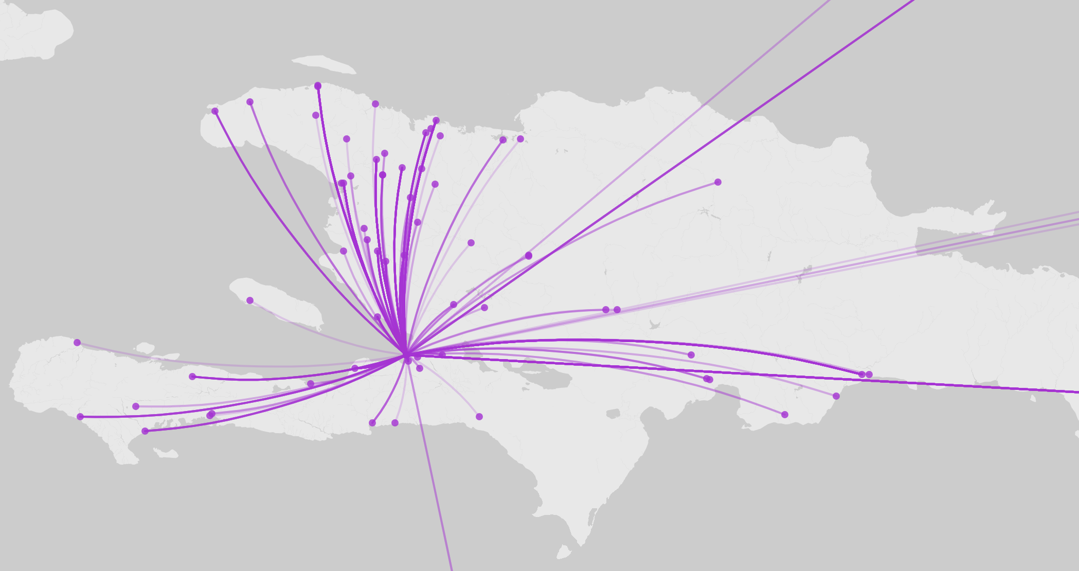
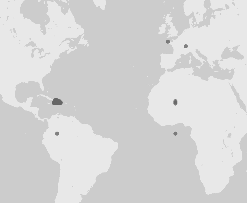
This file has fields called latlong origin and latlong destination from which we can create a spatial network. In this example we have defaulted all of Louverture's letters to have been sent from Port au Prince.
Create a map and this time select Point to point as the map type. Then select according the source places, target places, and tooltip. Scroll down and then add the layer.
You should have a map showing the origin for all the letters as Port au Prince.
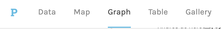
Now click on Graph
It shows the entire network of Louverture and his recipients. To make this more readable and usable we can create a facet using the "machine_date" field.
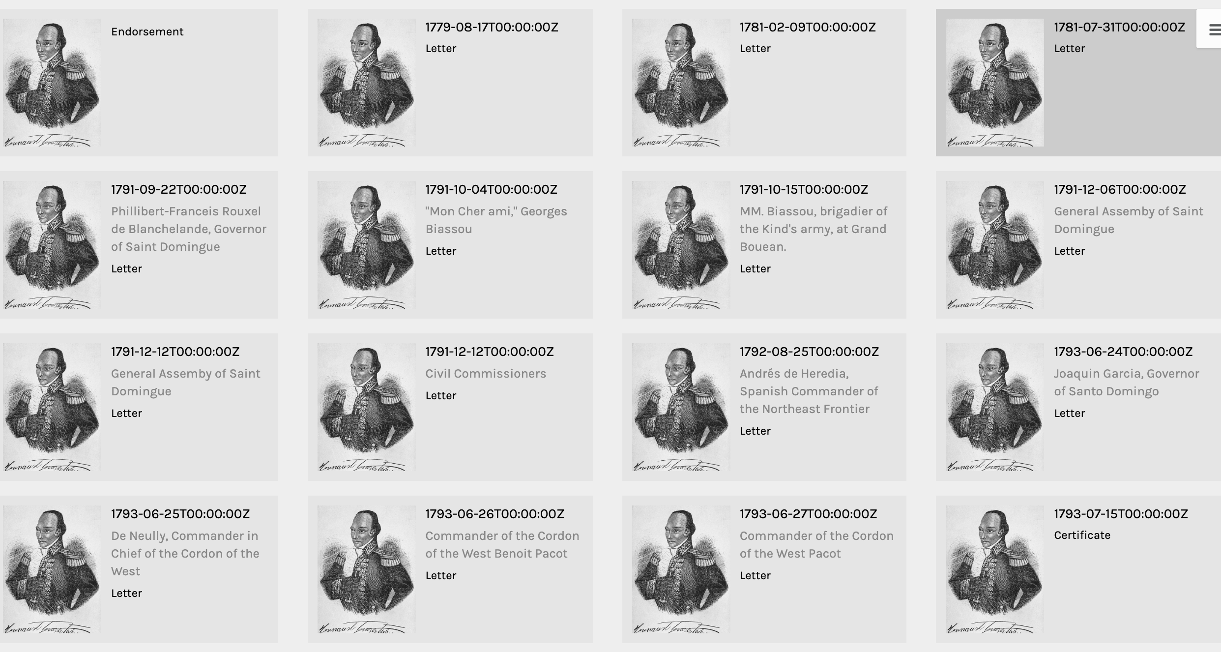
One nice feature of Palladio is that you can browse through every record in a Gallery mode. This feature is especially nice if you have unique image urls. The PalladioNetworks.csv file has an extra field called image_link that has a url to an image of Louverture from New York Public Library. This is just an example for displaying the Gallery.
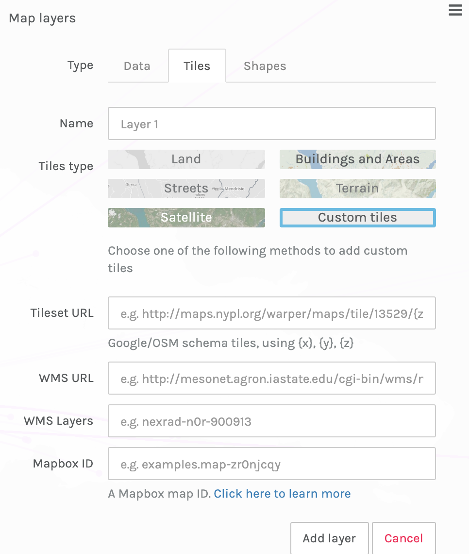
Palladio lets you add a historical map as long as it is already hosted elsewhere, for example, at NYPL or through the David Rumsey Map Libray at Stanford.
Return to the Map Layers and add a new layer. Select "Tiles." And then just Custom Tiles.
Copy and past the URL from the box below into the "Tileset URL" field. Click "Add layer."
https://maps.georeferencer.com/georeferences/988586362611/2018-11-19T00:08:34.285788Z/map/{z}/{x}/{y}.png?key=JxtmprkSqEOUFYPdH9Ga
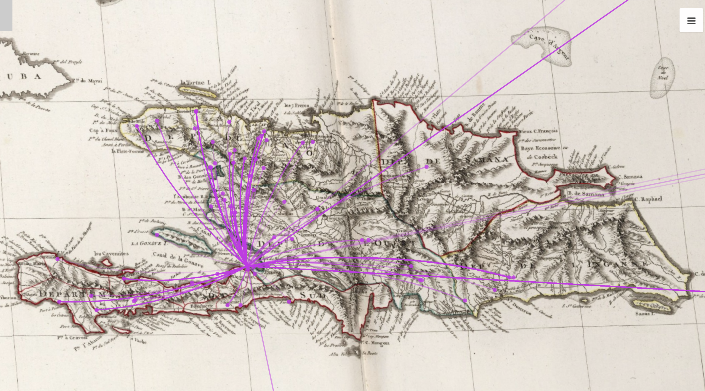
One of the first things you will notice is that some of the points have incorrect latitude and longitude.
Palladio quickly reveals these type of errors and you can go back to your CSV and fix them.
Here is another example.
What is wrong with this picture?
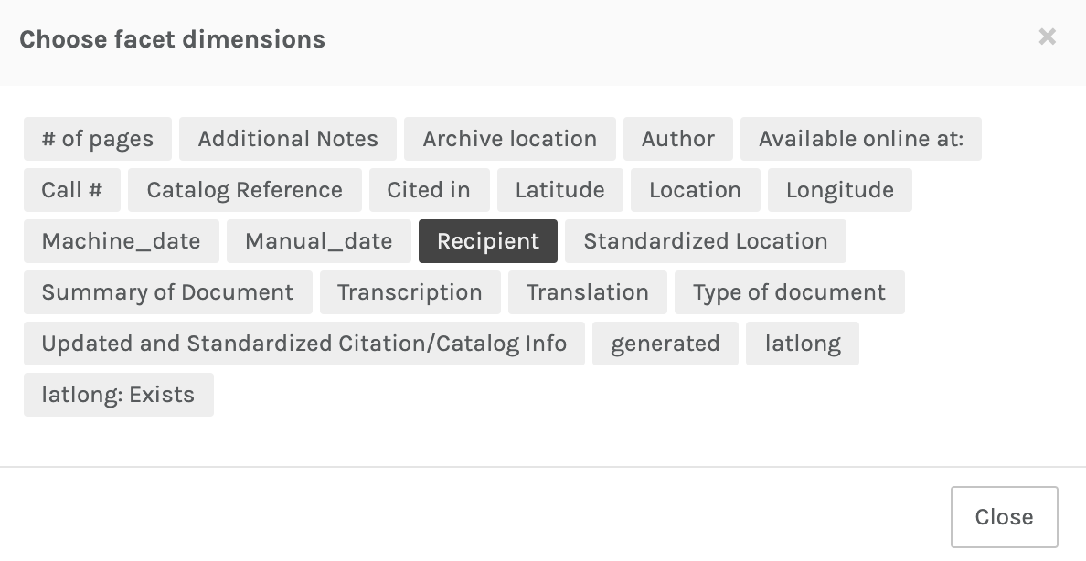
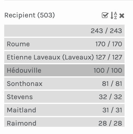
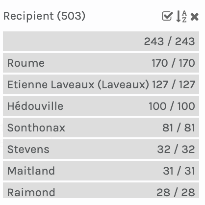
Create a facet using Recipient to easily see who received the most letters.
Notice 243 records have no recipient!
manage multiple layers
georeference and use historical maps
show routes
create custom polygons
create a research environment for analysis and exploration
Points color coded by recipient and labeled with a historical map overlay.
Before we begin. Make sure to have the Louverture Spatial Workshop folder on your desktop.
You will be working within this folder so it is helpful to have it in easy to locate place. Once a project is saved QGIS refers back to that folder location.
Blank template with no data or maps
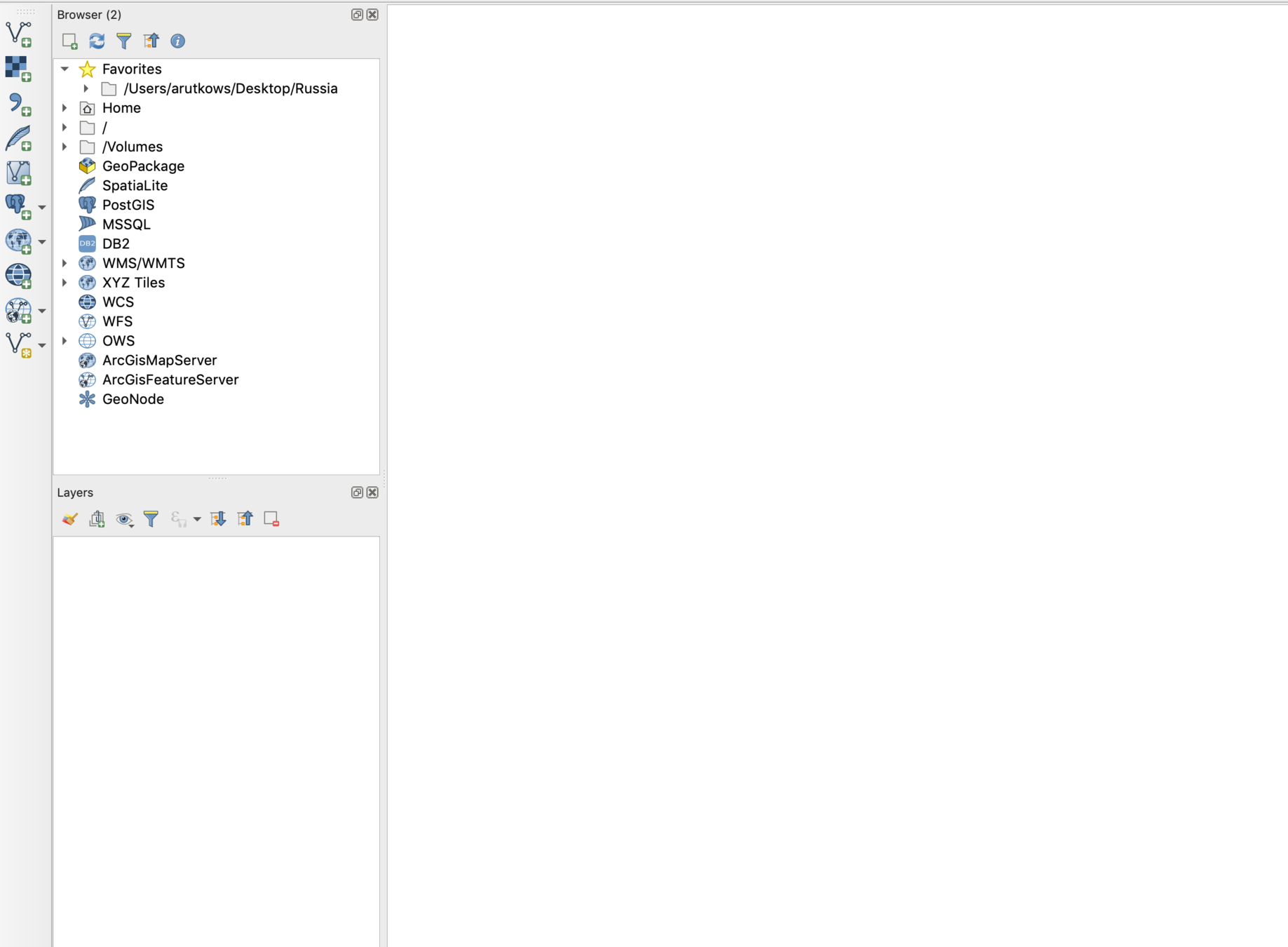
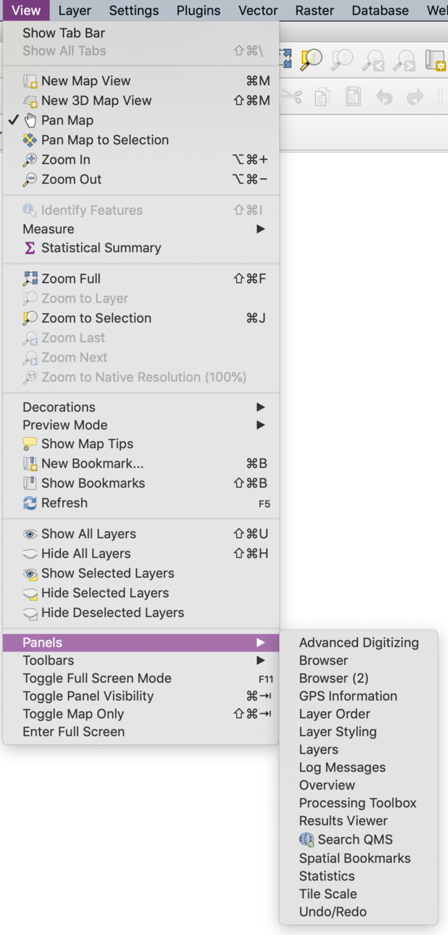
Lots of options and configurations. One small thing to do. From the "View" dropdown, select "Panels" and then check off "Browser (2)" and "Layers".
They should appear as integrated windows on the left hand side of your workspace.
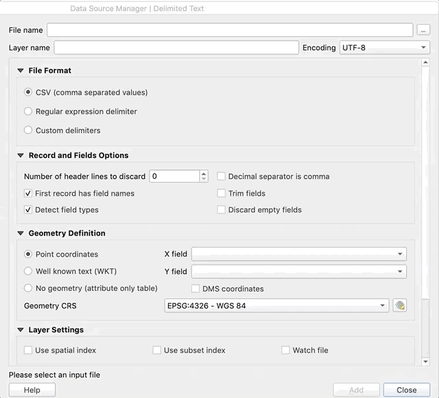
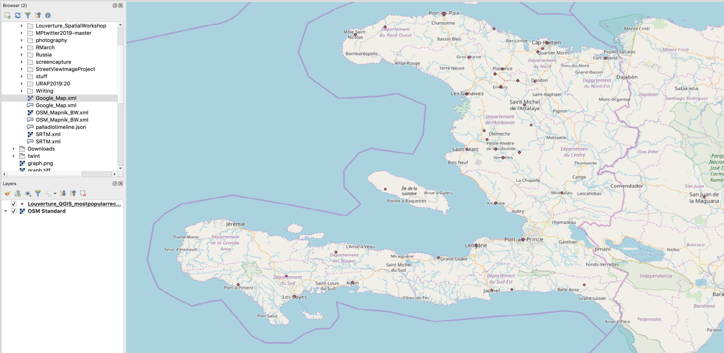
Lets load in a CSV file of data points.
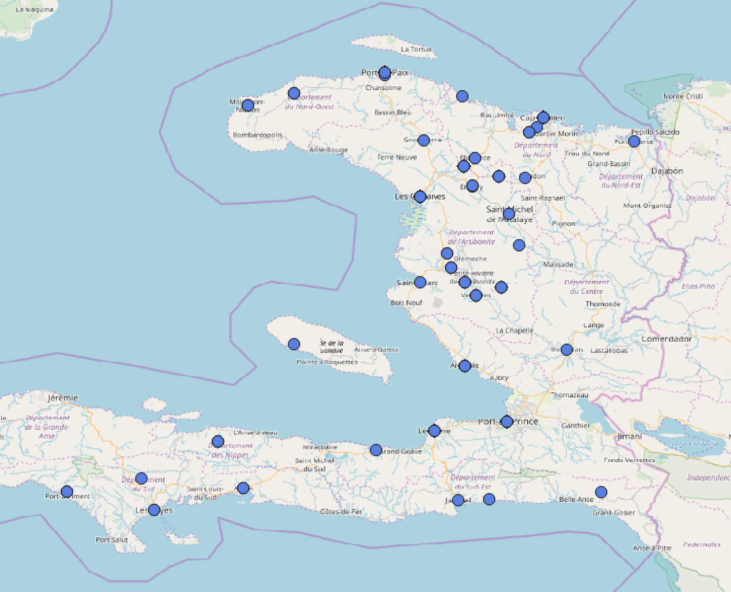
click and open the "Louverture_QGIS_mostpopularrecipients.csv" file
After adding the layer you should see points on a blank background.
Lets add a basemap now to put these points into context.
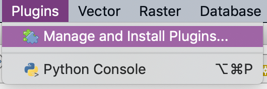
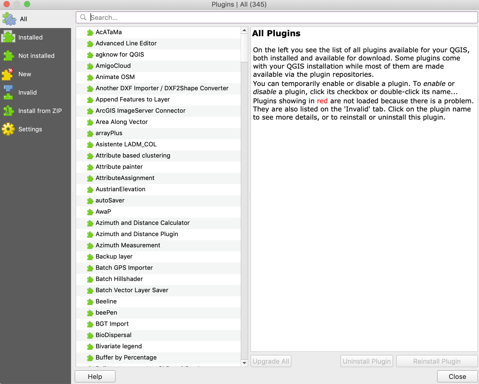
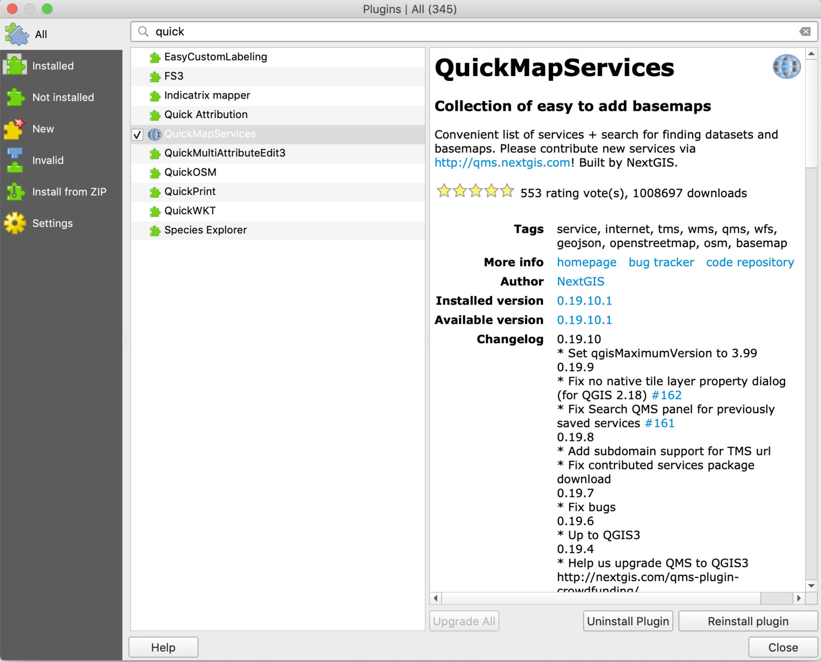
Go to plugins, Manage and Install Plugins and search for Quick and then install QuickMapServices
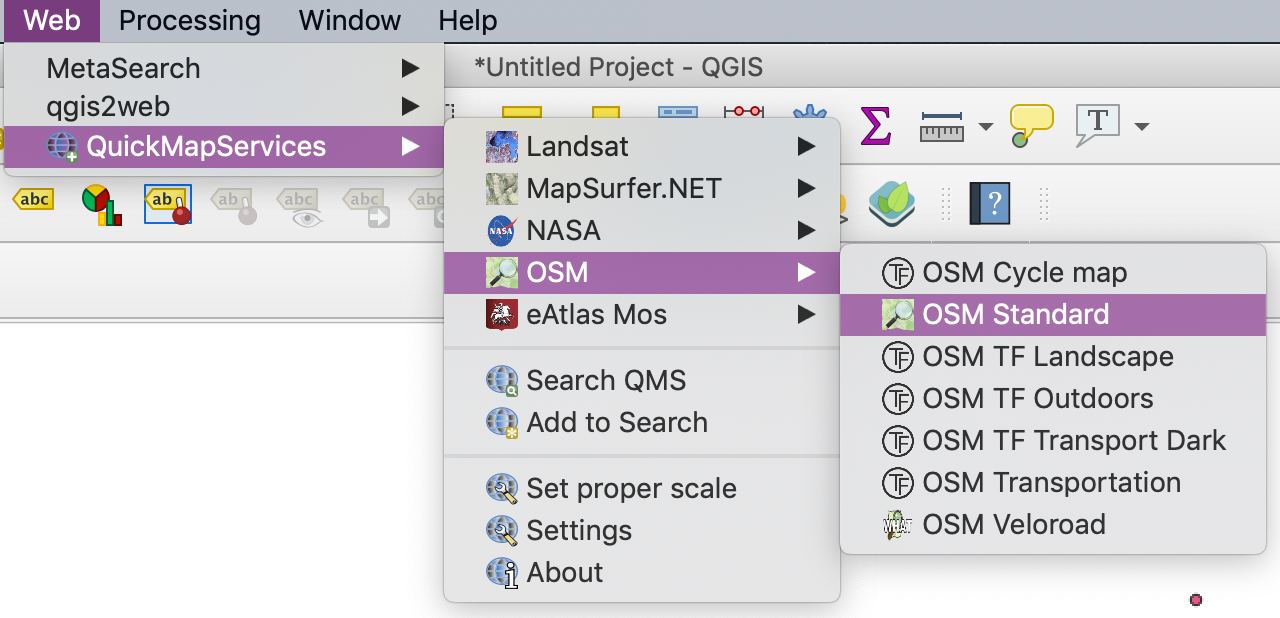
Once installed go to Web and then select a basemap. Try OSM Standard.
You can customize the points in many ways.
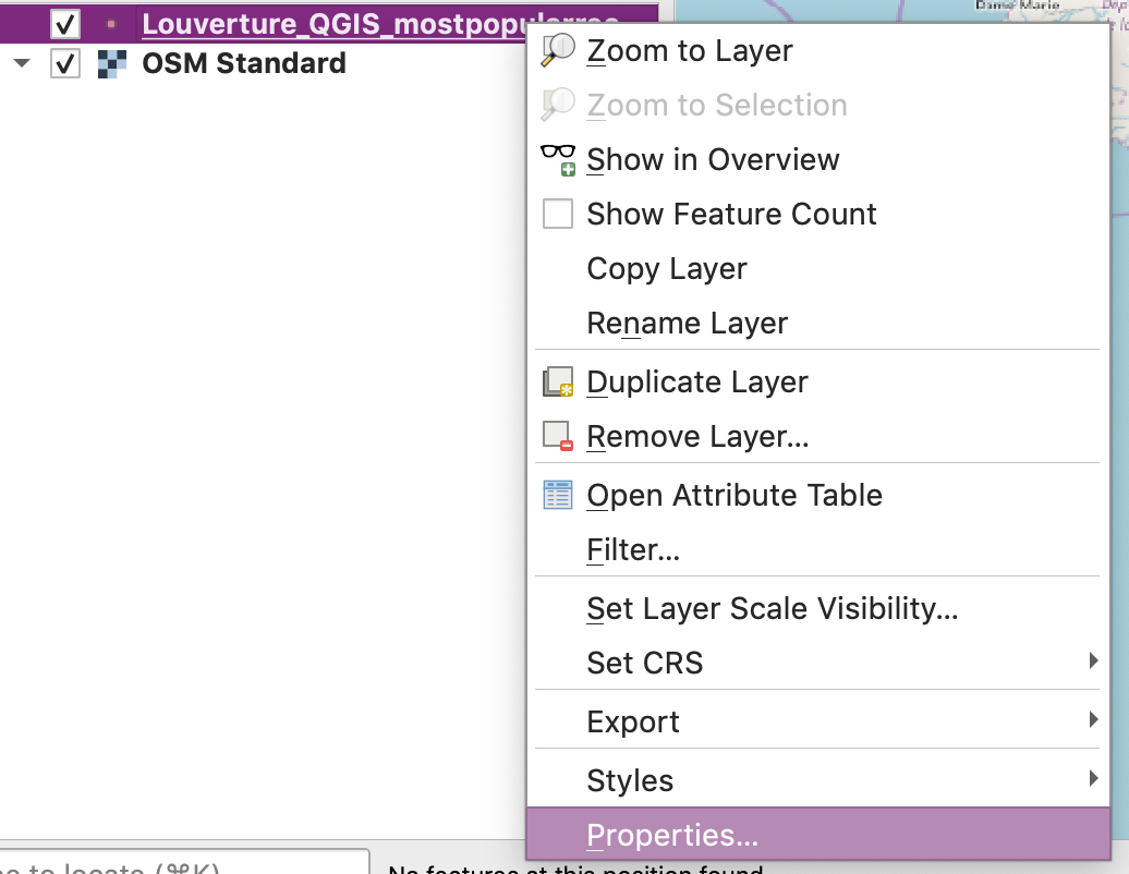
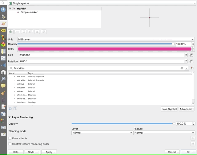
Right click on the Louverture file and then select Properties or just double click on the file.
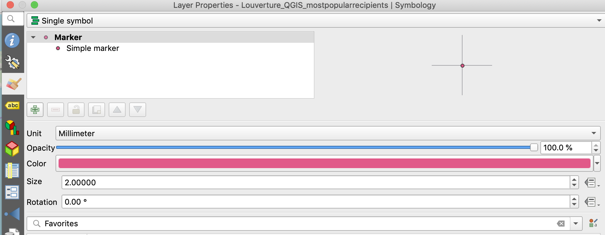
You should get a pop-window like this one with options on the left hand side. Select the paintbrush icon.
You can now style your marker by size and color. Pick a new color and increase the size to at least 4.00. Click on Apply and then OK.
Click on the drop down menu and then select categorized.
Then select Recipient and click Classify.
Then click Apply and OK.
By Andy Rutkowski


